An animated Game User Experience review of Brain Dots

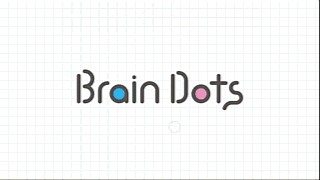
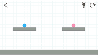
The game startup screen is enough to show the principle of the game. The volume is a bit loud though.
Let’s start with discussing the tutorials, the onboarding experience is particularly nice.
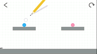
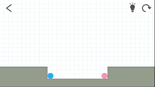
The game is as easy as it looks. The player reaches the first level in two obvious taps. The player is guided so he doesn’t have to wonder about how to start the first level (Unlike, say, Lines, which I should definitely write a review for later).
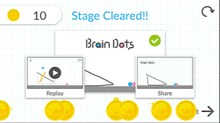
Notice how the first level actually is exactly the title screen. Not only is there a tutorial, but also the player already saw the solution before. This step by step start is both brief and cristal clear.
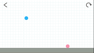
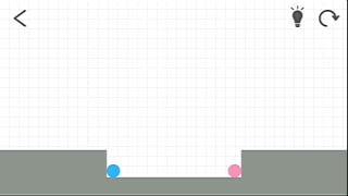
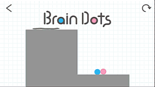
The second and third levels are still tutorials, teaching the players everything that is needed to be able to complete the game. The first level shows you need to join the two dots. The second shows you can move the dots around. The third teaches the player that figures have a solid shape that can be used to create path.
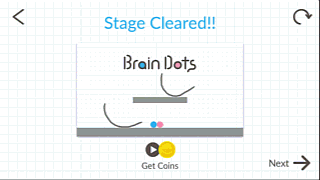
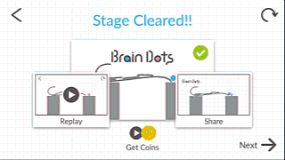
There is another thing this teaches the player. Notice how at the end of each level, the game title is displayed as a reward? Brand awareness. How many games does the player try? How many of them will he remember? And how many will he remember by name? Certainly, Brain Dots has a higher chance of being recalled.
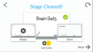
Notice, the tutorial is done, it took about 15 seconds, just watch the gifs, it’s a real time recording of a player discovering the game.
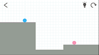
So, just to be sure that the player got the basics down, here’s the fourth level again, which is basically the first level, with a spike below. The in the fifth level, the repeat tutorial two on a non flat surface. If it looks repetitive to you, the player still wonders if that same strategy is going to work and doesn’t really mind anyway, since technically they’re progressing in the game. Not to mention, again, that it takes only seconds.
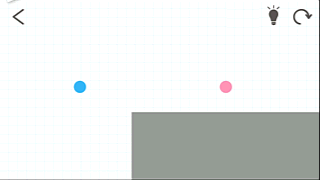
And then, things get interesting. Trickier. Although using technically exactly the same principles as before. You can use twice the arc to move both dots towards each other, and with the right timing, they might collide. Or you might figure out that by combining two of the things you learnt, you can make your life easier: you can just put a block on one side, then push both dots in the
Conclusion ? Brain Dots has all it needs to create a great first impression and a positive onboarding experience. But the game isn’t perfect mind you.
First of all, the lines drawn are broken if they cross other objects. The game provide clear signs to help the player anticipate this fact. They were not seen by our player though, who experienced his first failed game as a result.
Failing the game is not much of an issue, starting up again is quite fast. What is more annoying in the adds shown in between the tries. They’re not so long, and easy to close, but still quite intrusive. Theses ads annoy the player during an otherwise relaxing and Engaging experience.
While they disrupt the rythm of the game, they are easy to close, don’t require to wait according to a timer: even if there is a timer, it doesn’t actually require the player to wait for it to run down to 0. Furthermore, the game is not the type where the player would frantically tap the screen in between tries, because it’s rather slow paced. This reduces risks of errors and unvoluntary inputs.
An even more user friendly way of showing the add would be to present it in between levels, when the player has completed the level he failed once, or if he decides to leave the game. This animation show the same situation, with the add displayed at a different moment. It feels more smooth an experience, and doesn’t interfere at all with the player experience during the game session.
The game regularly presents messages in between levels. Above, you can see two example messages: progress in the game, unlocking new levels, new features. The same type of messages are also used to encourage the player to share his end-level drawing, or the game.
The issue with this is that the player is likely to not read the messages after a while, discarding them as standard call to actions, and missing the point, including a whole bit of gameplay, like the pen that unlocked. Even if an icon appears in the next level -the one blinking in the capture), it doesn’t strike the player, who is blind to change in this interface. Actually making it blink for a short while after it appears might attract the attention of the user to use it.
Lastly, finishing on a positive impression is equally important as starting with a good one, and again, Brain Dots does a good job at that, by showing tha player the “artworks” he made during his play session, when going through the menu to leave.
Articles on similar topics
The Mass Effect series
Game Usability reviews, Game user experience analysis,
A game usability review of Triple town
Game Usability reviews, Mobile game user experience,
A game usability review of Amazing Brick
Game Usability reviews, Mobile usability, Mobile game user experience, Game user experience analysis, Initial experience, Out of box experience,
A game usability review of Auralux
Game Usability reviews, Mobile usability, Game user experience analysis, Initial experience, Out of box experience,
A game usability review of Ollie Pop Retro Skateboarding
Game Usability reviews, Game user experience analysis, Mobile usability, Mobile game user experience, Initial experience, Out of box experience,
A game usability review of Time of Exploration
Game Usability reviews, Game user experience analysis, Mobile usability, Mobile game user experience, Initial experience, Out of box experience,