A game usability review of Ollie Pop Retro Skateboarding
 Ollie Pop is a pixel art skateboarding game in which the player has to progress as far as possible in the level avoiding obstacles. To do so, he has to charge a jump by holding his finger on the screen. Releasing the touch will trigger a jump. The longer the player touches the screen, the higher the character will jump.
Tested on Android / Samsung Galaxy S3
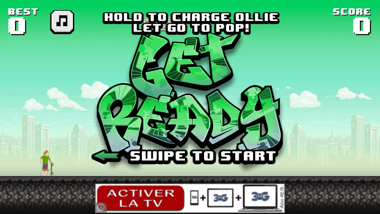
The game is very fast to load and the player can start immediately. However, the game starts with the instruction “Swipe to start”.
This fails to act as a tutorial while launching the game session. Swiping is never used as an interaction to progress in the game. It teaches the player an interaction he never will actually need afterwards.
On the contrary, the gameplay explanation is stated above the “swipe to start” message and a visual tag telling the player to get ready. As a result, “Hold to charge Ollie, Let go to pop” is lost in the visual clutter, while it’s the most important message on the screen. As a result, the players will need to experiment with trial and error to find out how the game works, despite all the information being there.
Starting the game by holding a tap for a while, then releasing would be a lot more useful in the player’s learning process and ensure the game mechanics are understood before the game starts without being intrusive.
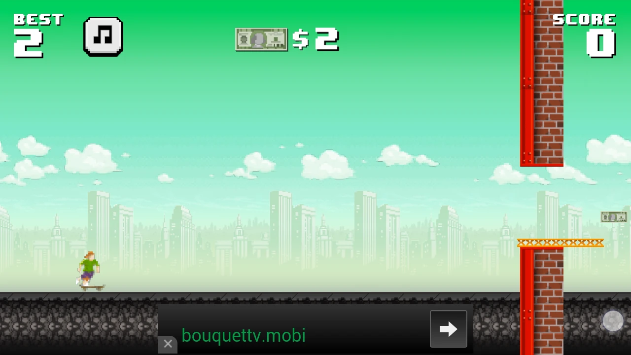
Sadly, this indication disappears once the player has swiped to start, leaving him wondering how to play at that exact moment in time. Leaving the tutorial message visible a little longer might just do the trick, although the player doesn’t really have the time to read once the game has started.
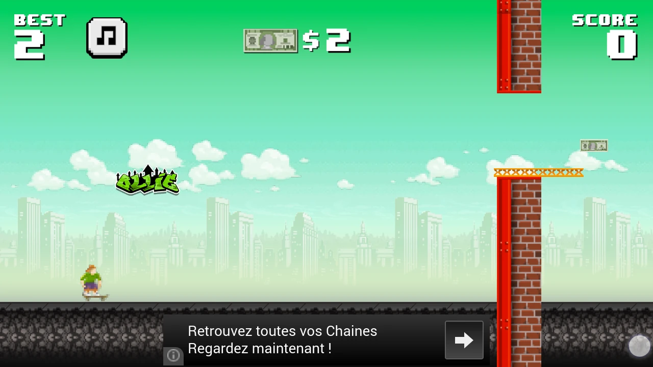
When tapping the screen and holding, a visual indicator tells the player how high Ollie is going to jump if released at that precise time. This is a very helpful feature to the player, to help him get his timings right when he picks up the game.
The visual cue reading ‘Ollie’ with upward arrows should be understandable, but appears very cluttered as well and difficult to identify as such at the start by the player.
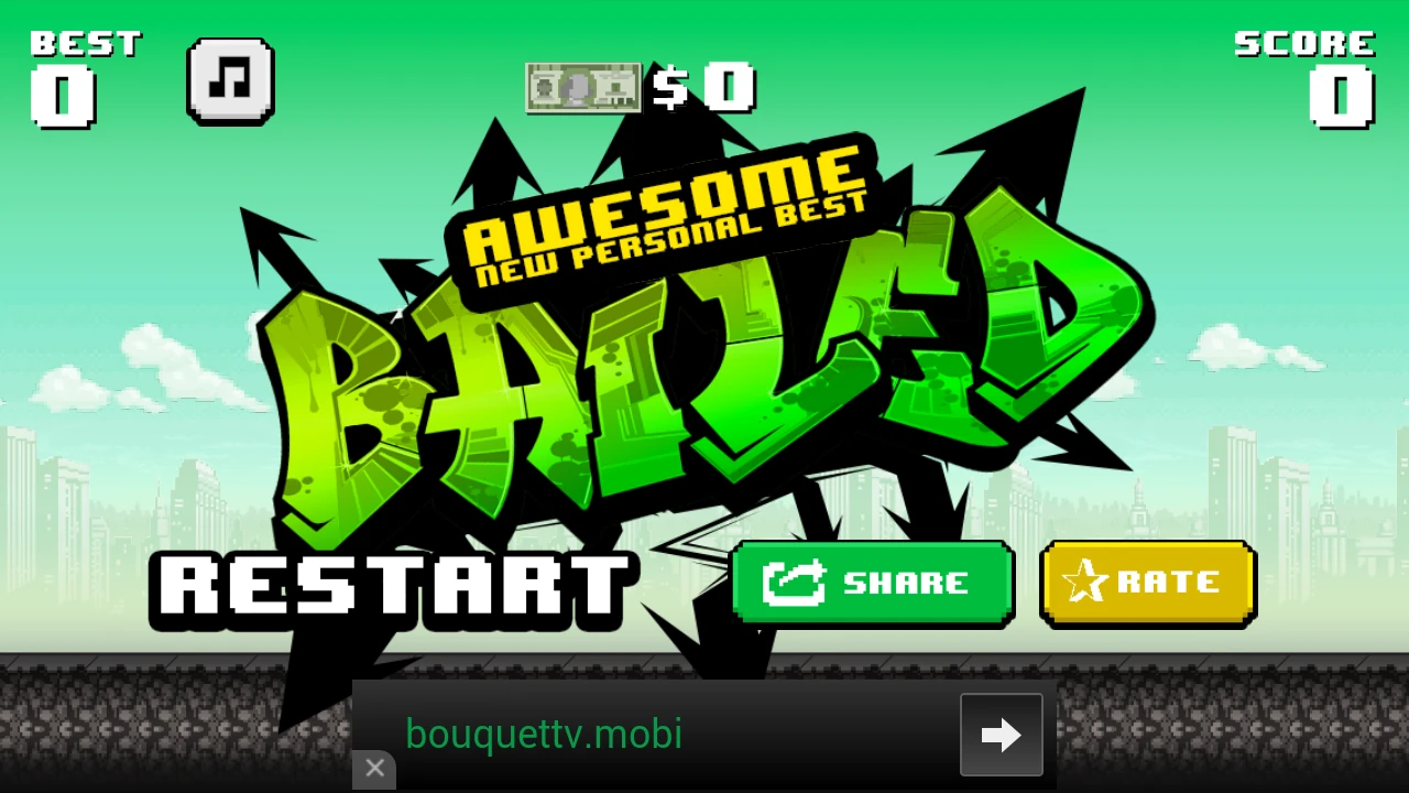
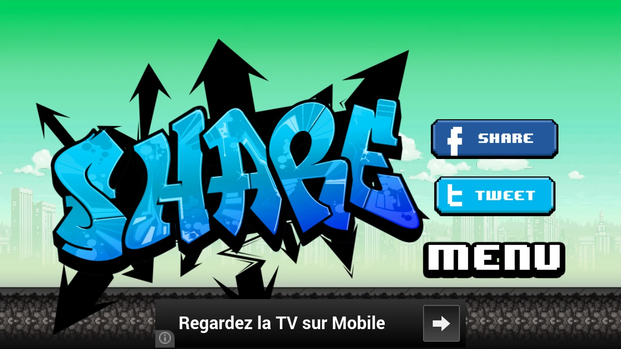
After the player has failed the game, sometimes, he will be strongly prompted to share, as seen below on the right. This screen is very prone to errors, since the player has gotten used to press the “retry” button on the left side of the screen, in the image on the left.
This is clearly a dark pattern, tricking the user into clicking the share button since the image in click-able. This will take the player out of his gaming session, but also make him feel annoyed by the interruption that he is likely to face many times when playing intensely – definitely not encouraging him to actually want to share the game at that point.
Articles on similar topics
The Mass Effect series
Game Usability reviews, Game user experience analysis,
A game usability review of Triple town
Game Usability reviews, Mobile game user experience,
A game usability review of Amazing Brick
Game Usability reviews, Mobile usability, Mobile game user experience, Game user experience analysis, Initial experience, Out of box experience,
A game usability review of Auralux
Game Usability reviews, Mobile usability, Game user experience analysis, Initial experience, Out of box experience,
A game usability review of Time of Exploration
Game Usability reviews, Game user experience analysis, Mobile usability, Mobile game user experience, Initial experience, Out of box experience, Game interfaces,
A game usability review of Shu’s Garden
Game Usability reviews, Game user experience analysis, Mobile usability, Mobile game user experience, Initial experience, Out of box experience, Game interfaces,