A game usability review of Triple town
- Triple town is a fun and easy puzzle game !
- Usability review
- Smart error management : play with the limits of tap target sizes
- Conclusion
Triple town is a mobile puzzle game by Spryfox that has kept me addicted for quite a while, despite the free to play time limiting features. In this article, I will introduce the game’s strength, then walk you through some of the usability issues that would be worth fixing to make the experience even more enjoyable.
Triple town is a fun and easy puzzle game !
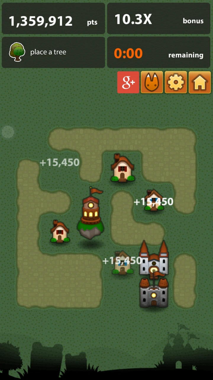
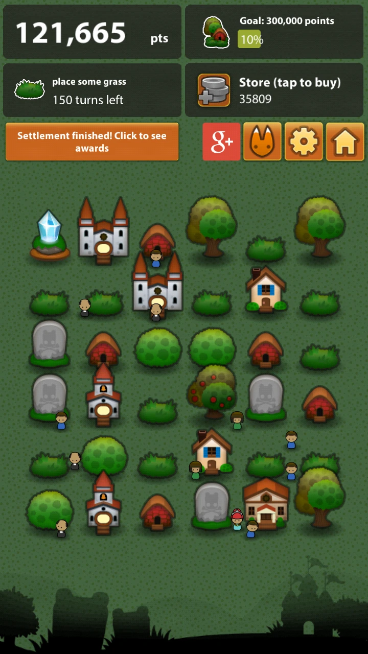
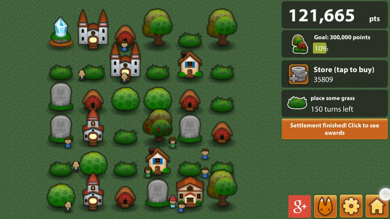
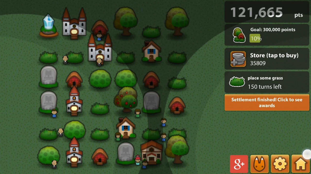
The core gameplay of Triple Town is very simple : place elements on your map to build a town. When you place at least three of the same element next to each other, they combine into a more complex building. The map size is limited, so you shouldn’t waste space and need to plan ahead to go as far as possible in the game and build the most complex buildings.
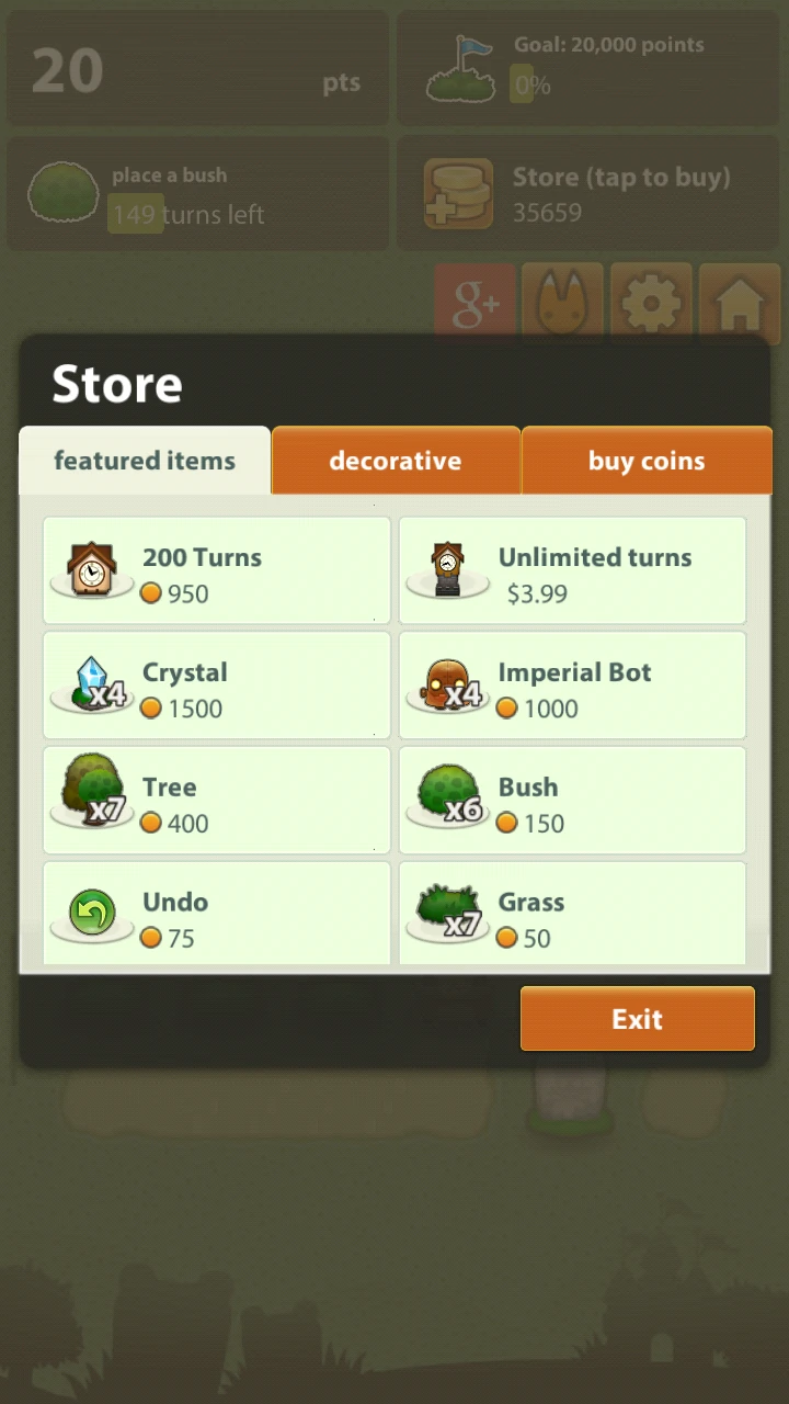
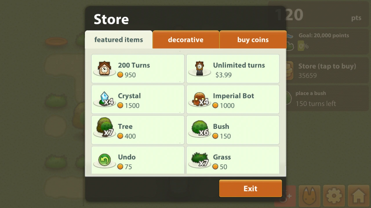
The main strength of Triple town is its ease of use : the basic concept is simple enough, yet hard to master. As a free to play, the game proposes an integrated store experience that doesn’t disrupt the gameplay.
It is seamlessly part of the game to pass through the store and switch an element for another. The store doesn’t give you huge advantages over the game, but it helps you play a little longer when you’re stuck. Because of this, it is more likely to be considered as a normal part of the game, rather than an artificial way of creating revenue.
A game session, lasts about 5 to 15 minutes and doesn’t require you to have both hands free, which is perfect for a quick game on the commute to or from work, before sleeping, on on the toilet (because yes, 40% of users use their phone in the bathroom).
Usability review
Triple Town has a couple of minor usability issues still, yet they don’t break the game experience. Here are a couple of enhancements that would make the game even greater.
It is unclear what can and can’t be clicked.
As most mobile interfaces, the absence of rollover makes it impossible to know what elements are interactive. When in game, interface elements that are interactive are presented with the same design as those that aren’t.
For instance, the store, goal, next item and score have the same looks, one can be clicked, the other is inactive. This is a minor issue though, since the player can experiment with it and learn quickly about the feature.
In game advertisements : usability Epic win
Triple town shows both the best and worst practice in terms of ad placement.
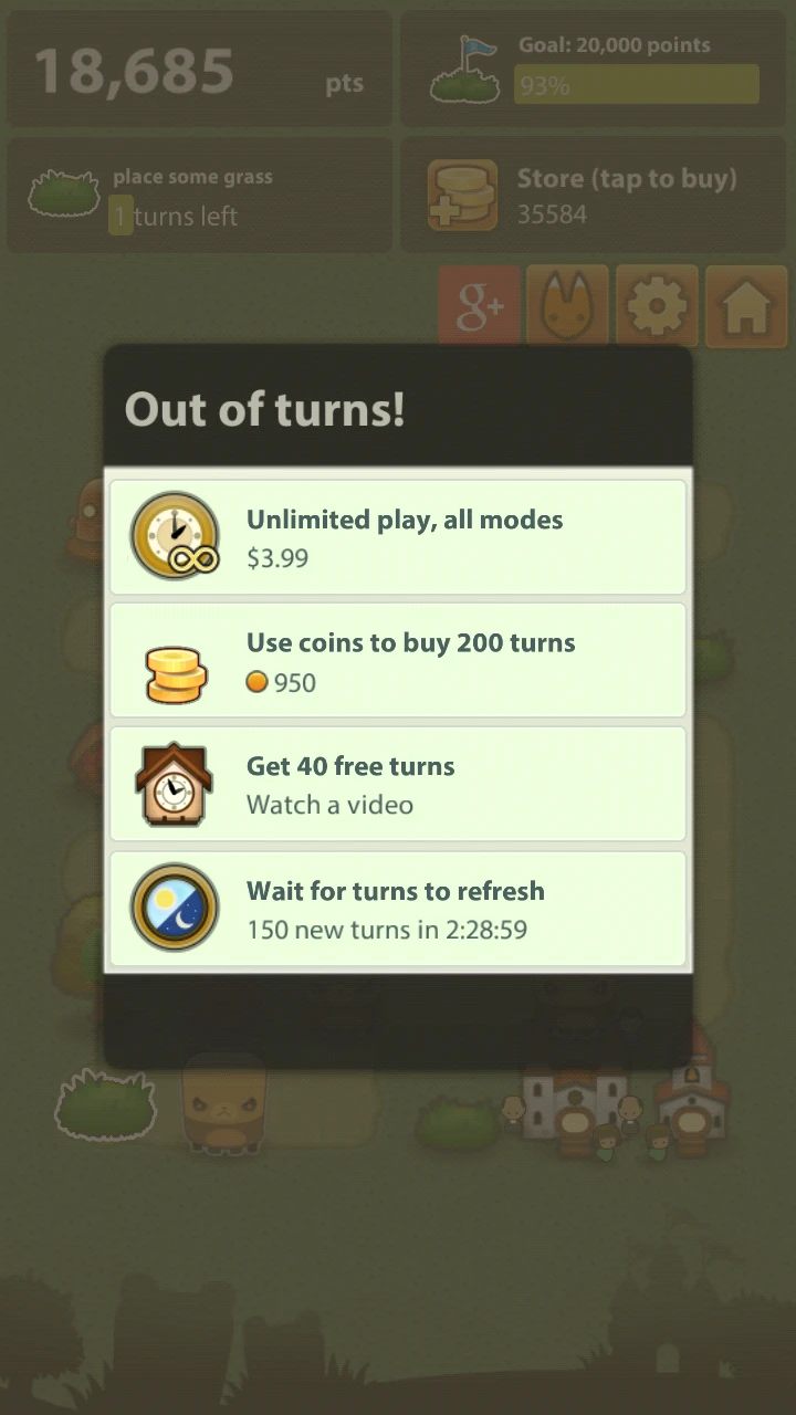
When the player runs out of turns, he can increase his gaming time by watching a video advertisement. This add is displayed on demand and non intrusive. It is suggested to watch it only if the player can actually use the feature, in exchange for a small reward. This is smart for two reasons :
- When the player actively chooses to view the ad, he will have a more positive feel towards it, and may actually be interested in the app presented in the video. The fact that he accepts to watch the add also increases the chances of conversion, thanks to a psychological mechanism called priming : the first positive response to a question (do you want to watch an add) increases the chances of getting a second positive response from the next related question (are you interested in this app?)
- This ad doesn’t distract users from the game when they can play, and creates a positive gaming experience.
- When the player runs out of moves, it is easier for him to watch the advertisement rather say no, and wait 30 minutes to get 30 turns. Since the reward for watching the add is quite small, the player will adjust his attitudes to match his behaviour. As a result, he will consider the advertisement in a more positive way and accept that he doesn’t mind watching ads that much after all. This follows a psychological process called “reduction of cognitive dissonance”.
On game start, Spryfox proposes a link to download another of their games, which is from the user’s perspective, the wrong time (No thanks, I want to play triple town right now, that’s why I opened it after all…). However, it is not very intrusive and hardly bothering for the player.
Evil automatic screen rotation
Triple town provides an adapted view for both vertical and horizontal play. Depending upon the device orientation, the game will automatically adjust. That’s great. What is less great, is that this happens even when rotation is deactivated on the phone.
While it is nice that the developers thought of users who want to use their device horizontally, it is never an option to over ride phone settings. In the underground, only 5% of users hold their phone horizontally. Those 5% are playing games most of the time, which require the player to hold their device horizontally.
Holding a device horizontally is probably more likely for players at home. It is easy to think of the standing or sitting folks in the subway, but what about the dude chilling upside down on his sofa? I admit this might be extreme, ok, so what about the dude who plays in his bed on a sunday morning ? In these situations, although the phone is held horizontally in terms of gravity, it is held vertically compared to the players orientation.
He will lie in bed, and although he has deactivated his auto-rotate feature, triple town will forbid him to play with the vertical layout while lying on his side.
Never, ever override the settings that the user chose for his phone.
Smart error management : play with the limits of tap target sizes
A light tap precision issue
A lot of apps generate errors by cramping too many things in the game screen, for example, to fit all tiles of a hard game of Hacker (where you need to link little computers through a network). Triple Town plays this very smart.
The interactive areas in Triple Town are fairly large. Errors still occur fairly frequently though, while placing elements in the town :
- The player wants to place three grass to create a bush. The first item the game lets him place is grass, the send also, but the third is actually a bear. In the heat of action, the player is likely to put the bear down where he wanted to place his third grass before he notices the item was not what he expected. This is totally the player’s own fault, yet still frustrating. It could be prevented partly by showing the upcoming item in a corner of the screen.
- Sometimes, when playing with one hand, or standing in a more or less stable way in the subway, the player’s finger won’t hit the spot he intended. It’s hard to tell then whether the tap size or the player’s clumsiness are at fault, but this is a more frustrating error.
However, as long as it’s only one error, the player can undo the action, and that’s the smart part.
Error management Turned into a conversion mechanism
The player can pay a tiny fee from the shop to undo his actions. This has a double positive effect :
The player has a solid reason to buy features from the store : it’s not just comfort and ease of winning that they’re buying, to be honest, the store doesn’t seem to make that much of a difference, compared to tactically placing items. The player actually buys better usability, something that is both useful and doesn’t have an after taste of cheating.
Thanks to this feature, it’s unnecessary to fix the usability issue by making the tiles bigger for example, since there is an easy and satisfying workaround, that even encourages players to spend money. The shop is regarded as something positive that helps the player to progress in the game.
The player easily grows a habit of using virtual coins in the shop, specially since they can be easily earned by playing well – which the store helps to achieve. It increases the chances of further spendings, and in the end, conversion.
And why encouraging a horizontal phone may profit spryfox
When playing while holding the phone horizontally, I first was puzzled by the fact that the game area, where you actually play is positioned on the left, and the menus are on the right : easier to access, despite they need to be accessed less often. This might actually be another smart move.
About 12% of the population is left-handed, and 20% of players use their left hand to interact with their phones. They might actually get a very positive impression because of this, because for them, the game seems more accessible.
In terms of interaction, it is often encouraged to design critical interactions where they are more difficult to trigger by accident. On mobile, for instance, the upper left corner is a preferred position for critical actions. The most common actions are pushed to more accessible areas : central area towards the top right.
This only takes in account right hand usage though – but we know users interact with their phones with both hands, and they aren’t equally efficient with both : using the left hand might actually make them more clumsy (now that’s something I should definitely add to my metro studies)
What this means for Triple Town is that about 80% of users are likely to make more input errors while playing, but less likely to make input errors while using the store. And as we saw earlier, making errors in game is not that bad, and it even encourages users to interact with the store. Using the store on the other hand, with the less clumsy hand for 88% of users, avoids critical errors, like spending money accidentally.
Conclusion
Although some small usability issues remain, none of them is critical, and I think the guys from Spryfox can be pretty proud of their user experience achievement.
- No visual different indicates which elements are interactive or not, which can create a little confusion mostly for new players
- External add placement and access is very smart and focused, but Triple Town still displays adds on startup, which is the worst possible moment for a player who obviously came for playing : Ads work best when presented at the moment where it makes most sense for the user to change his activity.
- The game over-rides phone settings and prevents the player from fully controlling its display by rotating the view automatically
- The game transforms error management into a conversion lever by allowing the user to buy usability features from the store, making it a positive, integrated and useful experience to spend money on the game, and growing a habit of doing so over time for the player
But rather than believing me, I suggest you get the game for free on your phone and try it out for yourself, or read more about the design of Triple Town and other design tips on Danc’s blog : lost gardens.
Articles on similar topics
A game usability review of Amazing Brick
Game Usability reviews, Mobile game user experience,
A game usability review of Ollie Pop Retro Skateboarding
Game Usability reviews, Mobile game user experience,
A game usability review of Time of Exploration
Game Usability reviews, Mobile game user experience,
A game usability review of Shu’s Garden
Game Usability reviews, Mobile game user experience,
A game usability review of Osmos
Game Usability reviews, Mobile game user experience,
A game usability review of The Tower
Game Usability reviews, Mobile game user experience,