Does your game user experience suffer from blindness to change ?
- What is change blindness ?
- Change blindness is hard for users to overcome
- Brain Dots suffers from blindness to change
- How we solved a blindness to change issue in Olympus Naumachia
- How to avoid blindness to change ?
- Make the new elements stand out visually
- Place content where users will expect it to be
- Minimize visual interruptions whenever possible, especially in between states subject to change blindness.
- Place important new elements near where the user is likely to focus his attention, whenever possible.
- Use animations to highlight changes, either on the item, or moving from the player’s area of attention, towards the target you want to be seen.
Change Blindness is a perception phenomenon where the observer does not notice a change in a visual stimuli. It was first studied as part of memory and eye movement studies, and became largely researched for its applications in eyewitness testimony and distractions white driving.
This common perception phenomenon can greatly influence your user’s experience. In interfaces, this means people often overlook changes in the design. It can affect error messages, or information in menus for example, and lead users to fail their tasks. Web users fail to notice errors or changes in products, or player can completely miss out on your games features.
So does your game suffer from change blindness?
What is change blindness ?
Here’s an example. In the gif below, two images flash, try to spot the difference.

source: http://cogsci.uci.edu/~ddhoff/cb.html
Flicker examples are classic, but change blindness can also occur when changes are very progressive, or when the observer’s attraction is distracted by another task.
If it didn’t work for you (though it likely will have even if you know the topic), try showing it to your friends or colleagues, and don’t tell them what the test is about.
“Change blindness is the tendency of people to overlook alterations in images, especially when those changes appear immediately after a visual interruption such as a flickering screen.” nngroup
Change blindness is hard for users to overcome
- Changes in pictures create a difference in brain activity, even when the perceiver isn’t aware of the change consciously
- It usually takes a while for individuals to notice a change even though they are being instructed to search for a one
- Expertise reduces blindness to change, for example, physicists perform better at detecting differences between physics problems
- Users who chose a product can fail to notice the difference if presented with a different product after their choice, only 26% of them noticed the difference in a face recognition experiment
- People tend to overestimate their capacity to overcome blindness to change, depending on search time and perceived success rates
- People expect others to notice changes in them, this is called the spotlight effect (By the way, have you noticed my new haircut ?! ) More on wikipedia
But how does this apply to games?
Brain Dots suffers from blindness to change
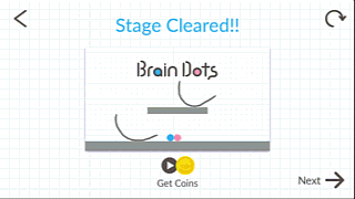 In Brain Dots, the player unlocks a new feature (a new pen, that draws different types of lines).
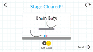
First of all, the message describing the new feature is skipped, discarded as a non essential message.This screen creates an interruption between the two views where the change should be noticed. So basically, the perception of the player could be represented as follows :
Without further guidance, the player doesn’t see the difference, and is likely to totally miss out on the new feature he needs to complete the level.
A simple way to solve this issue would be to add an animation to the icon, for example, make it blink. Typically in games, you would use an arrow to attract the attetion of the user towards the new interface element. For example, making the pen icon blink might do the trick by attracting the player’s attention through mouvement in his peripheral vision (which is very good at noticing movement).
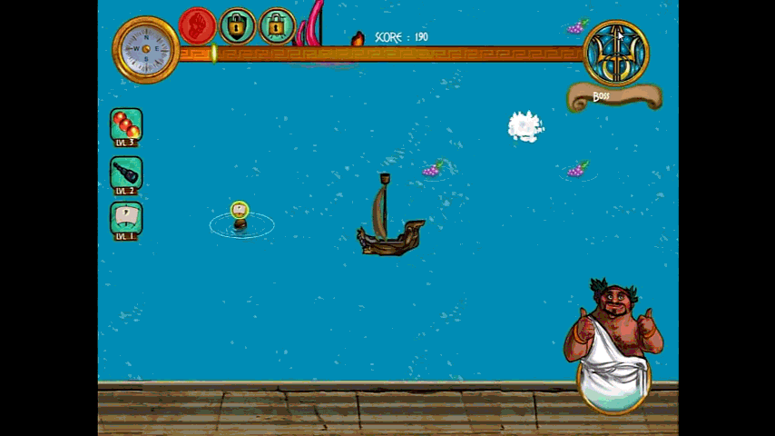
How we solved a blindness to change issue in Olympus Naumachia
In the first prototype of the game where we added power ups, players caught the barrels in the water, but never understood what powerup they were getting.
They saw the effects, but didn’t understand why they could shoot more bullets, why the camera moved back or why they moved faster. When asked after the playtest, we realised the interface elements on the left showing the power ups were not seen at all, not to mention the counter increase with the power up or the loss of power ups when being hit. It made sense too : the player’s attention is focused on the centre of the screen. He looks at his boat, to dodge bullets, and the enemy’s to target them properly.
To solve this issue, we added a small animation moving the icon of the power up from the barrel, towards the interface. Re-testing after this simple change allowed us to confirm that this time the interface was seen and the game mechanics understood.
How to avoid blindness to change ?
Change Blindness is encouraged by different factors
- Visual interruptions, such as a page load, the screen shift when changing the orientation of a device, or the user’s blinking if the change is too fast
- The speed of the change increases the risk of change blindness
To reduce the risk of blindness to change…
Make the new elements stand out visually
It’s important to have proper contrasts, whitespaces, or emphasis by greying out the background temporarily. In the game Stay Alight, the loading icon on the included screenshot is clearly visible thanks to good contrast and animation that attracts the user’s attention efficiently. The background of the level is also darker than in-game, which contributes to make the loading icon stand out even more.
Place content where users will expect it to be
For example, a shopping cart to the left of an e-commerce site’s header will be hard to find.
This also goes for games. In Clay Jam, for example, the “shopping cart” is placed in the top right area of the screen, which makes it easy to locate and visible, despite it not standing out by contrast in this colourful and quite crowded interface.
Minimize visual interruptions whenever possible, especially in between states subject to change blindness.
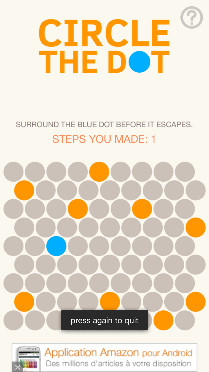
In circle the dot, the game state changes every time the user makes in input, trying to circle the dot. The dot movement happens after the input, so its movement might be subject to change blindness. This effect is reduced by the fact nothing comes in between both states, so the dots movement is made easier to spot.
Place important new elements near where the user is likely to focus his attention, whenever possible.
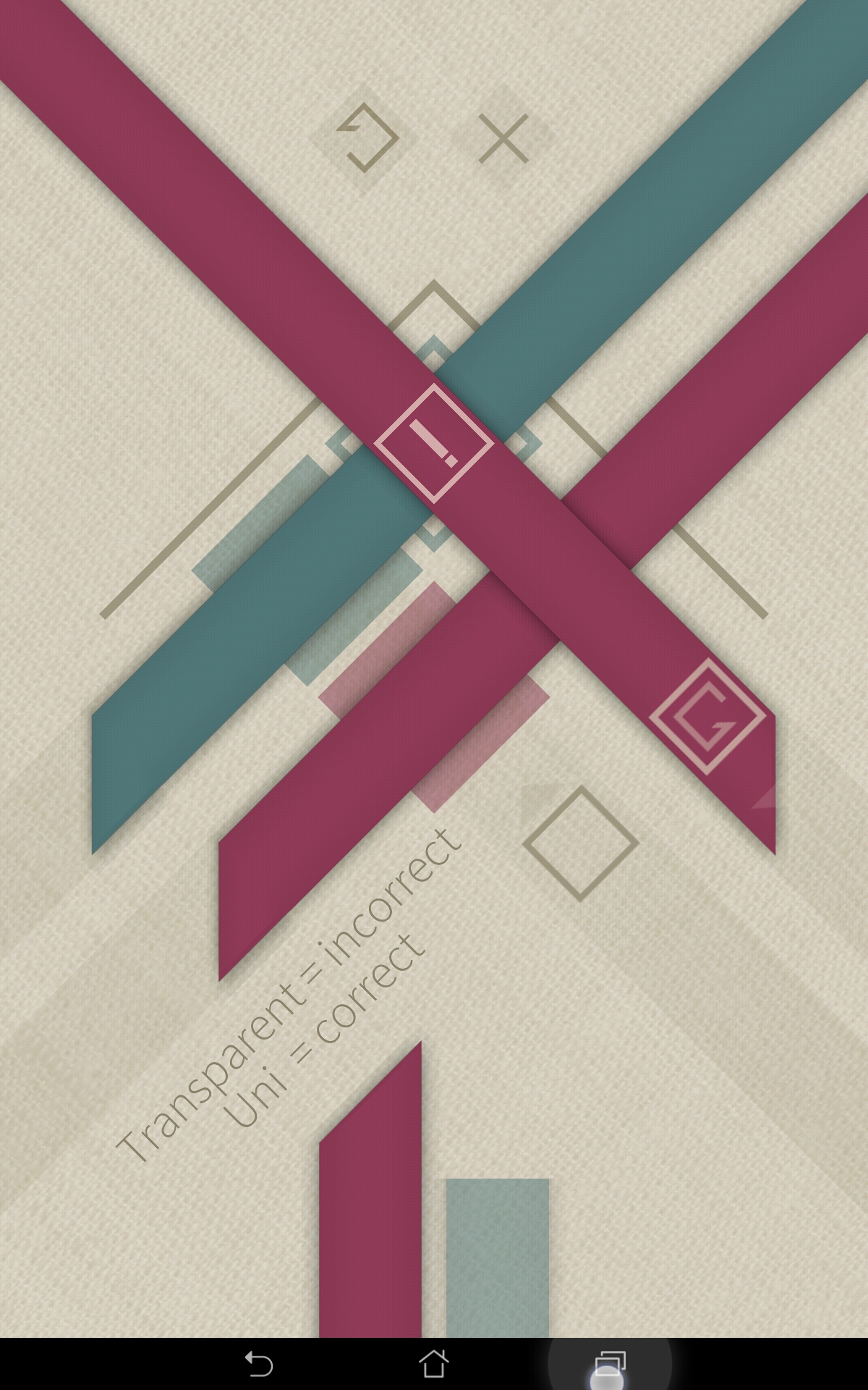
In Strata, the player needs to overlap colours in a certain order. If the wrong colour is on top, the error icon appears where the player is looking : on the crossing of colours where the error occurred. This makes it easier for the player to notice and understand when they did something wrong, and fix the issue.
Use animations to highlight changes, either on the item, or moving from the player’s area of attention, towards the target you want to be seen.
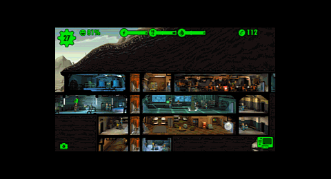
In fallout, when the player collects resources, an animation shows the resource icons moving towards the counter on top of the screen. The makes sure the player notices the increase on resources, whereas simply incrementing the number would be a type of change that’s hard to spot on its own.
Articles on similar topics
The Mass Effect series
Game Usability reviews, Game user experience analysis,
A game usability review of Amazing Brick
Game Usability reviews, Game user experience analysis,
A game usability review of Auralux
Game Usability reviews, Game user experience analysis,
A game usability review of Ollie Pop Retro Skateboarding
Game Usability reviews, Game user experience analysis, Game interfaces,
A game usability review of Time of Exploration
Game Usability reviews, Game user experience analysis, Game interfaces,
A game usability review of Shu’s Garden
Game Usability reviews, Game user experience analysis, Game interfaces,