A game usability review of Shu’s Garden
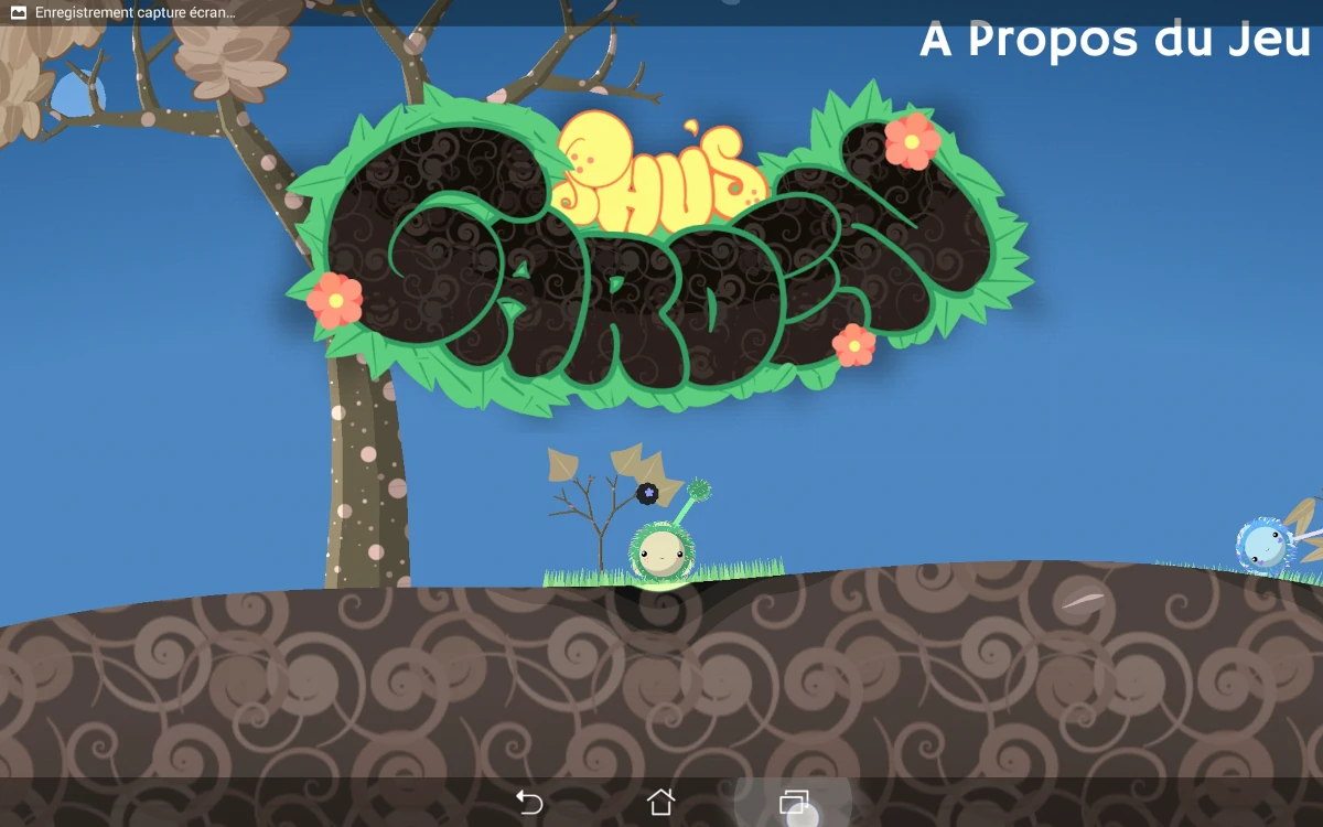
Shu’s Garden is a relaxing and fun exploration game. The player controls a small furry creature that can roll around a planet. Wherever it rolls, grass will grow. Using it, the player can gather seeds and plant them all over the planet, using trees to climb and jump from one planet to another to populate them all.
Tested on Android / Asus Transformer Tab
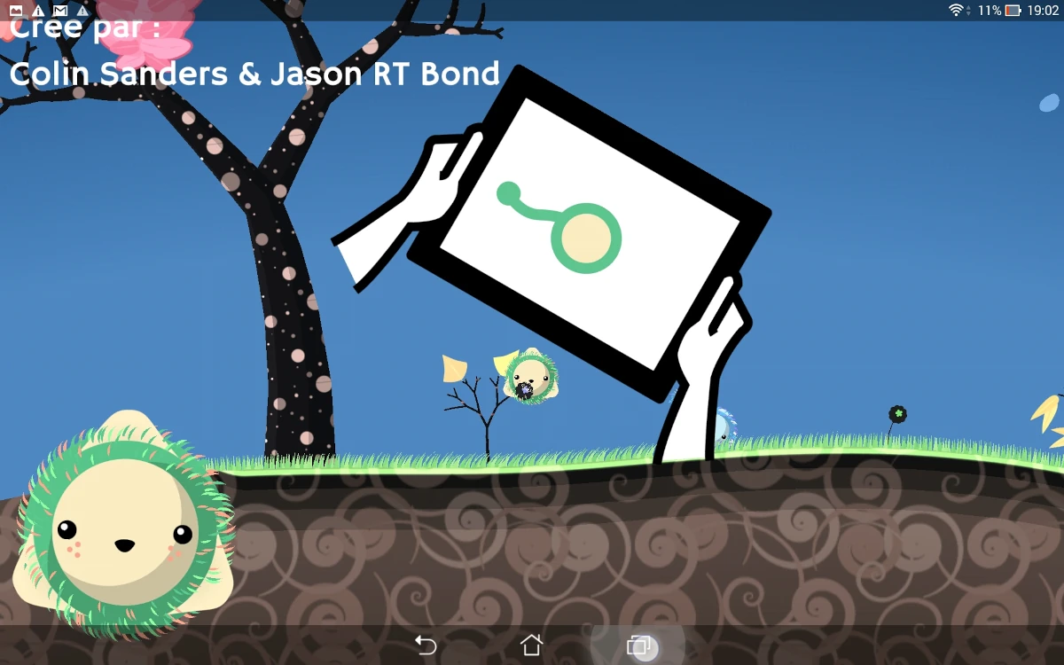
The game starts really quickly and the player is immediately inside the first level, controlling the creature. Small tutorial overlays explain the basics of the game: how to roll by tilting the screen, how to jump, and how to plant a seed, once the player has picked up a flower by rolling on it.
The hints remain visible as long as the player didn’t perform the action, which ensures he has done it at least once and has a good chance of getting the concept. The whole instructions are done without text, which makes the game really easy and accessible even for very young children.
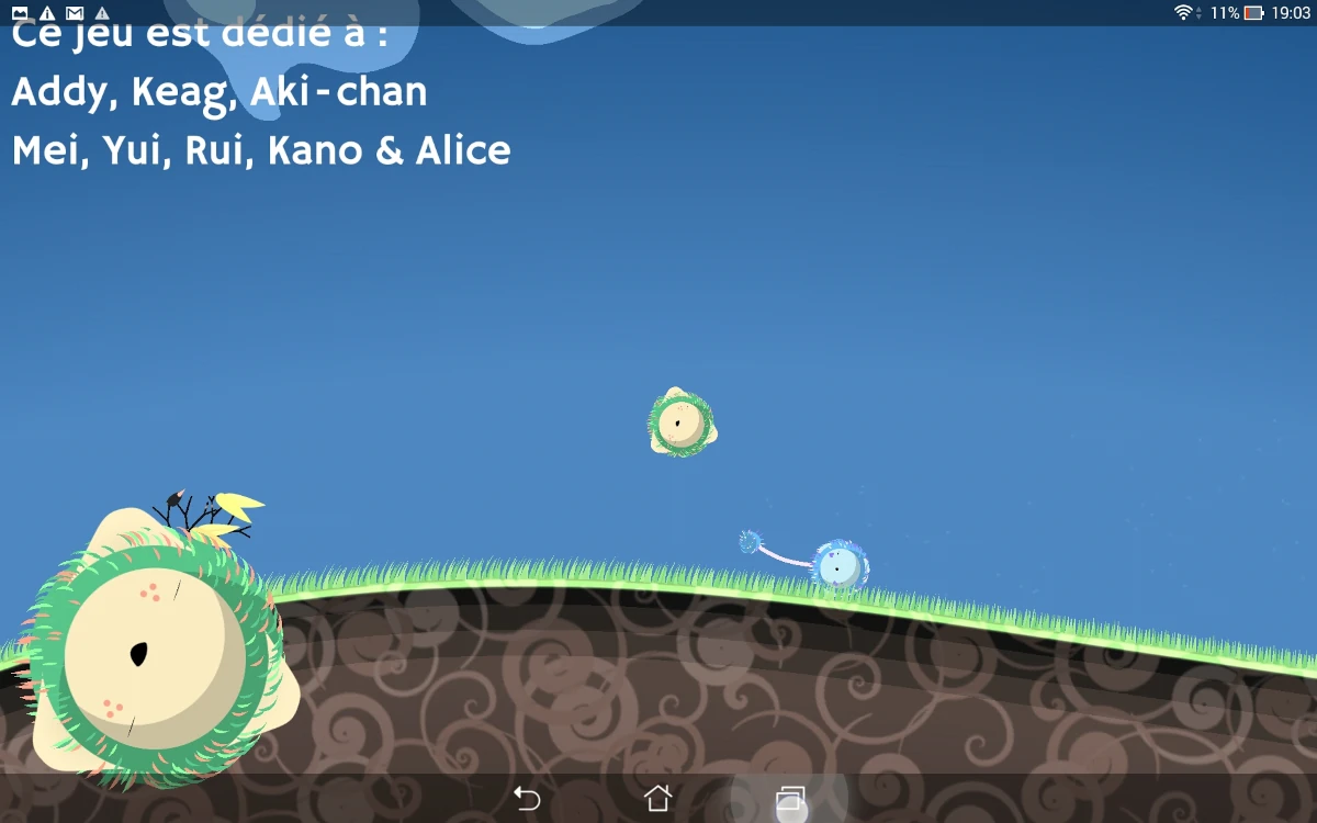
If the player is stuck, or idle for a while, a second creature will appear. Sometimes it will also appear randomly as a way to make the world more lively. In terms of usability, this creature is used to provide help and hints to the player. The second creature will perform actions that will encourage the player to imitate or follow it, or try to achieve the same goals, like jumping from one planet to another.
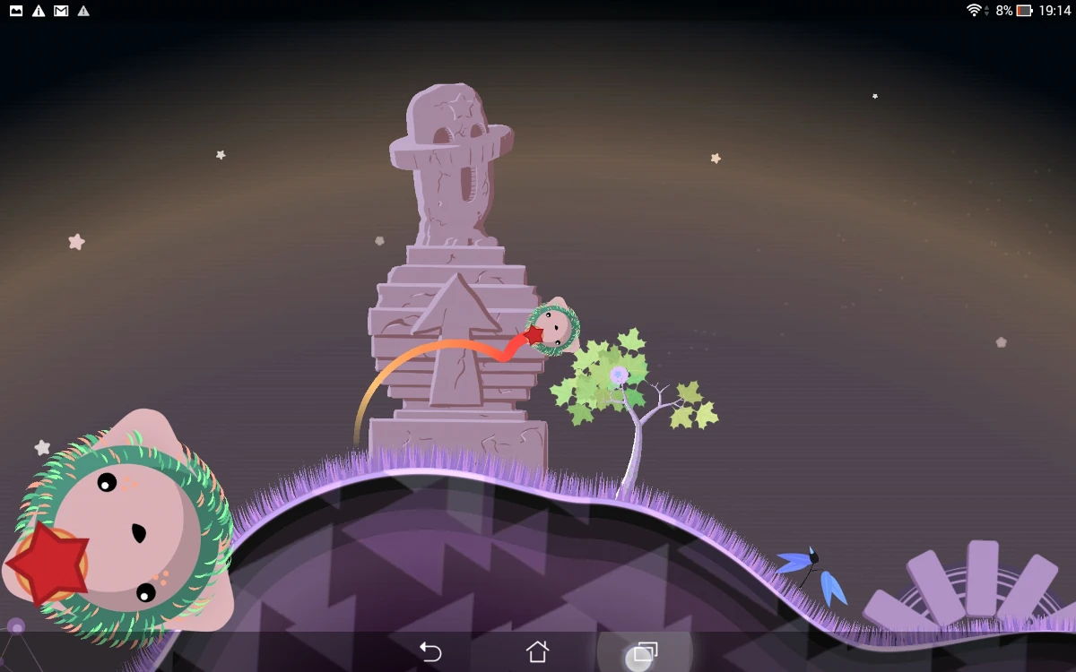
Hints are also available in the landscape, in the shape of arrows of animations. For example, stones are present at spots where it is possible to jump from world to world. A shooting star will be visible in the sky to encourage the user to get power-ups that drop when they land.
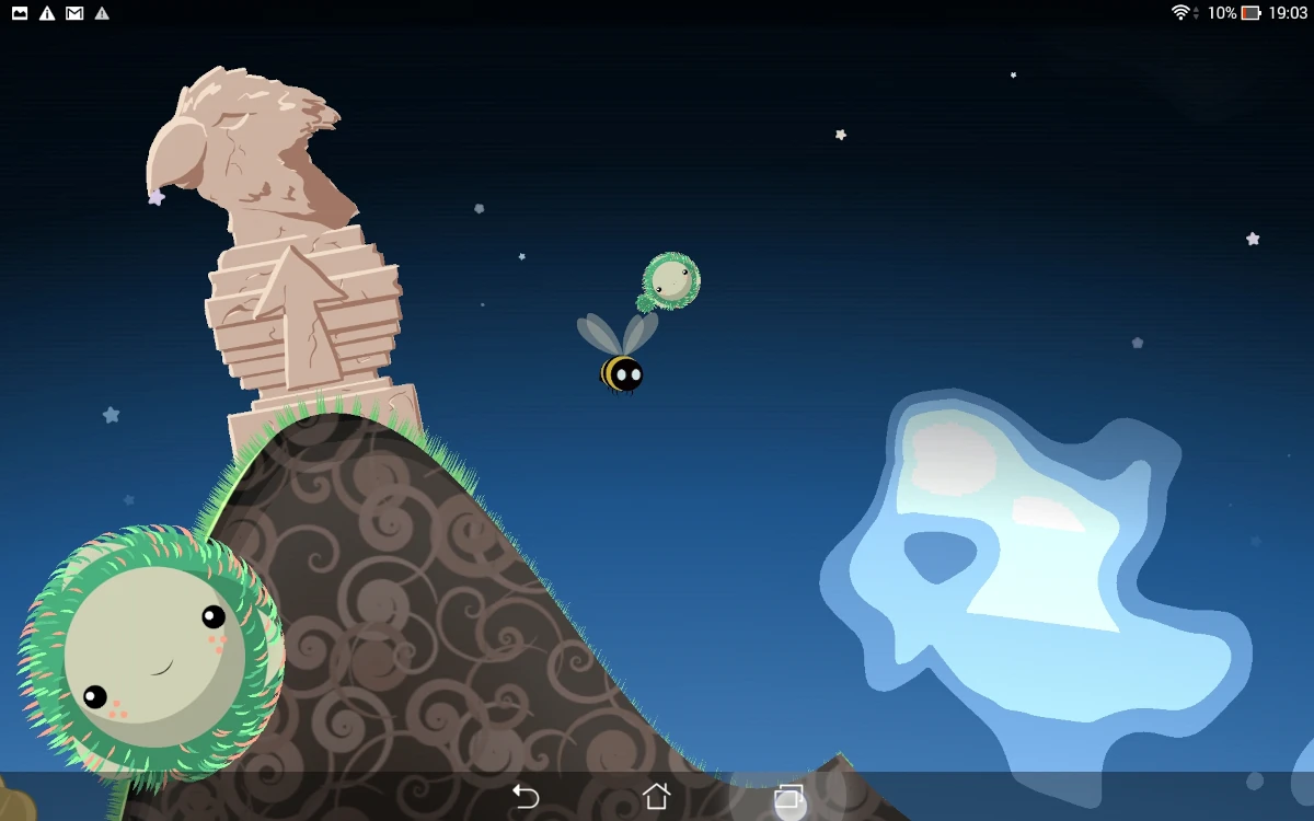
The game gives little sense of progression at first. Many interactive elements are there to keep the player in the game for longer, but it is possible, for example, if the player didn’t get the hang of jumping immediately, that he may feel like the game is repetitive and that he’s seen it all.
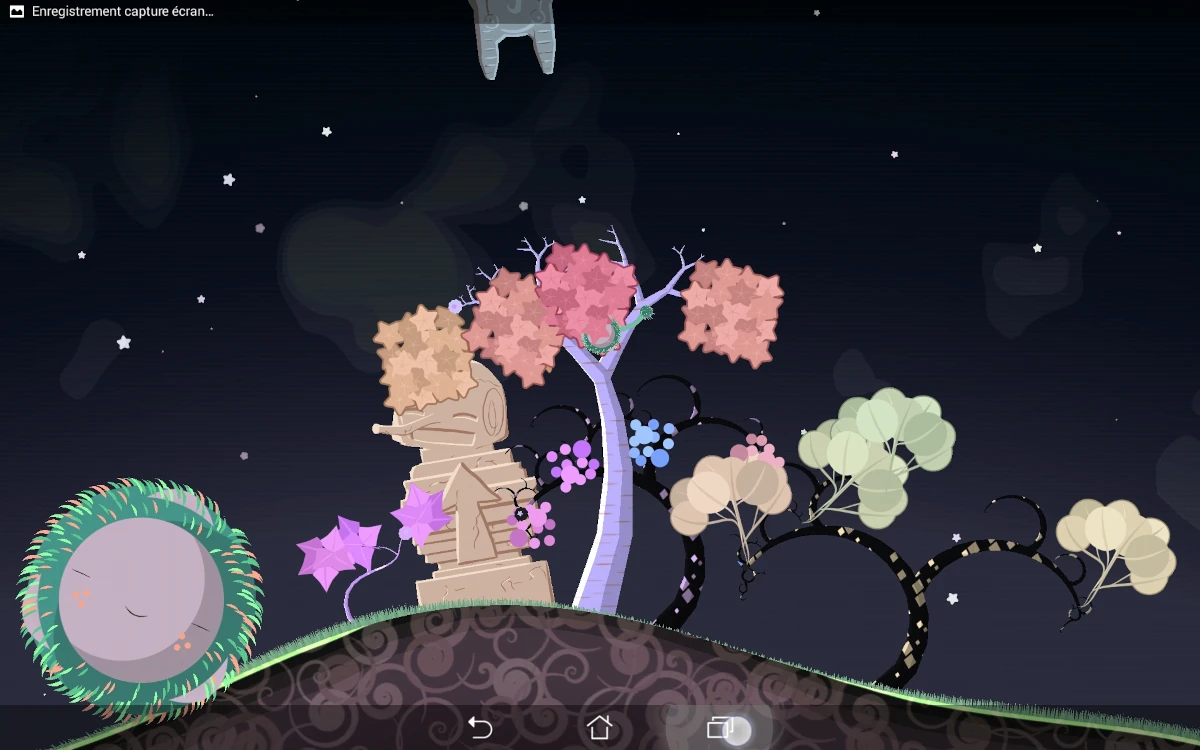
A real sense of progression only appears later in the game when the player realises the world is not just one planet, and that plants grow quite faster than he imagined. The environment really adjusts and reacts to the player’s actions, which is likely the main motivation to play on and engage the user, encourage exploration and discoveries.
Articles on similar topics
The Mass Effect series
Game Usability reviews, Game user experience analysis,
A game usability review of Triple town
Game Usability reviews, Mobile game user experience,
A game usability review of Amazing Brick
Game Usability reviews, Mobile usability, Mobile game user experience, Game user experience analysis, Initial experience, Out of box experience,
A game usability review of Auralux
Game Usability reviews, Mobile usability, Game user experience analysis, Initial experience, Out of box experience,
A game usability review of Ollie Pop Retro Skateboarding
Game Usability reviews, Game user experience analysis, Mobile usability, Mobile game user experience, Initial experience, Out of box experience, Game interfaces,
A game usability review of Time of Exploration
Game Usability reviews, Game user experience analysis, Mobile usability, Mobile game user experience, Initial experience, Out of box experience, Game interfaces,