A game usability review of Time of Exploration
Screenshot_2015-02-07-11-43-46Time of Exploration is a kind of text-based civilisation-like game. The player has to reach a civilisation’s top achievements, the equivalent of building a Wonder in Age of Empires, for example. In order to do this, he will need to create buildings and generate resources. Buildings cost resources to build, and can sometimes have an upkeep (aka cost resources over time). In return, they will produce other resources. The whole game is based on simple text and button interfaces.
Tested on Android / Samsung galaxy S3

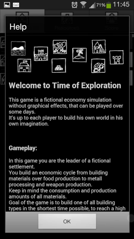
On first launch, the game is very fast to start up. It presents the player with a long text documentation that acts as a tutorial and explains all of the game’s mechanics. This is good, but most players won’t read further than the first few lines, if any. With luck, they might scroll and look at the pictures, but they definitely won’t be able to remember it all.
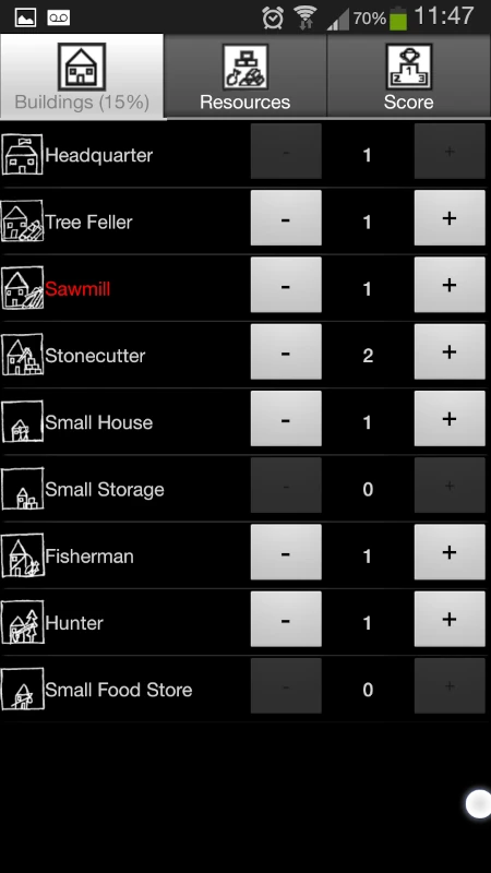
Luckily, the start of the game offers very few options to the player: four buildings, and some resources. The players will build randomly, progressively unlocking new options, until they can’t do anything any more. When the players unlock new features, a clear message shows them what just happened, which helps them understand the game on their first play, and confirms their actions on a later play-through.
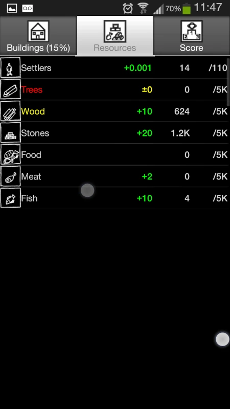
When they can’t do anything any more in the buildings tab, they will likely check out the resources tab if they didn’t before and progressively start to understand the games mechanics; even if they didn’t read anything. Besides, the text is accessible via a menu should the player want to read a specific part of it later during the game.

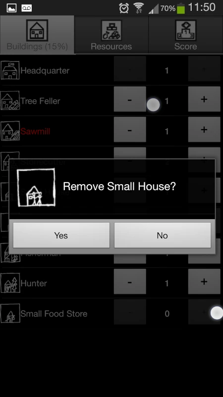
Building structures is very fast, but destroying them requires a confirmation. This is nice, since it means the loss of some resources in the process if it should be rebuilt, but still gives the option to. This avoids players to be frustrated by input errors.
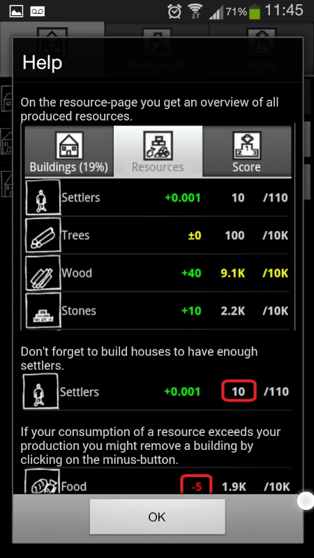
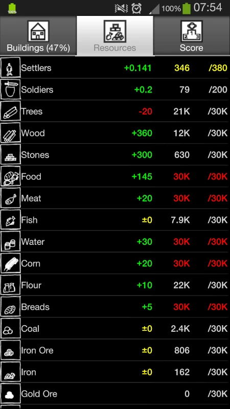
The game is very clear on its status, using colour codes. Whenever costs or upkeep can’t be met and some buildings don’t produce all the resources they could, they will appear in red.
On the resource tab as well, colours are used to show resources that are being stocked, that are used exactly as they are produced, or that will soon be depleted based on their consumption rate. The colours make the important information really stand out from all the content.
Because of the colour codes, the game is not as accessible to colour blind as it could be by adding simple icons before the lines where something should be noticed, for example. This is particularly true because the game uses a dark background, and the colours red and green, which are more often impacted by colour-blindness than blue for instance.
The choice to display a good contrast with white on a black background also has another drawback: players will have trouble enjoying the game outside, as this configuration is more prone to reflection issues. Reversing the contrast would be make the game more usable on the move, outside, specially since the game adapts well to very short sessions during commute for example.
Lastly, the leader-boards really encourage players to progress in their game by showing their ranking with some scores above and some scores below them. This avoids the frustration of not even being in there, and shows the player he can make progress, to encourage him play again.
Articles on similar topics
The Mass Effect series
Game Usability reviews, Game user experience analysis,
A game usability review of Triple town
Game Usability reviews, Mobile game user experience,
A game usability review of Amazing Brick
Game Usability reviews, Mobile usability, Mobile game user experience, Game user experience analysis, Initial experience, Out of box experience,
A game usability review of Auralux
Game Usability reviews, Mobile usability, Game user experience analysis, Initial experience, Out of box experience,
A game usability review of Ollie Pop Retro Skateboarding
Game Usability reviews, Game user experience analysis, Mobile usability, Mobile game user experience, Initial experience, Out of box experience, Game interfaces,
A game usability review of Shu’s Garden
Game Usability reviews, Game user experience analysis, Mobile usability, Mobile game user experience, Initial experience, Out of box experience, Game interfaces,