Usability review of Walking Dead - Road to survival
- Starting the game is promising
- Contextual help and tutorials
- Balancing guided tutorials with help and documentation
- Inconsistencies throughout the game make it confusing during FTUE
- Cluttered interfaces also contribute to confusion
- Mobile interactions and interface design
- Shopping for coins
- Conclusion
When I started playing Road to Survival, I was impressed y the polish of some of the usability. The first time user experience is far better than lots of games I tried, but it is also a quite confusing experience.
Starting the game is promising
Flexibility, efficiency and player control
It starts well, booting is fast and doesn’t require passing annoying popups right from the start. There’s dialogs for immersion, you get into the story. At this point, the game already demonstrates the flexibility of controls and efficiency of use it will display later on, promising a smooth experience. Players can read or skip dialogs, dive into the action, or get in the mood.
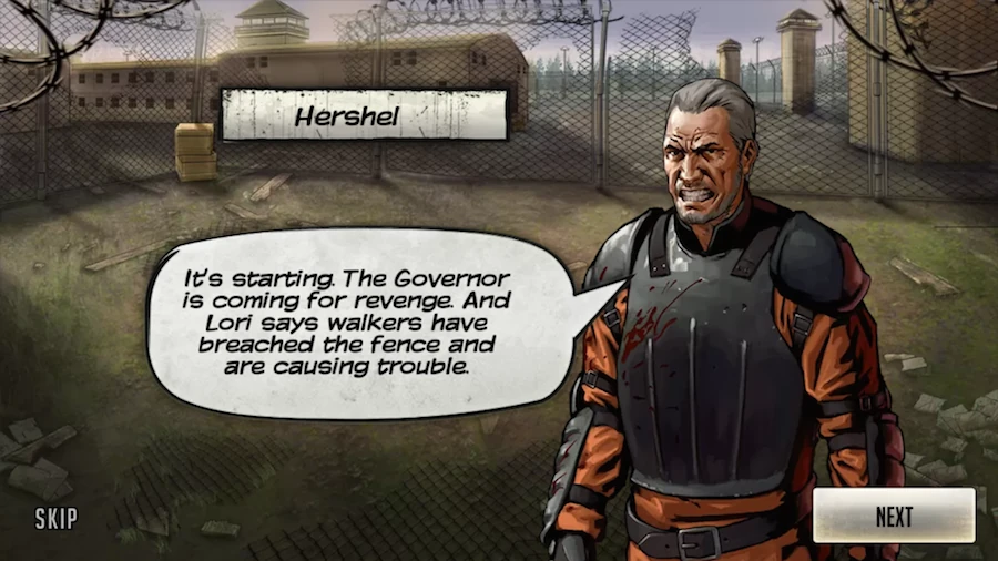
The tutorial can’t be skipped though, otherwise players might actually do that.
Contextual help and tutorials
Switching topics to give an interesting overview
The player is guided through the functionality of the game. They are straightforward to follow : players are told where to look, what to click and showed around all the aspects of the game : dialogs, choices, combat, choosing rewards building the base and collecting resources.
Topics are switched regularly during the tutorial. It keeps the players attention, avoiding to bore them with too many details on a single feature. Game developers I’ve worked with often switched tutorial content like this to avoid boring players with too many details, or repetitive tasks. Sometimes it’s simply to give an overview and keep the tutorial as short as possible, since players don’t like bad tutorials.
Interleaving is good for learning
But more importantly, it’s a great technique for learning. Switching topics and coming back to them later helps make connections between the different subjects, getting the big picture as well as encourage recall to improve chunking information in a meaningful way.
Did you ever wonder why you always had one or two hour math classes a day at school, several days a week, instead of a single 6h session on one day to optimise the weight of your backpack? Well, it’s called interleaving, and it’s a key factor to efficient learning.
Information overload
Players may however feel frustrated to go so fast through features. The amount of information to remember is sometimes just overwhelming, and players are likely to skip some parts thinking they’ll figure it our later somehow. Actually taking breaks for the tutorial might help.
Clicking on wherever an arrow points is also likely to teach little to players. It’s just like when you go somewhere following your GPS, you’re unlikely to remember the road to drive without the GPS the second time.
Balancing guided tutorials with help and documentation
It is always tricky in tutorials to balance information transfer and user freedom. The Walking Dead provides a linear tutorial that goes through lots of features in one go, and going back to some later. Discovering the new features is a positive surprise.
For example, finding out there is a base suddenly opens new perspectives, promising variety in the game. The second time the tutorial takes the player to fighting, the missions system, and unlocking a character from the comic / TV series is a pleasant surprise.
Giving a little more freedom to explore
The game does provide help and documentation to understand more detailed mechanics, but the player can’t always access it during the tutorial.
It would have been nice to provide a little more freedom by allowing players to explore other features on their own. For example, highlight the button to access missions after completing the resource gathering task of the tutorial, but leaving other options to the player if he wants to click elsewhere.
As is, the interface looks interactive, and players will try to tap other stuff, see nothing happen and finally figure out it’s not possible. To keep it like that, it should be made more clear other buttons are inactive.
Inconsistencies throughout the game make it confusing during FTUE
Inconsistencies in the tutorial presentation
Tutorials have different approaches to attract the player’s attention to areas of the screen. Most of the time, the screen is darkened to highlight an item the player should look at. When the player needs to interact with something a hand icon will show where to click, without an overlay to highlight the item to interact with.
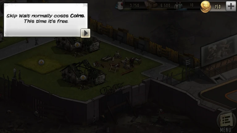
Sometimes, the text will tell the player to tap somewhere, the other elements of the screen will be masked to attract the players attention, but there will be no hand icon. Sometimes the dialog will have an arrow, and other times not, depending upon the need to skip to the next or not.
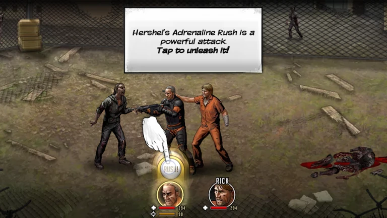
These small differences create differences between player’s expectations and the outcome of their interactions. In this example, player’s can’t be sure if they need to tap the item slot (and it might skip to the next bit of text instead) or if they need to click the text to skip (and nothing might happen because they actually needed to equip an item)
Inconsistencies between the tutorial and the game content
Worse than small presentation issues, the tutorial sometimes teaches something wrong to the players. The tutorial doesn’t match the game’s real world behaviour.
For example, the tutorial about the shi-fu-mi style gameplay seems straightforward. Blue beats red. Click on the guy with the red icon in his chest. He takes more damage. Great!
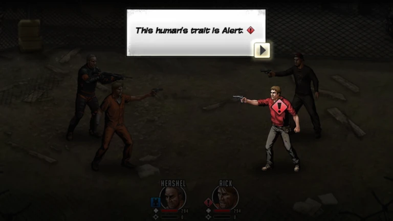
Except in game, there are no small coloured icons on the enemies at all. If the player is lucky, they may see the icons displayed on all characters for a split second when the level loads, then disappear. In fact, you don’t even know which zombie your character will target if you tap Lucia to attack directly. A mistake which happens quite a bit when playing the first few levels after the tutorial. It’s hard to predict the game’s behaviour and nothing prevents those kind of errors.
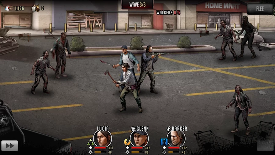
Players will feel frustrated at the idea they’ll need to remember which monster has what icon. They don’t need to in fact. The players need to tap an enemy to see the icon. The tutorial completely fails to pass on this important piece of information.
But the feature itself means the player needs to tap all enemies to see the icons while remembering the icons from previously tapped enemies, in order to decide his attack strategy. Beats both the minimal actions and recognition over recall usability criteria, and that’s time they won’t spend in the shop…
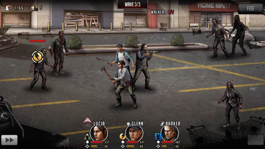
The feedback when an enemy is selected is great though, because characters that have an advantage over that mob have a small animation next to them so players won’t even need to remember which colour beats what.
Players will feel frustrated or worry over things that are actually done well, but either aren’t explained properly, or explained too late compared to when the player cares.
Cluttered interfaces also contribute to confusion
Minimal information required to start playing
Usability criteria encourage good aesthetic and minimalist design. In games, design can be a lot more artsy than in other media. In Road to Survival, the look and feel is clean and efficient while setting the mood. It does however get cluttered quite a bit with lots of information.
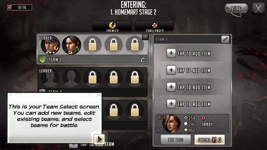
The team selection screen is still quite clean. There’s a lot of information, but it’s necessary to prepare for action. Inactive teams are plain black, contrast helps identify useful areas from context. Minimal information to start the fight is available. It’s a good way to start a fight in just one step most of the time.
Too much detail when editing the team
The screen behind the “edit team” button is more cluttered. The first time, the amount of information presented seems overwhelming or confusing at best.
Unlike the team select screen, unavailable slots stand out more. The difference between useful slots and context is blurred. Do players really need to know what the fuel depot looks like when they’re going through homemart and don’t have alternatives anyway? Teasing the player that he’ll go to woodbury is nice, but it could be less distracting.
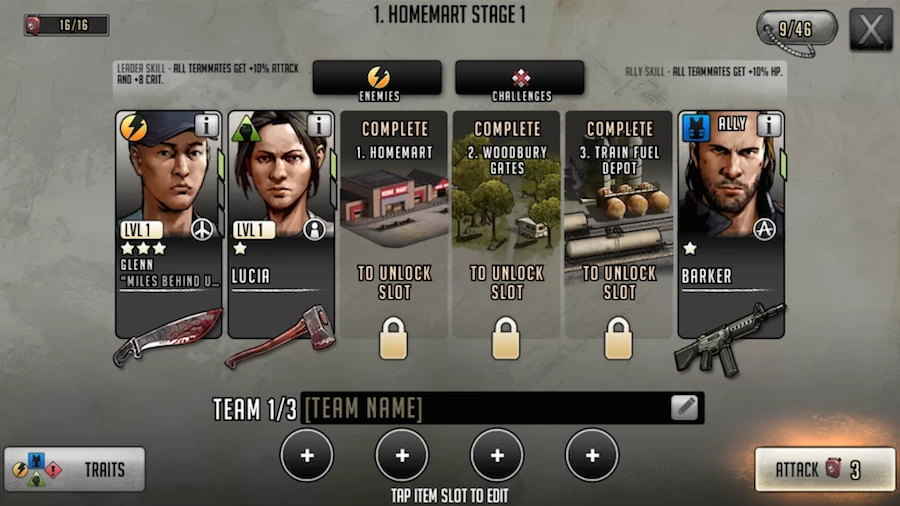
There’s a lot more information than on the team selection screen, but many things are unclear. What do the stars mean? What about the icons right of the character’s level? etc.
Also, some information is presented on the wrong screen. Traits for example, is good help and a reminder for beginning players. They may not see the button behind their thumb and will not remember this information during the fight. It would make sense to help players with team building strategy, but it doesn’t hint at using it for that purpose.
I’d be curious to compare analytics regarding this button usage with external playtesting. Who knows, maybe counter intuitive results of a playtest actually lead it to be placed here instead of what seems logical from a heuristic evaluation perspective. Otherwize it’d help optimize the display based on when players wonder about this information and whether it helps when they click it.
Mobile interactions and interface design
Good use of gestures and transitions
The game uses many interactions that match what players will be used to from other applications. Typical mobile gestures make the interactions really smooth and comfortable. The game plays with off-canvas menus that contextually offer a feature or an error message.
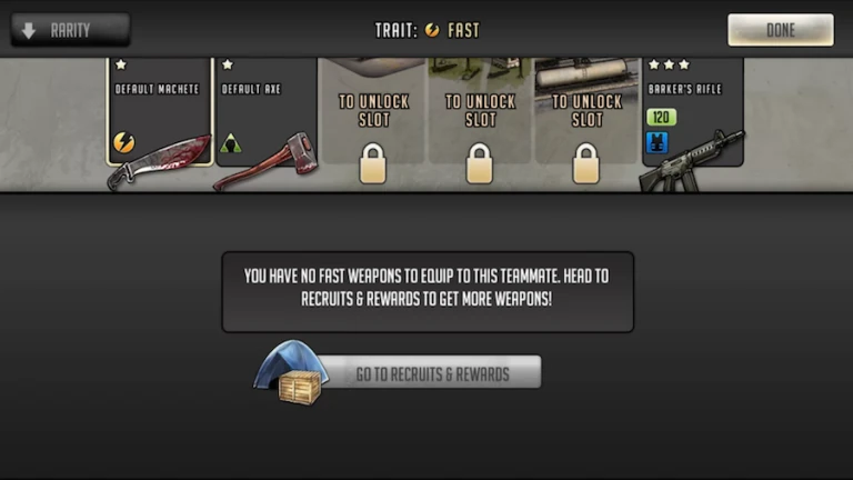
Rewards can be swiped through like deals on an e-commerce site. Button sizes are carefully tuned to be usable on different mobiles.
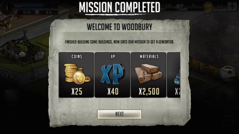
Clean and efficient layout
The base’s screen layout is also very interesting to look at.
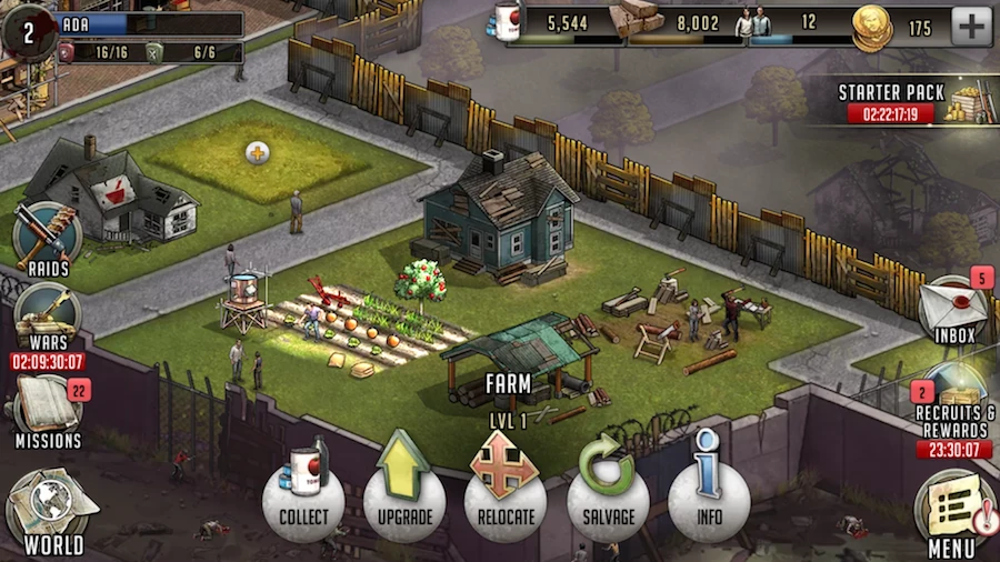
Items that mostly require to be visible, but no interaction are on the top, where players will see them without effort. All interactions are on the side and bottom of the screen, making them easily accessible for thumbs.
You’ll notice some limited time features are highlighted. Starter pack on top is the most visible, and likely to drive the best conversion at this stage of the game. I’m guessing analytics heavily define what to display at this location of choice.
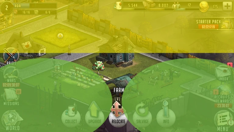
Top yellow area offers best visibility, green areas on bottom and sides is easiest to interact with. Top yellow area offers best visibility, green areas on bottom and sides is easiest to interact with.
Other features are placed conveniently below the natural position of thumbs. They’re alternatives to the starter pack, and though less visible, it’s likely players will be aware of their existence, either by actively looking or by activating the input by mistake.
This kind of trick is often painless for players who can just go back and consider it their own mistake rather than an intrusive add. It makes them aware of the promotions by displaying them full screen, which is one involuntary step closer to a purchase. I’m generally against this kind of practice, but it’s relatively painless here.
What’s interactive and what isn’t ?
Purely in terms of design, it’s not always clear what can be clicked. The visual of the help can be a little confusing as to who beats what, also known as “what does the arrow mean exactly?”. Players can tap on each icon to get a textual explanation as well, but it’s not clear the icons are interactive, specially compared to the clearly defined tabs on top.
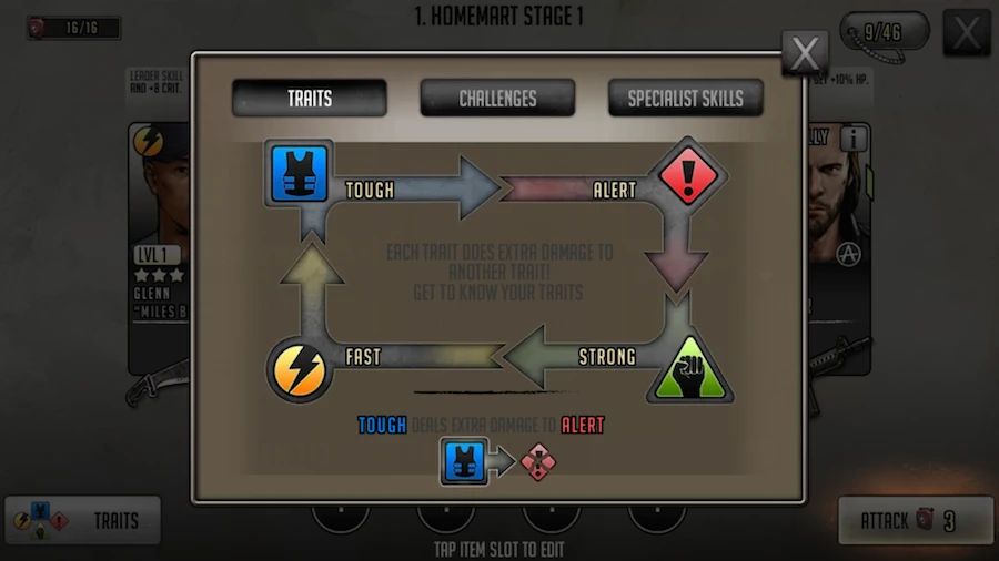
The game lacks some sort of consistent code that helps the player identify interactive elements on the screen.
Shopping for coins
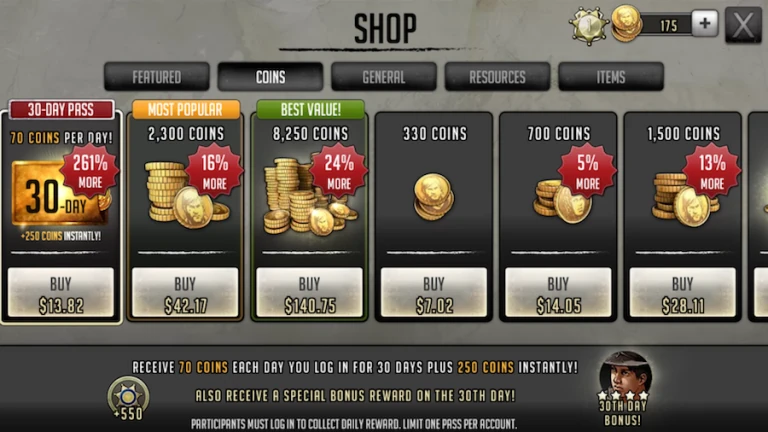
The shop in game offers a wide variety of choices to invest actual money into the game. Starter packs are usually popular with players.
Displaying a wide range of values also encourages other players spending just a little more than what they actually would, or simply pend some because it seems cheap compared to the other items. The game combines a decoy and endowment effect to encourage purchases.
While the items and monetization techniques follow best practices, I’m a little skeptical about the amount of offers displayed on a single screen. Presenting fewer options makes decision making faster and makes behavioural economic techniques more efficient, potentially increasing revenue by removing barriers to monetization. It’s certainly the result of analytics and iterations. I’m just wondering if this isn’t a case of optimizing one design without considering enough alternatives early on.
Error prevention and recovery
Error prevention is a tricky criteria, often balanced against profitability these days. In the previous screen, the screen layout is likely to cause “harmless” input errors for the players that may have good business value to the developer. While crafting items, the tutorial explicitly says making an energy drink doesn’t cost anything, while it’s actually using food resources.
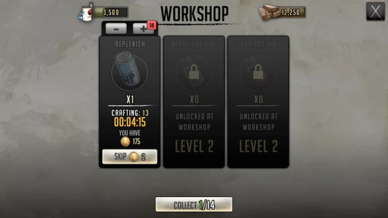
Although you can see the food stock decrease, nothing really warns the player that it is linked, and his attention being on the amount of production, the change will likely go unnoticed. Then BAM, the game says “give me money”. Aside from the monetisation mechanics of free to play themselves, here the player will be frustrated because he had no way of anticipating properly what would happen.
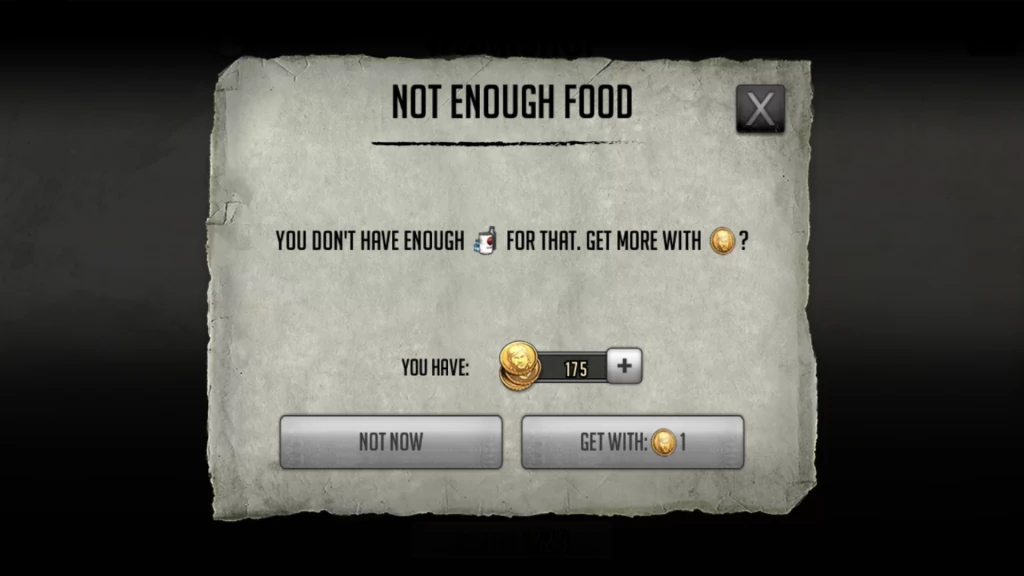
Sadly, the screen doesn’t say how much food is missing, or how many food you can buy with 1 coin. Will it just completely the one crafting session or will it give the player a fixe amount of food to use for other stuff too ?
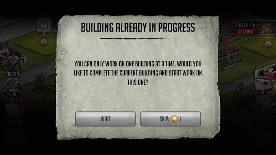
Another example is for buildings. Allowing one building at a time is smart here. This is again convenient to get players into the store page. However here, the player doesn’t know how much credit he has left. I’m guessing some inconsistencies make sense for testing purposes and I’d be curious about the performance of each of these options.
In my experience, players are more likely to spend or voluntarily watch ads if they feel they’re treated fairly. With this presentation, the players who don’t buy it will feel smart for not falling in a manipulative trap. If instead you’d offer a clear value with a bargain pricetag, players would feel smart for buying instead.
Conclusion
The first time user experience mixes moments of confusion and frustration with pleasant surprises and fun action.
The player quickly jumps into action and tutorials are globally clear, if a bit constraining. There are however many small inconsistencies throughout the game. Some might barely confuse a few players but others encourage misunderstanding of core interactions and prevent players from properly anticipating what will happen as a result of their actions.
Walking Dead : Road to survival’s usability is still quite polished. Feedbacks are high quality and explicit. Screen layouts are pretty clean and efficient despite the complexity and depth of the game. Some barriers to monetization remain, but I’m sure they could be removed by experimenting more to get everything just right.
Articles on similar topics
The Mass Effect series
Game Usability reviews, Game user experience analysis,
A game usability review of Triple town
Game Usability reviews, Mobile game user experience,
A game usability review of Amazing Brick
Game Usability reviews, Mobile usability, Mobile game user experience, Game user experience analysis, Initial experience, Out of box experience,
A game usability review of Auralux
Game Usability reviews, Mobile usability, Game user experience analysis, Initial experience, Out of box experience,
A game usability review of Ollie Pop Retro Skateboarding
Game Usability reviews, Game user experience analysis, Mobile usability, Mobile game user experience, Initial experience, Out of box experience,
A game usability review of Time of Exploration
Game Usability reviews, Game user experience analysis, Mobile usability, Mobile game user experience, Initial experience, Out of box experience,