How to teach players your game?
- No Tutorial
- Tutorials using dialog boxes
- Visual explanations with video
- Visual explanations with steps
- Using swipe to navigate tutorials without confusing players
- Teaching how to play through in-game explanations as tutorial
In this article, we’ll have a brief look at different types of tutorials and typical player behaviour when they encounter them. We will use the 2048 games as a reference because they exist in many forms and shapes and are simple enough to illustrate typical situations.
While creating efficient tutorials for more complex games may require more, the fundamental points this article aims to highlight are valid no matter the complexity of what needs to be taught.
No Tutorial
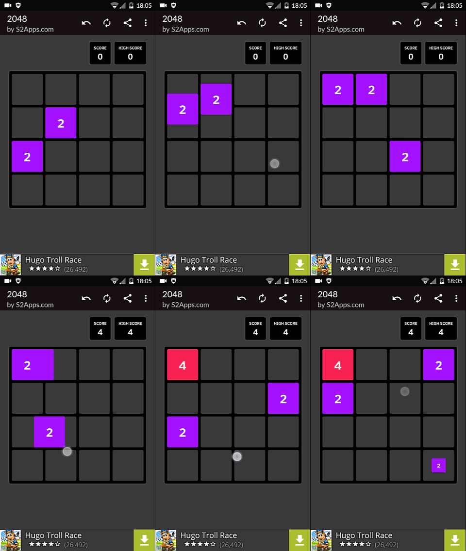 The player starts up the game. Being given no indications, he tries something random.
In the case of a 2048 game, this can work because the game uses basic controls, that are common on the device. Players might also have played similar games and be able to figure out the controls on his own, by trying the most common controls he knows.
The animation for this example shows a player who figures it out right away, trying to swipe. The player had previous experience of similar games. Players interacting for the first time with this type of game may try to tap on the numbers, on empty spots, drag the numbers around, or swipe.
For the most common controls, it can be considered superficial to teach standards. Players usually know how to move around in a 2d platform game. Most players will know how to move around in an fps. Most players will typically try the most common inputs controls for moving, jumping, interacting with the environment with a keyboard or mouse. Many players would also try all buttons on a controller to check what does what hen starting up a new game.
Not all players are familiar with basic controls: niche targets, young players, more occasional players will not always have the reflex to try out random controls. Mandatory tutorials for basic controls might frustrate regular players however. While the no tutorial option may work sometimes, providing some kind of optional guidance is always better.
Tutorials using dialog boxes
A cheap way to add basic explanations without bothering the player a long time is to provide informations in dialog boxes that are easy to close.
The player can decide to read or skip them, depending upon his needs for information. On paper, this may seem like a good idea
Textual explanations
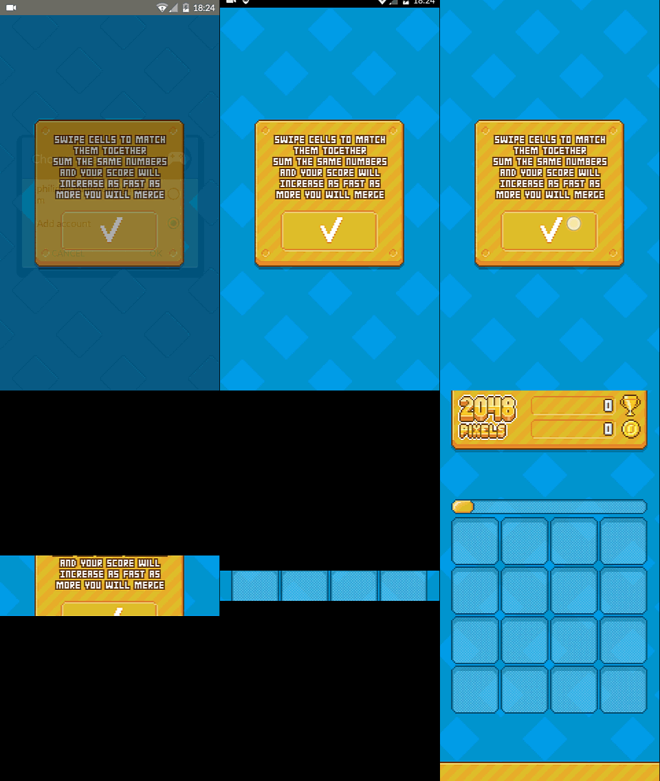
The most straightforward way to create tutorials with dialog boxes is to give textual explanations.
Now the big drawback of this approach is the same for web, apps and for games. Clients often ask me how people will read their content. Usually, the answer is they dont.
On this animated screenshot, you can see an actual player not reading the tutorial. The game being simple, it didn’t bother him to find out how to play by just trying. So, we’re back to the no tutorial situation. But at least, people who want to read could do it, right?
But then, there’s another drawback : when players read, the explanation might not be enough to understand the game. in this example, you have to know what a swipe means. Not all mobile users know this term. Even designers say swipe, or sometimes slide, or even drag. Technically three subtly, completely different interactions. So when using text in tutorials, it is very important to use simple explanations, plain vocabulary, or better yet, the user’s vocabulary.
Worse than that, players will not learn how to use the game properly if textual tutorials are used extensively, with too much dialogs, too much text, and showing too much information at once. A very good example of this is the tutorial from Dragon Age Heroes on mobile, where players can spend what feels like an hours just skipping through text messages, going through all the features of the game, then when it’s finally over, feel at last free to think :
Okay, now that I’m through the tutorial, I can finally try to figure out how this game works
Endless Space is also a good example of too much text.
Visual explanations with video

Adding visual cues aids the explanation. In this example, text is accompanied by visuals. Visualisation can transform complex information processing into perception task. While this is true for understanding data and solving problems, it is equally valuable for teaching.
In this case, a video is used to show how the game functions. This can be a great way to show what the goal of the game and how to achieve it. The interactions are simple and require only a little practice, which makes it a good, fun, efficient approach for a 2048 game.
We have seen this in more complex games such as Deus Ex : Human revolution. Most of the tutorials were videos of the next bit of level, with explanations on how to perform certain actions to reach the end of the section. The tutorials in Deus UX were optional, unlike the pop up of city 2048. They were however much longer, and required the player to watch through them if he just wanted to know the one bit at the end. Videos are generally good if they are short, and focus on one bit of information, with a clear teaching goal, much like videos from online MOOCS.
Same as with the text explanation, the animation is quickly skipped by the player, who may only see the animation of the video appearing before he closes the dialog, as seen on the animated screenshot above.
Visual explanations with steps
Paginated tutorials can use buttons to navigate
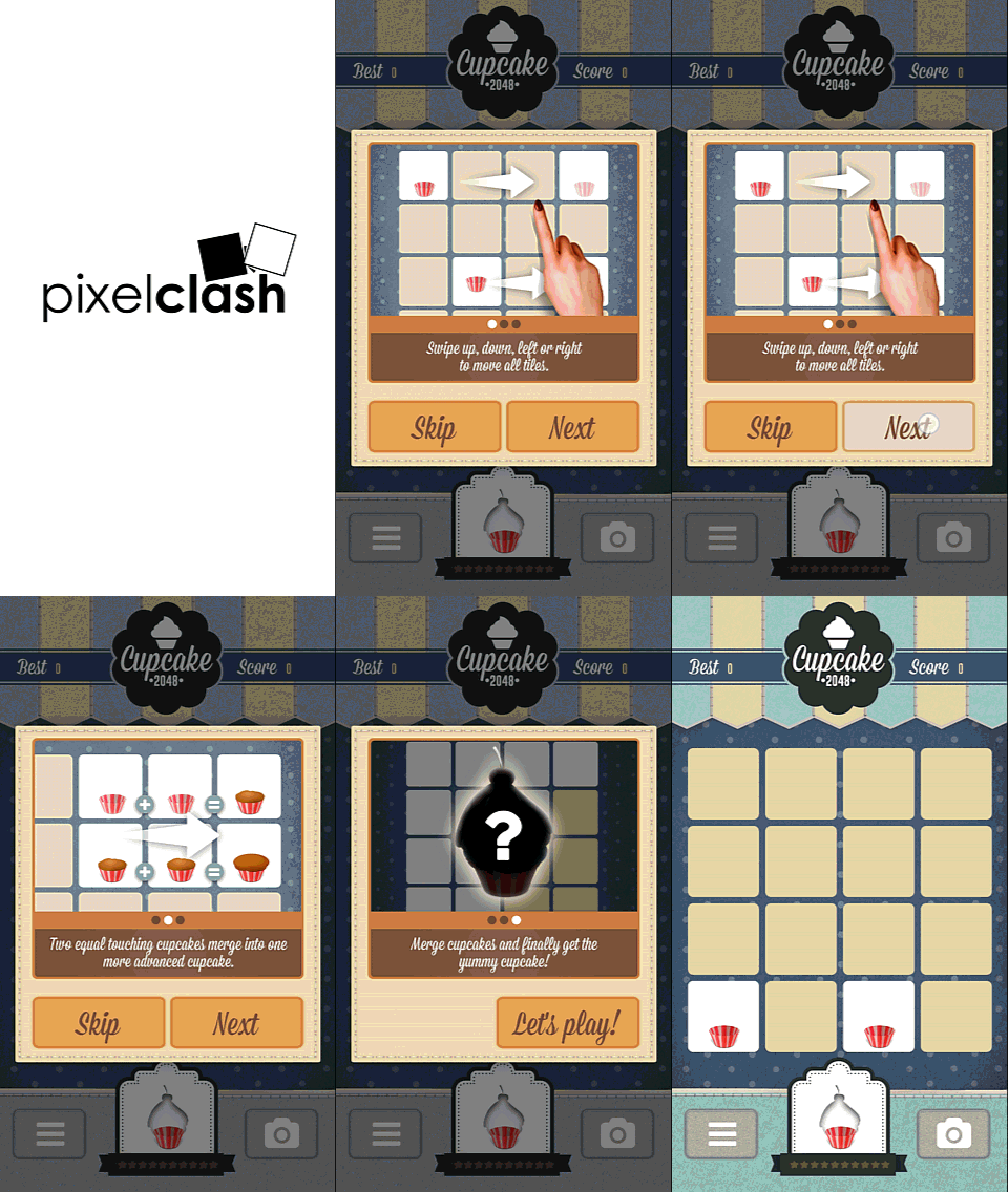 Without using videos, visual tutorials can use multiple steps to explain different concepts. On mobile, this will often be done with a slider, or page icons. The simplest interaction on that kind of tutorial is to skip to the next page using a button, like previously. The difference is that the button doesn’t close the dialog directly, but moves the player to the next page of the tutorial.
Visual cues to supplement the textual explanation adds extra value to using images. The player can actually look at the image and get the idea even without reading the text. The text can still be useful to remove any ambiguity visuals only may not be enough to clarify.
Paginated tutorials often uses swipe to navigate

Paginated tutorials are often controlled using a swipe motion on mobile devices. This can be very efficient, or confusing, depending upon how it is used.
In the first example by Joylol, the first page of the tutorial explains how to swipe to move numbers around, then explains the addition mechanism, and finally the goal.
The first slide is confusing, because the arrows explaining the motion are pointed down. You can actually see the player trying to swipe down in the animation. The input explained is different from the input required to move through the tutorial. The player gets it quickly enough, but the inconsistency is confusing at first.
I’ve written this many times already, but again, these first few moments are critical for the player. Even such a small amount of confusion can lead the player to form a negative first impression of the game, which will in turn make his judgement more negative, through what is called the halo effect.
Using swipe to navigate tutorials without confusing players

A better way to use the same type of tutorial and interaction is to make sure the first motion matches the one required to play. This way, the player will experience the first satisfaction of getting it right, and being rewarded with progress.
It is the case in “This is 2048”. not only the first motion of the tutorial is the same as the one required to move to the next frame, but accessing the tutorial is optional, and explicitly triggered by the same motion.
This creates an extra good first impression. Players don’t have to close annoying pop ups that they didn’t ask for teaching them stuff they already know, or want to figure out by themselves. Accessing the tutorial actually already teaches you to play, and moving through the first step of the tutorial is kind of rewarding, as you learn both how to play and how to navigate the tutorial at the same time.
This is pretty much the same mechanics as in Flower, or Journey, where the player has to learn the controls and make the motion he will need to play to actually launch the game.
Teaching how to play through in-game explanations as tutorial
Passively being taught about a math problem doesn’t guarantee you’ll understand and be able to solve similar problems later. When studying, practice is mandatory to understand, learn and remember something you want to learn.
 Applied to games, this means a tutorial that requires the player to perform the actions he’s supposed to learn and see its results when they fail or succeed is the best way to acquire the new skills needed to complete the game.
In this last example, you can see this theory applied. It looks pretty much similar to the step by step tutorial, except it doesn’t work the same at all. Here the player in actually in-game, and when he performs the right action, the player sees the impact of his input and gets appropriate feedback to adjust his behaviour if needed.
Visual cues help to tell the player what to do, in the form of arrows. As with consistent swipe, this creates a satisfactory first experience. It also makes the core mechanics explicit while playing, allowing the player to anticipate the effect of his actions.
This is often used in games, from arrows telling the player where to click and what to buy in Rad Soldiers, to indications on panels in World of Goo, to the controls shown in a corner of the screen in Dragon’s Dogma.
This approach requires a little more budget to produce tutorial assets for the game, implement a specific level or script on top of the gameplay to validate user inputs. It can be frustrating for developers because here too, players may want to skip through the tutorial and rush into the real game. It may be little concern when you’re just adding a dialog with a text box, but can get frustrating when you put hours of work into something few people might experience.
It is very important though to make that effort, because it often provides the best possible player experience, and is part of the on-boarding phase of the game, which is critical to engage players in the long run.
So what alternatives can you think of, and what will your tutorial be like?
Articles on similar topics
The Mass Effect series
Game Usability reviews, Game user experience analysis,
A game usability review of Triple town
Game Usability reviews, Mobile game user experience,
A game usability review of Amazing Brick
Game Usability reviews, Mobile game user experience, Game user experience analysis, Initial experience, Out of box experience,
A game usability review of Auralux
Game Usability reviews, Game user experience analysis, Initial experience, Out of box experience,
A game usability review of Ollie Pop Retro Skateboarding
Game Usability reviews, Game user experience analysis, Mobile game user experience, Initial experience, Out of box experience,
A game usability review of Time of Exploration
Game Usability reviews, Game user experience analysis, Mobile game user experience, Initial experience, Out of box experience,