Playtest insights on Amanita’s Botanicula
- Goals, guidance and storytelling
- Guiding the player through the story
- Collecting creatures
- Clarifying goals
- Better ways to show missing items
- Interaction design and the complexity of puzzles
- A wide variety of controls and interactions
- Variety in interactions create complexity in puzzles
Goals, guidance and storytelling
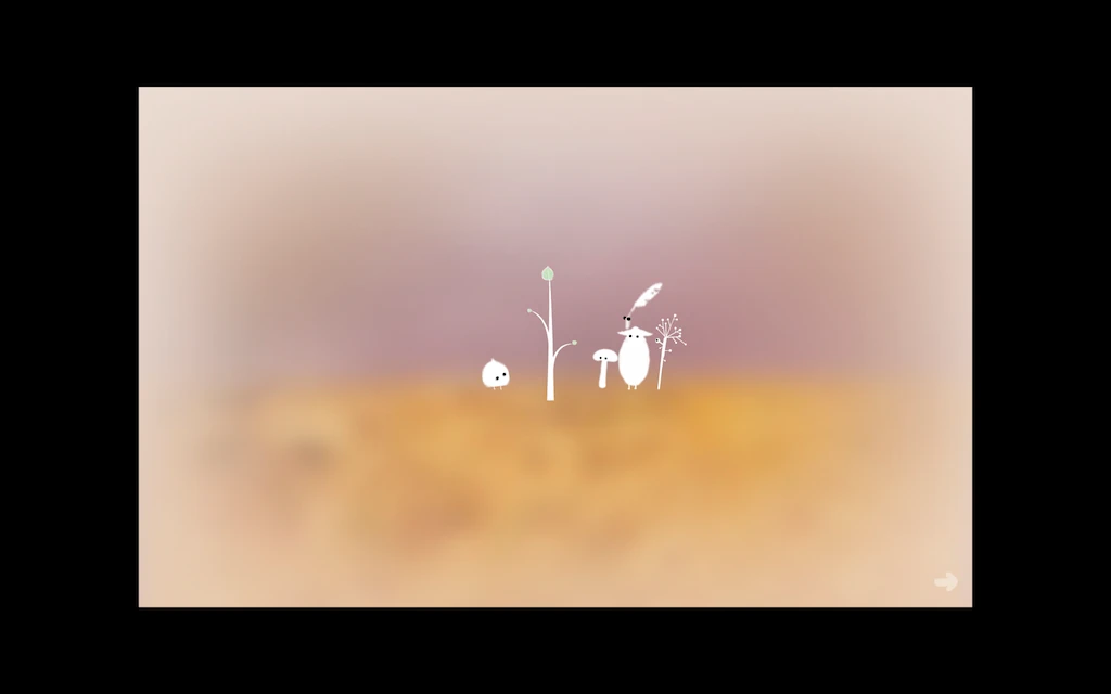
Botanicula is a “relaxed game perfect for hardcore gamers, their partners, families and seniors”; A point and Click adventure by Amanita Designs, who already won our hearts with Machinarium.
I’ve had the chance to test this game with two teenagers: Joe, a core gamer, Alex, a casual gamer and Robin, a 5 year old little girl, a 66 year old grand mother and a zen-game loving mom (not mine though!). Here’s some highlights of their player experiences.
Tested on PC/Mac
Guiding the player through the story
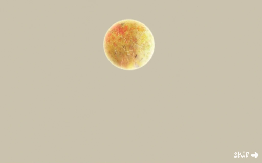
The game is introduced by cute and explicit cutscenes that clarify the game’s context and goals. Repetition is used to teach the player the important aspects of the game. It manages to convey complex information by using meaningful animations. Funny thing is, the core gamer was the only one to explicitly be able to tell your goal was to plant a tree. All others focused on exploring by trial and error to progress and see what happens.
The game attracts the player’s attention on the storytelling and important information by darkening the rest of the screen.
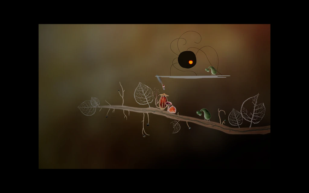
For example, here, the creature is telling how the spider stole its head, when the player gives it back to them. The level around the animation sequence gets darker, to guide the player’s attention.
Naturally, the player’s attention will be attracted by the movement of the animation, but the darkening effect strengthens this, and ensures there is no competition with animations that might loop in the scene. Usually, scenes with storytelling are also more minimalistic, they have less elements in them, interactive or not.
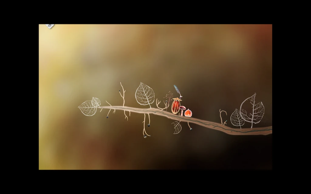
When the narration is finished, the game view goes back to normal, as seen in the second screenshot. Colors are more bright, and the player understands he can resume his exploration.
Collecting creatures
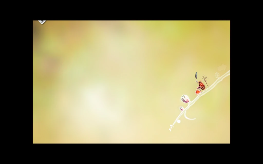
When players discover new creatures, they are added to a card collection. When that happens, the first time, it is explicit, but later, only a small part of the cards becomes visible at the top of the screen. This feedback clearly indicates to the player that he has a new card in his collection.
Our hardcore player decided to go through the game a second time to find more creatures than during his first play, clicking and teasing anything that looked a bit different on the screen during the second playthrough to make sure he found everything. Turns out, he’s still missing 6 creatures.
Clarifying goals
Arrows mean “click here” to players

Arrows are a widely understood sign that clearly give directions, literally, pointing at what the player should notice, see, pay attention to, think about.
In Botanicula, arrows are used for a variety of meanings.
Arrows to click work well
- By default, an arrow is shown to Skip a cutscene, the word skip will appear next to it on mouse over to clarify the action.
- Arrows appear on the edges of the screen on mouse over when the player can walk that path towards another screen.
- Arrows in the game screen mea “You can also stand here”
- Arrows point at each character when the player needs to choose one to perform the action in their own unique way.
This is all nice and consistent : see an arrow, click. Simple. Small issues can arise, but not blocking or very frustrating ones.
- When arrows point at the characters to encourage the player to pick one. One player thought it told him what he already had tried, or what was left to try. He was confused, but it didn’t prevent him from succeeding.
- Players did not always think they could change screens immediately, since the edge arrows only appear on mouse over.
But then, there’s one last type of message conveyed by arrows.
Arrows to show confuse
- Arrows point at missing items in the screen or problems that need solving, to explain why an action is impossible.
Most players had trouble understanding this. They understood the arrows only as “Click here” and never as “Look, this is missing?” As a result, at the start of the game, they clicked repeatedly on the creature missing wings, instead of figuring out they needed to collect the feathers that the arrows were pointing at. Watch this player get confused:
They figured it out when they gave up trying to click, tried to explore randomly other areas, and gathered the first feather by interacting with anything they can.
Only the gamer Joe knew what to do by experience. The Mum also had less trouble with it because she did not notice those arrows at first and left the screen immediately.
It was not blocking for anyone though, and nobody expressed frustration, but it did take away some of the pleasure of feeling smart you can get when you understand what the game is trying to tell you.
Better ways to show missing items
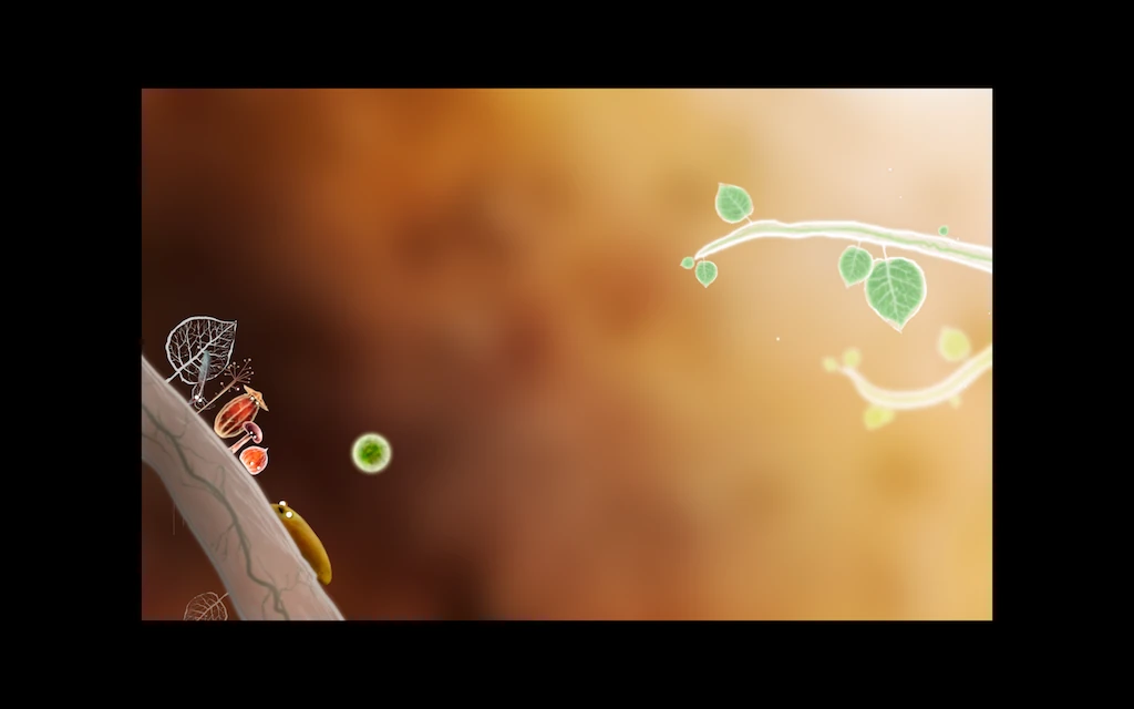
Later in the game, arrows are not consistently used to convey this “missing item” message, as seen on the previous screenshot.
The creature simply “shows” the missing item as a “thought”, visually standing out from the rest of the set, and that worked for everybody to understand the creature wished for this item, and they had to find and bring it to them.
Another process used in the game, that was explicit for all players was gathering blue flowers to grow eyes on a creature. The first flower is in the same screen as the creature, and when interacting with it, it moves directly to the creature, instead of staying in the player’s inventory first. This way, the player knows immediately what those blue flowers are for, and knows what to do with them when he encounters them later in the game.
Interaction design and the complexity of puzzles
A wide variety of controls and interactions
Variety is rich and fun
The game allows the player to interact with the game in many ways:
- Items and creatures can be clicked, sometimes to progress in the game, and sometimes for the sheer amusement of watching what they will do.
- Moving the mouse over some elements will trigger an interaction : creatures will hide, run away from the cursor, others will appear, grass will curl up… It gives the feeling the world is alive and wonderful. Sometimes leaving the mouse somewhere will trigger an interaction. Good feedback is required to figure that out, but in Botanicula, it is well done.
- Some items can be dragged. This is less obvious at first, some items seem to be dragged after clicking, but sometimes players feel like they need to hold their mouse button down. This control creates some confusion for the player, who is unsure how to proceed exactly, and needs a couple of tries to get the hang of it every time they encounter the situation. But they feel like it makes them think out of the box and need to be creative in how they solve problems.
The exploration and controls are fun to explore, understand and master. The following video illustrates how users engage with the environment through a diversity of interactions.
Combining the controls though…
The end gets more complicated though, and the combination is a little difficult to understand, and very difficult to master even for our hardcore player, who wasn’t able to figure it out properly until the second playthrough :
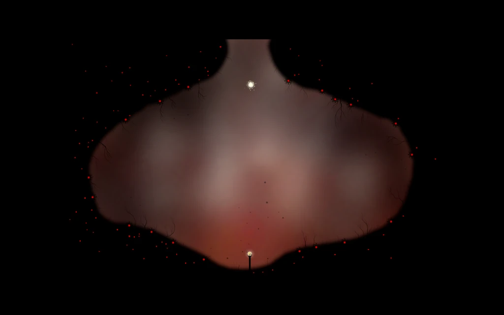
First, the player needs to click his character to load a power. On click, there will be little particles that flat around the character to indicate it is ready to shoot.
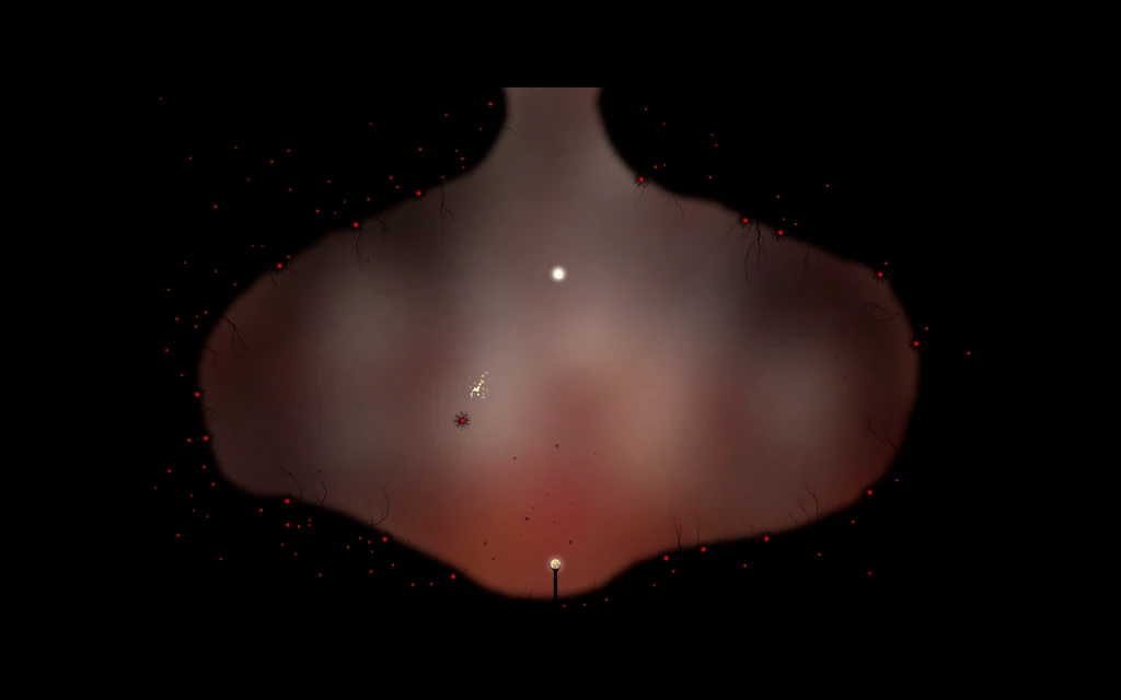
Then, the player needs to place his mouse cursor above an enemy to shoot a light bolt at it. And then, you have to do this really fast, on many enemies, in the right order. Real arcade gameplay in an adventure game !
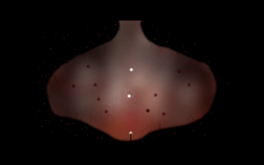
This is where not one of our four players understood: they all kept clicking on their character, then clicking on the opponents. The result is, they all were too slow and only the hardcore gamer managed to finish, happy to face a challenge, playing on a trackpad.

He did feel something was off and that he didn’t get something about the controls, but he only figured out what the second time he finished the game.
The kid give up very soon, too scared by the scene. The casual gamer rage quit. The teenager was really surprised and disappointed, and felt bad for not managing to finish a “kids game”. All four players had a strong reaction to this change of “genre”.
Variety in interactions create complexity in puzzles
Sometimes too simple for players imagination
In this puzzle, all adult players tried to move the greyish bubbles into the air vents, thinking it would allow the characters to move through to the other side. The red node was understood as being a bothering object that would be in the way somehow of getting the other bubbles in the slots.
Then, when the adult players understood they needed to make the red “ball” fly out through the right vents in the right order to make the key drop, instead of walking to it, they kept adjusting the position of the neutral bubbles, thinking it would otherwise not make the red one go the right trajectory. It took hours.

The kid on the contrary, she just solved the riddle in ten minutes, just playing around because it was funny to move the red bubble around, and not stuck with a too far fetched preconception that all bubbles needed to have a use.
The “least favorite” puzzle : trial and error

Three players felt frustrated on the bumping jumpers puzzle. The goal is to move around these spongy creatures, then jump from one to the other to reach the other side. The direction of the jump and the required position of those creatures seem arbitrary to the players.
They felt like it was plain trial and error, with no way of anticipating or understanding the logic of these random jumps. They all managed to complete it, but didn’t like it as much as the other puzzles. The hardcore gamer also voiced annoyance when he had to do this level again, and kept if for last, after a first, frustrated, unfruitful attempt.
Only the casual player disliked another level: the one where the player blows 3 horns, and each makes a sound and creates a body part of the create, in the hope of randomly creating a full creature with the right body parts.
Articles on similar topics
The Mass Effect series
Game Usability reviews, Game user experience analysis,
A game usability review of Amazing Brick
Game Usability reviews, Game user experience analysis, Initial experience, Out of box experience,
A game usability review of Auralux
Game Usability reviews, Game user experience analysis, Initial experience, Out of box experience,
A game usability review of Ollie Pop Retro Skateboarding
Game Usability reviews, Game user experience analysis, Initial experience, Out of box experience,
A game usability review of Time of Exploration
Game Usability reviews, Game user experience analysis, Initial experience, Out of box experience,
A game usability review of Shu’s Garden
Game Usability reviews, Game user experience analysis, Initial experience, Out of box experience,