2048 benchmark
- Welcome to 2048 usability evaluation
- Words 2048 usability evaluation
- Pixels 2048
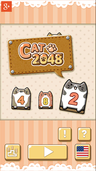
- Kittie 2048
- City 2048
- Hexic 2048 usability evaluation
- Doge 2048
- Cupcate 2048
- 2048 mania
- Colorful 2048
- Cats 2048
- 2048 – tile merge feedback comparison across games
- 2048 : quit game
As part of a benchmark series, we will look at many 2048 games out there to see how they compare, and highlight best practices swell as common pitfalls for this type of games.
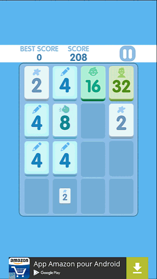
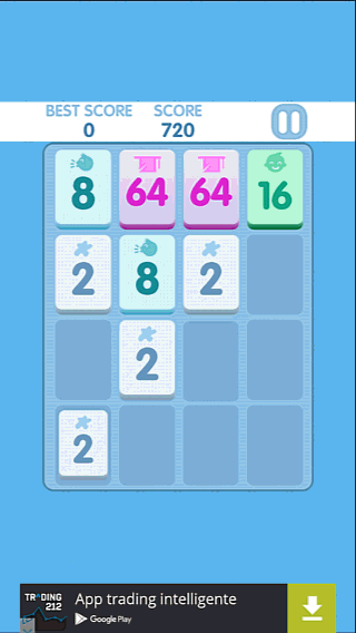
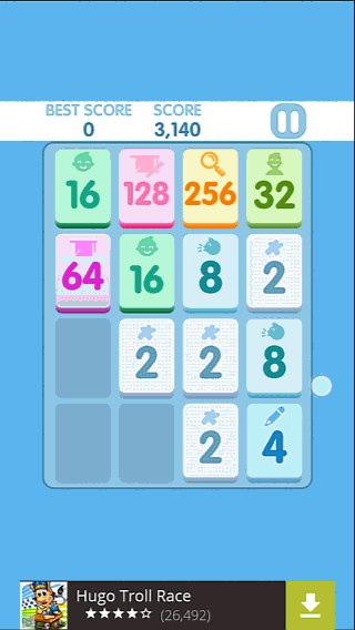
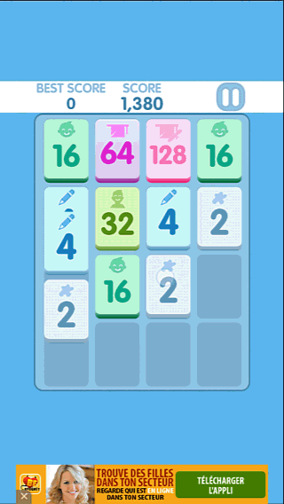
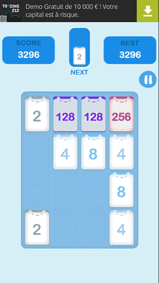
Welcome to 2048 usability evaluation
Tutorial

The game starts with the tutorial and leads the player really quickly to the play button. The user flow is very smooth and clear. The first screen teaches the player to swipe, which makes browsing the tutorial screen smooth. The tutorial itself is very visual and can be understood even without reading the textual information.
Notice how the explanation fo the first interaction is in the same direction as the movement needed for the tutorial: this avoids confusion and reinforces the lesson learned.
Player strategies
 Players make different types of decisions. When completing a sequence with a discrete goal, players will decide each step of their action, for example, when they’re near reaching a higher score, and make a conscious effort to reach it. This type of behavior is characterized by slower interactions, and pauses. The player makes a decision between each gesture to define the next step.
The human brain is made to simplify complex decisions, and limit the number of decisions made to reduce the cognitive cost of an activity. The more the activity is familiar, the more the player will make decisions about behavior patterns, rather than single movements.
This works pretty much the same way as walking : at first, a baby has to focus on each step and manage his balance. Once he becomes an expert at walking, he only needs to decide whether to start or stop, and doesn’t need to pay attention to the movement his body carries out to keep in balance and move forward. This leaves his mind free to make different types of decisions, such as compute the route to the destination.
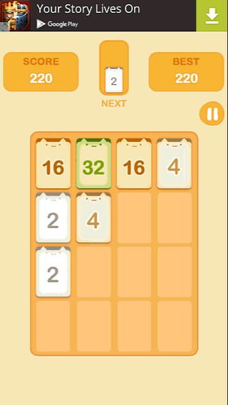
In 2048, one of the strategies is moving numbers in a single direction and switching only when that doesn’t work anymore, until it works again.
For example, the player will make a gesture UP repeatedly, until no more movements are available. He will then move the board LEFT or RIGHT to unlock the situation, then resume the always UP motion.
It will also usually take some time for the player to notice when the repeated UP motion doesn’t work. This is because the gestures are automatically repeated. The player’s attention isn’t fully required to do so, the cognitive load is less important, which leads to more input errors before the player realises he needs to make a decision again.
Inputs & interactions
The player tends to make oblique movements, rather than clean, straight up or down gestures. The player will make a gesture that will have no effect a couple of times before they actually get the issue and take the time to make a more precise gesture, which will work. In doing so, the game requires the user to pay attention to his interactions, which removes focus from the game’s problem solving challenge.
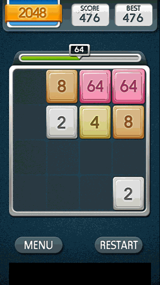
In welcome to 2048, sometimes even straight gestures are not taken in account, as seen on the following screenshot. The movement amplitude is very small here, so the player isn’t aware that the movement is oblique, again. Here, the player fixes the gesture by making a more ample movement.
Feedback
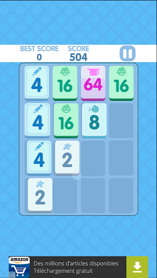
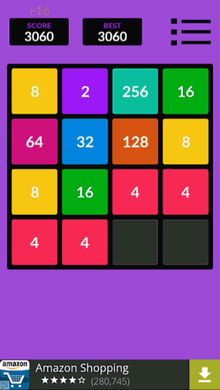
The game shows animated, subtle feedback throughout the screen. The score moves slightly forward and appears bigger when increased.
The exact change in the score isn’t highlighted, and the player has no aid to compute the amount of points he gets from each successful movement.
Appearing tiles grow bigger from the center, which helps the player notice them more easily and understand their appearance.
The merging of tiles isn’t highlighted by an additional feedback, but the color and number change. This allows the player to interact quite fast with the game. The player might fail to notice some changes however. There is also no feedback on errors, when the player tries to move in a direction where nothing can happen.
Whereas the exact score increase isn’t highlighted, the game emphasizes progress in the game as achievements, when the player reaches a new type of tile. This appears on top of the screen, with an animation that makes the dialog very visible, without being intrusive with the playing session.
Menus and options
 Leaving the game is pretty easy. A nice animation introduces the menu, which gives a sense of polish, and the use of icons allows users to understand the options without reading / translation needed.
Yet, the animations are brief and smooth, so the player is not frustrated by wasting a lot of time on useless content if he needs to close the app fast.
What did we learn in this game?
- Tutorial slides are a quick and easy way to teach basics, even better when they are this visual, only have 3 slides, and they can be manipulated with the same interaction as wht the player will need to do in the game later
- Player inputs are sloppy, specially when they’re experienced and use strategy decisions over single action decisions. Oblique inputs need to be dealt with to allow players to focus on the problem solving, rather than how to properly interact with the game
- Short feedback animations help notice and understand changes in the interfaces: tiles that appear, that merge, input errors, achievements unlocked…
- Score highlight without focus on the amount of points forces the player to do the math. It’s ok if scoring isn’t our main focus, but if it is, the player needs to know how he can score better, faster, stronger
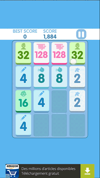
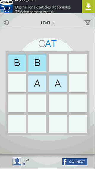
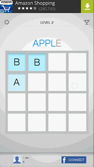
Words 2048 usability evaluation
Game goal
 Though it may seem obvious, the goal of the game isn’t cristal clear from the start. The word above the grid might not be seen, and the change of color might be subject to blindness to change. Even if the player sees the word he should spell by playing, they are unlikely to understand the game mechanics just fro seeing it there, even when playing.
Feedback & signs
 The choice of colors and feedback on the word are confusing. At first, RED is used to to highlight missing letters, then the whole word turns red when it is completed. This is created contradictory signals which makes understanding the progress less intuitive for players.
On the “level completed” screen, the word appears in RED, which, unless you’re in japan, is associated with a negative impression (cancel, don’t drive, danger…). It doesn’t feel like success. The same goes for the red “play next” button. For us westerners, it is less inviting.
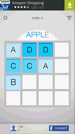
In the second level, the goal is still unclear: all letters are blue from the start, then the E highlights in RED, but right before the player has an E in his grid, the letter was back to grey.

The RED highlight helps the user understand it is missing, but generally the use of colors feels inconsistent and confusing.
What is not clear throughout levels is whether all letters of the word create the goal, or if the target is just the one red letter from the start.
 Unlike the feedback on the progress towards the goal, the feedback on the gameplay interactions are very good. Merging cells seem to move forward slightly and appearing new letters grow from the center of the cell. These animations really help the player understand what’s happening.
Player strategies
Note on the previous video the interaction dot: the player slides his finger forward, in a motion that will have no effect on the newly appearing letter. This is a behaviour that we will often observe in this kind of game: the player often makes decisions on a direction he repeats, and changes only when no actions are left. So it is usual to observe players try to move letters up 3 to 5 times in a direction that won’t work before they realise it and change directions.
When observing sessions of this game, players appear to play slightly slower than when player other games of the like (1 to 2 interactions per second instead of 2 to 3). Comparing to other games, reactivity, speed and length of the feedback animations can play a role in this behavior.
Privacy & security
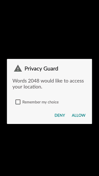 On a side note, Words 2048 ask permission to access the user’s location when starting up the game. The user will not see the benefit for him to allow this, and will probably deny the game the information.
Don’t waste time integrating this kind of feature.
I understand it may be useful for targeted ads, however the sweet spot lies in the area where your business goals overlap with user needs. This is not one of those sweet spots.
Menus & options
 The game clearly asks confirmation before closing, with straight forward choices.
What did we learn in this game?
- Consistent use of color helps the player understand the game’s goals and progress
- Brief but clearly visible feedback after moves help the player understand the gameplay
- Long animations on feedback can slow down the player interactions to understand and regulate their actions.
- Players don’t decide every single move in this kind of game, they are also likely to decide by “series of moves in the same direction”
- Culture has an effect on understanding: while in japan RED is associated with “ok”, it is not an appropriate color in Europe or North America for positive feedback, rewards or positive actions like “next level”
- If your game doesn’t involve geography in its gameplay, it is unlikely players will be ok with sharing their location, specially if you don’t provide a good reason to.
Pixels 2048
Tutorial
![]()
It’s good that the game starts with the tutorial directly. The textual description is likely to be skipped though, and it is more abstract to understand for players, should they need the tutorial.
The retro font provides good contrast and readability, when the size is big but becomes difficult to read when small, despite contrasted outlines.
A more visual tutorial would be more efficient for players to understand and learn the game.
Goal
![]()
The game provides no particular emphasis on reaching a new max number of tiles : the game is more focused on scoring than on progress.
The feedback on progress towards the highscore is difficult to understand during the first few sessions. It gives more of an impression of a timer, or seems like a goal that is already reached.
The highscore is defined by the first game session here. Default target scores, like in old arcade games, would be more motivating.
Feedback
![]()
Short and visible animations when tiles appear and merge give a clear feedback to the player of his actions and their results, while highlighting the changes in the game’s state.
Flashes on the score make the change noticeable but make it more difficult for the player to assess the nature of the change: the amount of points earned is not highlighted and the flash makes it harder to compute the change manually by creating a blindness to change effect: the player can’t just see the change but has to remember the previous value before computing the difference.
Menus & options
![]()
Clear menu & icons allow the user to play without reading / translation issues. This allows a larger variety of players to enjoy the game, without increasing the production (localisation) workload.
The animation also feels smooth and gives a nice, polished touch to the game.
What have we learnt from this game?
- Textual tutorials tend to be skipped, and are harder to understand for users, specially without illustrations. They also require translation, else the player can completely miss the information. It is better to use a more visual approach.
- Text should be legible and readable and well contrasted on any background
- While the goal is clear, the game doesn’t really reward or encourage the player to reach further goals by providing specific feedback or incentives with short, medium and longer term objectives.
- Using explicit icons in menus makes the game clearly understandable by all users and reduces the localisation workload.
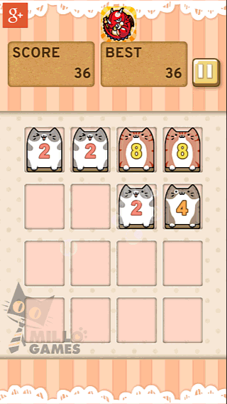
Kittie 2048
Onboarding

The game starts up really fast and gets the player directly to play. It takes less than 5 seconds to go in game, and this is very much appreciated by players. It contributes to create a great first impression : introducing the style and a first positive experience with the game.
Interactions
 Interactions are very smooth. The game can be played as fast as one wishes, players never experience input errors . The game feels very comfortable to play.
Feedback & signs
New tiles grow in from center, allowing the player to notice their appearance and the changes in the game board.
Merging tiles grow slightly and zoom out again. This animation is very short and subtle.
The score does not benefit from a special animation. The player’s attention is not drawn to it particularly. The game does present the current and best score though, which means the game shows that the game focuses both on progress and scoring.
When the player reaches a new tile, a dialog congratulates him for his achievement, which feels good and rewarding. The goal, progress and next step isn’t very clear though. A small indicator in the center between the score and best score shows the next goal to reach. It is not very visible though and was not clear enough for many players.
Menus & options
The menus of the game are icon based, which helps making the game understandable while requiring fewer efforts for localisation.
The direct access to sound options is also nice, since many players want to turn off the sound when playing in public places without headset.
What did we learn from this game ?
- Very quick start-up and access to gameplay contributes to create a positive first impression which will have a positive impact on later impressions, making negatives less negative, and positives even more positive. This works also the other way around, that’s why making a positive first impression matters so much.
- Animations help players to notice changes in the interface, such as new goals and score increases. Lack of animations fails to draw attention to scoring or goals, and take away a little satisfaction from the player who is motivated by progressing visibly.
- Reaching a new goal is rewarded with a pop in congratulation message. This can be intrusive, but here it feels like an accomplishment.
- Well chosen and distinguishable icons help players understand actions without reading, which makes the game more accessible for younger audiences and easier to localise.
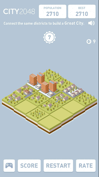
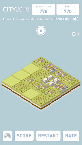
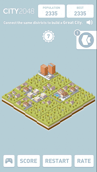
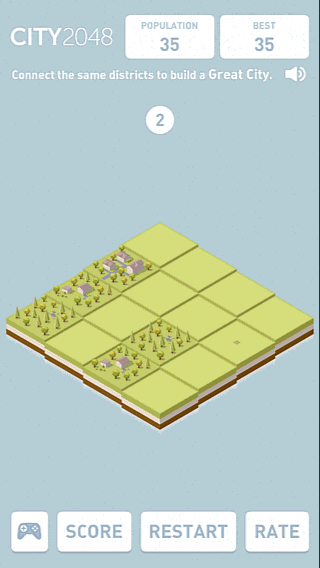
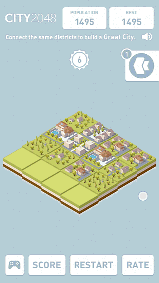
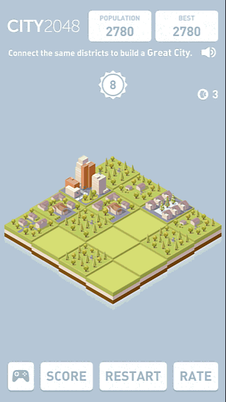
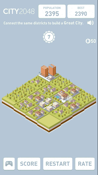
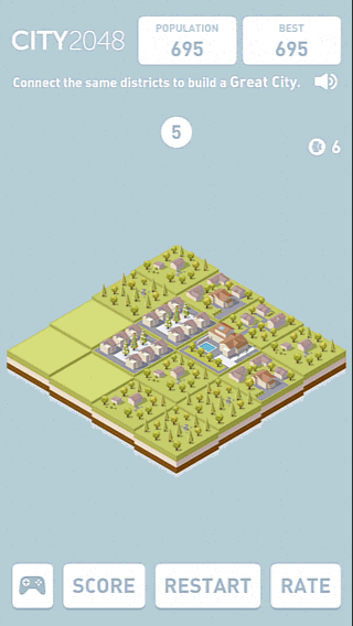
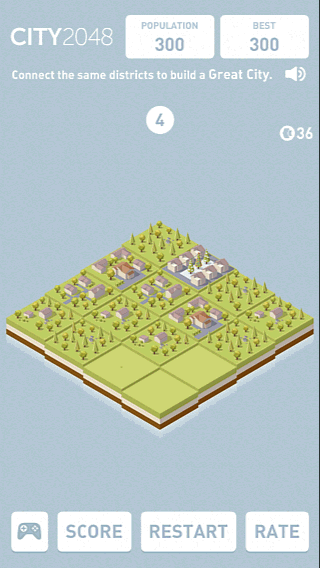
City 2048
Tutorials

First how to play screen teaches the basics of the game and appears quite soon when starting up of the game. It is mostly textual though, but legible, readable and brief.
The progressive and animated appearance of the game’s graphical elements help the player to identify these areas by attracting his attention and highlighting the structure of the interfaces.
The tutorial is split in different message boxes across the game. The first one teaches how to play, then informing the player about new and advanced features as he unlocks or needs them, or highlighting features the player did not notice / access yet.
For example, the level of the biggest buildings is highlighted when reaching a certain level, while the “undo” bonus is explained when unlocked.
As you can see, the message appears as the player is trying to perform an interaction. It disrupts the gameplay in this situation by interrupting the player’s task. In this session, it was not considered too intrusive or annoying by the player though.
Interactions
 Contextual interactions are suggested, acting as a reminder, for things the player might not have learnt from the tutorial and are only needed later in the game, such as the option to undo a move to play on by using a bonus.
It is a good way to reduce the information load in the tutorial and maintain a positive experience by providing the user with the information he needs when he needs it.
The interaction itself also requires less effort of the user, since it is oblique. Even in games where the tiles are horizontal and vertical, the players touch interactions tend to be oblique rather than straight up or to the side. Not only does it contribute to the nice look and feel of the game, it is also more consistent with the player’s natural movement and is more friendly to thumb-based gaming.
 Also, when the player is fast, notice how the feedback doesn’t block the interactions. The previous score increase finishes to rise as the next one already appears. This contributes to make the game feel smooth and increases the feeling of reward from the score.
It also avoids frustration of the player who is sometimes forced to play more slowly than he’d like just because the animations aren’t finished.
Player strategies
Slower interactions, with occasional pauses to make the right sequence to get a higher level building. Each action requires thought and is based on conscious decisions and planning.
In city 2048, this behaviour is observed slightly more frequently than in other games.
This might be because the tiles are slightly more difficult to determine : the player needs a little more effort to distinguish the different types of buildings, and their order in levels, compared to simple numbers.
Players also display a more contemplative behaviour, enjoying the aesthetic pleasure of their construction, that feels alive, thanks to small details and animations like passing planes.
Feedback

Unlike the other games reviewed before, city 2048 focuses its feedback on the score increase, by displaying the amount of points earned for an interaction in the game area, rather than next to the score.
The tiles merging and appearance animations are more classically based on size variations that are visible and help to notice the changes in the game state.
Menus & options
While the score and bonus / gameplay menus appears on top, this game has a different approach to screen layout : main menu items are directly visible at the bottom at the screen. They don’t intrude because most of the time, they will be hidden by the player’s hand, allowing him to focus anyway on the game’s content rather than the menu’s content. On the other hand, this might result in input errors, but I never saw it happen during a game session.
What did we learn from this game ?
- Making the different menus appear progressively allows the player to get an overview of the screen layout and where to find what kind of information by attracting his attention on the different areas and elements.
- Splitting tutorials to explain features progressively as they appear or become more important reduces the effort to get into the game and contribute to an extended positive experience. - Beware though that it doesn’t disrupt the game flow too often, or at critical moments in the game. Here it works.
- Guiding the user when he is stuck and has an available bonus he didn’t use contributes to maintain a positive experience and contributes to learn how to use the game.
- Oblique interactions are more in-tune with the player’s typical interactions even on a non oblique grid, it feels more natural and comfortable.
- In city 2048, the player can interact with the game even if the animations from his previous actions are not complete. This makes the game flow more smooth and seamless. The interactions feel natural and rewarding.
- Displaying the score increase above the tiles makes them more visible, and allows the player to understand the value of each one of his interactions and movements, allowing him to define a more long term strategy to make moves that give more points. It takes attention away from the total score that is more attractive in other games.
- Menus placed at the bottom of the screen are directly visible without drawing too much attention from the game, compared to a menu on top, or menu items hidden behind a button. The menu should have error prevention implemented though, and can be overlooked if not properly introduced since it will likely be hidden by the player’s hand often.
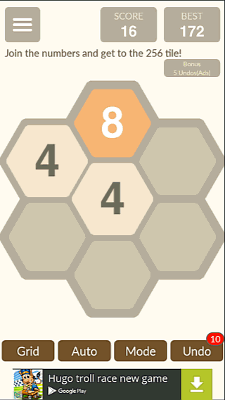
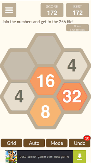
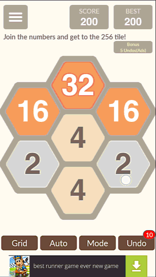
Hexic 2048 usability evaluation
Tutorial
The game starts with a slider showing the tutorial. While the images are very clear and the game is easy to pick up, the swipe to slide is not always understood right away.
Seeing the arrows, the player sometimes assumes he’s in a playable tutorial and doesn’t see the small dots at the bottom of the screen. They’ll probably be hidden behind his hand anyway.
This might seem like a non-issue, but we’re in the first seconds of the game, where the player forms his first impression. This first impression will influence all others, positively or negatively. Small details like these can seem harmless, but can contribute to form a negative first impression.
To make the experience seamless, the first tutorial slide should require movement in the same direction as required to pass to the next slide. Even if the user makes an error, the result will still be good, and since the player will see what happened was not what he expected, he understands and doesn’t make the same mistake a second time. The overall experience would be more smooth and positive that way.
Interactions
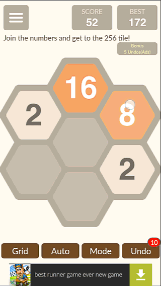
To move the tiles in this 2048 game, the player needs to perform oblique interactions, which we saw in other reviews, the player does naturally. This makes the interactions comfortable and natural.
The inputs are not always taken in account though, and prevents some players to play as fast as they would like. Possibly, managing 3 directions for the tiles movements rather than 2 in a square version of the game gives less freedom to handle errors in a transparent way for the player.
When losing, the game offers the option to undo the last action, but it is not very visible, despite the red marking, players I observed using this game often just start a new session, and aren’t aware of the feature when questionned.
To exit the game, the player needs to go back to the menu after losing, which is as intuitive as clicking start to end your session in windows. It goes fast though, and most users would kill the app or go back to their home screen with their device’s hard button, so it’s a very minor issue in this game.
What have we learnt from this game ?
Slides presenting the tutorial are a good visual way to quickly introduce the gameplay without being tedious for players already familiar with the concepts In this case, the first slide would work better if the interaction presented was the same direction as the one required to use the slider. Don’t make the user think. The oblique layout of the grid is more in line with the natural movements the players make to interact with the screen when they play 2048, but the fact there are 3 possible directions makes it more prone to detection errors. The game offers an undo feature, but doesn’t emphasise it enough for the novice player to really use it. It’s likely to be ignored, where it could be treated as a special bonus, being in itself rewarding and a positive experience for the player who just thought he lost the game to have a second chance at it.
Doge 2048
Feedback & Signs
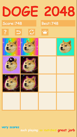 The game provides clear feedback of tiles appearing and merging, using a typical zoom effect, to highlight the merging
times, and make the new ones move into the board.
The game provides clear feedback of tiles appearing and merging, using a typical zoom effect, to highlight the merging
times, and make the new ones move into the board.
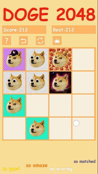
While doge 2048 has a unique style, this style makes it harder to understand the game’s progress. There is no natural hierarchy between the different types of dog pictures, to help the player understand his progress through the game.
Menus and interfaces
 The interface and menu items are all placed above the gameplay area, which makes them visible at any time. They small size and low contrast can make them hard to interact with or identity. For example, one arrow stands for retry, and the other for undo, but they could also mean, go back to the start and repeat last action.
While the game might actually be accessible to play thanks to the dog’s alterations and distinguishable backgrounds, the menu lacks better accessibility features.
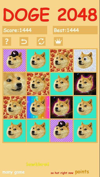
The end-game screen shows the heart of the game, but fails to propose actions to the player. In fact, he can still restart the game through the menu buttons on top of the screen, but since they’ve always been there, he doesn’t think about it. Nothing guides the player’s attention towards the menu, or encourages him to start a new game clearly. The player is likely to leave it at that and exit this funny game, that he has seen now.
What have we learnt from this game ?
The original design of the game makes is fun, but harder for the player to assess his progress and engage in long, meaningful sessions to challenge himself to do better. It is possible to allow anyone to play a game, even with a funny, alternative or even artsy theme. Using simple features like patterns instead of only color or altering shapes makes the game more accessible. Icon based menus are more visual, take less space, and avoid localization costs, but the icons should be clearly identifiable, and different enough from one another that there can be no confusion. When the player ends a game session, just having the menu there isn’t enough to make him play again, or even know how to if they really want to. The player shouldn’t have to wonder what to do next, but be proposed meaningful options to make their life easier, and allow them to focus on the gameplay, not how to get to play.
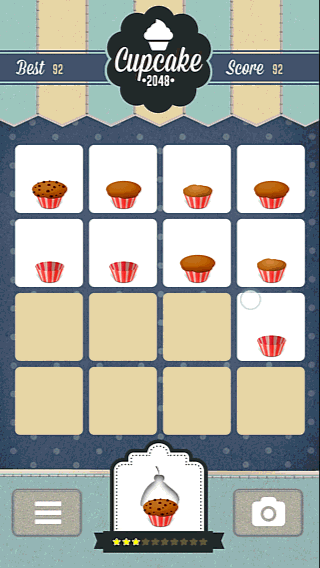
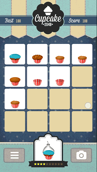
Cupcate 2048
Tutorials
 Cupcake 2048 has opted for a more classical type of slider, clearly displayed above the content as a modal window (pop in, in the foreground with opacity effect over the background). The player navigates the tutorial pages with actual buttons.
It does not teach the player how to interact with the game by interacting in the same fashion with the tutorial, but it also avoids any confusion.
Interactions
 Globally the game interactions are smooth, but they sometimes seem too slow compared to the player’s expectations and movements.
This can be a little frustrating when playing, specially if the player makes a different move before the previous one was really taken in account.
Specially in games where many quick interactions compose the natural way of playing, the game should allow the player to be as fast as he wants.
Interactive areas have an appropriate size for mobile interaction and the spacing makes it even more comfortable to use, avoiding errors.
Feedback & signs
 The feedback when merging tiles is a zoom motion, like in many similar games. New tiles fade in while growing in size.
The main difference is the zoom motion is applied only to the content of the tile, instead of the whole tile. This makes the animation more subtle, but still visible enough to help understand the changes in the game state and the impact of the player’ interactions.
The scoring changes however are hardly noticeable, and doesn’t seem to bear much importance in the game. In cupcake 2048, the progress in unlocking more and more impressive cupcakes is more important, and a reward in its own.
Menus and interfaces
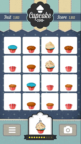
The menus and interfaces benefit from a pleasant design. Messages are clear and understandable, both concise and precise. Visual elements help to assess the player’s progress, and choices are globally clear.
One icon, the cupcake, is impossible to understand and even when opening the menu, its goal isn’t clear. The invite friends interaction is explicit but what to make of the blank cupcake spaces, or the icons on to?
It also uses similar icons to before, though at different locations, which leads the player to wonder of those same icons have the same meaning, or after all might not.
The font is legible and stylish, but the text sometimes lacks contrast for easy reading, specially when playing outside for example. The accessibility of the game could be improved there.
What did we learn from this game ?
A step by step tutorial navigated with “next” buttons can clearly explain the game interactions without using them: the player doesn’t benefit from the “training” but it avoids the confusion sometimes experienced when they do. In games like this one, where many fast, short interactions are at the core of the gameplay, the player should be able to play at the maximum speed he can manage without it causing errors or detection issues. Waiting or repeating actions for them to be taken in account is disruptive of the player’s experience and can disengage him. A zoom on the content of a tile, rather than on the entire tile, can work as a noticeable feedback, while being more subtle. Without animations to highlight score increases, the changes are hardly noticed by players. This works when the game puts the emphase on the cupcake design and progress in unlocking the next design, and scoring isn’t the main motivation to keep playing the game. Lack of consistency in menus can make them confusing even when they mix text and icons appropriately. The player will question the icons meanings, and wonder about this that he would have understood easily otherwise. It also forces him to learn how to interact with each screen, with less help from what he has learnt from other screens he already explored.
2048 mania
Tutorial
 The tutorial of 2048 mania is pretty straight forward. It requires the player to perform both required actions in the game to progress: swipe horizontally and vertically, then explains to the goal of the game. While it doesn’t explain the full mechanics, it is enough to quickly get started and have fun.
Surprisingly, there’s an option to open the tutorial and to play, but the player will still need to complete a short tutorial when selecting play.
Being able to re-do the tutorial any time is good for players to recall how to play if they take a break from the game, and it is short enough that experienced players won’t find it annoying.
Accessibility
 Like many 2048 games, low hanging fruits to improve the experience involve accessibility. The colour scheme of this game is hard to distinguish even for people with perfect sight. The numbers written inside the blocks are sometimes hard to read, for example the black number or a red background. The colour shades are all very similar and it requires a little more attention to distinguish different tiles in this game compared to many other 2048 titles out there.
Feedback & tile merging speed
 Players who merge tiles will easily see the effect of their input, as the new merged tile appears larger and has a clear animation. The score also becomes bigger, attracting attention to its changes. the player doesn’t know however how much points each merge earns them, and they’re unlikely to do the math.
Game pacing
In this game, the players also tend to repeat a valid interaction when it has already been triggered. Unlike other games where players repeat invalid interactions multiple times before realizing their mistake, here, they repeat valid interactions.
This means they don’t have the feedback that their interaction is taken in account soon enough, or they want to continue to the next interaction faster than the game allows them.
Adjusting the time it takes to complete the merges depending on the speed of the swipe motion would allow players to play at their own pace. It would make the game harder to read at high playing speeds, but it would definitely be interesting to test how it impacts the player experience for the most skilled players.
Colorful 2048
This colourful 2048 game has some great features to learn from and some issues that could easily be avoided.

The first of those issues it the contrasts. The colours used for the different numbers are not easy to distinguish, specially for colourblind players. But even without colourblindness, the contrast between the numbers and the coloured backgrounds isn’t always the best. The white number of a yellow background is hard to view. The red and orange are sometimes hard to keep appart.
Transitions and feedback animations are really clear.
A slow fade to menu gives the player time to realise they’ve lost and pick an option from large and tactile friendly buttons.
When watching players in this game, one interesting observation was that they had two main strategies. Some players performed actions slowly, paying attention to what their next move would be, and taking more time in between swipes.
 The second group of players played a lot faster and paid less attention to what they were doing, depending upon stages of the game. In this scenario, the player absent-mindedly plays until reaching a more tricky situation or a certain progress in the game by using a predefined strategy.
These players often repeat an input that doesn’t work two or three times in a row before changing their input. They perform the action automatically although they realise their mistake earlier, or realise their mistake only after so many tries. Either way, additional feedback to attract the player’s attention on this would reduce this type of errors and add another level of polish to the gameplay.
Cats 2048
Tutorials
 The game doesn’t provide a tutorial, which can make the first time user experience sub-optimal for new players.
Bugs don’t inspire confidence in the product. Even if they are not blocking, they give a negative first experience to this game that will prime players to perceive further experiences more negatively.
The error message is also not clear. Here the player was simply offline, but the error message reads “unknown issue”. Offline play should be the rule, as many players will use their phones to pass time when they can’t access the internet ! Online is the exception :)
Interactions
 When trying to swipe in a correct direction, there are sometimes input errors. Unlike other games, it is not a diagonal swipe that creates this input error.
With some experimentation, one cause of this input errors is the starting point of the swipe motion. When starting to swipe on the edge of the grid, the input isn’t taken in account. Players expect to be able to make swipe motions anywhere on the screen, specially with this type of game that doesn’t require to drag or swipe specific items on the screen.
Player strategies
 Player strategies in this 2048 game are similar to the other ones.
Players will repeatedly swipe up, commit multiple errors before changing movement to a sideways swipe.
Either they keep swiping sideways until they are stuck, or they only use one sideway swipe to get unstuck and continue with up swipes.
The fact players commit multiple errors before changing their strategy suggests they may need a more visible feedback when they make an invalid gesture.
Feedback
 Merging items has a very clear feedback in the game. Increasing the size of the tile when it merges is usually visible and explicit.
The score changes however are not highlighted at all. Users will be blind to the changes and not realise their progress. This means they miss out on the reward of seeing their progress and feeling accomplishment when they get a lot of points.
Player also need to compute the score change by themselfves. There’s nothing telling the player how many points he gets from different actions, so the game fails to guide and motivate them to reach further levels and merge higher scoring tiles.
The game also provides an audio feedback : mieuwing, which adds to the feel of the game.
Menus & options
 Leaving the game doesn’t require a confirmation. that would be okay only if the game saves your progress and allows you to pick it up later.
What did we learn from this game ?
- Although 2048 games have been popular recently, and most people will know how to play it, there should still be a non intrusive tutorial for new players to be at ease.
- Bugs are a no go, players won’t try to understand or be patient with bugs, they will just leave the game, so QA is very important for mobile games. PC and console games could be fixed with a patch, but a mobile user won’t give a second try to your game if it was bugged the first time.
- Interactions should be reactive and a player shouldn’t have to try several times the same interaction before it is taken in account. In this game, players can have trouble getting an interaction right even when they pay attention to do it slowly and in a straight vertical or horizontal line.
- Audio feedback is good and eases the player’s visual attention. Players often turn off sound in mobile games though, so it should not be the only feedback provided.
- The scoring changes will be completely missed when they are neither calculated, nor highlighted.
- The game doesn”t ask a confirmation before quitting, this is ok because the player won’t lose his game progress with this game.
2048 – tile merge feedback comparison across games
This article takes a look at how different 2048 games provide feedback when a player successfully merges tiles and how those feedback choices affect player perception of their success and progress.
The whole tile gets bigger for a short time
It is the most commonly used feedback type. It works well. There are variations in how subtle the animation is. The first three examples are easy to perceive both when looking at the tiles or with peripheral vision. The fourth example with the blue cats on the other hand to a lot more subtle and the feedback is hard to perceive with peripheral vision alone. In the Doge example, the tile does get bigger, but so fast that it is hard to see. While the feedback is there, the animation isn’t clear.
![]()
The items inside the tile get bigger for a short time.
This is a good way of shoring the feedback, but can be less visible depending on the content of the tiles. In the following examples, the cat’s feedback is very visible and pops out even if you’re using peripheral vision to catch multiple merges. The cupcakes have a more subtle change, and are less obvious and need to be looked at, making the player potentially less aware of peripheral changes.
The tile disappears and a new tile grows bigger inside the tile slot
Any animation will probably work, as long as it is long and visible enough. That being said, some will be easier to understand than others. In this example, the animation for the merge is similar to the creation of a brand new tile. It may or may not lead to confusion, but the risk can easily be avoided by using completely different animations for different events. Because players are likely to be used to a different approach, they may still find it more confusing if the conventions are not followed.
The points gained by each tile merge appears above the new tile
On top of a tile getting larger, City 2048 also displays the number of points each merge adds to the total score. This additional feedback also provides meaningful information that can motivate the player to focus on combining more advanced tiles and keep them engaged in getting further in the game.
2048 : quit game
This article looks at how 2048 games manage closing the game and what it means for the player experience.
Close immediately without confirmation
Closing the game by accident can be really frustrating for players if they were doing good and lose their progress. This can be a problem when quit interactions are mapped to the hardware back button, which is easy to touch by accident. If the progress is saved and players can continue their session afterwards, it may not be as much of an issue, but it can still be frustrating if it happens by accident, even if the player only needs to restart the game.
Confirm before closing using a native dialog
Using a native dialog is effective and cheap to avoid accidental quits. It adds an action before leaving, but prevents most of the potential frustration of quitting by accident. It is also consistent with leaving the game using the hardware back button, without risking to lose progress by accident.
Confirm before closing using a custom dialog
Using a custom menu can add to the consistency of the game, by matching the look and feel. It represents more work to design well, implement and localise. It works well both with the device’s back button or a quit option in a menu. The advantage of this approach is it lets you display a non intrusive add when quitting the game, as they do in the cupcake example below.
With a custom dialog comes the risk of introducing usability issues. An effective custom dialog follows as closely as possible the native behaviour of the device. It implies an increased workload which may not be worth it in many cases. For example, many users close their apps by pulling up the list of active apps and closing those they don’t need anymore. In that case, all development of the closing screen will be by-passed, ads included.
Displaying ads before closing
Some games will display a full screen add when closing the game. This can get extremely frustrating specially when combined with accidental quits without a confirmation messages. I don’t know how well this performs in the short term, but it definitely is a poor experience for players and will fail to build trust and long term engagement with the brand. I do believe displaying an add when closing the app is a good timing, but the previous example on the confirmation dialog seems more user friendly and would be displayed as much as the full screen one.
Articles on similar topics
The Mass Effect series
Game Usability reviews, Game user experience analysis,
A game usability review of Triple town
Game Usability reviews, Mobile game user experience,
A game usability review of Amazing Brick
Game Usability reviews, Mobile usability, Mobile game user experience, Game user experience analysis, Initial experience, Out of box experience,
A game usability review of Auralux
Game Usability reviews, Mobile usability, Game user experience analysis, Initial experience, Out of box experience,
A game usability review of Ollie Pop Retro Skateboarding
Game Usability reviews, Game user experience analysis, Mobile usability, Mobile game user experience, Initial experience, Out of box experience,
A game usability review of Time of Exploration
Game Usability reviews, Game user experience analysis, Mobile usability, Mobile game user experience, Initial experience, Out of box experience,