How the mobile game experience of Lines could be improved

The game start ups fast, but the first screen is immediately confusing. The player has to chose between puzzle and free.
In this screenshot, you can see a player expecting the “puzzle” to be a paying option, and pick the “free” button first.
From there, the next steps aren’t obvious, and the player finally realised their error, seeing there was no tutorial at the start of the game.
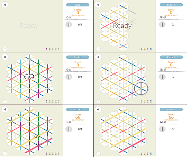
The goal of the first level is quite simple : align one color to form a single vertical line.
Players we observed did not see the goal area on the right, focusing entirely on the grid of lines.
Matching lines of the same color is obvious enough, but not the target.

A while later, the player is completing all lines of one type, still not understanding why he’s not progressing in the game.
This is a typical case of selective attention / change blindness, and the players failed to notice the game’s goal throughout several levels.
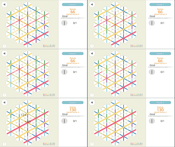
Later, still in the first level, the player realises that he can create lines in other directions, yet he keeps failing making a vertical one to complete the level.
When the player finally completes the game, he isn’t given time to understand why he won.
As seen in the previous animation, the “win” dialog is displayed as soon as the player completes the game, without a transition.
This is very confusing for the user who can complete several levels without understanding why he completes them.
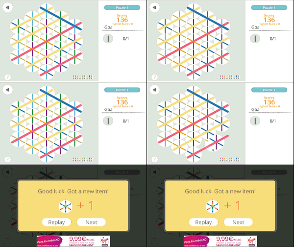
To make the winning condition and goal easier to understand, making the “win” pop up appear just after the scoring feedback may help the user to understand which end situation lead him to win.
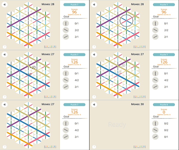
Later in the game, we can observe other, smaller issues that are more or less related to this first one.

The transition between two levels is extremely fast…
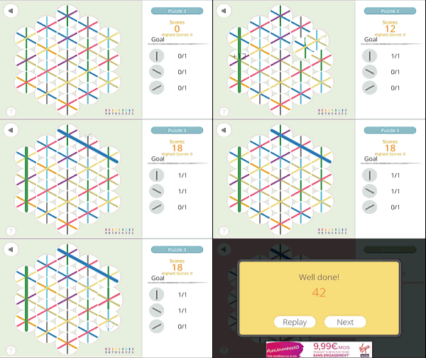
but the loading animation of a new level is a bit long, and gets frustrating after a while, for the player, who just wants to start playing.
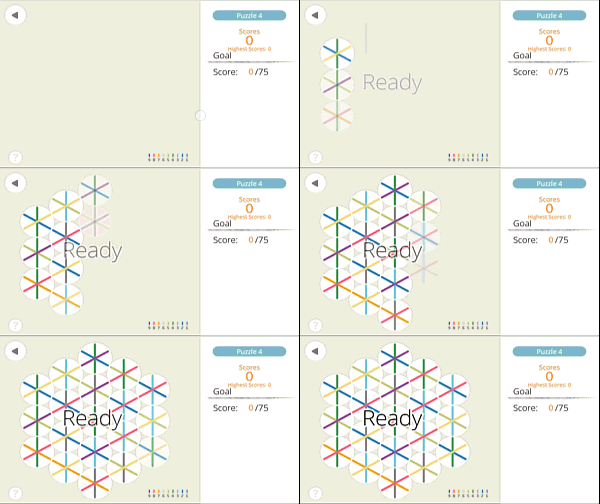
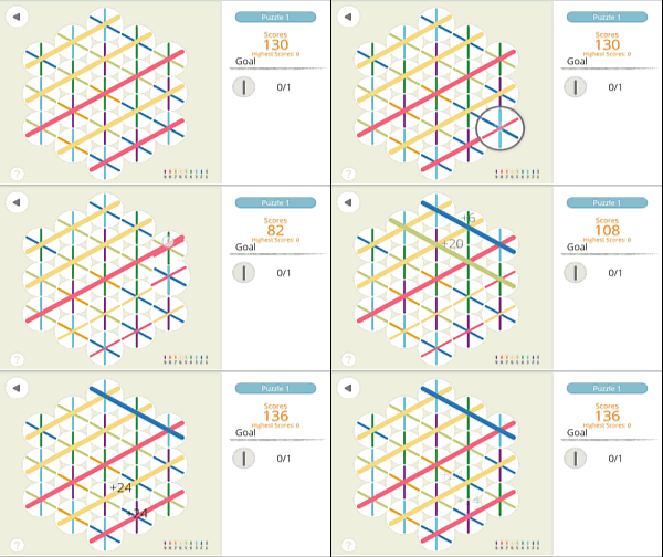
It is unclear for the player that he can switch tiles that aren’t next to each other. Players took, again, several levels to realise this.
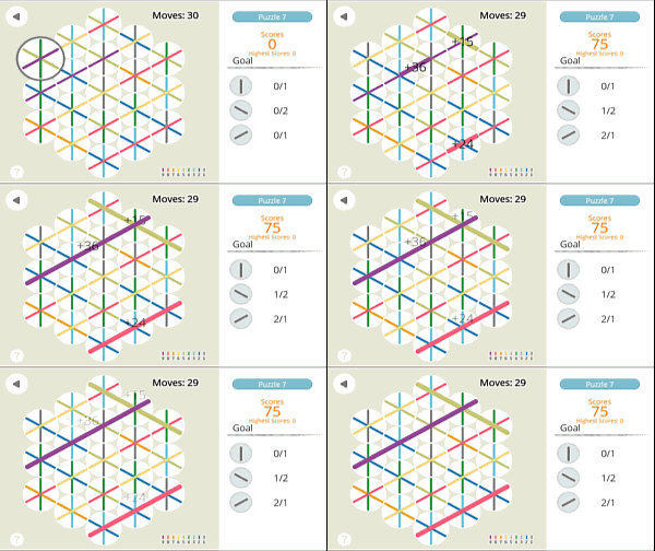
On the plus side, notice the feedback on the score increase when the player matches colors : the number of points added is clearly identified, and helps the player understand the impact of his action on the score.
Articles on similar topics
The Mass Effect series
Game Usability reviews, Game user experience analysis,
A game usability review of Triple town
Game Usability reviews, Mobile game user experience,
A game usability review of Amazing Brick
Game Usability reviews, Mobile usability, Mobile game user experience, Game user experience analysis, Initial experience, Out of box experience,
A game usability review of Auralux
Game Usability reviews, Mobile usability, Game user experience analysis, Initial experience, Out of box experience,
A game usability review of Ollie Pop Retro Skateboarding
Game Usability reviews, Game user experience analysis, Mobile usability, Mobile game user experience, Initial experience, Out of box experience,
A game usability review of Time of Exploration
Game Usability reviews, Game user experience analysis, Mobile usability, Mobile game user experience, Initial experience, Out of box experience,