Usability issues that break Tale of Tale’s Sunset experience
- Clearly defined tasks
- Narrative choices
- Tutorials and controls
- Zoom to collect
- Not knowing how to zoom breaks the whole game
- Conclusion
Sunset is the last of Tale of Tale’s games, and their first commercial attempt. We’re not going to discuss in depth the business issue, there’s already all the tough love for Tale of Tales out there, and it pretty much matches my point of view.
Don’t get me wrong, I love Sunset, as much as The Path or The Graveyard. The idea behind it is awesometo me. But that’s just because Tale of Tales inspire me, and I have an infinite patience with their games that most players I have watched play Sunset do not share.
This review is going to highlight 3 usability issues that can break Sunset’s experience.
Clearly defined tasks
Provide clear goals
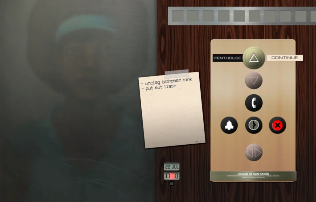
The to-do list is kind of nice. It gives a clear overview of the tasks at hand, yet the player can decide to do this or not. The all done! notice also helps to figure out if hidden interactions remain.
These “clearly” defined tasks aren’t clear at all though. The player has to walk around the whole house each day to find where the task is, with little to do in any other places. And the task is often not even explicit. For example “Pick up papers” means pick up a paper boat in the pond. I’ve seen players walk around, looking for pages scattered around the floor and never finding them.
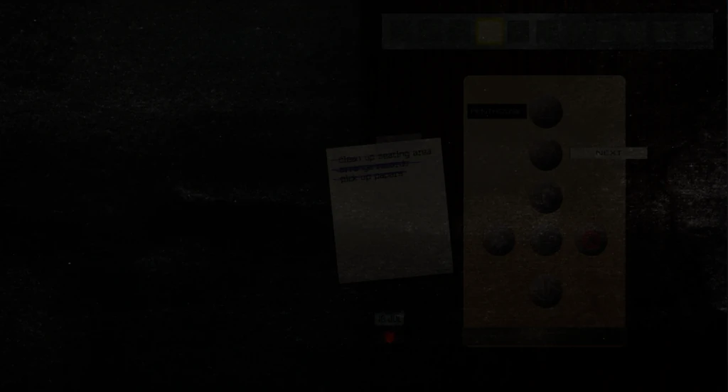
Aside from the one day where the lighting is too poor to read anything, this feature has one bug that badly influences gameplay, and creates great frustration for players :
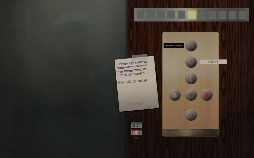
When a task is written on two lines, only one is striked through. When the following task is done, the strike will be displayed on the line above it, making it seem like the task was not validated.
It’s pretty funny to watch players run around looking for a task they’ve already completed, but that’s usually not what we’re trying to accomplish when making a game. This is definitely not fun for the player. And their reactions get even worse when they finally figure out the bug during their second playthrough.
Narrative choices
One of the core features of the game is the ability to make choices about how to clean the house. You can fold a poster or hang it, you can put away a book or take it home, you can steal money or leave it n the counter… Each choice influences the player’s relation with the home owner, Gabriel Ortega. When the only choices one can make are small, they matter.
Narrative choices are difficult to make
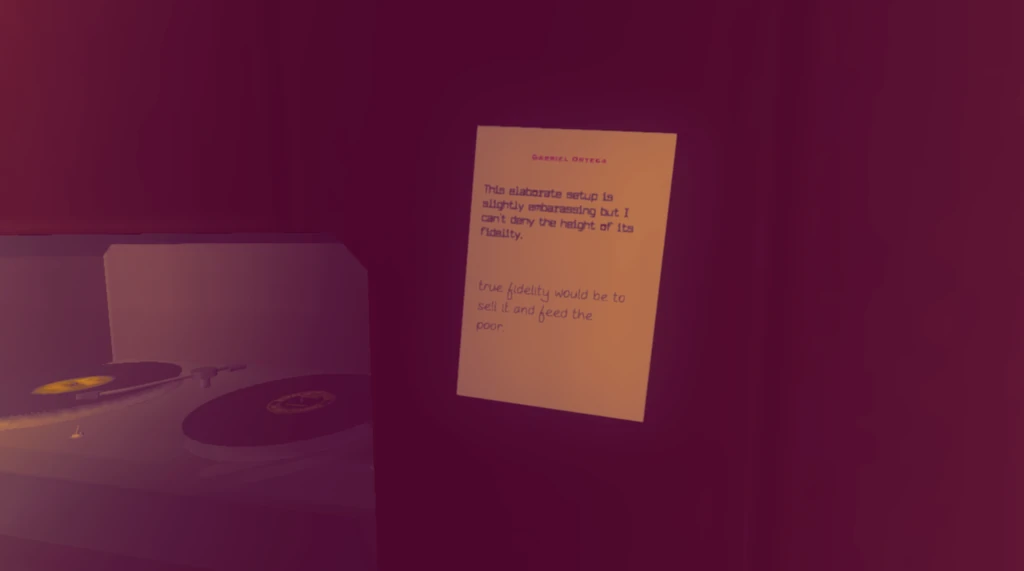 Choices are represented by different color interactions (red for flirty, blue for professional), that have to be triggered with different inputs. Nice idea to let people roleplay their reactions. Decide what to answer to Ortega’s notes. Decide how to carry out the tasks you were given.
Choices are not obvious, it is sometimes difficult to display each choice before deciding
- Most of the time, red is above, and blue below. A couple of times, it is reversed. Other times, it is sideways instead of vertical
- Sometimes, the player has to read the developper’s mind to figure out the alternative options before seeing them: the choices are mapped on completely different objects in the room, rather than be next to each other.
- Sometimes, it is mechanically difficult to look at the alternative choice, players move around, look at items from different locations or while sitting down to be able to see the options. For example, putting the stamps on a letter has driven a couple players crazy.
Players won’t feel they have a choice anyway
When games offer a fair choice between playing a good or evil character, players tend to play good over and over. In this game, choices are oriented questions : one is always cool and the other boring. So when a player reads both alternatives, they won’t feel like it is a real choice, but rather like there is a good and a bad option.
Lets try. How would you carry out this task ?
Task: Hang picture
- Arrange paintings with personal taste?
- Arrange paintings in a boring grid?
So players who expected to have choices, will feel compelled to give only one answer, for fear of missing out on the game. Worse, they might feel personally judged, since the game seems to tell them :
“If you’re not artsy, you suck”.
Without changing the options, the example above would be more inclusive if both options had a positive formulation.
How would you carry out this task ?
Task : Hang picture
- Playfully arrange paintings with personal taste?
- Carefully arrange paintings in a perfect grid?
Players would feel more free of their decision and included by the game, invited to express their personality. They would also feel more engaged in the game because their choices would make sense to them.
Players optimise their play even when it’s boring to do so
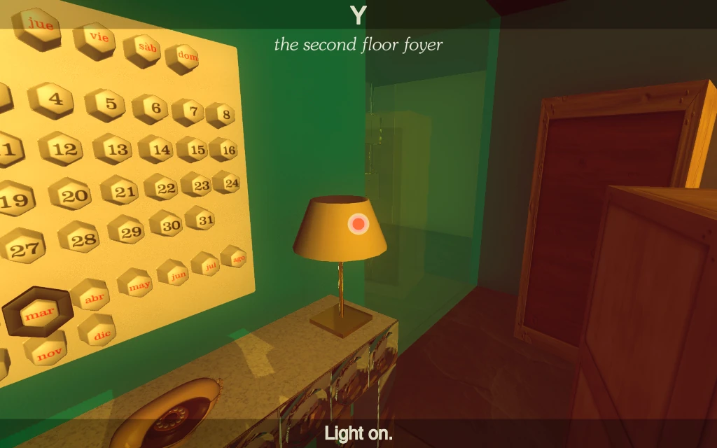
Once (ro if) you discover that the color red/yes influences the story towards romance, you figure out leaving all the lights and taps on is going to make Gabriel happy and fall in love.
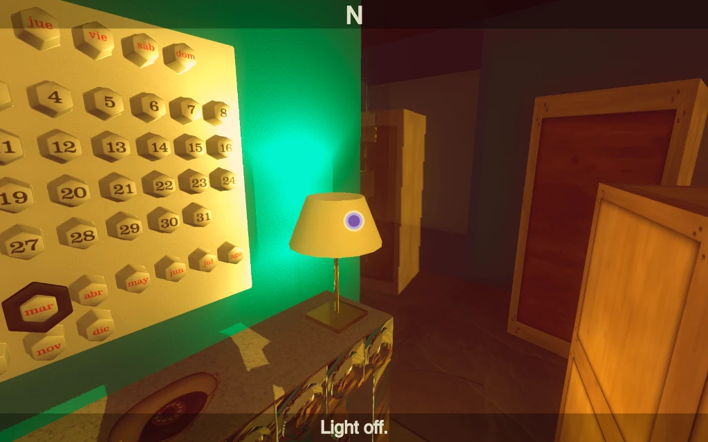
- It is not believable.
“If I had a maid who turned on all water taps, I’m pretty sure I’d fire her.”
- It is tedious! Players who know this will try to optimise for it. They spend ten minutes, each day, turning on all the lights. This repetitive task will just get them bored.
Since these actions have an impact on the visual comfort for the player, it would be better not to encourage this behaviour and leave it up to the player as neutral actions. That way, they may use that time to explore more and uncover more storytelling or plot-related events.
Tutorials and controls
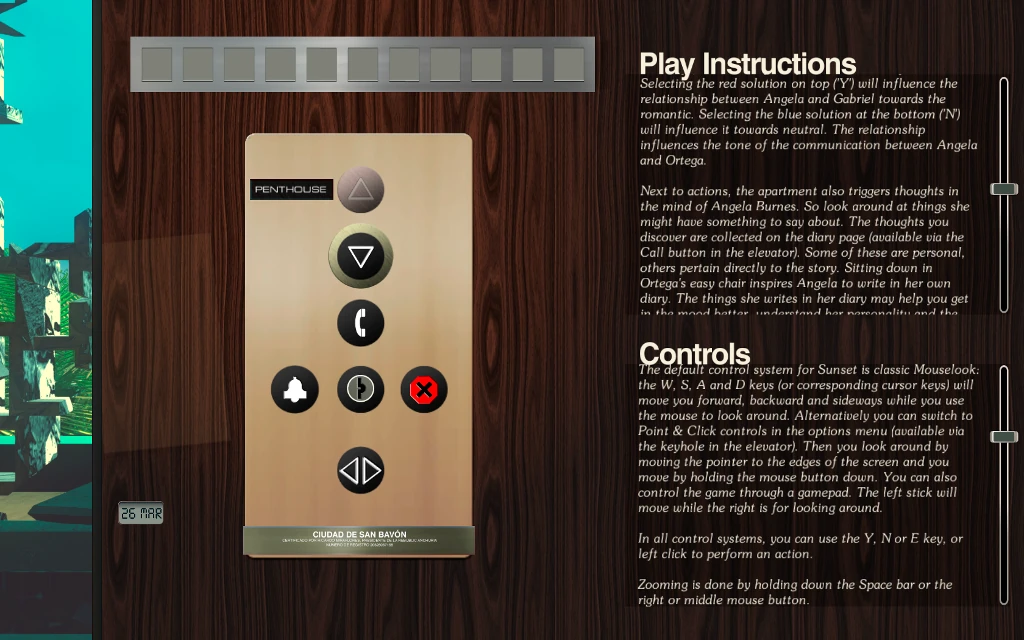 One thing to know about players is they dont read. They specially don’t read long tutorials before playing when they are forced to see them, why would they when they are hidden at the bottom of a menu…
The game has pretty classical controls, so the player can figure them out on his own. The problem is, despite its “classical” controls, the game has some mandatory, uncommon features to offer, such as the zoom, or the diary.
Zoom to collect
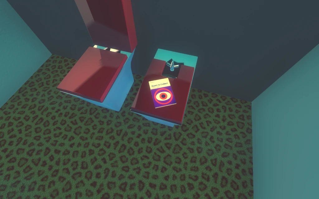 Of course there is this book, that gives you an achievement if you learn how to zoom to look at items. It requires quite some exploration to find it. Not all players have seen it on their first playthrough.
Placing the book in the middle of the living room, or adding this an one of the explicit tasks might have ensured it is found.
zoom-zoomedAmong those who found it, I’ve seen players stare at the book from all angles before just walking away, never actually using the zoom feature. Some players only figured out this existed during their second playthrough.
What does this mean for the player?
Not knowing how to zoom breaks the whole game
Without zoom, players can’t read important story-related information, like the messages displayed on a building outside the window.
Without zoom, the player can’t unlock most of the achievements, which are collecting books
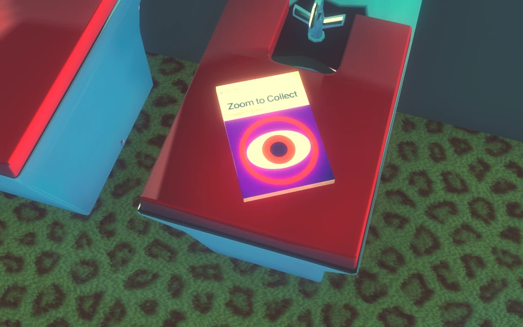 Without zoom, players can’t always read Ortega’s notes, and will miss out on the relationship building. There is an overlay, but how exactly to look at the note can be tricky, specially if you don’t know there is an overlay because you never zoomed at a note before. As a result, players can’t make meaningful decisions as what to reply. They can’t feel engaged in a friendly or romantic relationship.
There are many options to avoid this bad experience
- Add a lightweight tutorial at the begin of the game showing the basic controls.
- Place the book at a more visible spot and show the zoom key when looking at the book, or even consider adding this as a task in the to do list.
- Display the Zoom key when looking at books, the same way the Y and N keys are displayed to trigger choice interactions, maybe only if the player is looking towards a book for a while already, or only during the first few days
Conclusion
Artsy games, even more than “regular” ones, should pay extra attention to avoid usability issues so that the player can focus on the experience, the message, the emotions the game is trying to create. In this game, two issues literally break the experience for players by preventing them from making meaningful decisions :
- Limited camera controls combined with inconsistent interaction placement make it difficult to spot interaction options
- Failing to teach players how to zoom makes it difficult to make meaningful choices
- Despite saying there is no right or wrong choices, the way they are phrased often favours one option and strips the player of his sense of freedom
What do we learn from this for future games?
- Even when using classical controls, they should be explained clearly, because all games have specific features that should not be missed
- If the player is given choices, all options of the choices should be visible and meaningful
- Players can do boring, tedious, repetitive and useless tasks because they believe they are optimising their game session. If that makes the game boring, it is better not to encourage this behaviour by giving it an impact on the game outcome.
Articles on similar topics
The Mass Effect series
Game Usability reviews, Game user experience analysis,
A game usability review of Amazing Brick
Game Usability reviews, Game user experience analysis, Initial experience, Out of box experience,
A game usability review of Auralux
Game Usability reviews, Game user experience analysis, Initial experience, Out of box experience,
A game usability review of Ollie Pop Retro Skateboarding
Game Usability reviews, Game user experience analysis, Initial experience, Out of box experience,
A game usability review of Time of Exploration
Game Usability reviews, Game user experience analysis, Initial experience, Out of box experience,
A game usability review of Shu’s Garden
Game Usability reviews, Game user experience analysis, Initial experience, Out of box experience,