Some games user research on Color Zen

Color Zen is a game in which the player needs to fill the screen with a single color. To do so, he needs to move objects around. When two objects of the same color touch, they fill the screen with that color. Sounds simple enough?
Let’s have a look at the usability wins and fails of this game !
Tested on Android / One+

The game starts up really fast. It does take the player manually through the menu and all steps though.
The game provides clear goals and explanations on how to reach those goals.
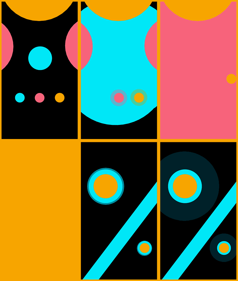
Levels are short, and the learning process during the first few minutes of the game is really fast.
Players try to match the color of an object with the wall of the same color, during the last action. They would expect the wall to react in the same way as other objects of the same color.
 In the previous animation, you see the actual behavior of the game. In the following animation, you can see how the player expects the game to behave.

Specially during the last steps of a session, players tend to repeat this kind of error, although it doesn’t prevent them from completing the game.
As an extension, the player also expects this to happen by domino effect when he indirectly moves objects towards the wall, and this is his last move.
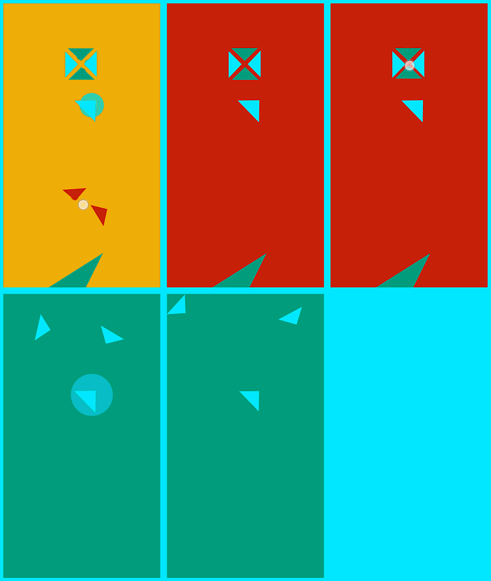
For example in the previous screenshot, the player matches the green objects, and waits expectantly for the blue ones to touch the border, before realising it won’t work, and completing the game.
The domino effect would make the game a lot more difficult, forcing the player to pay attention to what collides as a side effect of his movmenets. It would definitely feel rewarding though, to complete a level in a single, smart move.
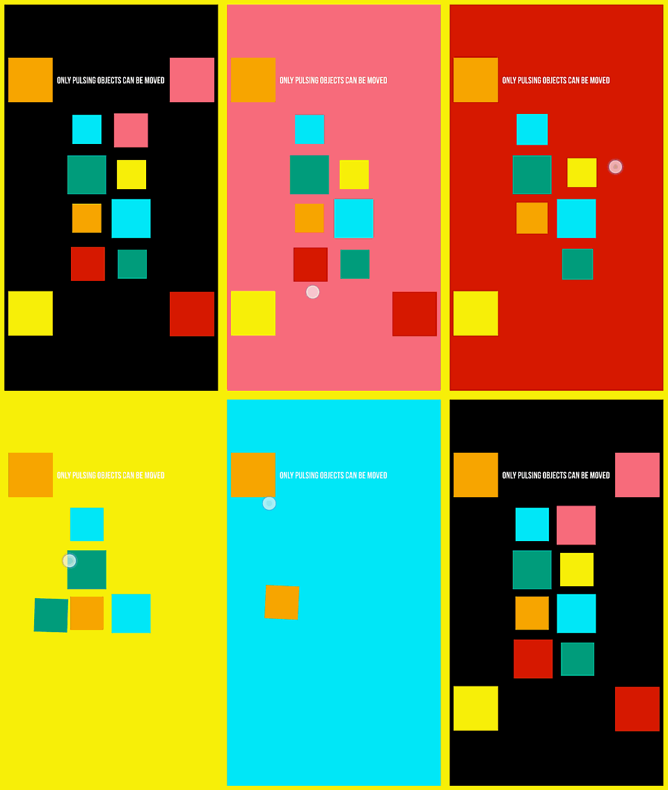
It would make the level from the following screenshot a lot harder though. It already requires more dexterity. As you can see, this later level also contains a new tutorial. It explains that some objects can’t be moved around. The player already encountered this situation earlier in the game, but in case he didn’t actually pay attention and explicitly learnt it, it is a nice reminder to make sure that the player knows the trick before actually needing to use it repeatedly in later levels.
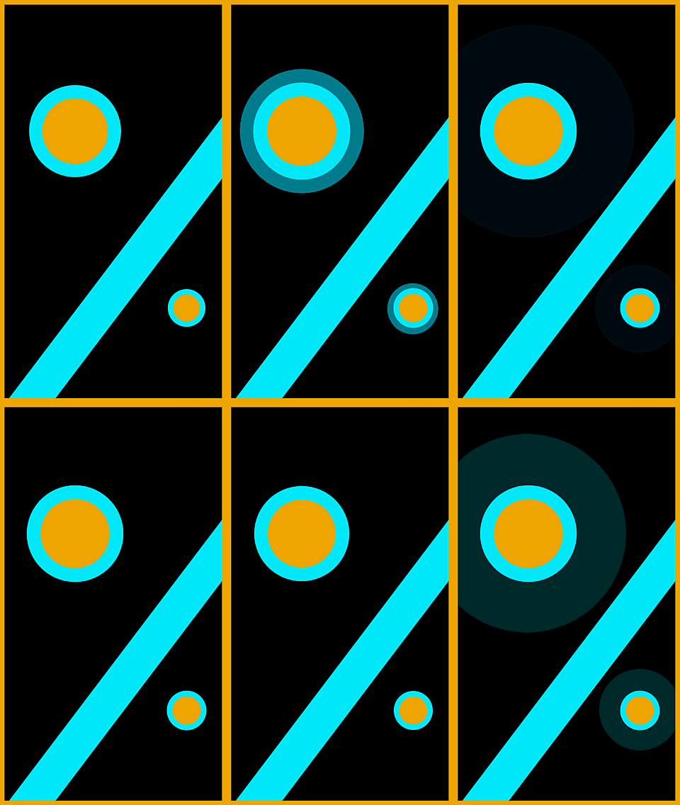
As written above, not all objects in the game can be moved. Those the player can manipulate are clearly distinguished by their pulsing animation.Some players might have noticed it already in the begin of the game with the level in the shape of a %. For others, there is a tutorial later in the game, as explained above.

This animation also adapts to the progression in items the player can move : items linked together pulse as one, separate items give a separate signal. This makes it easier to understand complex situations later in the game, as in the next screenshot.
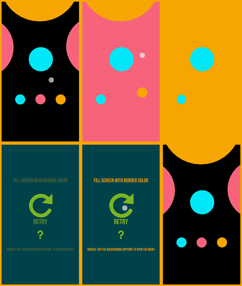
One issue player repeatedly encounter, is that despite clear colored borders to show the target color of the level, players tend to forget the objective, and sometimes need to replay a level, for lack of attention. This can happen on quite simple levels, as seen on the previous screenshot, or on more complex ones.

Making the boarder more thick, as in the tutorial might help the players to remember it more easily, or at least, to have more trouble forgetting about it.

A small annoyance in the game is the intrusive “buy now” dialog, that confuses the user by popping up right after the start of a level, rather than in between levels.
This disrupts the game experience and creates confusion for the player, who takes a while to realise what he’s looking at, and possible tries to figure out what he’s supposed to do. The animation of a level also contributes to confusing the user, by distracting his attention, taking it away from the message by drawing its eyes to the movement in the animated area, wich doesn’t help him to understand and make a decision.

Lastly, leaving the game is quite pleasant, it is fast and rewarding to see the progress made even in a short playing session. As a result, it may encourage the user to play again: he gets a sense of progression and of incompleteness that is likely to lead him back, realising that he has unfinished business in the game.
Articles on similar topics
The Mass Effect series
Game Usability reviews, Game user experience analysis,
A game usability review of Triple town
Game Usability reviews, Mobile game user experience,
A game usability review of Amazing Brick
Game Usability reviews, Mobile usability, Mobile game user experience, Game user experience analysis, Initial experience, Out of box experience,
A game usability review of Auralux
Game Usability reviews, Mobile usability, Game user experience analysis, Initial experience, Out of box experience,
A game usability review of Ollie Pop Retro Skateboarding
Game Usability reviews, Game user experience analysis, Mobile usability, Mobile game user experience, Initial experience, Out of box experience,
A game usability review of Time of Exploration
Game Usability reviews, Game user experience analysis, Mobile usability, Mobile game user experience, Initial experience, Out of box experience,