Good game usability ideas from Tale of Tale’s The path
- Tutorials & controls
- Creating a feeling of being lost
- Interactions
- Guidance on the required character
- Passive interactions side effects
- Conclusion
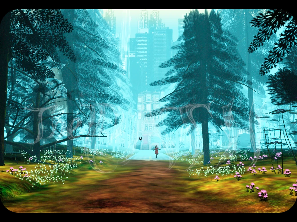
The path is a short horror game by Tale of Tales inspired by Little Red Riding hood. Released in 2009, the game is known for its uniquely feminine and grown up vision of the grey area between childhood and adulthood, where the same sentence can be cynical and innocent at the same time. Even more skeptical reviews called it a triumph of atmosphere after condemning its pretentious artsiness.
When I played The Path, I was taken by its ambiance, but I my attention was also caught by some neat implementations of good usability practices. And that’s what this article is about
Tested on PC / MAC
Tutorials & controls
You know how I was saying we will have a look at the strength of this game? Well tutorials aren’t one of them. The Path does have some flaws too after all. (I’ not even going to mention the controls)
For starters, the tutorial is pretty difficult to read. And by read, I mean both decipher the faint yellow text on the red semi-transparent background, and to understand the apparent complexity of the controls.
Basically, the player can mouse around using his mouse and keyboard in a pretty classical fashion. The interaction system however is different: when near an object, the player character will automatically interact with it if the player releases the controls. He can force or interrupt the interaction though.
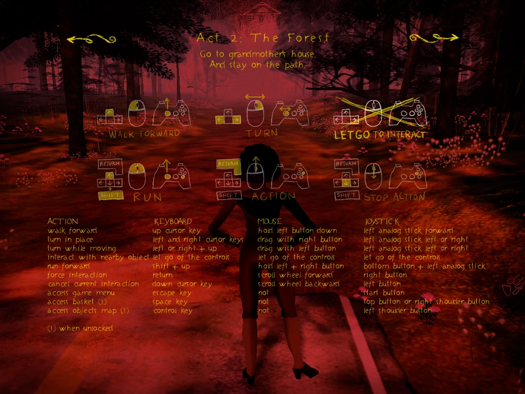
The screen is cluttered with explanations for all types of controls, and the table summarising the interactions for each device is hard to read. There is too many information at once, and while exhaustive, this makes the controls harder to figure out. A separate “page” for each device would have been better. Or better yet, display only the controls matching the device you’re detecting / using to display them (depending on the settings for instance).
But most players don’t get to this screen before they feel frustrated by some control or other, such as: “Why can’t I run anymore?” “Why did the map disappear, How do I display the map again?”
At the start of the game, part of it this information is displayed at the bottom of the screen, but sadly, the message is still cluttered by the different controller’s information, when the player is only using one of those. Additionally, the information may be difficult to read, depending upon the background color.
Players I have observed fail to understand the controls during their first playthrough, one of them abandoned because he didn’t get how to get back to the road: he tried to interact with the girl in white, and the more he tried, the less she would take his hand to bring his back.
Creating a feeling of being lost
What the path does really well lies in the core of its experience: contrasting an oppressive feeling of being lost in the woods with the safety of the path. Let’s see how Tale of Tales managed to create a feeling of being lost in the game, whithout leaving the player clueless and frustrated.
The camera
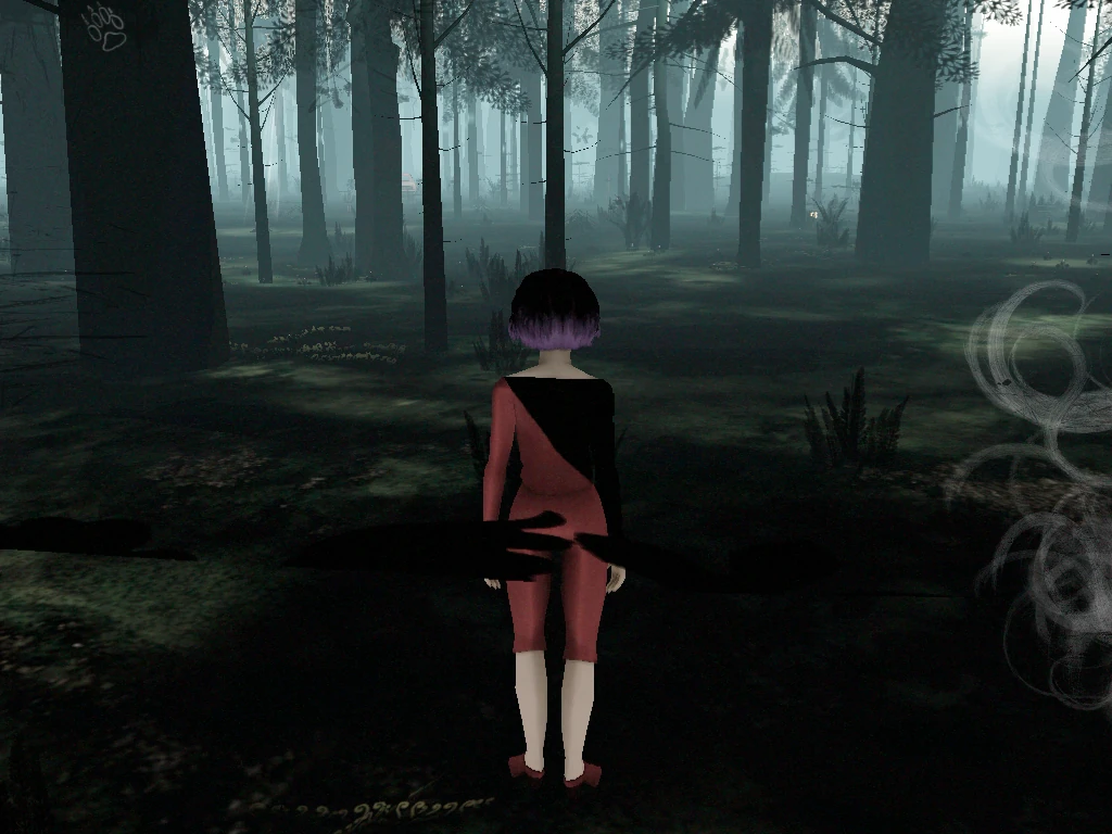
On the screenshots below, you can see the camera as the player walks, vs. as he runs. When running, the camera moves up and backwards, preventing the player from clearly seeing ahead. This is accompanied in the woods by an effect on the screen that makes the whole environment look darker the longuer you run, with a more and more oppressive sound track added.
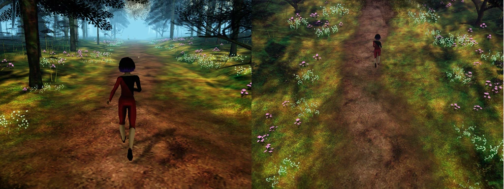
This combination of camera, audio and visual effects re-creates the feeling of running in a sort of panic, where everything around you fades and you only focus on the act of running itself. Even collectible items fade away, as one would fail to see things as they run by. This works really well for many players.
In longer sessions, for players who want to pick flowers in the wood for grand-ma, the disappearing of items gets frustrating though. As a result, players tend to do the same as what can be observed when scanning planets in mass effect 3, or scanning rooms in resident evil revelations : players will run for brief periods repeatedly, replacing the effect of feeling lost by the sheer frustration of being so slow.
Speeding up the default walking might do the trick here.
The map
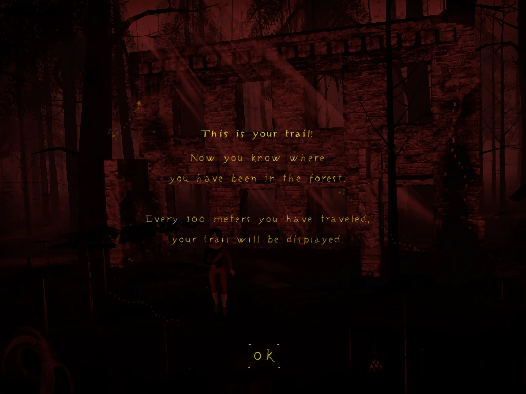
The game also provides a map, with the straight train to grand mother’s house, or the path the player walked through the forest, with a couple of landmarks they have uncovered, but not all locations. This helps the player get a minimal orientation and focuses on the exploration of new areas, rather than the identification of the forest layout.
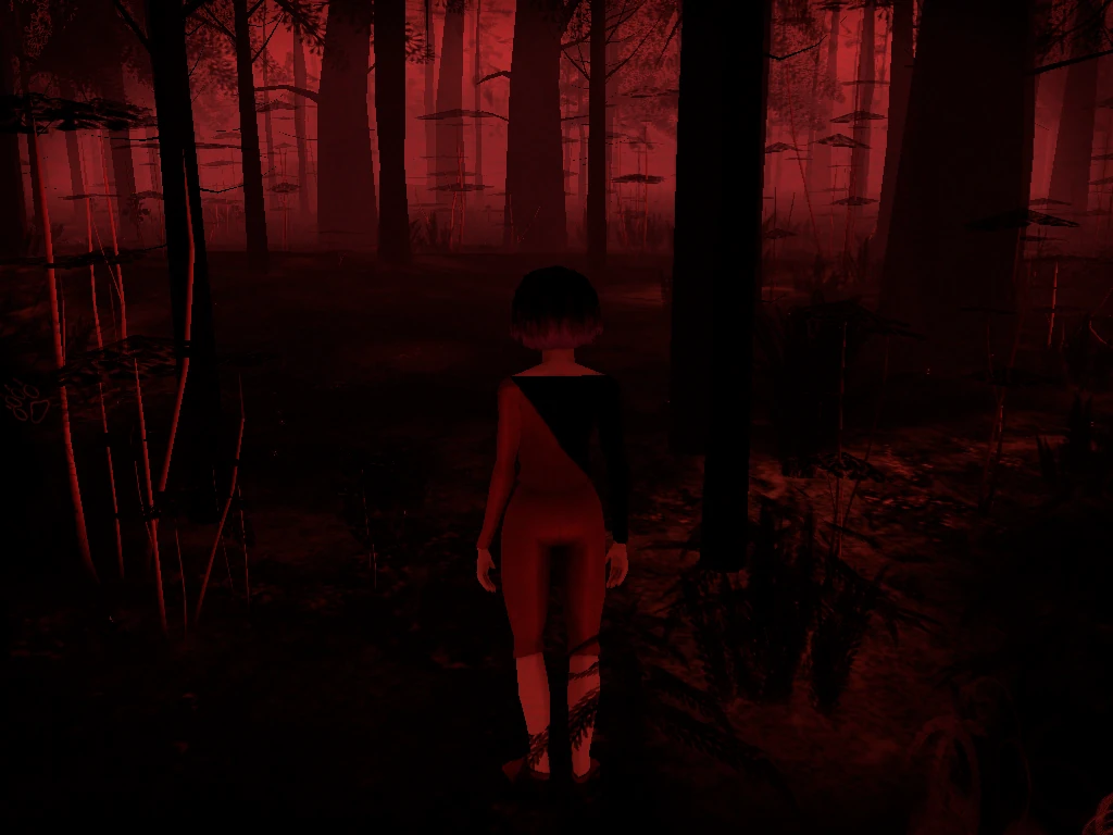
At the very start of the game, no map is available, it unlocks after some time only, adding to the feeling of being lost specially at first. Players will only see the map for a brief period of time after walking enough distance. Often, players fail to locate themselves on it before it is gone again. “Why am I punished?” is their reaction.
When the map finally unlocks, it is not felt like a reward, or progress, but rather the end of a frustration. And even then, when the player can first display the map, but no trail appears, they tend to just give up trying.
Players who looked up the input before unlocking the map have a similar experience, since they learn the input is useless. It takes them even more time to figure out that they can actually look at the map after it unlocked.
The discrete guidance
 Despite creating the feeling of being lost in the forest, the game does provide some subtle guidance, perfectly integrated in the art direction
Collectible flowers contribute to guide the player a little by following 2 or 3 of them placed in a row, guiding him to discover new items or landmarks. This only works when walking though, and does not always lead to a meaningful location.
- A girl in white wanders the forest, never vary far from the player. Only she can lead the player back to the safety of the path.
- The horizon of the forest is lighter or darker in certain areas. Going towards the light is likely to lead to a major landmark
- On the edges of the screen, artsy marks indicate the general direction of the girl in white, the wolf and, when nearby, landmarks or items of interest
- Sounds also play a role, as the dynamic soundtrack adapts depending upon the location, it can give a hint something of interest is nearby, though it will not actually help finding anything easily The flowers might actually have been used a little more liberally to guide the player and attract him to interesting locations
Interactions
One uncommon feature of The PAth is that to interact with the environment, the player actually has to let go of the controls, instead of doing something. This brings the player characters to life, by giving them motivations and spontaneity. It can also trigger the player’s curiosity to what will happen with this or that character.
Collecting items
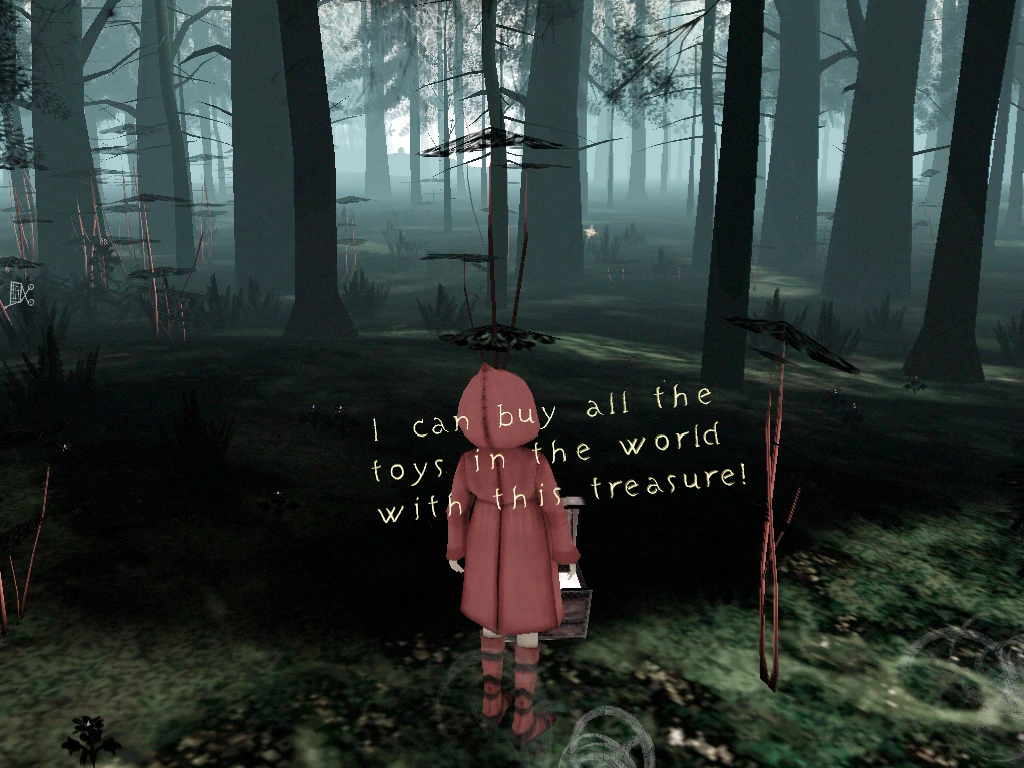 The forest hides a limited set of unique items to gather and place in the basket for grand mother, along with 144 collectible flowers. When nearby an item, a character will pick it up and comment on it. Each character makes different comments to different objects, in accordance with their age and personality.
Guidance on the required character
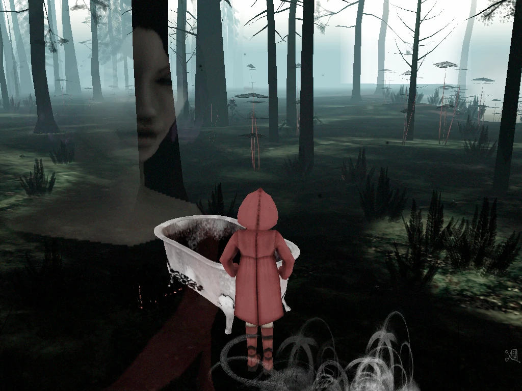 Some items can only be interacted with by certain characters. When this is the case, the game lets the player clearly know why a character isn’t interacting with this item, and shows an overlay of the character it is meant for. This helps the player form goals and understand the feature without explicitly explaining it.
This hint is quite subtle, and not understood immediately by most players, but after a while, they figure it out.
Collecting memories
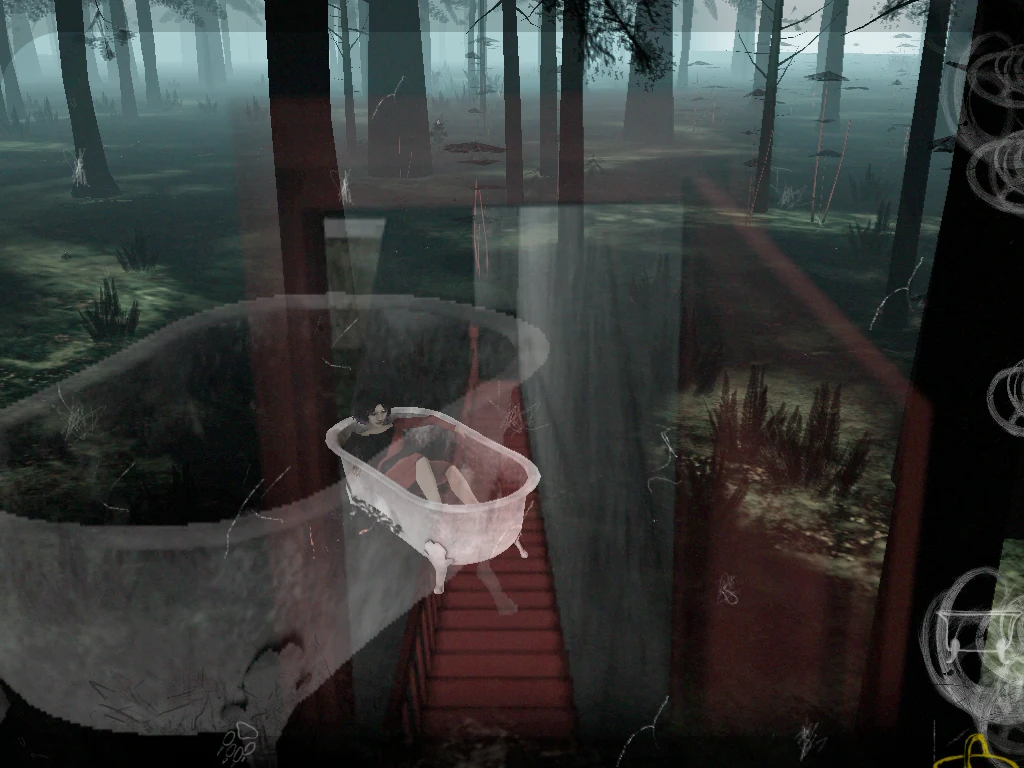 When the right character is used, these special items trigger a short animation, and an overlay indicates this time, that a memory has been unlocked. At the end of the game, the player will see something new in grand mother’s house.
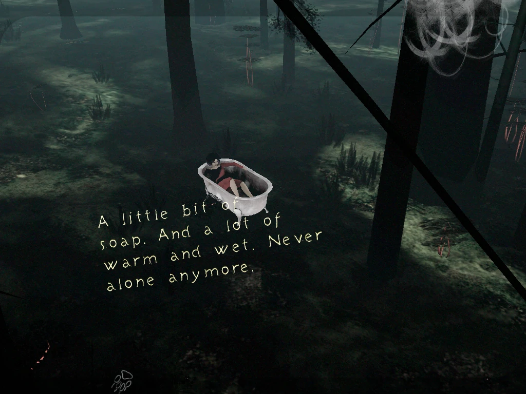 The player character also comments on the interaction, as with unique objects to pick up. Each innocent phrase can be interpreted in various ways, from really cute, childish comments, to explicitly sexual content for the older characters.
Passive interactions side effects
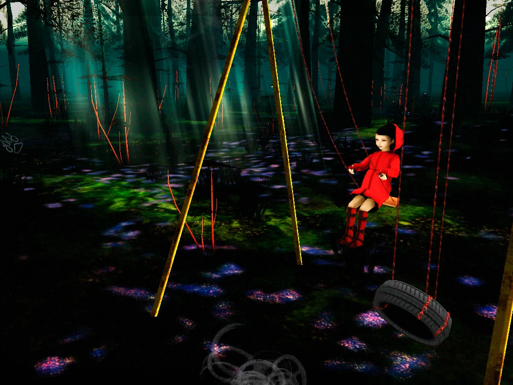
Player characters also interact with some items just “for fun”. It makes sense for them, and why not, if the player hands control over to them.
One small frustration that results from this is if the player leaves his character in the forest to grab some drink: they will likely find their character back on the road, or well on the way to it. While away, the white girl has caught up with their character and they hop merrily towards the path.
One frustration players express when going into special locations is the changes in the controls :
- the camera sometimes becomes fixed, and makes it hard to move in the desired direction, or to see where the character is or is going…
- the player sometimes doesn’t have the possibility to run anymore, specially in a large area with lakes, this just encourages the player to leave the area as fast as he can, so he can run again and avoid this annoying location. It’s a shame because there is often something interesting to find nearby…
Sometimes with readability issues
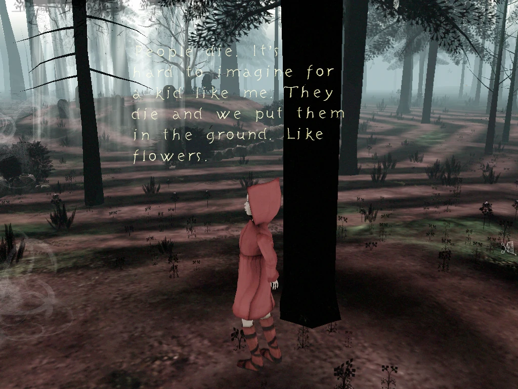
Another small issue is with the text readability : while the font is easy to decipher and the text is simple, it sometimes appears on a similarly colored background, which makes it fade into it, and become really hard to see, even with good eyes. This often happens at landmarks too, when the text feels important, because the player found such an impressive location. At these places, the camera is sometimes fixed, and some level of control is removed from the player, which makes it difficult to move to a location where the text can be read again.
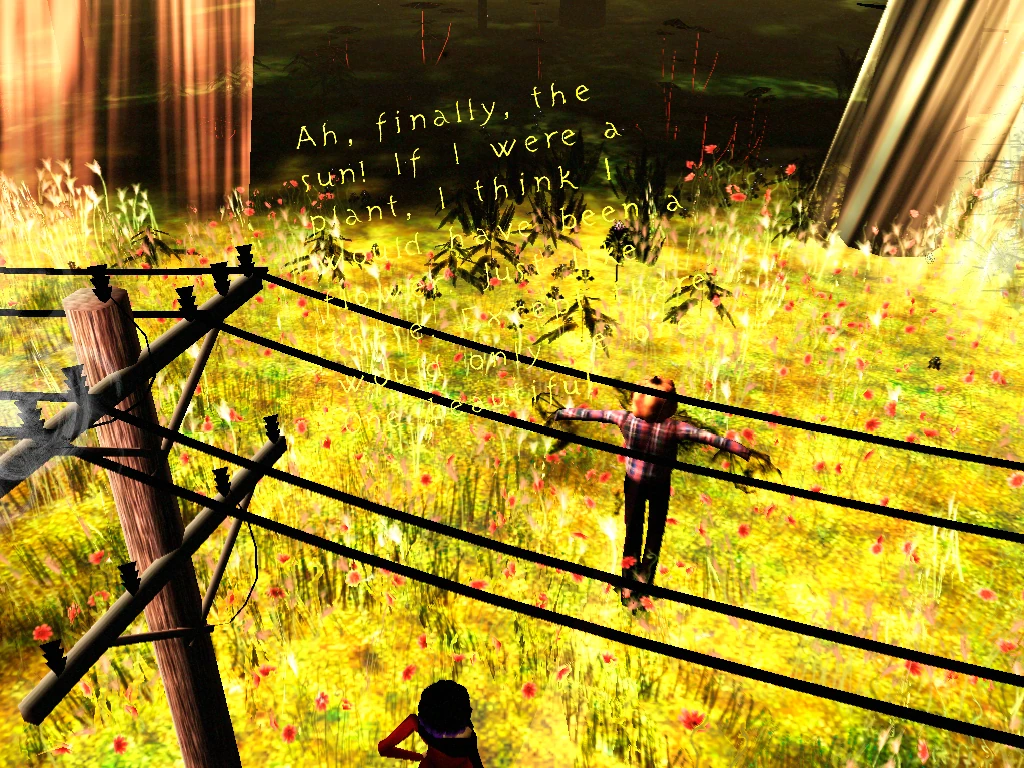
Adding a slight background behind the text would help to make it stand out more, by increasing the contrast a little. This would ensure the text can be read on any type of background image.
Conclusion
As many games from Tale of Tales, The Path’s frustrations lie in its confusing and inconsistent controls. Sometimes they feel like bugs and discourage the player, often they are frustrating and get in the way of the player’s tendency to optimise their playtime, specially for completionists who they try to collect flowers.
The Path does offers a large panel of examples of more or less subtle ways to guide players without explicitly telling them what to do or where to go
- Markers on the edge of the screen Using in game characters to provide help and guidance
- Camera effects to highlight scenes and important objects
- Audio cues about nearby locations of interest
- Light changes to help orient and attract players towards interesting locations
- Hints of which character is meant to perform an inactive action
The Path manages to create the feeling of being lost, while still providing many cues and help
- The map helps the player make decisions about his movements, without giving him the worlds layout or his specific location
- The camera contributes to make the player feel lost, running without being aware of their surroundings as in a panic
- The forest and its layout itself contribute to make the player run in circles, and feel lost as soon as the Path is out of view
Articles on similar topics
The Mass Effect series
Game Usability reviews, Game user experience analysis,
A game usability review of Amazing Brick
Game Usability reviews, Game user experience analysis, Initial experience, Out of box experience,
A game usability review of Auralux
Game Usability reviews, Game user experience analysis, Initial experience, Out of box experience,
A game usability review of Ollie Pop Retro Skateboarding
Game Usability reviews, Game user experience analysis, Initial experience, Out of box experience,
A game usability review of Time of Exploration
Game Usability reviews, Game user experience analysis, Initial experience, Out of box experience,
A game usability review of Shu’s Garden
Game Usability reviews, Game user experience analysis, Initial experience, Out of box experience,