A mobile game usability assessment of Hacker
Hacker is a small puzzle game in which the player needs to connect computers to a power source by rotating pieces of wire to create a fully connected network.
Tested on Android / Samsung Galaxy S3
While the game starts-up quickly, it shows an add before the game is even seen. This sends a negative message to the player: you already send him away from your app before he even tried it out.

Despite this, the games starts up extremely fast, directly to a tutorial on the first launch. The first screen explain the basics of the game. The second screen puts the player in a game session directly.
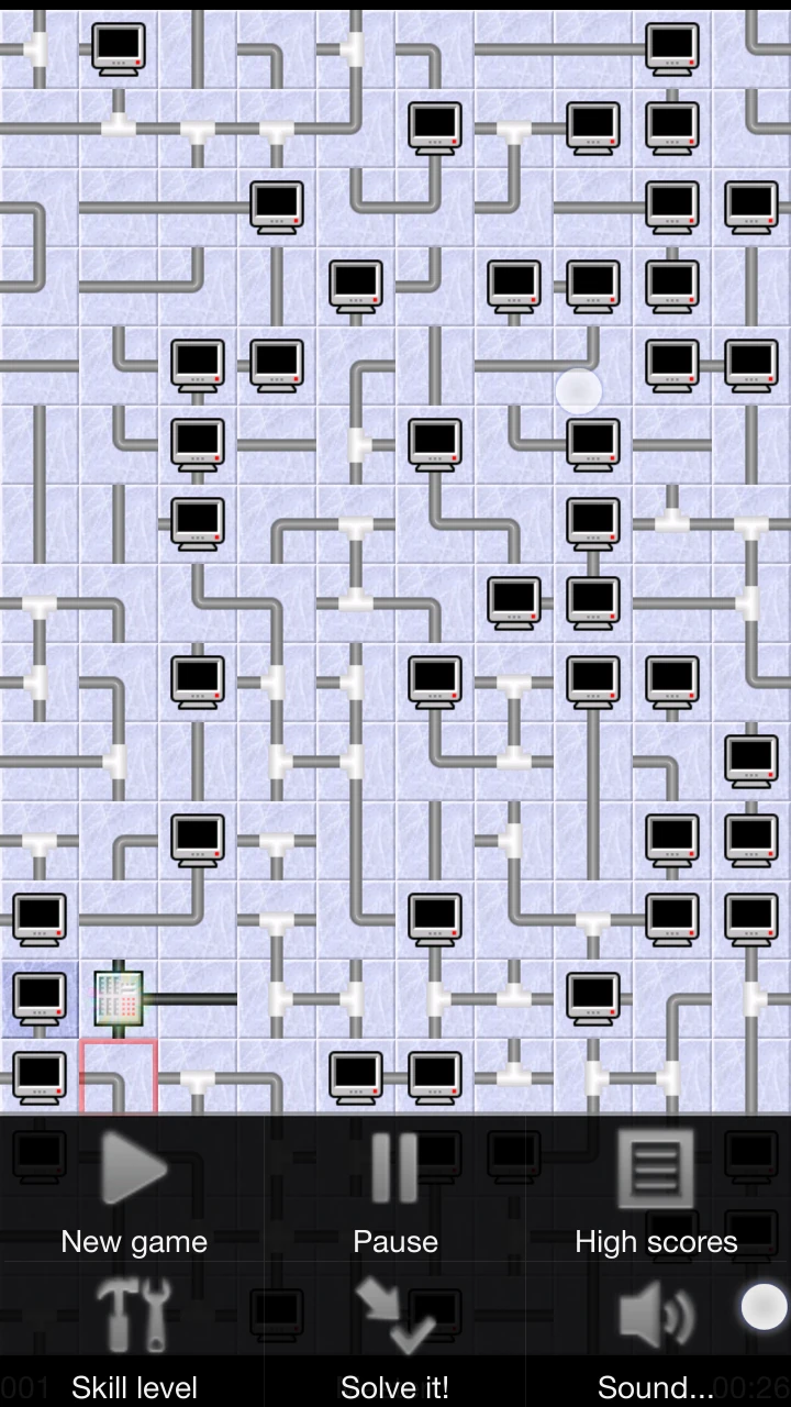
For mobile, the target sizes of the interactive items are exactly the minimal recommendation, and are relatively easy to manipulate even though they seem small. The same size is used for both beginner and expert levels, which means the game doesn’t get less usable with the player’s progression in difficulty. The game is also rendered more consistent this way, and can reuse the same assets for all levels.

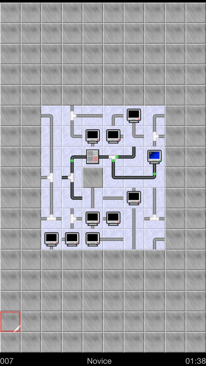
The game status gives clear feedback on rotations, and clearly shows which wires and computers are connected to the power source, and how the power flows through them.
It is not clear from the start that the game will take completion time for setting highscores. A timer is visible on the screen, in the lower right corner. Yes, that’s right, just where the user can’t see anything because that area is usually hidden behind his right thumb. As a result the option to pause the game may also be a bit confusing and seem useless at first.

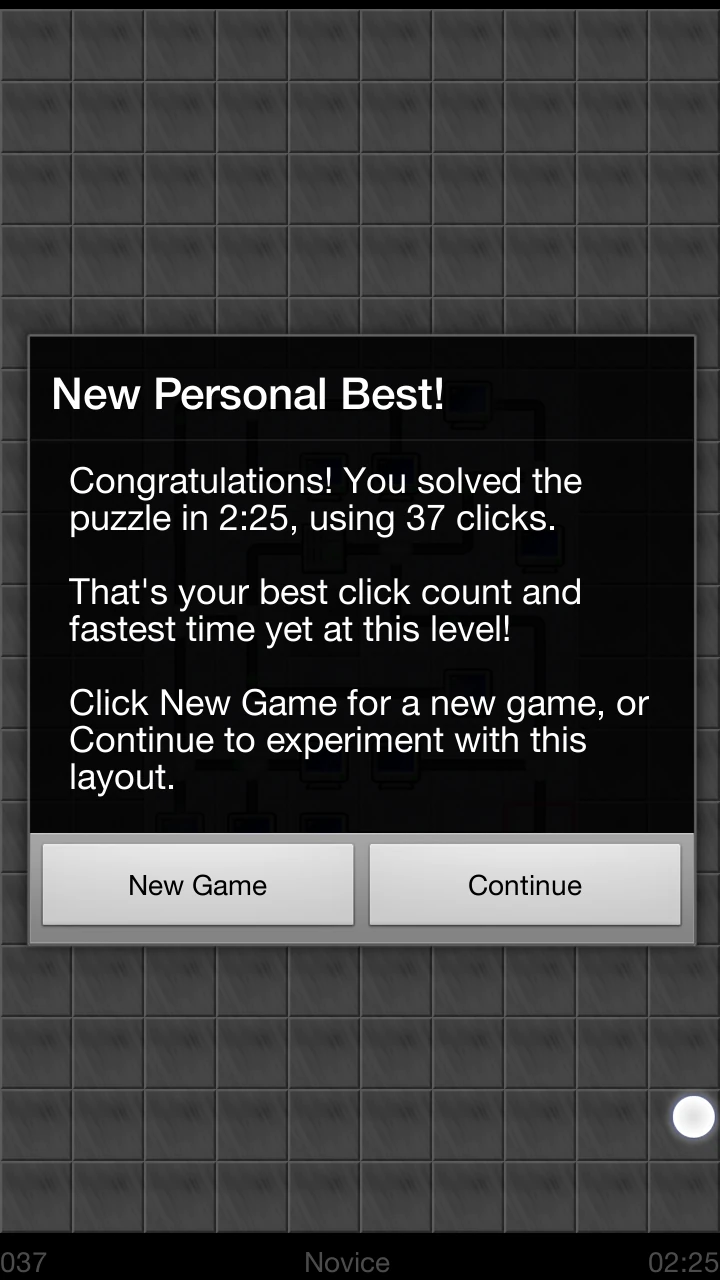
When the player has completed his first game, a dialogue will congratulate him and explain the score. In that dialogue is a continue button.
The player will expect this button to take him to the next levels, as seen in many other games. However, this only closes the dialogue and leaves the player on the previously competed game. He then has to manually launch a new game from the menu, using the device’s button.

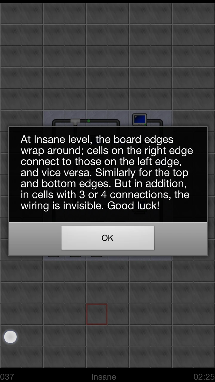
In the menu, the player has the possibility to change the game’s difficulty. When a difficulty is selected, the game will explain in a modal window what the difficulty level implies in terms of new rules and constrains. This requires the player to try all difficulties if he wants to set the game directly to something harder, but doesn’t know what level would be right for him. Many taps that could have been avoided with a small description next to each choice.
Articles on similar topics
The Mass Effect series
Game Usability reviews, Game user experience analysis,
A game usability review of Triple town
Game Usability reviews, Mobile game user experience,
A game usability review of Amazing Brick
Game Usability reviews, Mobile usability, Mobile game user experience, Game user experience analysis, Initial experience, Out of box experience,
A game usability review of Auralux
Game Usability reviews, Mobile usability, Game user experience analysis, Initial experience, Out of box experience,
A game usability review of Ollie Pop Retro Skateboarding
Game Usability reviews, Game user experience analysis, Mobile usability, Mobile game user experience, Initial experience, Out of box experience,
A game usability review of Time of Exploration
Game Usability reviews, Game user experience analysis, Mobile usability, Mobile game user experience, Initial experience, Out of box experience,