Tale of Tale’s Fatale - game usability issues analysis
- Unconventional and inconsistent controls
- Storytelling, illusion of choice and feeling in control
- Conclusion
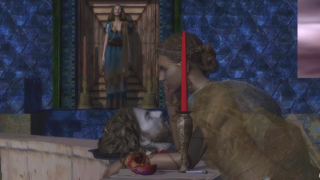
Fatale : Exploring Salome is Tale of Tale’s haunting revisit of the tale of Salome, who asked Herod to give her John the Baptist’s head. The game is split in 3 scenes :
- In the cistern, players can read Oscar Wilde’s lines to set the mood
- Exploring the terrace, players can discover the story by extinguishing candles
- Under the sun
This is a good example of a game made with thought, providing a different experience and exploring complex narration and emotions, stimulating imagination. The result is quite experimental. Players usually comment in one of two ways. Either it makes them think, about lust, about desire, about love… or they consider it the worst kind of artsy fartsy. The one thing they agree on, is that, as often seen, the game could have been be really good.
Not everyone will be sensitive to this kind of game, but as someone who likes to see variety in games, and appreciates successful alternative or experimental games, I want to dig deeper into this “could have been” and what could bring this kind of game closer to its goal, if not Fatale in particular.
Tested on PC / Mac
When playing fatale, the first experience is strange, unconventional. Controls for one thing are unconventionnal. Many games with alternative controls do work though. For example, the controls in Katamari are unconventionnal, and even unconvenient, yet the fun of the gameplay resides in them. For Fatale, there are a couple of issues I see.
Unconventional and inconsistent controls
First chapter : the cistern / dungeon
First of all, on pc, with mouse and keyboard, the controls are only partly unconventional. They are similar to FPS, but not quite. At first, they feel more like old school shooters, where you had to move the mouse around to walk. You move with WASD, but you need to click to control the camera with the mouse, else nothing happens.
Clicking will also make you move forward though… This doesn’t feel artsy or interesting to players, it only makes them frustrated by slow, clumsy and dated controls. While the slow part may contribute to the ambiance, the controls get in the way of the storytelling when the player thinks about them all the time instead of the experience itself.
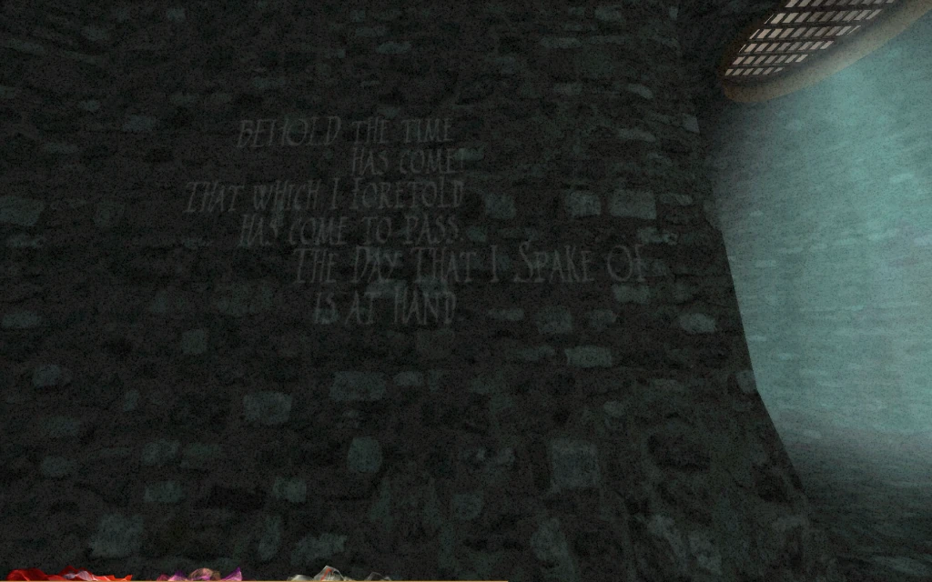
During this phase, the player instructions are to wait. While waiting, players can move around and look at texts on the walls, and some appearing in mid air over time.
It takes some time, and while it immerses the player in the ambiance, it also forces the player to pace like a prisonner, walking slowly in circles.
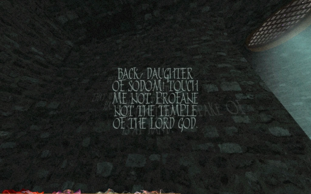
Or so it would. I’ve seen players race back and forth, pressing the mouse and the W key at the same time to run around restlessly, then just wait iddle for the timer to be over when they are tired of not finding interactions.
Second chapter
The controls change completely in the second part. Probably, they change to distinguish the physical from the ethereal nature of the player character, but it just makes things confusing.
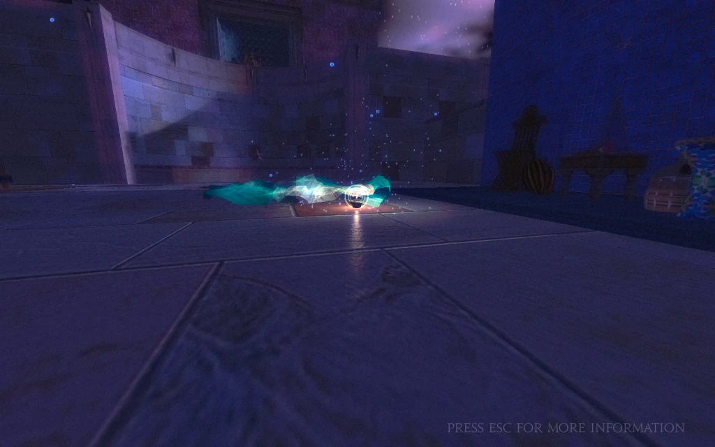
In the second part of the game, the player has to click to move and look around. Each click moves the player by one step forwards or backwards, whereas before, it made him move smoothly forward. I hear this is to reduce motion sickness, but I would be curious to read literature about it to believe it. (If by chance you know any references, definitely share it in the comments!)
The A, S and D keys are inactive. It is still possible to move forward with W, but not straight forward anymore : it moves the player character towards the location of the cursor. The tutorial however encourages the player to move using the mouse only, and click step by step through the environment.
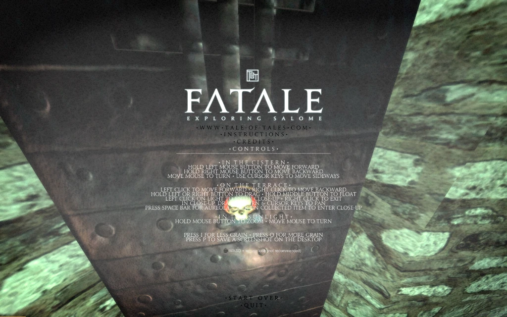
The explanation of the controls itself is confusing when reading. It feels a little like a wide range and complexity of controls was implemented. But while opening the game for more diverse play, it actually makes the controls confusing. Yet, the mouse controls alone are incredibly simple.
Strange effect, holding the mouse button in the hopes of moving smoothly forward (as previously) results in triggering an interaction on an unidentified target.
In this game, completely removing keyboard input or better yet, giving options to adjust the controls to the player’s liking, and default to mouse only might make the experience better for many players.
Now let’s move on to the next topic, while waiting for the results of this experience. Let’s discuss how to unravel the story in the terrace.
Storytelling, illusion of choice and feeling in control
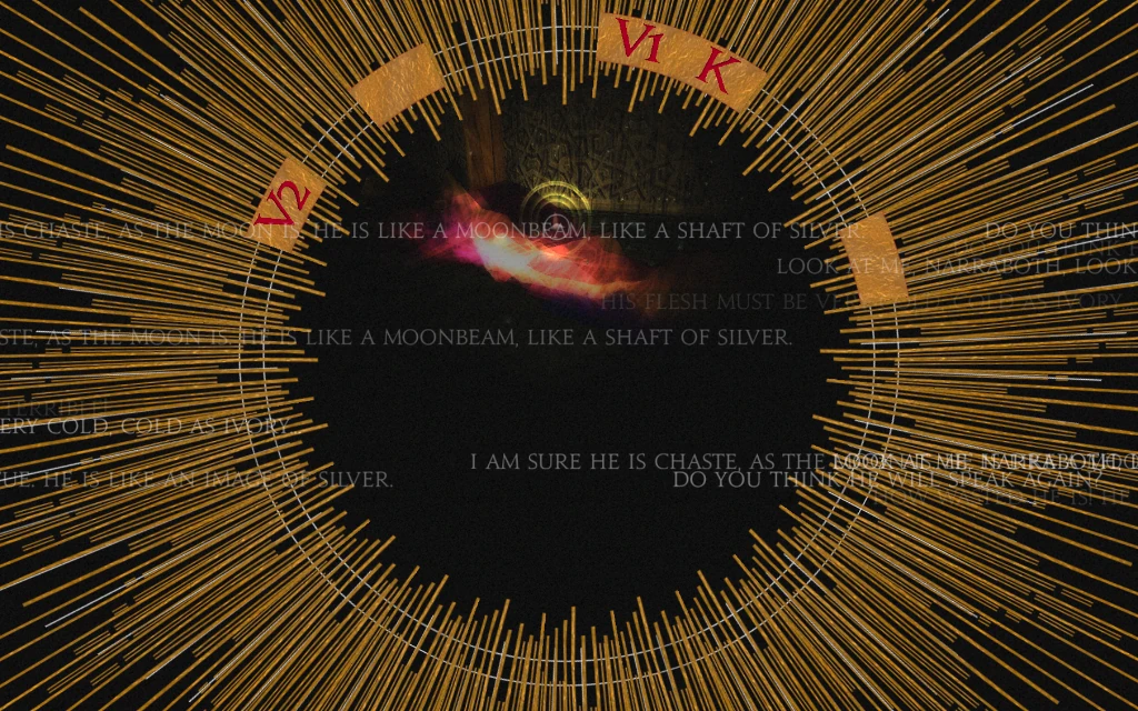
When focusing on a light by clicking on it, voices are heard and bits of story emerge.
This feature is actually nicely done. It gives a feeling of progress by activating sigils on the side of the circle. The combination of audio and written words creates an ambiance that feels supernatural at best, intriguing at least. It paints a picture of the story without telling it, and can well engage the players in it, definitely triggering the player’s imagination, as the developers intended.
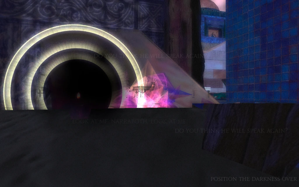
Then the player can blow the candle by placing darkness upon it. This causes new candles to light and become available.
At first, the story progresses little by little too: words are spoken, repeated and mutate into other words, different combination of sentences that mutate the story as it advances. But later in the game, the words whispered in your soul become more repetitive, sometimes breaking from the previous pattern, sometimes evolving from it. It creates some confusion. That partly comes from the colors of the flames.
Some have a blueish hue, and others are clearly red/yellowish. Warm and cold flames give an illusion of choice.
It creates two frustrations in the player: the fist one, is lack of control. Players feel they have choices, but don’t understand them. I have seen players focus on the blue or reddish ones, spending time moving around, exploring to find them, before going back to their second choice when it appears there are none of their favorite colour.
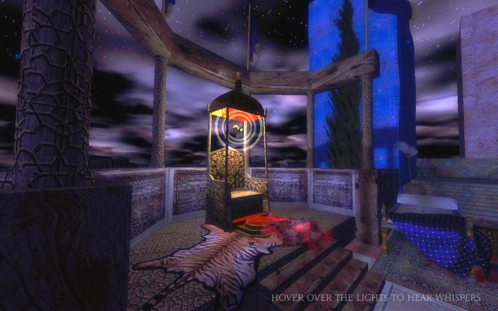
Sometimes, players are offered only one option : a blue candle or a blue candle? This makes sense, because there are no choices to be made, which creates the second frustration, and limits the replay value of the game. To the player, extinguishing only the blue flames might have an impact on the story. Combined with the variations on word combinations, players feel like their choices mattered, and not being able to make that (imaginary) choice leads players to feel frustrated, and attribute apparent inconsistencies, differences or repetitiveness of the whispered text to their lack of choice.
The illusion of choices encourages the players to explore the area far from their original position, despite clumsy controls. It is a strong motivation, also to replay the game and try alternate choices or combinations.
Fatale would have been a lot more impactful for those players, by actually providing alternate plot lines, or different ways of telling the same story. They could allow the player to kill or to spare, to feel thankful, comfortable loving a severed head, or hate and shameful for falling to carnal desires.
If the complexity of feelings is too valuable to split them in different options, a single design for the lights, flames and their halos would make the whole experience more satisfying for players, by removing unnecessary confusion and complexity to the game.
Conclusion
Generally, the game does a good job at creating the picture of Salone’s world and stimulating the player’s imagination. Sadly, basic usability issues prevent some of the players that might be interested in the game from reaching into the rich storytelling : the awkward controls are a barrier making the game less accessible at the start, and players may hook off soon.
The illusion of choices given later can increase the lack of control felt by players, which will experience frustration from not seeing or understanding effects of choices they made. Fixing those two issues by simplifying the controls – giving alternatives only as options – and removing cues that hint at non existant choices would make the game more accessible and pleasant to a wider audience.
Yet, let’s not forget this review is about a game from 2009. Game usability preoccupations have gone a long way since then. As a matter of fact, Tale of Tales possibly made the best decisions they could in 2009 to make their vision come true, they proposed innovative features that worked really well in The Path, and keep improving their productions, as we will see in our upcoming review of Sunset.
Articles on similar topics
The Mass Effect series
Game Usability reviews, Game user experience analysis,
A game usability review of Amazing Brick
Game Usability reviews, Game user experience analysis, Initial experience, Out of box experience,
A game usability review of Auralux
Game Usability reviews, Game user experience analysis, Initial experience, Out of box experience,
A game usability review of Ollie Pop Retro Skateboarding
Game Usability reviews, Game user experience analysis, Initial experience, Out of box experience,
A game usability review of Time of Exploration
Game Usability reviews, Game user experience analysis, Initial experience, Out of box experience,
A game usability review of Shu’s Garden
Game Usability reviews, Game user experience analysis, Initial experience, Out of box experience,