A game usability review of Box Pop
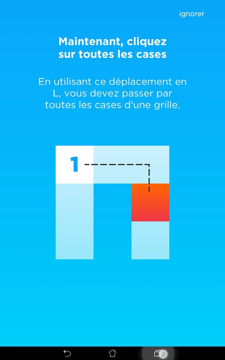
Box pop is a game in which the player has to move a knight – as in the chess piece – on each spot of a predefined grid, but only once to complete a level.
Tested on Android / Asus Transformer Tab
Box pop starts up with a connection request, while the player doesn’t yet know if he even is going to play the game. This is a bit too intrusive, specially since it does not happen only on start up, but repeatedly when the player starts up the game.
The brief introduction story is interesting and catches the player’s attention, while actually the second step of the story immediately guides the player into an interactive tutorial.
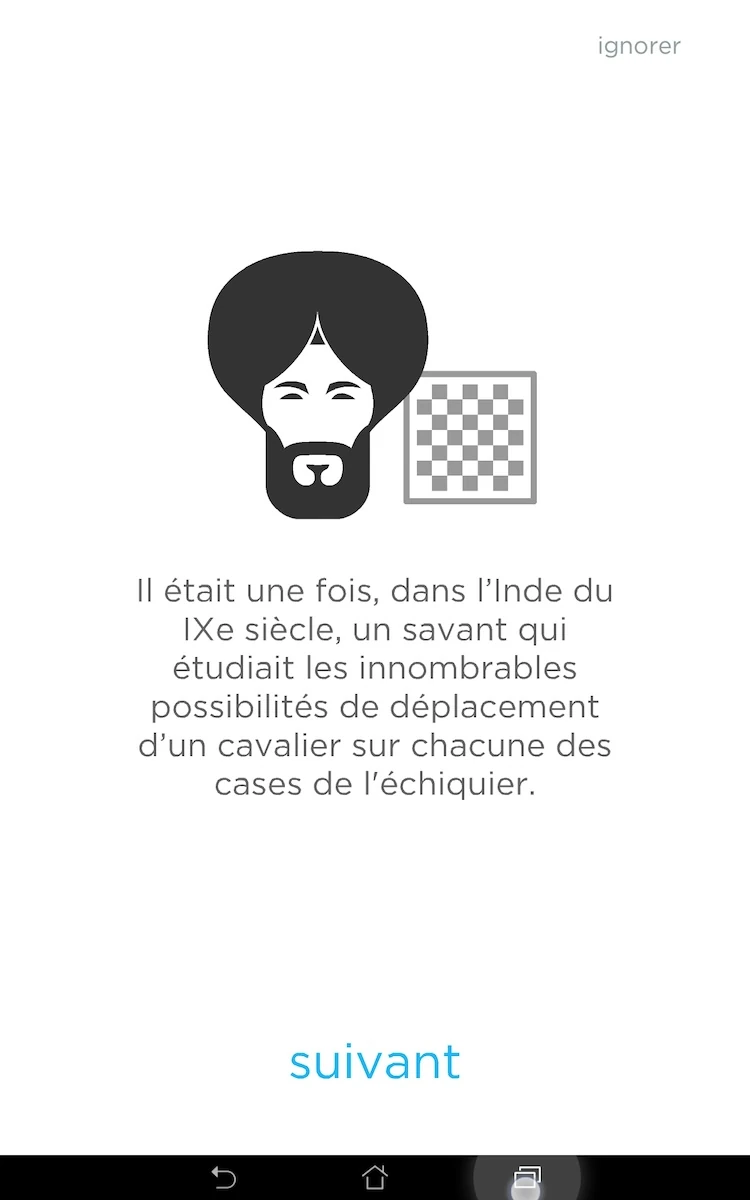
Although usually it is good to give the option to players to skip the story introduction, in this case, it might not be so simple. The player is unlikely to expect the story to turn into a tutorial in the first place, and might skip the whole thing by accident. The player would be left confused. It would be better to allow the player to skip only after he has reached the tutorial, since the story only takes one step and is extremely short.
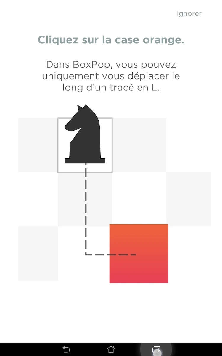
From the tutorial, the game moves on directly into the first level. the player doesn’t have to go through the whole menus at all, and can start playing immediately. Before he knows it, he has played the two first levels. Once a level is finished, the game offers to move on to the next without going back to the menu every time.
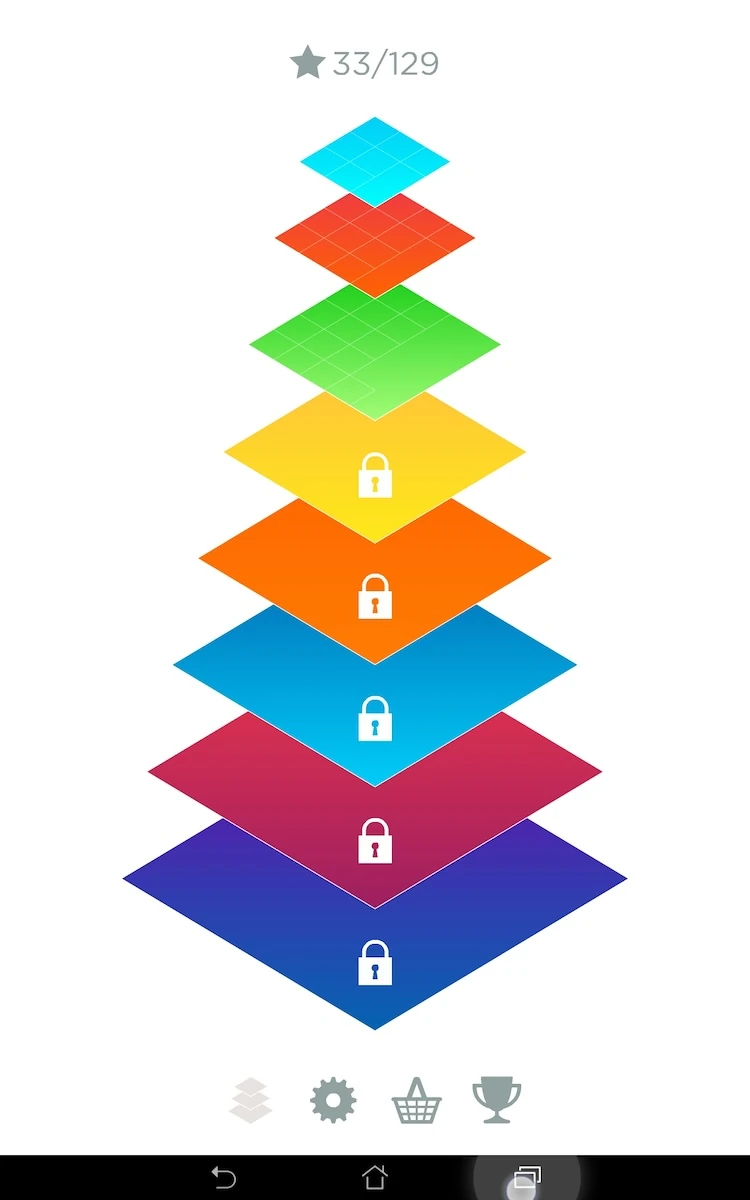
The screen presenting the levels at that point might be a little confusing. The menu show the number of stars acquired throughout all levels, and not the level numbering.
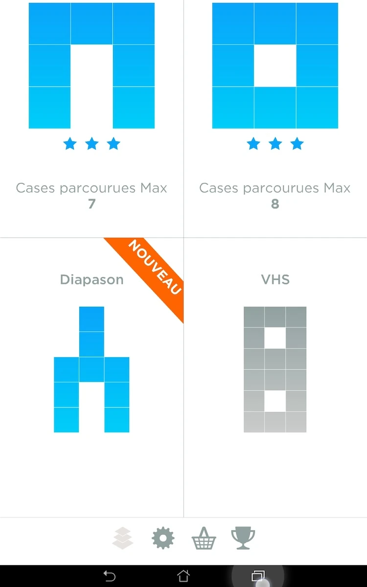
The player might think he has played though levels 7 and 8, where in fact, he gathered that much stars from his previous games. It can create a little confusion and hesitation at first. It’s not a big deal, but since we are still in the first few minutes of play that are critical to engaging a user and convincing him to keep playing, a little extra care couldn’t hurt.
Another usability issue comes with the access to the next level after completing one. In game, all actions from the player are replayed to summarize his actions. During this animation, the player sees how many stars he won on the level. Next, the congratulations dialogue also counts up his score, and only when this score is completed, the button to access the next level appears.
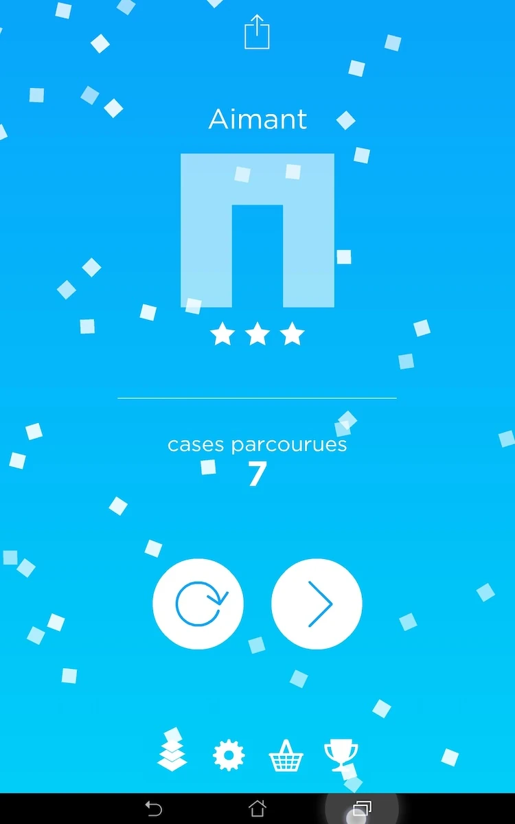
This is annoying because the player already knows if it is going to appear or not, from the number of stars he got. Impatient players might actually replay the same level by accident by trying to skip and play on as fast as they can. Since neither animation can be skipped, the player just has to deal with the waiting. This could definitely be avoided to enhance the player experience throughout the whole game.
The share button on this screen is also unclear. The icon used is not the usual one, and although an arrow moving out of a box can be understandable, this typical icon is more common for uploading things to the cloud. Although its great the suggestion is visible but not intrusive, the player will not be encouraged to share if he does not understand the feature.
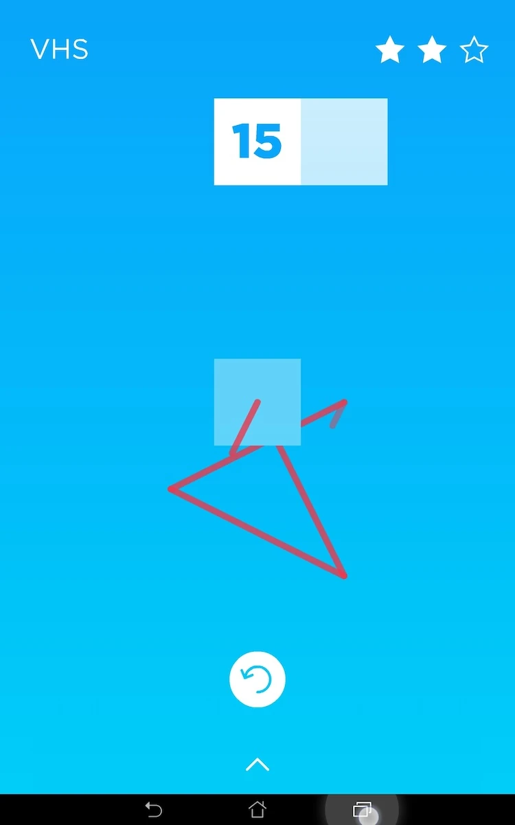
The menus clearly display the level based structure of the game – though some icons aren’t explicit. For example, the menu button looks like the shape of the menu which is not familiar to the user the first time he sees and can use that button.
The app respects the functionality of the native buttons from the device. The back button closes the game with no confirmation.
This can lead to errors, but accommodates mobile usage well. It is acceptable because the game is saved and restored easily exactly as it was. It would be a bit better if there was at least a confirmation of the action by pressing the back button twice to make sure the input is voluntary.
Articles on similar topics
The Mass Effect series
Game Usability reviews, Game user experience analysis,
A game usability review of Triple town
Game Usability reviews, Mobile game user experience,
A game usability review of Amazing Brick
Game Usability reviews, Mobile usability, Mobile game user experience, Game user experience analysis, Initial experience, Out of box experience,
A game usability review of Auralux
Game Usability reviews, Mobile usability, Game user experience analysis, Initial experience, Out of box experience,
A game usability review of Ollie Pop Retro Skateboarding
Game Usability reviews, Game user experience analysis, Mobile usability, Mobile game user experience, Initial experience, Out of box experience,
A game usability review of Time of Exploration
Game Usability reviews, Game user experience analysis, Mobile usability, Mobile game user experience, Initial experience, Out of box experience,