A game usability review of Two Dots
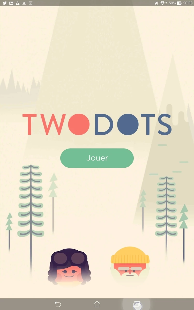
Two dots in a game in which the player has to collect different colors and elements by tracing lines between dots of the same color to make them disappear, until the targets are met. For example, the player has to collect 50 red, 50 blue and 50 yellow dots, or special items such as collect anchors, break ice or remove fire from the levels, with specific rules for each.
Tested on Android / asus Transformer Tab
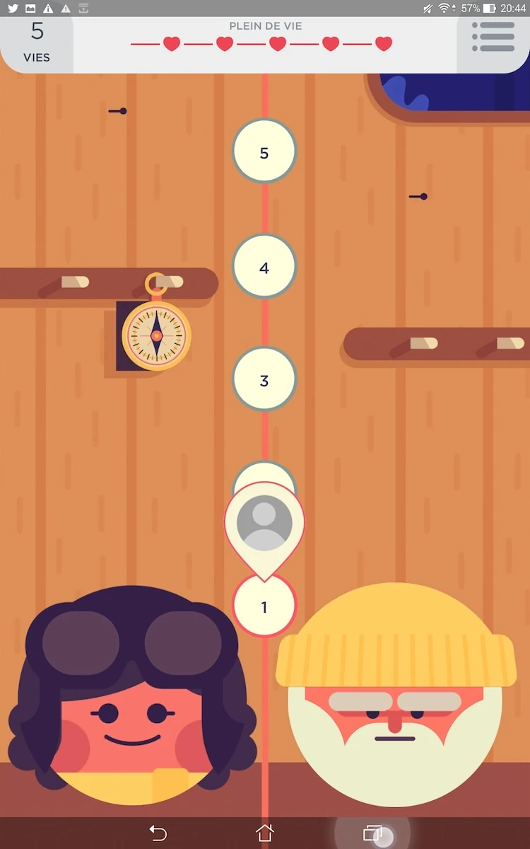
Two dots is a good example of polished usability. From the start, the game is accessible immediately, and provides a simple, non intrusive tutorial.
The first steps however are a little annoying: an add is presented before the player even got to try out the game, which can make the first impression a little more negative. The initial tutorial then displays text automatically, with no control over its speed or progress for the user.
Luckily, it’s not that bad if the player didn’t get everything from the start, because each level provides clear goals, and when a new type of goal appears in the game, a small tutorial explains the new feature.
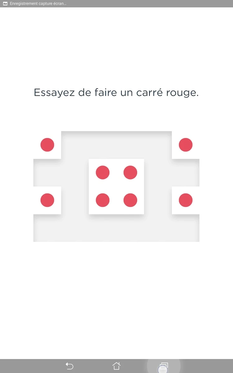
A specific levels, the game takes in account the progress of the user and gives him tips on advanced strategies to win the game more easily (such as selecting closed squares to make all dots of a single color disappear). All together, it creates an encouraging first experience of the game during the first few minutes of play, which is critical for mobile games.
At any time, the player is able to view all information required to make decisions: remaining lives, number of actions remaining before a game over, score progress after each move, and how close it brings the player to the 3 stars rating that will prove he mastered the level.
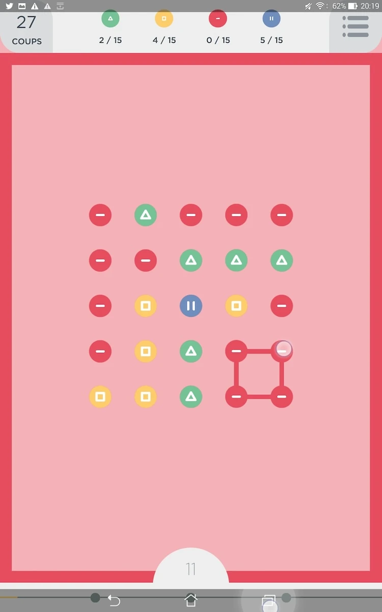
In game, the feedback is also very clear. A line clearly shows which dots have been linked, and an audio feedback changes in tone with each new dot. This allows the player who activates sound to know how many dots he selected just from the sound. When the player performs an advanced action, like linking a rectangle of dots of the same color, the whole screen turns that color, clearly confirming all dots from that color will be removed from the board at once.
The menus are simple and explicit, with direct access to options immediately when the player presses “pause”. When the player leaves a level, moves on to the next or returns to the game after a break, the level list remains focused on where the player left it.
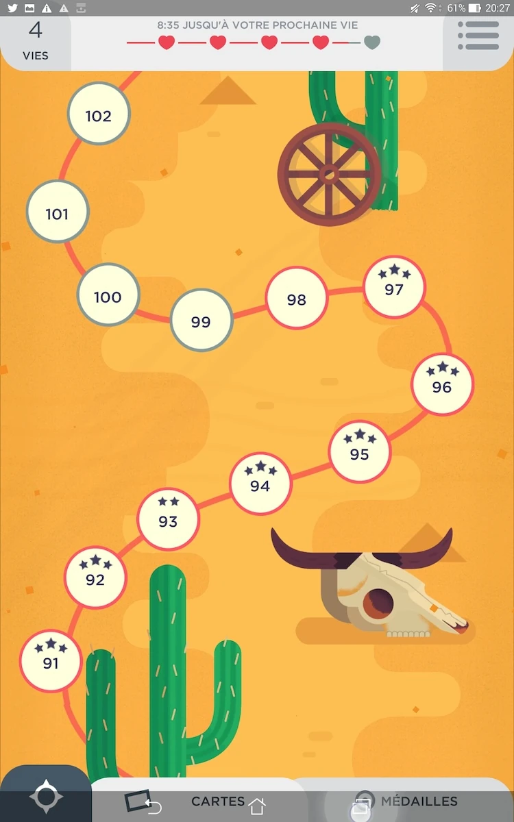
This means if he’s progressing in the game, he will se the next levels quickly without having to look for them.
Additionally it makes replaying easier by letting the player easily progress through levels he already completed once without the hassle of scrolling through the list over and again, one way of the other. This encourages players to indulge in the game’s high replay-value. The game does not allow the player to move automatically from one level to the next.
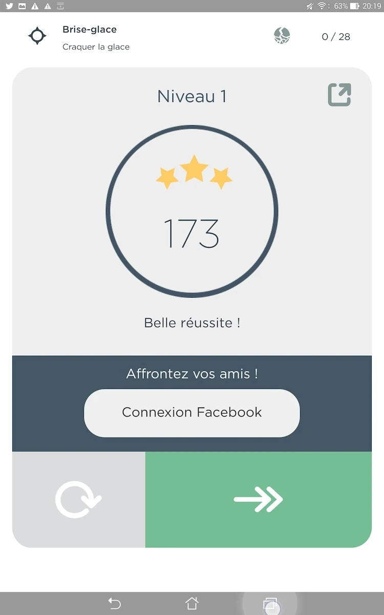
After a level is completed, the game shows the next level in the list, for the player to launch it manually. Although it adds an interaction for the player to perform, this actually gives him more control over the game: as each trial might cost one life out of five to the player, it is more fair to let him decide explicitly what levels he wants to spend this on.
The game also offers an accessibility mode, in which each color is completed with a symbol, that allows to solve the levels even when being color-blind.
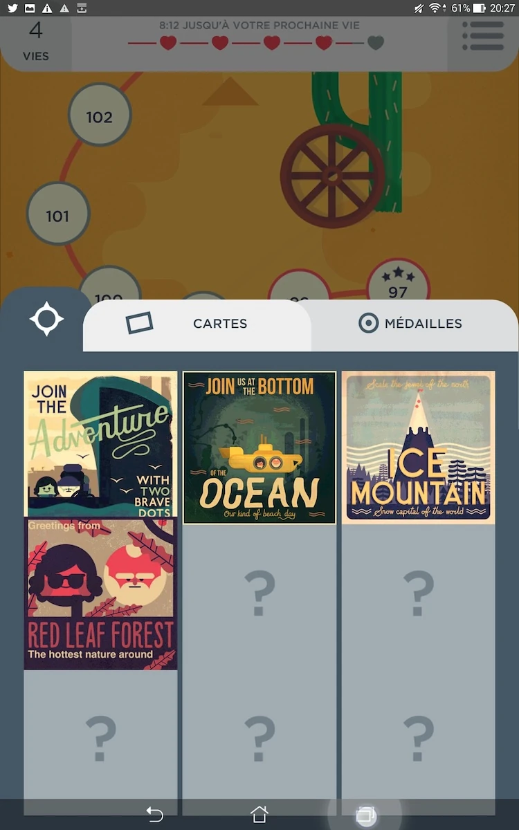
When the player has completed several levels and reached a new point in the game, he is given meaningful rewards in the form of advantages, but also very nicely designed post-cards. These cards are pretty cute and actually provide the player with something they might want to share with their friends, encouraging them effectively to connect to their social networks and promote the game through that mean.
Articles on similar topics
The Mass Effect series
Game Usability reviews, Game user experience analysis,
A game usability review of Triple town
Game Usability reviews, Mobile game user experience,
A game usability review of Amazing Brick
Game Usability reviews, Mobile usability, Mobile game user experience, Game user experience analysis, Initial experience, Out of box experience,
A game usability review of Auralux
Game Usability reviews, Mobile usability, Game user experience analysis, Initial experience, Out of box experience,
A game usability review of Ollie Pop Retro Skateboarding
Game Usability reviews, Game user experience analysis, Mobile usability, Mobile game user experience, Initial experience, Out of box experience,
A game usability review of Time of Exploration
Game Usability reviews, Game user experience analysis, Mobile usability, Mobile game user experience, Initial experience, Out of box experience,