Mobile Game Usability - 1010! seen through a player’s eyes
1010! is a puzzle game in which the player has to… well, let’s just have a look at the learning process through some bits of playtest videos. Here’s how Mickael(1) experienced the game.
Tested on Android, One+
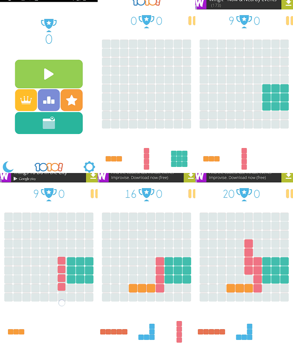
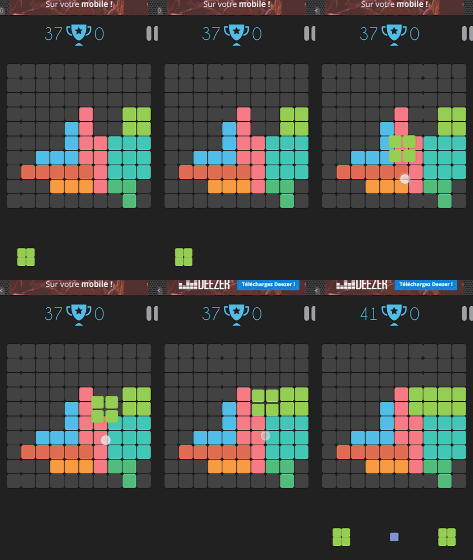
While the game starts up extremely fast, it does not provide any form of tutorial. The player has to try things out to figure out how the game works. In the screenshot to the left, you can see a player who instinctively got that he needed to move the colored patterns into the grid area. He first tries by tapping the bloc, then taping the target position. When that doesn’t work, he tries a drag and drop motion next, which works fine. He is not satified by the position where he droped the block, and you can see he tries to move it again. the player understood it asn’t possible, and decides to place the other two blocks to see what happens next.
When more blocks appear, it seems pretty clear that placing them on the grid is the right action. But what for?
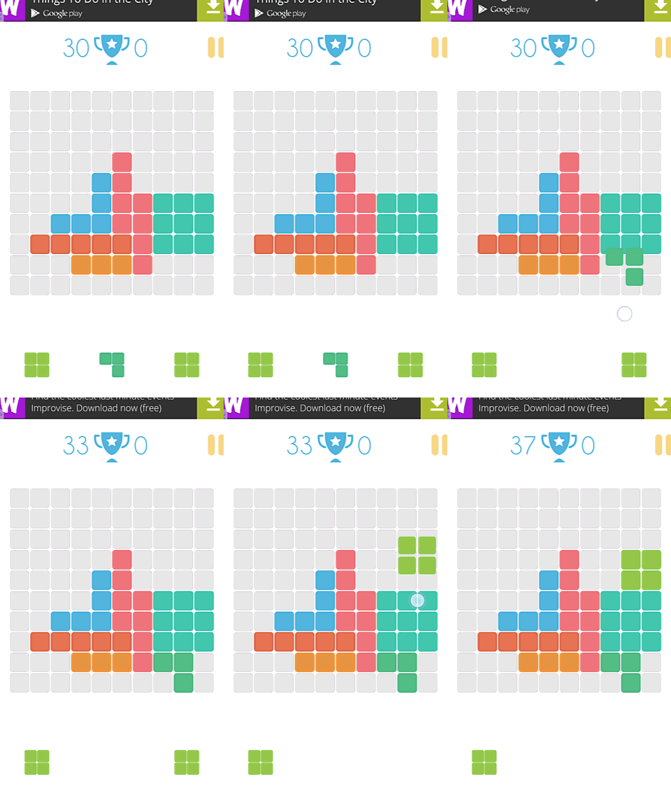
As any player would when not provided with a clear goal, he made up his own: match colors! Maybe something will happen, like in candy crush0?
Here you can see the player trying to match blocks of the same color. Three very similar shades of greenish patterns are put together are difficult to tell appart even for non color-blind users. On the next animation, you can see the player search for an accessible mode, and try the alternate contrasts instead.
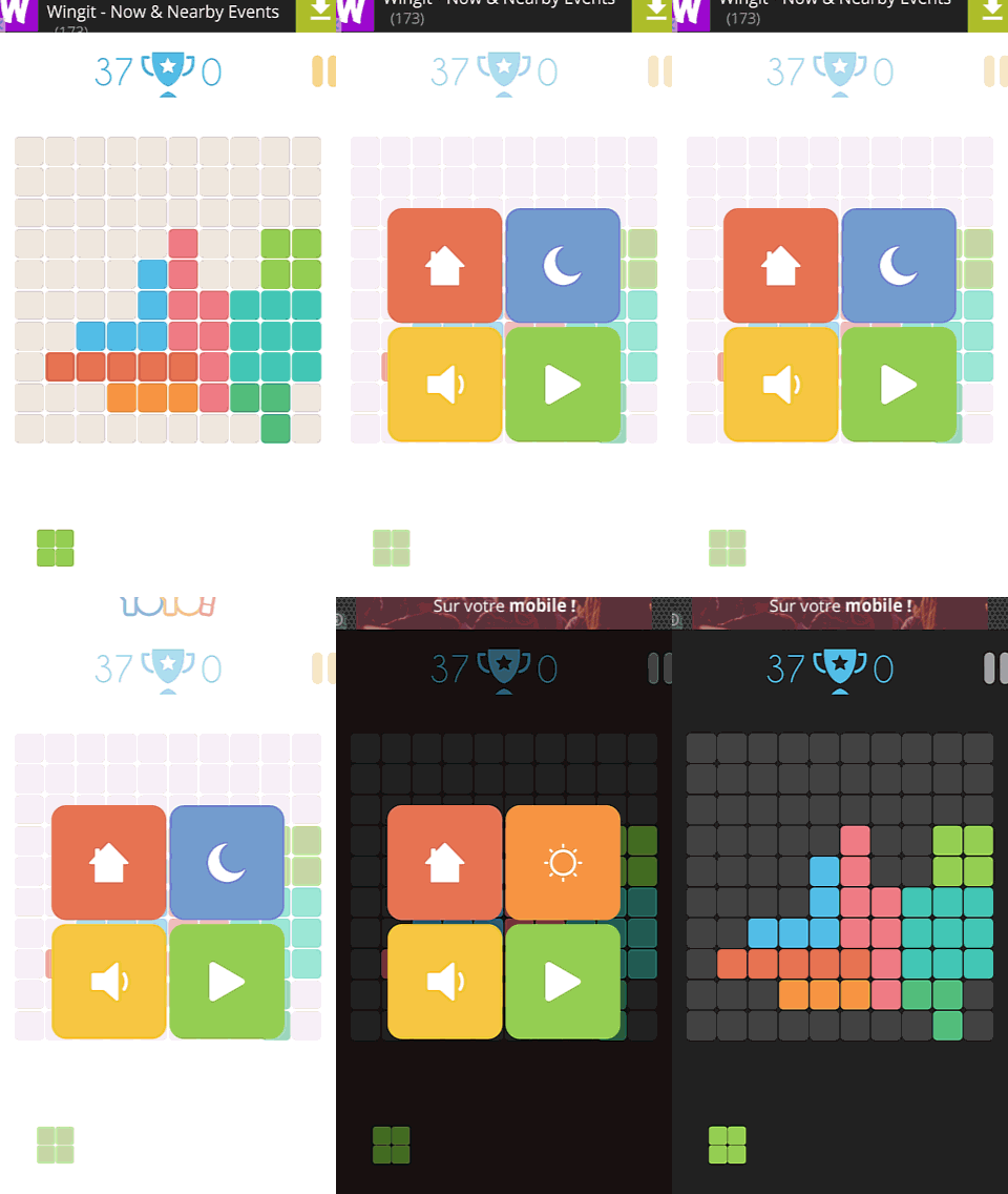
A good first step, but providing a more accessible display would be no luxury for the players, and would contribute to reach a wider target audience.
Alternating contrasts allows the player to comfortably play both outside in bright sunlight without being annoying by reflections, AND before sleeping in a dark room without getting a headache from too strong light at night.
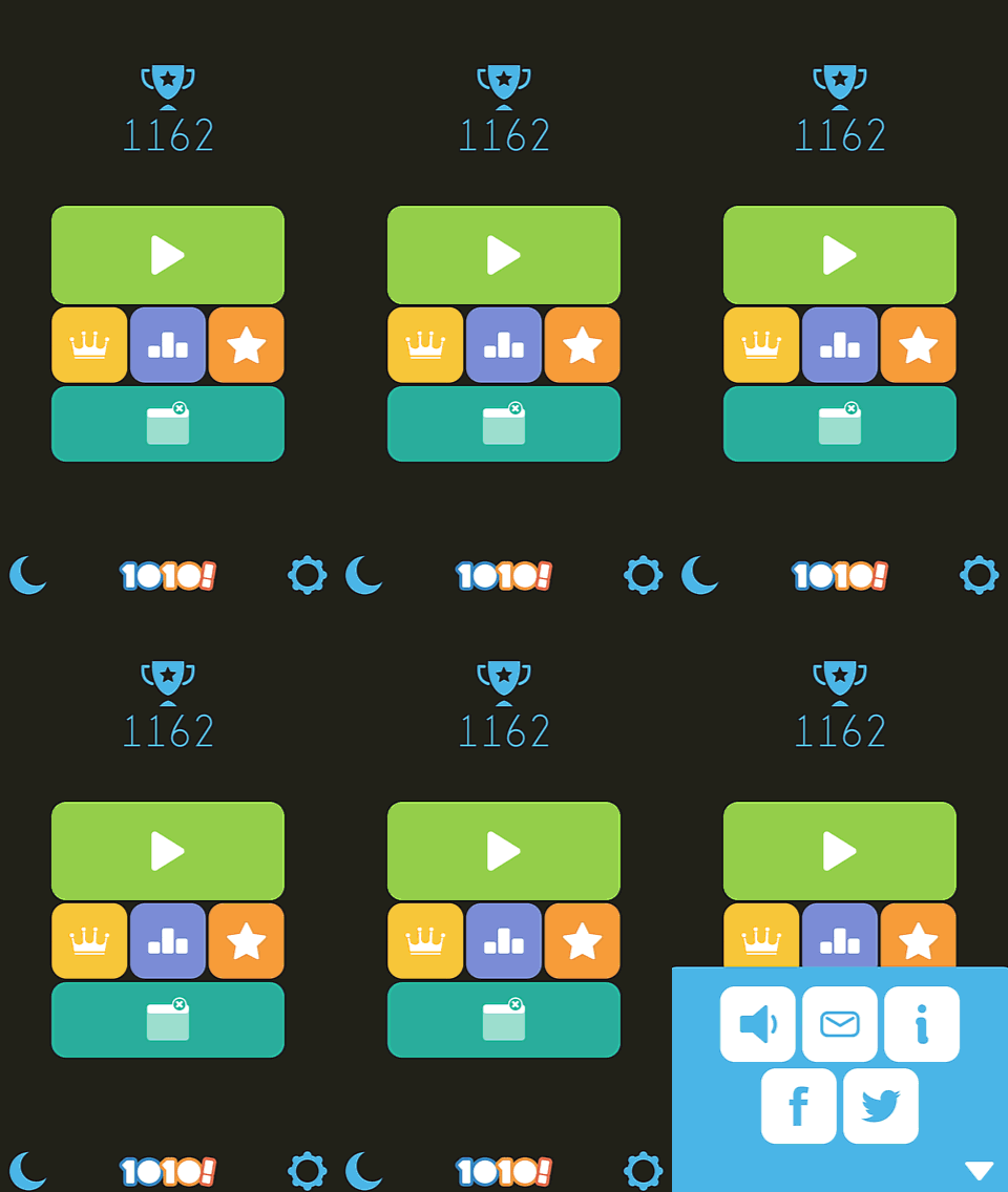
He also checked in the options screen (opened with gear icon), and was surprised he mostly had the option to share the game.
This wasn’t what he was looking for or what he was expecting. As a result, he picked up his game session, keeping the darker screen contrasts.
So with this new set up, Mickael went on for a looong while, trying to match colors and avoiding to leave empty spaces.
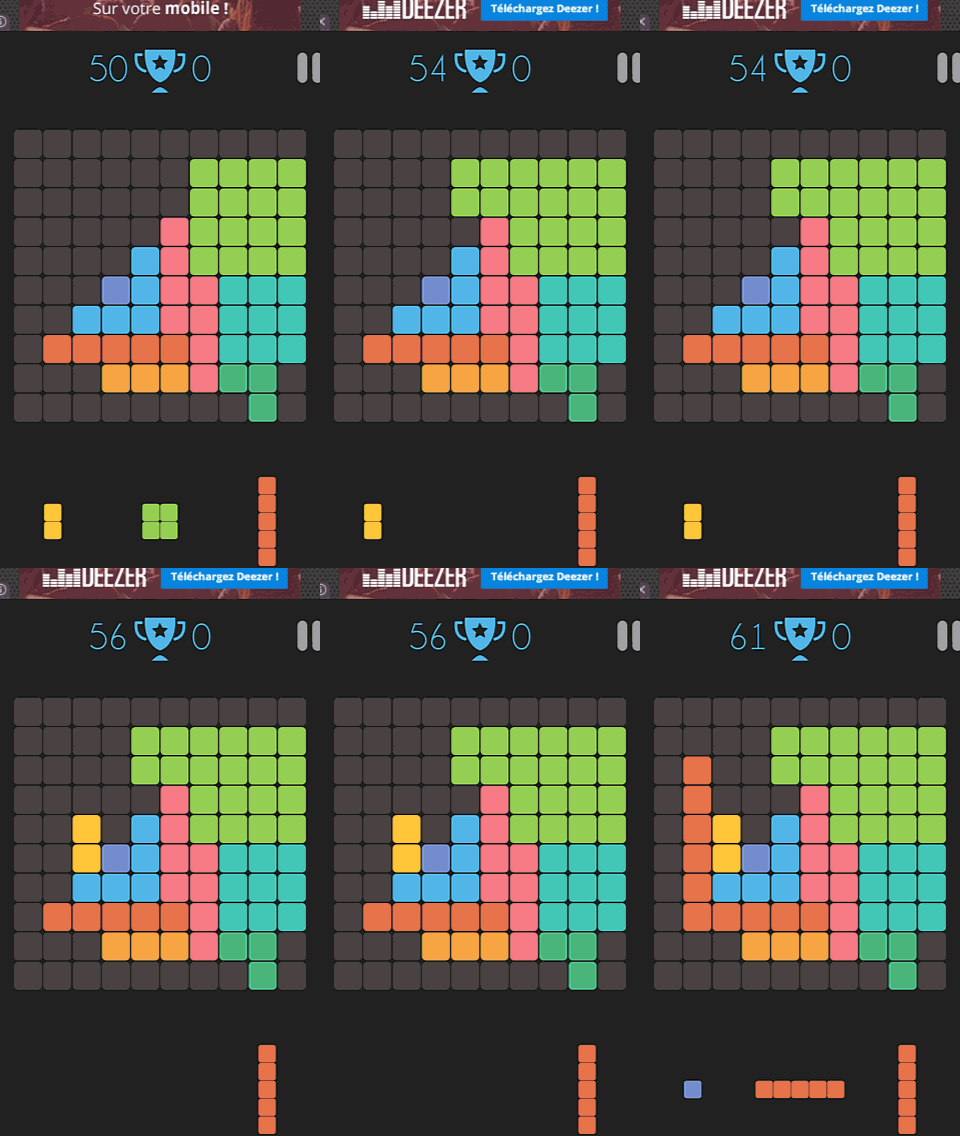
Until, after playing for about 4 minutes without getting the point, suddenly he completed a line by “accident”, while still trying to simply match colors.
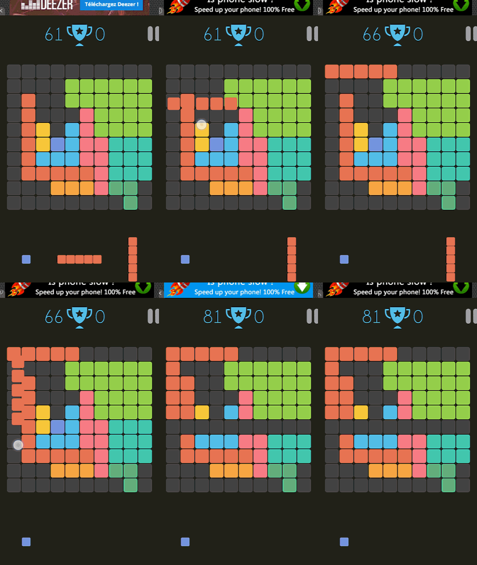
His first reaction was to laugh and say :
“Oh crap, if I had known… I wouldn’t have done things like this at all if I had known.”
So, the game was more like Tetris than Candy Crush. He then completely changed his strategy of placing blocks, completing horizontal lines with little effort for a while, until he, again, accidentally discovered another game rule.
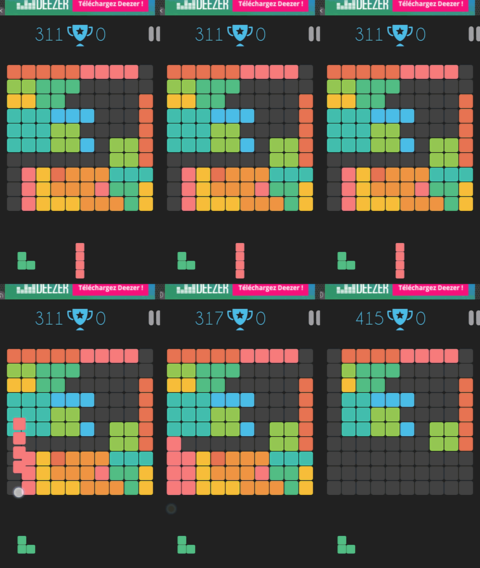
“It works with vertical lines too ?!”
He hadn’t thought of that at all, for him, the game turned out to be like Tetris. He imagined he needed to make horizontal lines to empty the board, and would lose if it was filled. He didn’t think it would allow vertical lines to work aswell.
When this happened, he said something else.
“I feel like I did something awesome, and at the same time, I don’t feel like I did something awesome. For once I’d ‘ve liked if there were glitter and unicorn rainbows now.”
Completing 5 lines at once, both vertical and horizontal, seemed like a big deal, and just gave him the same animation and sound effect as just one line. Nothing special. Comparing to Candy Crush again, Mickael expected something more “rewarding” even for small achievements, where’s the “Superb” when 4 items are aligned instead of 3?
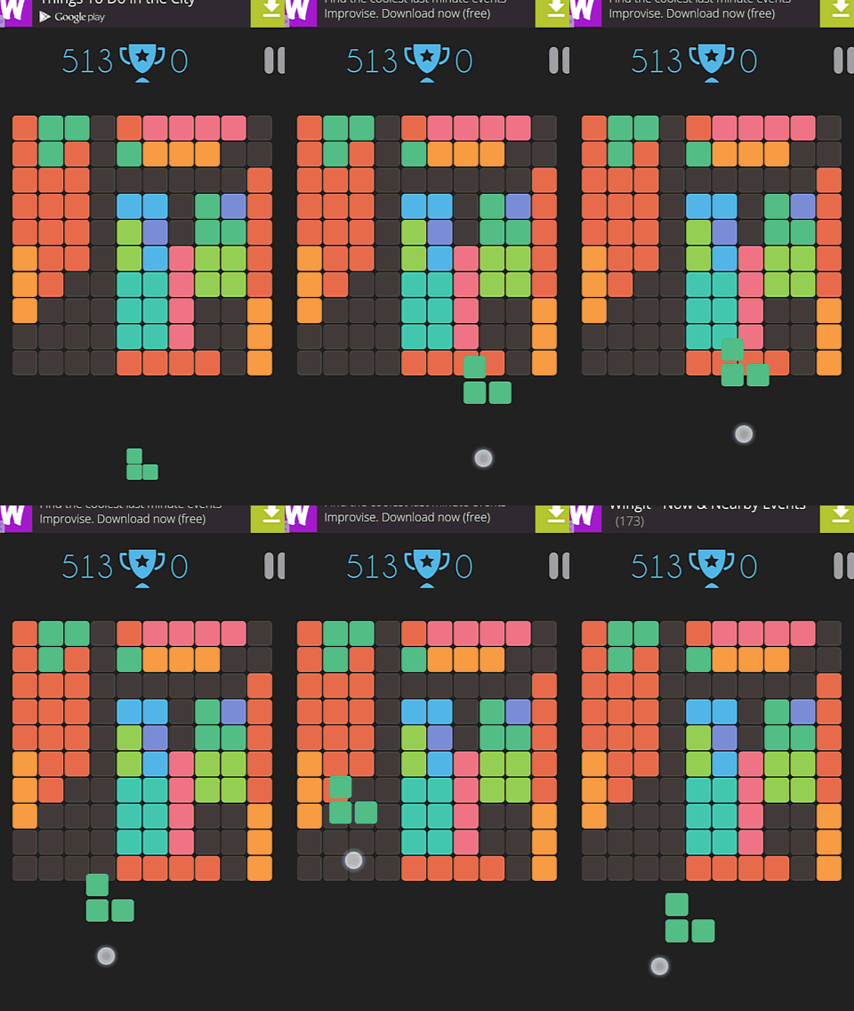
Finally, after getting the whole game mechanics, our player still compared the game to Tetris. And like in Tetris, he would have loved to be able to rotate his blocks. On this screenshot, you can see him spinning his finger in the “hope” that the block will turn due to rotational energy, then placing the block where he would want to place it, if he would have turned the block.
After 6 minutes of gameplay, Mickael declares he’s starting to find the game a bit boring, although he could imagine himself playing it in the subway for example, in order to pass the time instead of reading a book.
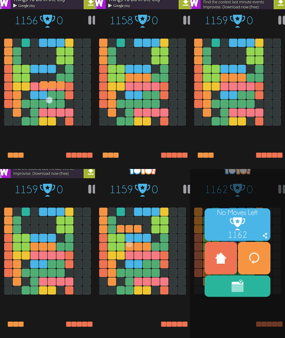
At the same time, he says he doesn’t really believe it is possible to fail at the game. When it finally happens after an 8 minutes game session, he admits it is possible to fail, but looking at the video, there actually was a solution that would have worked.
Maybe he paid less attention after a long session? In any case, he stopped the game, and when offered to play a second session if he wanted to, he decided to stop playing.
What can we learn from this example?
- A player can figure out basic controls on his own, provided he has enough gaming experience to guess the controls and mechanics of the game. Figuring out and discovering the gameplay can be part of the fun of a game with little guidance.
- A player who knows how to play, but who isn’t given a clear goal, can create goals on his own. This happens in many open world games, where the player can do anything but follow the main storyline. This also keeps player engaged in sandbox games like city builders or the sims. The difference here is that there actually is a goal, that can conflict with the goal the player set for himself. This will seem unfair to the player who gets punished for not complying to a rule he wasn’t told about.
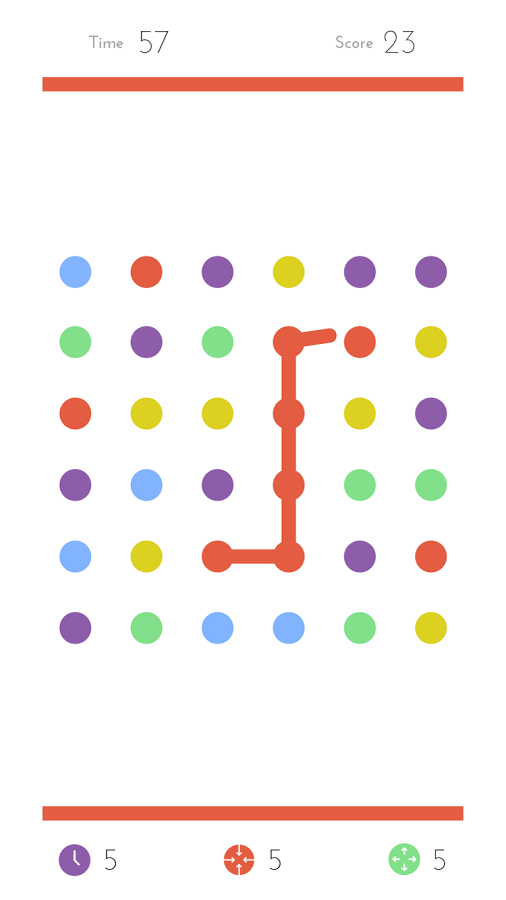
- In this example, the game didn’t provide enough challenge to the player to keep him interested. However, this particular player does keep playing other games, that aren’t necessarily more challenging. For example, he is an adept at dots. Although the basic gameplay is equally simple, dots provides different types of constrains, like number of moves or time limits. Dots also explicitly makes the player compete against himself, prompting him to do better and to start a new session right away.
Articles on similar topics
The Mass Effect series
Game Usability reviews, Game user experience analysis,
A game usability review of Triple town
Game Usability reviews, Mobile game user experience,
A game usability review of Amazing Brick
Game Usability reviews, Mobile usability, Mobile game user experience, Game user experience analysis, Initial experience, Out of box experience,
A game usability review of Auralux
Game Usability reviews, Mobile usability, Game user experience analysis, Initial experience, Out of box experience,
A game usability review of Ollie Pop Retro Skateboarding
Game Usability reviews, Game user experience analysis, Mobile usability, Mobile game user experience, Initial experience, Out of box experience,
A game usability review of Time of Exploration
Game Usability reviews, Game user experience analysis, Mobile usability, Mobile game user experience, Initial experience, Out of box experience,