How games user research lead us to make our game harder
- Defining controls
- Playtesting combat controls to get the most dynamic gameplay
- Conclusion : Shooting to the sides encouraged the most interesting player behavior
Making user friendly games doesn’t mean making them easier. Regardless, developpers still often make this mistake. The purpose of games user research is to ensure the player’s experience matches the designer’s intent. This can lead to simplify interfaces and remove unwanted challenges from the game, such as confusing controls. It does not imply removing any meaningful challenge though.
To illustrate that games user research can actually lead to making games harder, I will tell you the story of Olympus Naumachia. Game user research made this game quite a bit harder, yet less complicated.
Olympus is one of my projects as a game user research student. Though it feels like ages ago, I’m certain this story will interest you. In this story, playtesting actually lead us to make our game harder !
The assignment to make Olympus was to build a complete playable game in 3 weeks, using an imposed tool (game maker). The project had multiple goals from managing tight deadlines, being realistic about features and development time, and working efficiently as a team, while experimenting everybody’s tasks, rather than focusing on our own specialty only. So everybody got to code a little, design a little, test a little, write documentation, and so on…
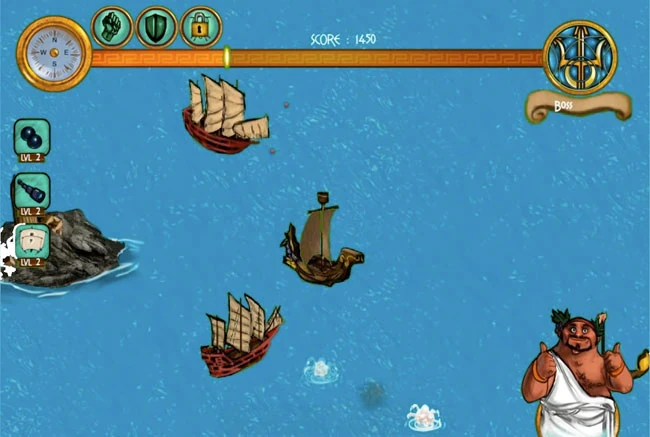
Our project, Olympus, was a fast paced arcade action game where civilisations compete for their gods through violent naval fights. Basically, the player controls a boat, and fights other boats in the name of his chosen god.
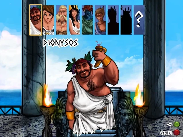
The designers wanted to create a fast-paced, dynamic arcade game, targeted at hardcore game players. For this, they imagined different types of controls, shooting to the front or shooting in all directions around the boat.
Defining controls
From the start of the project, game designers were unsure of the best way to handle the player’s controls and map them on a controller. I made different proposals, including:
- using one stick to move, and buttons to shoot (without controlling the direction). It would be simple to use, but we were unsure where the bullets should go : to the front? to the sides? to one side only?
- using one stick to move, and buttons to shoot (left and right). This option was my favorite option, because usability best practices vauch to give users control over their experience
- using one stick to move, and the other stick to shoot. This option was the designer’s favorite option because they enjoyed it from other games. So I set up some experiments.
Playtesting combat controls to get the most dynamic gameplay
The video analysis lead us to believe that shooting to the sides would create a more dynamic gameplay. Since it was easy to implement different controls in our prototype, we decided to confirm this through a playtest.
We tested 3 versions of the controls, all mapped to an xbox 360 controller.
Shooting to the front
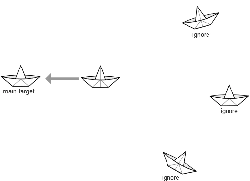 As expected, player allowed to shoot forward moved around little, focused on a single ennemy, positioned themselves in front of an it, and moved only to change targets once it was dead. They had trouble dodging bullets and soon didn’t bother to.
Shooting to both sides
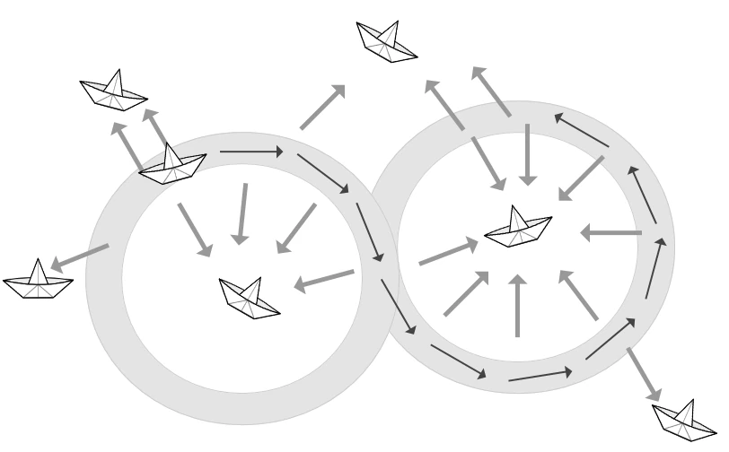 Players moved around a lot more, to keep their aim, and attacked several enemies at a time. Since they didn’t have a “steady” aim at a target anyway, they also made extra moves to dodge bullets. We had seen on other games that this type of control encouraged users to race along enemies in linear levels. It worked even better for us, in our arenas.
Shooting anywhere (direction mapped to a stick)
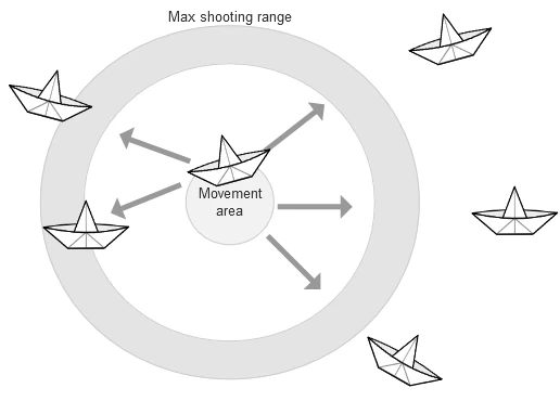 We expected players to enjoy their additional freedom to imagine even more complex strategies against multiple enemies.
To our surprise, players were more static with this setup. They still moved to dodge bullets, but only as little as necessary to avoid attacks. They focused more often on a single enemy at a time, making the fight feel less intense. It basically made it too easy to get rid of enemies. Players just had to wait for enemies to come at them, move only to dodge attacks and easily destroy any enemy within reach.
A third solution : shooting to either side ?
We also testing giving the player the choice to shoot to either side using the stick. The player wouldn’t be able to shoot where ever they wanted, but only left or right from the ship. With these controls, the game was as dynamic as with the second option (shooting to the sides), but it was more confusing for the players. If the shooting controls were relative to the camera, the players would be confusing when moving horizontally. On the contrary, when relative to the ship, they wuld be confusing when circling ennemies or racing near them.
Conclusion : Shooting to the sides encouraged the most interesting player behavior
With the information from the playtests, the designer made the final choice of controls for the game: shooting to the sides, without controlling the direction of the shots manually. It induced a more interesting player behavior, creating the fast-paced action the team was looking to create.
Usability best practices state to give control to the user. User research allows to go beyond best practices. In our case, it showed that the best practice had two drawbacks in our case:
- Either it made the controls less user friendly and confusing
- Or it made the game too easy compared to the designer’s intent
It appeared to be better to remove some freedom, to force the player into a more active role. In the end, games user research lead us to make Olympus Naumachia interestingly harder, yet less complicated.
Games user research lead us to make Olympus Naumachia interestingly harder, yet less complicated.
The story goes on, but I’ve made my point. Playteting the different control options lead us to chose the option that made the game harder, yet uncomplicated. It was neither the one recommended by experience, nor the one recommended by usability best practices, but it was the best, informed choice for our game.
I may tell the rest of Olympus’ story some other time. I hope you liked this one, and that it will be useful to you. Don’t hesitate to share your own experiences of how games user research has made games harder or has made hard games more user friendly.
For you curious folks, here’s a playthrough video of the game watch a video playthrough on youtube
Articles on similar topics
The Mass Effect series
Game Usability reviews, Game user experience analysis,
A game usability review of Amazing Brick
Game Usability reviews, Game user experience analysis,
A game usability review of Auralux
Game Usability reviews, Game user experience analysis,
A game usability review of Ollie Pop Retro Skateboarding
Game Usability reviews, Game user experience analysis,
A game usability review of Time of Exploration
Game Usability reviews, Game user experience analysis,
A game usability review of Shu’s Garden
Game Usability reviews, Game user experience analysis,