A game usability review of Lost Bubble
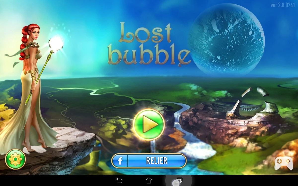
Lost Bubble is a puzzle game in which the player progresses through a storyline by completing levels. In each level, the player has to remove bubbles from the screen by throwing bubbles of the same colours on them. He also needs to have a minimum score to be able to proceed to the next level. The game encourages replay by also asking the player to reach a highscore, by bursting as many bubbles as possible at once.
Tested on Android / Asus Transformer Tab
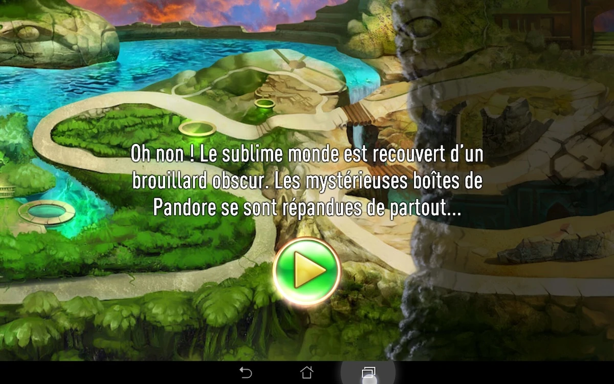
The game starts up really quickly, with a brief storyline introduction teasing the player with the upcoming levels, and no intrusive request to connect or add right from the start. There is a visible button to connect to social networks from the start though so players that want to can connect very easily after the game was installed.

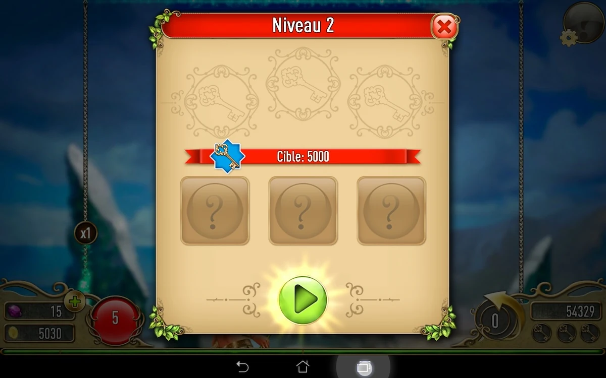
The objectives are made really clear at the start of each level: each type of objective is detailed : number of keys required, minimum score, empty slots where the user can expect to have bonuses of some sort – even if he doesn’t know which yet. And a clear incentive to start the game.
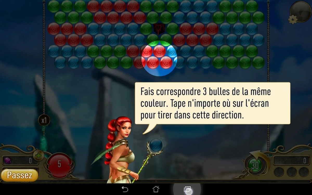
The game rules and interactions are clearly explained in a tutorial. The tutorial information is spread across several levels. Giving one piece of information at a time allows the players to learn and get used to one feature before the game tells him about the next feature.
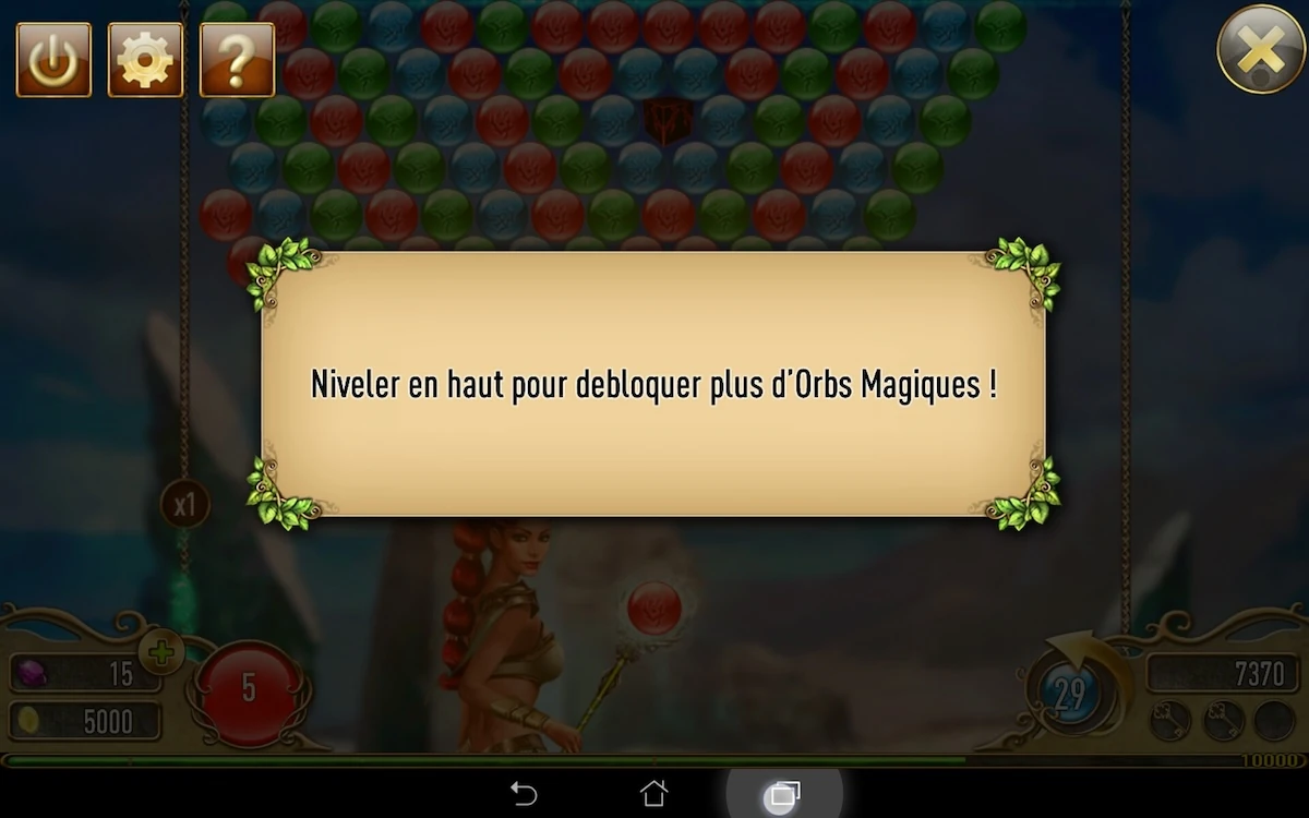
This helps the player ease into the gameplay progressively. While basic features are explained at the start of each level, errors are explained when they occur for the first time.
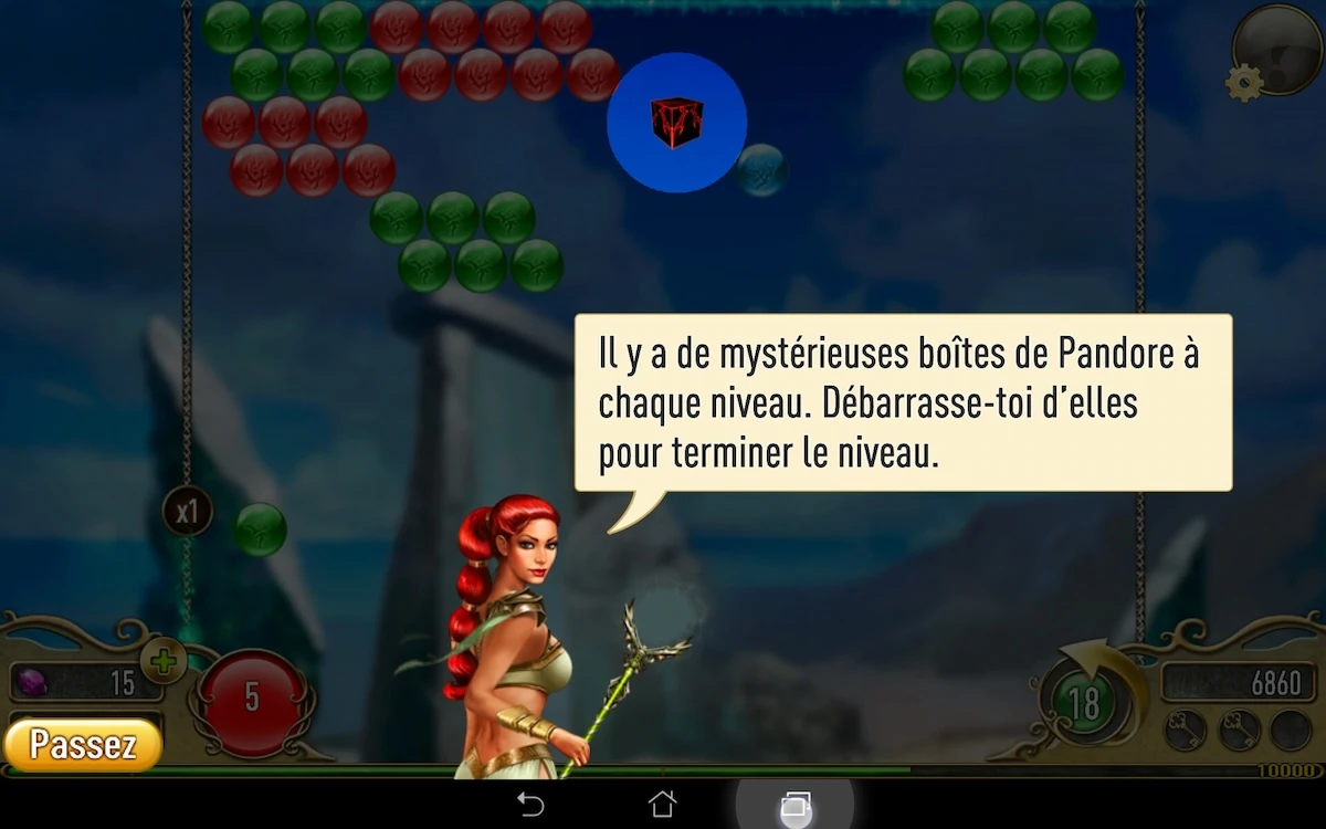
For example, in the game, the player should drop “Pandora Boxes” without ever throwing a bubble directly at them, but by removing bubbles above it to make it drop. When the player first touches a Pandora box, the game tells him he shouldn’t, and that if he does, he will lose a life, explaining the core monetizing mechanic at the same time. But since its the first error, and the player didn’t know, the game gives the player a second chance and doesn’t actually punish him the first time he makes the error. This gives a positive impression of the game and makes it look fair to the player.
One issue with the help and tutorials is sometimes the vocabulary is a little complicated. The player will sometimes be unsure what the hint tries to tell him, making it useless.
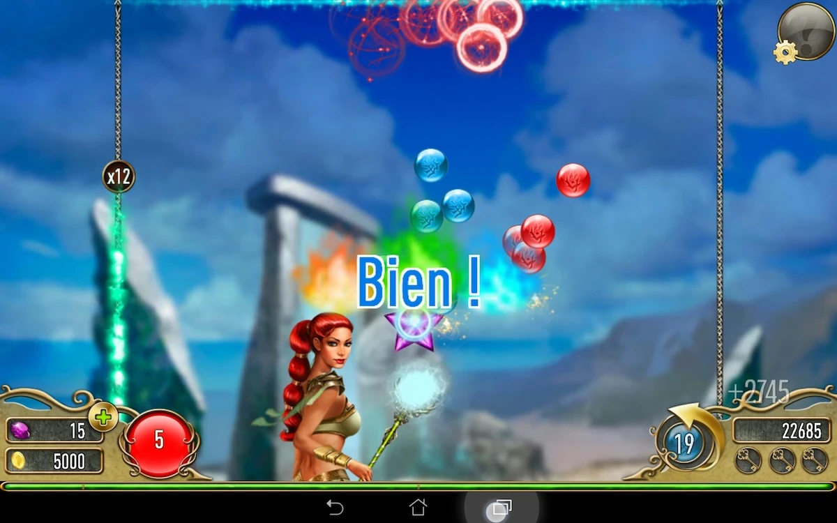
In order to throw a bubble at the others, the player can touch the screen anywhere. This can lead to errors and confusion. First of all, some elements of the in game HUD interface are interactive, but not all of them. The player may throw a ball thinking they can interact with the HUD. This is specially true since the interactive elements have little visual distinction from the rest to help identify them.
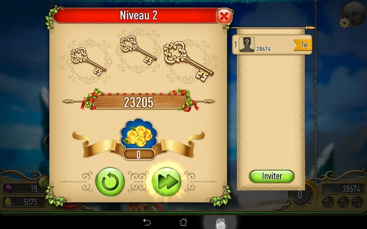
When the player completes a level, the game will show him not only his score and achievements, but also a leader board next to the typical end of level dialogue found in many games. This encourages the player to connect to social accounts to be able to compare his score with his friends’ on the level he just completed. The benefits of the social features are made explicit, and presented at a time where they make sense to the player. They also take advantage of a screen the user will need to pass through anyway, without adding additional steps to it. This contributes to making the player’s experience more smooth by avoiding repeated intrusive dialogues.
The game does still use some dark patterns though. The confirmation dialogue before leaving the game uses one for example: the “ok” and “cancel” buttons are red and green, but the colours are reversed compared to the player’s expectations. This causes a little confusion for the player and forces him to think twice not to tap the wrong button. While this kind of mechanic may keep the player in game a wee bit longer, it will cause frustration for players who actually want to quit, and go back to the game after a mechanical input.
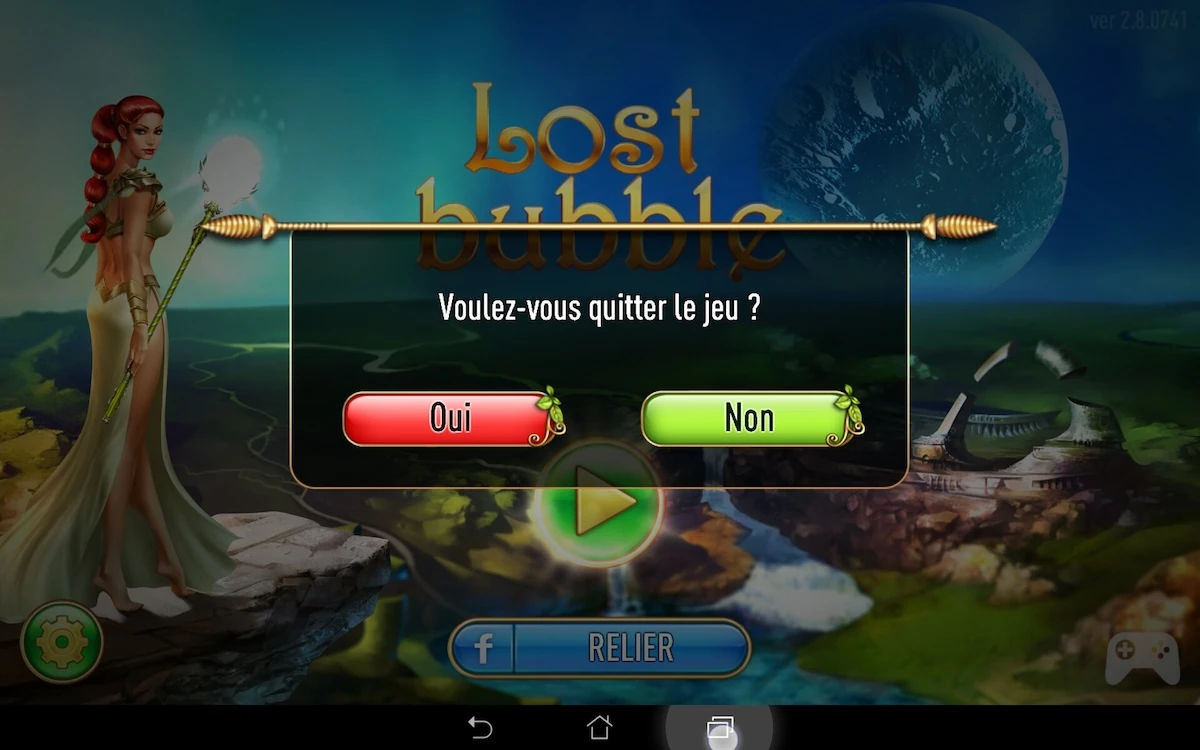
Additionally, as a way to prevent the player from leaving the game by accident, it just takes them more time to get back in the game, since they have to think before they can close the confirmation dialogue. In both cases, none of these experiences will actually make a difference as to whether or not the player will leave the game. It is unlikely it will change their minds from their original intention. This inversion only gives a bad image of the developers for trying to manipulate the player with a cheap trick.
Articles on similar topics
The Mass Effect series
Game Usability reviews, Game user experience analysis,
A game usability review of Triple town
Game Usability reviews, Mobile game user experience,
A game usability review of Amazing Brick
Game Usability reviews, Mobile usability, Mobile game user experience, Game user experience analysis, Initial experience, Out of box experience,
A game usability review of Auralux
Game Usability reviews, Mobile usability, Game user experience analysis, Initial experience, Out of box experience,
A game usability review of Ollie Pop Retro Skateboarding
Game Usability reviews, Game user experience analysis, Mobile usability, Mobile game user experience, Initial experience, Out of box experience,
A game usability review of Time of Exploration
Game Usability reviews, Game user experience analysis, Mobile usability, Mobile game user experience, Initial experience, Out of box experience,