A game usability review of Big Black Dot
Big Black Dot is a puzzle game in which the player needs to move similar dots on top of each other for them to grow within the available space on a grid. After each turn, the game adds a new dot until no spaces are empty and no moves are left.
Tested on Android, One+

The game starts up quickly. The player is in game with his first session within seconds. This is very important on mobile games, where the user’s patience is extremely limited.
The player immediately reaches the tutorial the first time he plays, which ensures he will be able to quickly grasp the basics of the game.
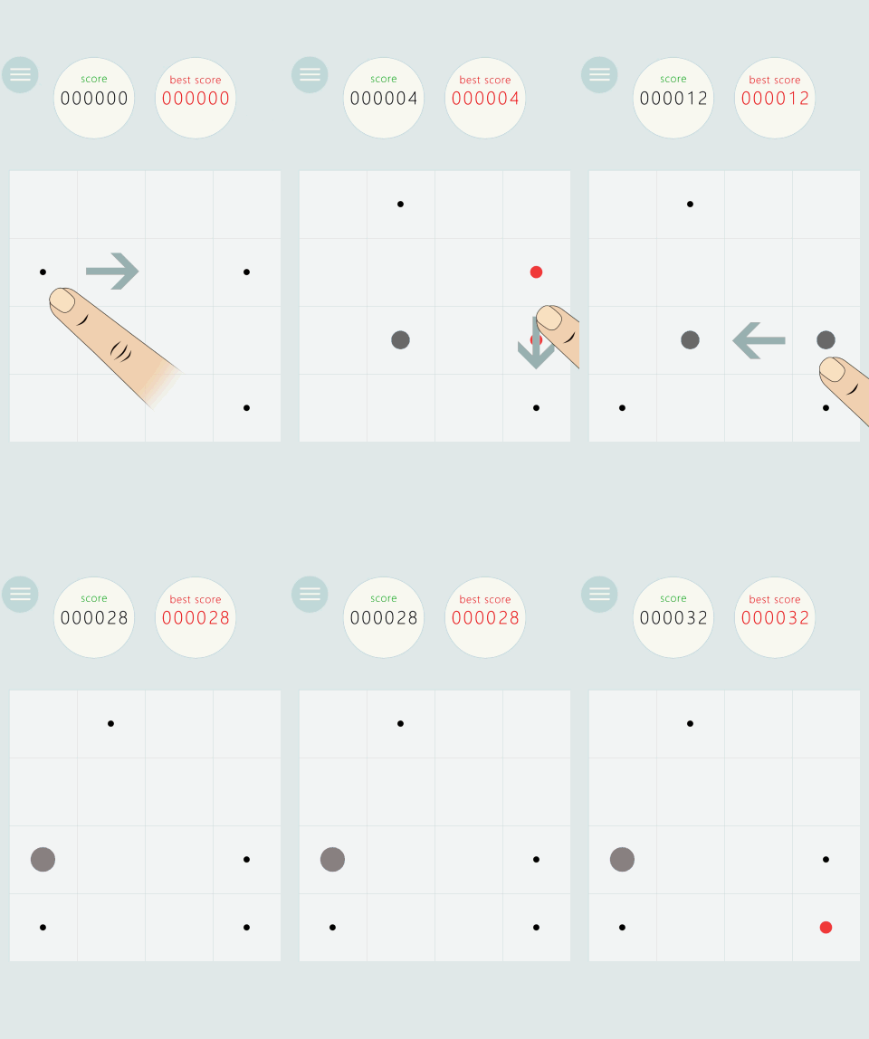
The tutorial is very short and explicit. It uses visual cues to show the interactions expected from the user. This makes the game more accessible even to younger audiences who can’t necessarily read. Swipe to move dots. Bring dots of the same type together. They will grow bigger and change color. After three interactions, the player knows the basics and is free to experiment. the tutorial is short and efficient.
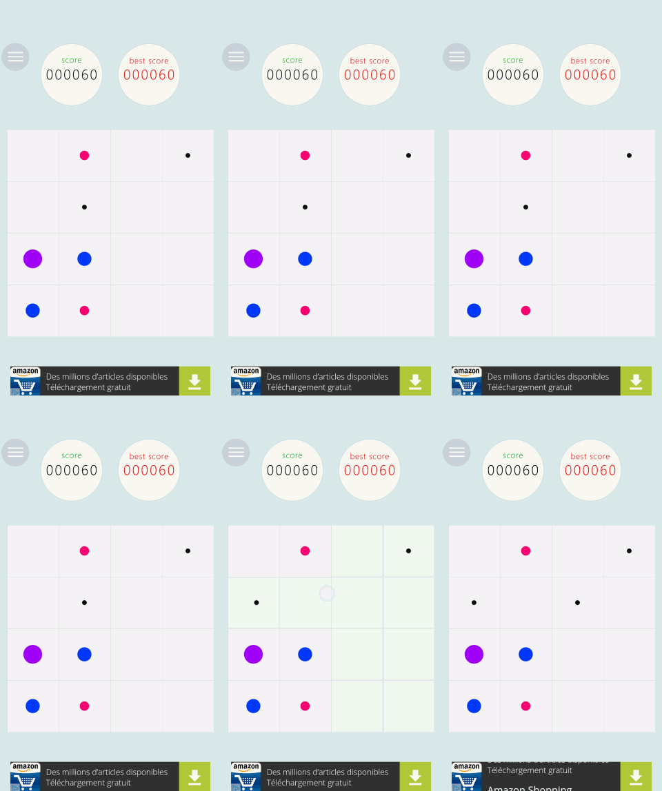
One thing the players have some trouble with is the interaction model. In Big Black Dot, the interaction is activated for single lines, and not for the whole grid, as player can have experienced before in 2048-type games.
As seen in the screenshot on the right, the player can move a single line of dots, rather than all items in the grid. The game provides only subtle feedback to the player : the columns the player touches are a slightly darker grey. The feedback is not contrasted enough to be noticed and doesn’t really help the player understand the interaction design, even in good light conditions, without reflections on the screen.
The learning process is relatively long, and happens by trial and error, despite the brief and efficient tutorial at first. The tutorial does show this interaction, but the player is still learning the basics of how to interact with the game. The tutorial doesn’t provide a highlight of this feature, so the player doesn’t pay attention to it and has to learn the feature by himself.
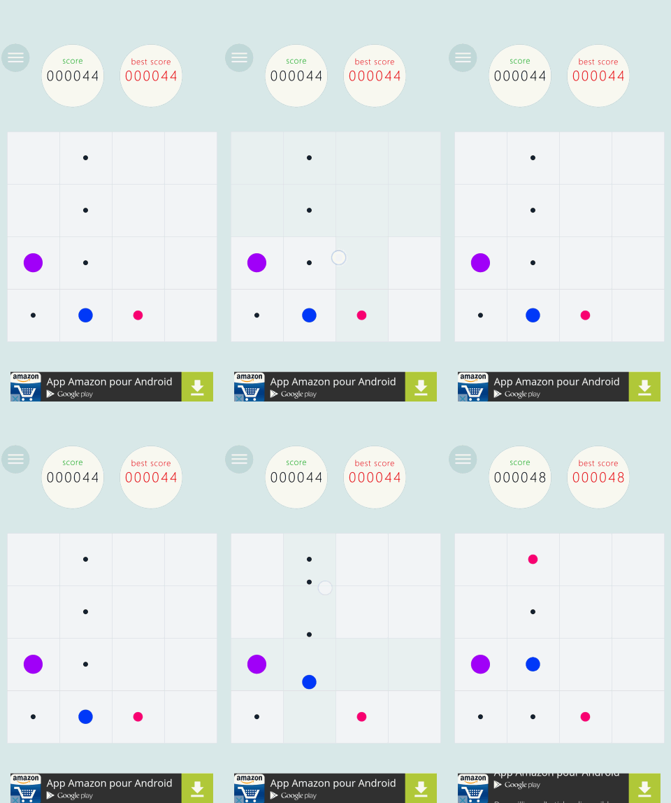
At first, players will try an action, fail to make the correct input, and quickly move on to a different action.
After a while, the player will realise his error and be able to fix it more and more quickly and make the correct input afterwards. Even after minutes of play, the player will still commit and have to fix this input error.
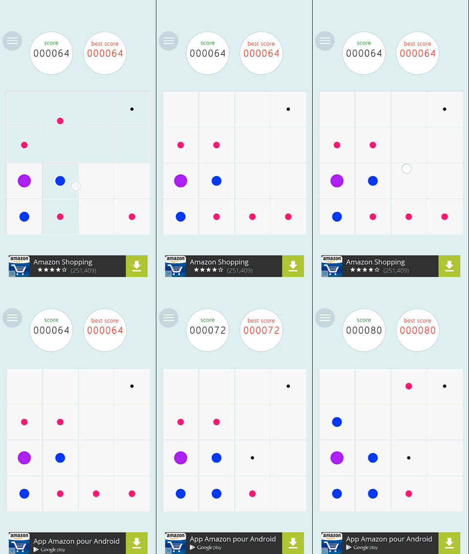
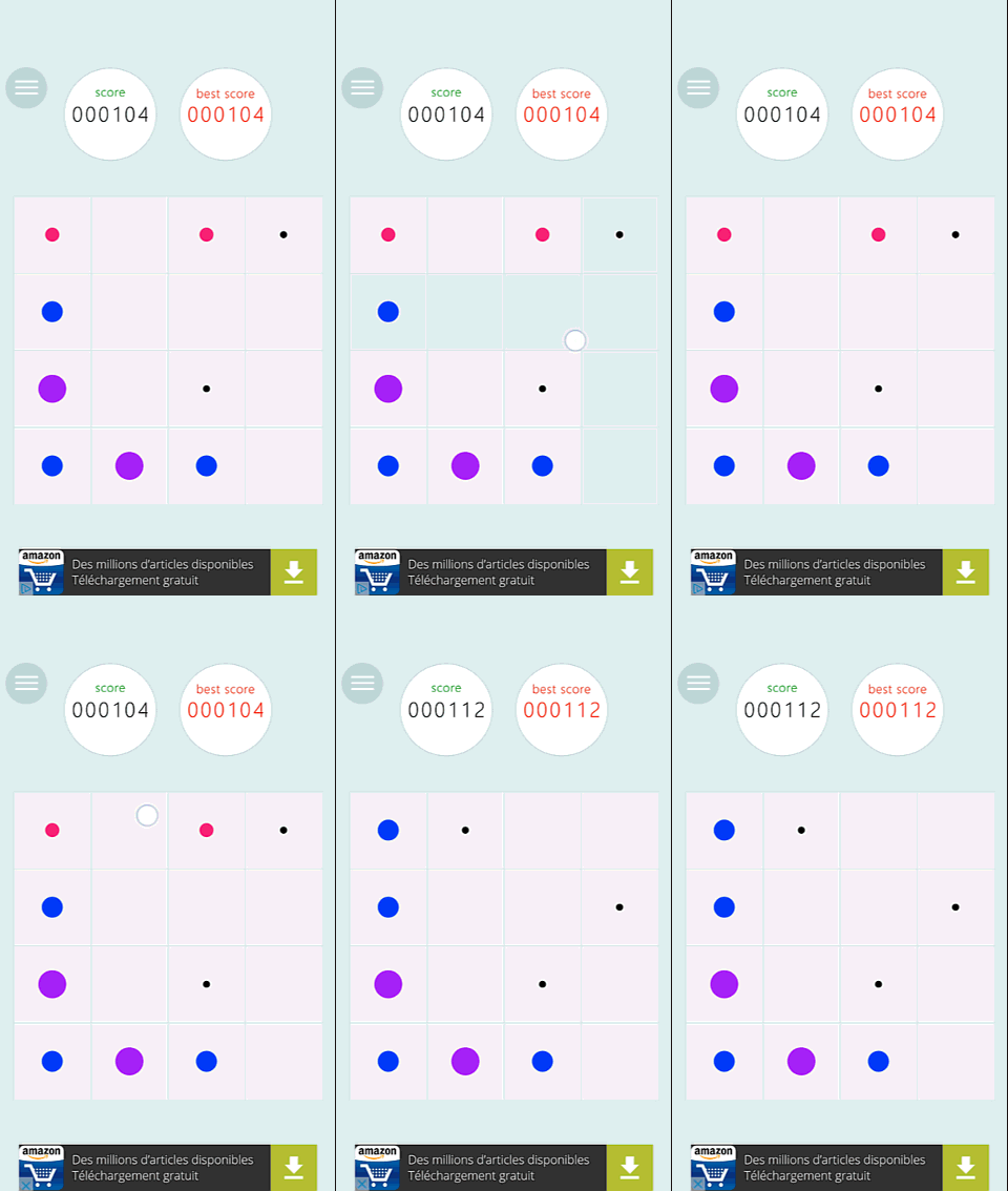
On this capture, you can see a player try to merge all pink dots towards the left. He tries twice to make the input at the most comfortable/reachable area of the screen. Then, the player realises the error and uses the input one on each specific line he wanted to move in the first place.
This issue was observed with one user only and you might argue that this issue might be limited to users who have experienced 2048 before. That represents over 50 apps. The most popular ones display over a million downloads.
I’m not saying that the inputs should be changed though. We’re not talking about a clone which only competes through smooth experience and controls. We’re talking about an entirely different gameplay paradigm.
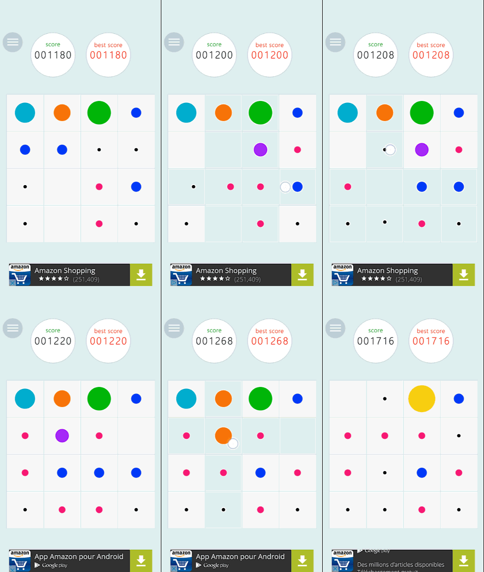
It brings novelty to the type of game, and it also pushes the use to think and solves problems in a different way.
Just watch John and Mary have fun solving problems on the screenshots on the screenshots. Left, John can make precise choices on how he wants to solve the puzzle, and which dots to use for this. Right, Mary finds a solution to merge the orange dots.
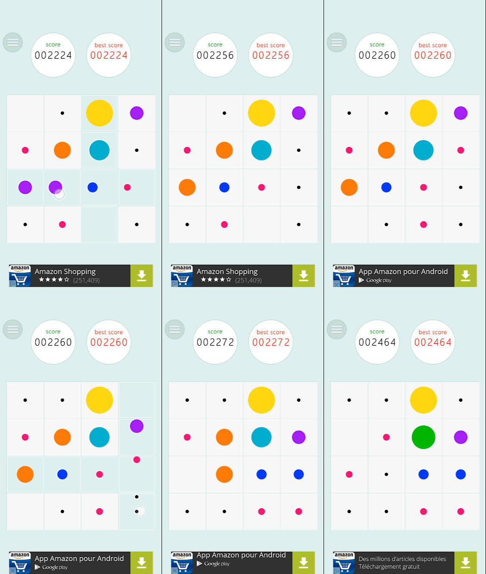
So, how can we help John and Mary to have fun without going through the less fun trial and error learning process? Here are some solutions:
-
Attract the player’s attention towards to non moving dots in the tutorial phase. A short phrase explaining this feature would completely clarify the topic, but would require specific developments and eventually localization efforts
-
Make the feedback stand out more : it will give a visual cue that will ease the understanding of the gameplay mechanic, without adding a lot of additional workload. It would also improve the game’s accessibility, which would allow it to target a wider audience.
-
Showing a different feedback when the user uses an input that has no effect might also help to make it easier to figure out and fix the error when the input is performed. Highlighting the fact that there are no dots to move would allow the user to understand more easily that he’s not moving all the dots with one input.
Articles on similar topics
The Mass Effect series
Game Usability reviews, Game user experience analysis,
A game usability review of Triple town
Game Usability reviews, Mobile game user experience,
A game usability review of Amazing Brick
Game Usability reviews, Mobile usability, Mobile game user experience, Game user experience analysis, Initial experience, Out of box experience,
A game usability review of Auralux
Game Usability reviews, Mobile usability, Game user experience analysis, Initial experience, Out of box experience,
A game usability review of Ollie Pop Retro Skateboarding
Game Usability reviews, Game user experience analysis, Mobile usability, Mobile game user experience, Initial experience, Out of box experience,
A game usability review of Time of Exploration
Game Usability reviews, Game user experience analysis, Mobile usability, Mobile game user experience, Initial experience, Out of box experience,