A game usability review of Stay Alight
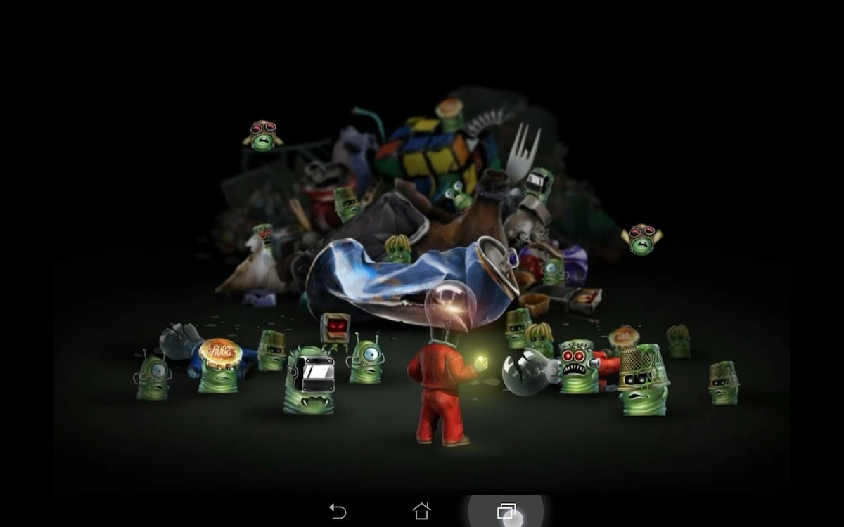
Stay Alight is a small puzzle game in which the player needs to remove monsters from trash cans by throwing light bulbs at them. To do so, the player needs to aim by touching and moving his finger across the screen. This allows him to define the throw’s orientation and strength.
Tested on Android / Asus Transformer Tab
The game starts up really fast and leads the player directly into the tutorial. The player is told how to interact with the game clearly. The game does not explain the goal of the player before though, which makes the first experience a little perplexing. The player learns to throw light bulbs, but has no idea what it will help him achieve.
The controls of the game seem pretty straightforward at first. However after a couple of levels, they appear to be awkward. Tapping anywhere on the screen will start the aiming process. The player can move his hand up and down to aim, but also left and right. When moving left and right, the throw will be more or less powerful, but it can also revert the direction of the throw.
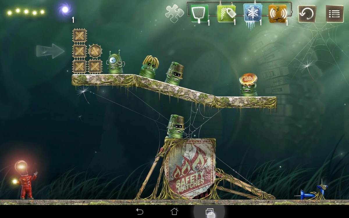
While this gives the player freedom and helps him prevent holding his hand above the area he wants to aim for, or the cues helping him to aim, it can get pretty frustrating. For example, the player can start his move too much to the right, and end up needing to go off the screen should he want to be able to aim further away if from the start, the power was very low at the previous throw. There is also a good chance he’ll release the aim by accident, which basically costs him a life, since he has limited ammo.
The developers probably noticed this issue, because they allow the player two switch fingers. This helps the player to reposition his aiming finger without shooting by accident. In order to do that, the player has to keep the first finger still, place a second finger on the screen, then remove the first finger, and voilà! The manipulation is quite complex, particularly for mobile interactions. The user is likely to fail if he moves even a little bit, and it should be avoided whenever possible to such a complex motion out of the player, when the game could manage the issue instead of the player.
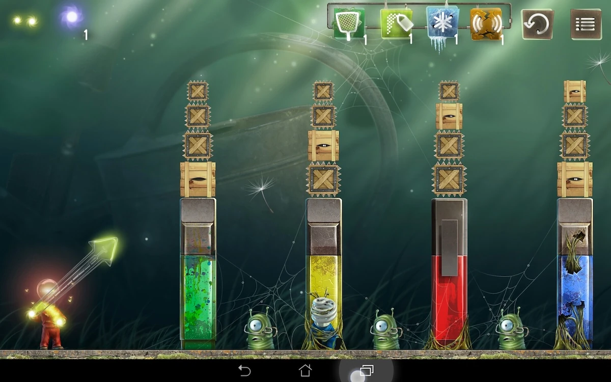
The information about the player’s shot is also unclear. It is likely users will try to throw a ball and be surprised by how little strength they put in the throw, despite placing their fingers all the way towards “powerful”.
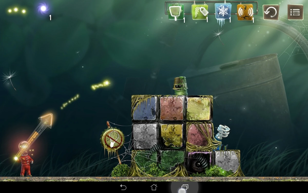
This is due to the visual representation of the throw strength: the throw direction is given by a fixed size arrow. The arrow fills up more or less with light to show how far the light bulb will be thrown. This stands our little, and since both the arrow and its strength indicator are green, the absence of strength can be tricky to detect, in particular when the gauge is almost empty from the start.
Both issues make it difficult to aim precisely and create a lot of frustration and confusion when the player fails without understanding why, and being warned before hand that his aiming was wrong. The small dots giving a hint on the light bulbs’ trajectory aren’t enough to compensate these awkward visual representations. In mobile more than any, visual feedback is extremely important, considering most users play without audio.
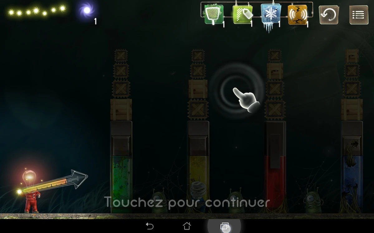
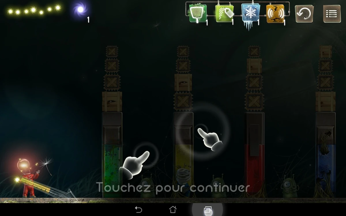
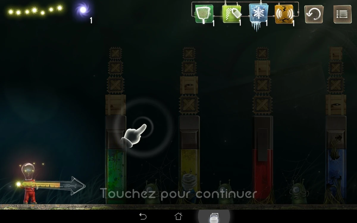
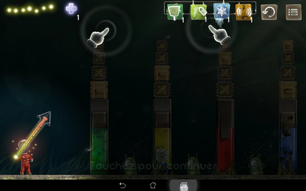
The tutorial does explain the finger swapping procedure, but there too, it is not clear. The player might think the two motions are unrelated. Since the strength gauge is filled up and emptied during the animation, the player might think the direction of the motion gives information about how to adjust the strength of the throw, while it actually should help the player learn a dirty trick to fix the controls issue. The tutorial doesn’t work because it conveys two messages at the same time: one of them is likely to be lost in the process.
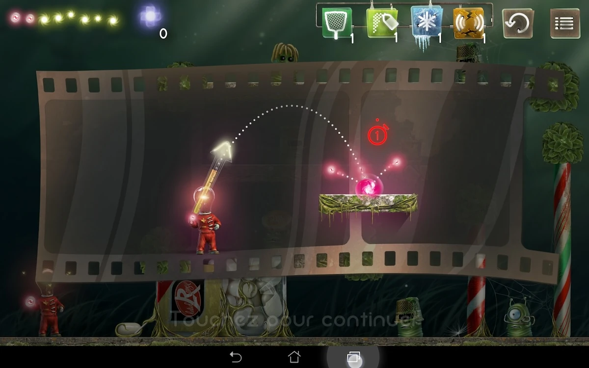
In general, the tutorials seem clumsy, and not straightforward enough. For example, a tutorial explains a red bullet will split in two when hiding the ground, giving a chance to hit one enemy on each side.
The player will wonder where he can get them first: the list of available bullets on top of the screen doesn’t stand out to help him understand they are given at the begin of the game. Before that, the player may not understand why he has a game over after 3 throws for the same reason: he never was told before he had limited bullets available.
It gets even worse when the player tries out the red bullet, and it disappears into a bush : another feature that is not clearly explained to the player, while its behavior seems quite subtle. With an accumulation of small disappointments and frustrations like this, it wouldn’t be surprising if the player quit the game with a negative experience.
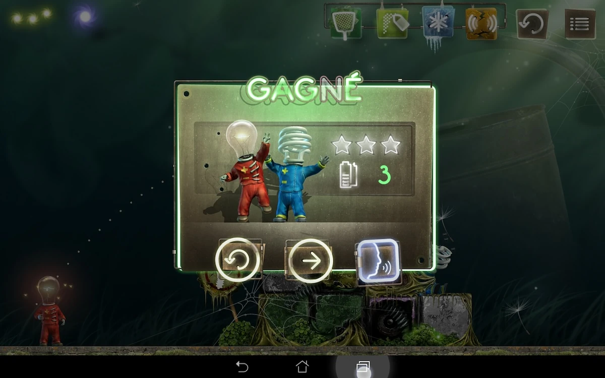
Aside from the learning experience, the game allows to easily move on to the next level after one is completed.
Loading times between two levels are short, but their lack of visual appeal, and the fact the previous level is visible below the overlay fails to help the player remain patient when repeatedly waiting for levels to load.
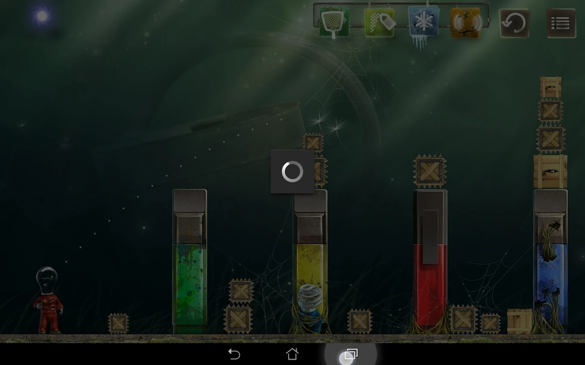
The loading times seem longer than they actually are, although their duration is quite reasonable.
Articles on similar topics
The Mass Effect series
Game Usability reviews, Game user experience analysis,
A game usability review of Triple town
Game Usability reviews, Mobile game user experience,
A game usability review of Amazing Brick
Game Usability reviews, Mobile usability, Mobile game user experience, Game user experience analysis, Initial experience, Out of box experience,
A game usability review of Auralux
Game Usability reviews, Mobile usability, Game user experience analysis, Initial experience, Out of box experience,
A game usability review of Ollie Pop Retro Skateboarding
Game Usability reviews, Game user experience analysis, Mobile usability, Mobile game user experience, Initial experience, Out of box experience,
A game usability review of Time of Exploration
Game Usability reviews, Game user experience analysis, Mobile usability, Mobile game user experience, Initial experience, Out of box experience,