A game usability review of Color Puzzle
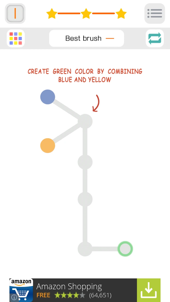
Color Puzzle is a fun little puzzle game that requires the player to paint targets in a specific color. To do this, the player can drag colors from a source to a destination, following a path among predefined possibilities. When two different colors meet, they blend and form a new color. When a blended color meets another, they erase each other.
Tested on Android / Samsung Galaxy S3
On start up, the game is very quick to load and gives access immediately to gameplay. This is very important since the player only takes a couple of seconds to decide to play or quit the game forever.

The game starts with a brief animated tutorial which clearly explain the game’s controls and goals. The first two levels also include just the hints on screen that are needed to get started, even if the player skipped through the tutorial animation without reading it.
The animated tutorial at the start explains all the game mechanics at once though. The two last steps are likely to be forgotten by the player by the time he needs to use that knowledge.

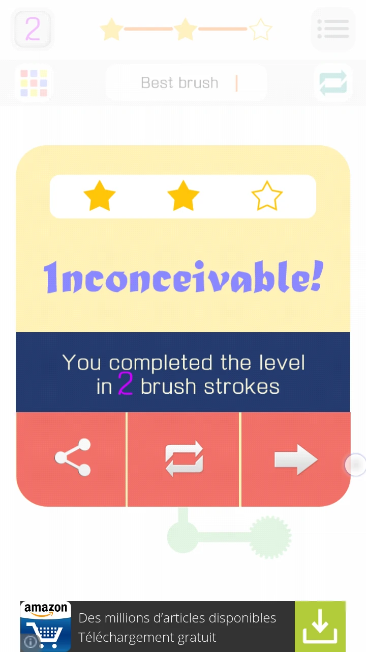
Playing through the levels is very fast thanks to an epic but brief winning animation, and a fast loading “next” level access in a single tap. The player also has the option to replay directly if he’s not satisfied with the number of stars he got for example.
The game shows interstitial adds, which are a bit intrusive, but they come only once the player has started having fun, and they can easily be closed. Smaller adds are presented at the bottom of the screen, which can be distracting and prone to accidental clicking, which can disrupt the game experience.
The on-boarding process is very smooth, and progressing through the game as well.

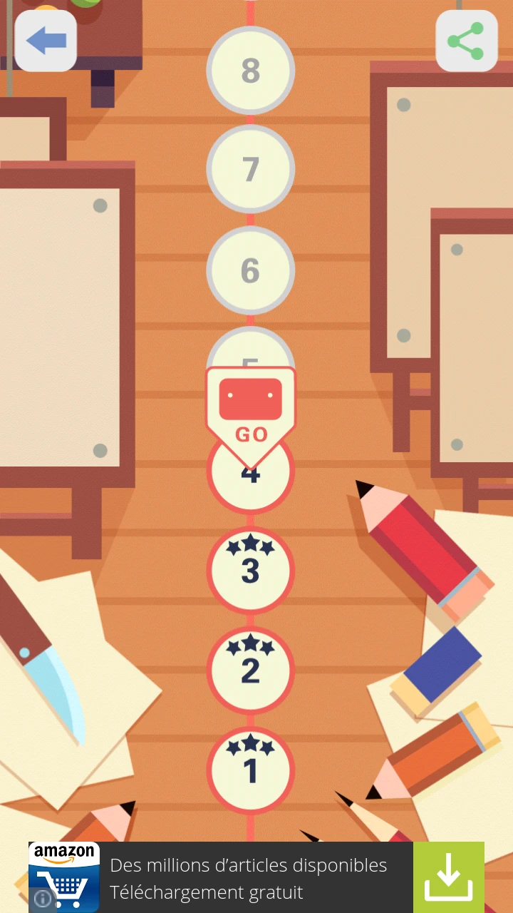
The main usability issue is for longer term player. Once all levels have been completed once, the player might be interested in re-playing previous levels, to achieve the maximum score and stars ranking. The list of levels is automatically set to the latest levels of the game. This means to play level 25 again, where the player only had two stars out of three, he will need to scroll all the way down again from level 150.
Worse, when he completes the level, and clicks next, to maximize his score at level 26 next, he is redirected to the last of the completed levels in the list. This means for each level he wants to replay, he needs to scroll through the whole list again. This is a hassle for the player, and greatly reduces the game’s replay value, even though players are likely to be engaged to play on in the first place.
Articles on similar topics
The Mass Effect series
Game Usability reviews, Game user experience analysis,
A game usability review of Triple town
Game Usability reviews, Mobile game user experience,
A game usability review of Amazing Brick
Game Usability reviews, Mobile usability, Mobile game user experience, Game user experience analysis, Initial experience, Out of box experience,
A game usability review of Auralux
Game Usability reviews, Mobile usability, Game user experience analysis, Initial experience, Out of box experience,
A game usability review of Ollie Pop Retro Skateboarding
Game Usability reviews, Game user experience analysis, Mobile usability, Mobile game user experience, Initial experience, Out of box experience,
A game usability review of Time of Exploration
Game Usability reviews, Game user experience analysis, Mobile usability, Mobile game user experience, Initial experience, Out of box experience,