A game usability review of Wave Run
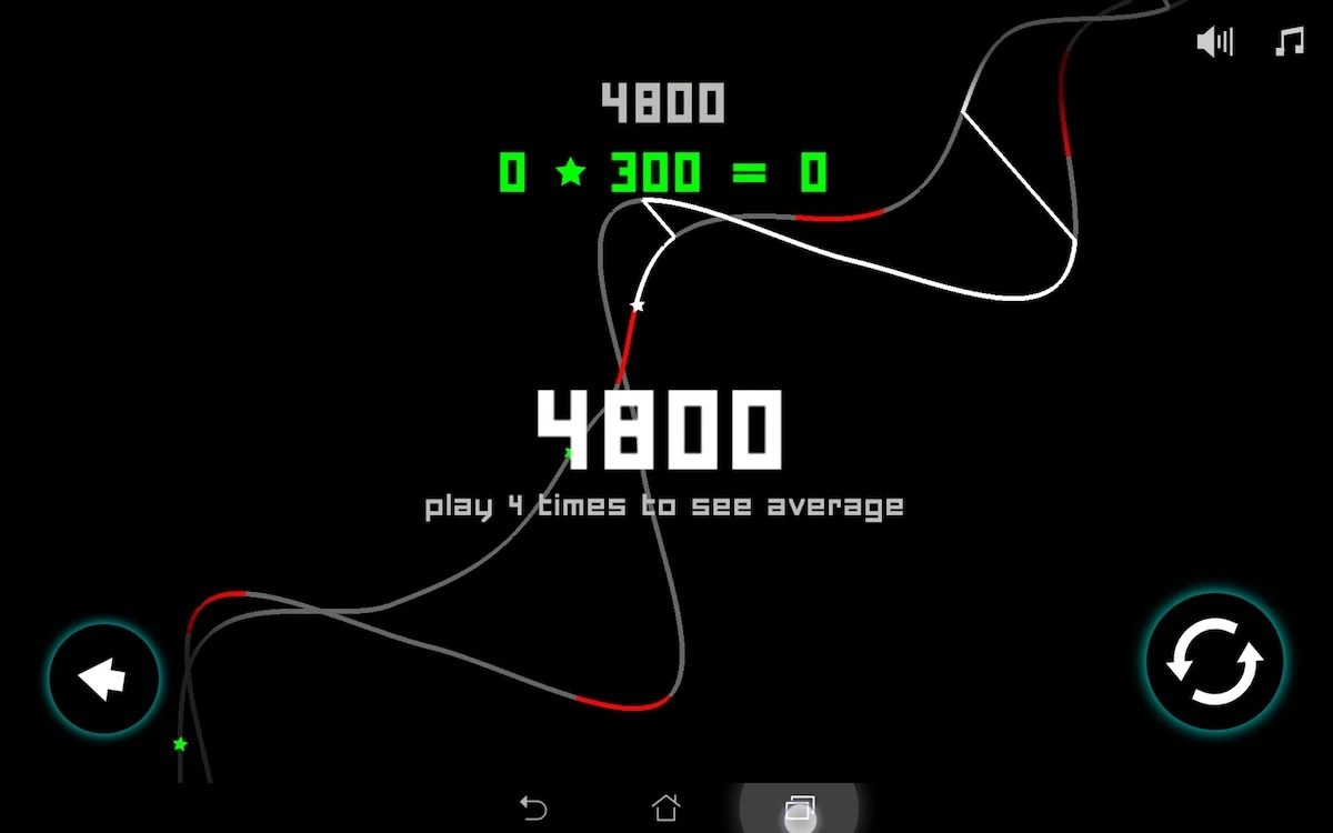
Wave Run is one of those games that is easy to learn and hard to master. The player is an electric impulse on a sound wave. Tapping the screen allows him to jump from one wave to the other. The player’s goal is to go as far as possible without touching an obstacle, while collecting bonuses to increase his score.
Tested on Android / Asus Transformer Tab
Wave run starts with asking the player twice to connect to social networks. not only this keeps the player from reaching the game, he also doesn’t know why he should connect to his social networks, since he didn’t get a chance to like the game, and doesn’t know what additional features it will unlock, and if they would interest him.
On the start menu, the interface appears clean and simple. The background animation pretty much show the player what he can expect from the game, in terms of visuals, gameplay and music, creating positive expectations. The next steps are straight forward as well, to launch a game.
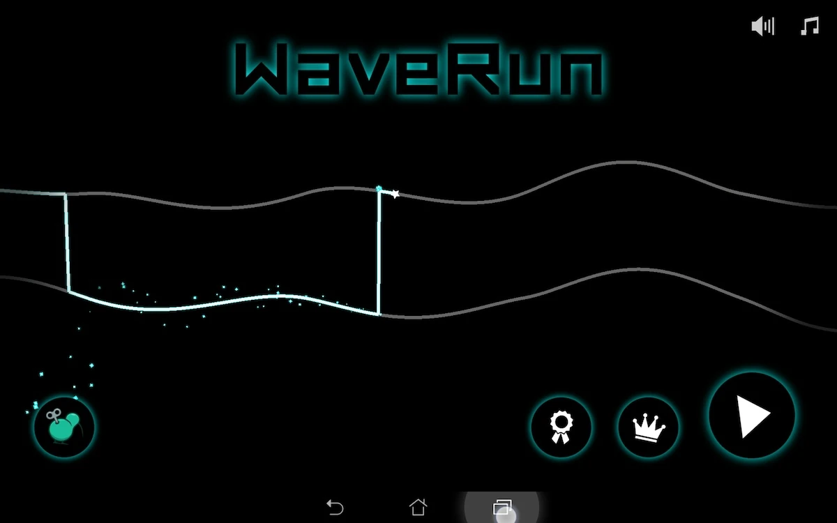
The interface also shows social features from the start. Though they are not clearly defined, the player could expect to find leader-boards and achievements behind each of them. On tap, they ask the player to connect to a social network. While this has the advantage of selling the feature to the player and showing him the advantages of using social networks, the player does have to tap it to know if the feature requires an account or not. A small indication could help the user feel less frustrated if finally he can’t access the feature directly – or at least help him anticipate that he needs to connect to use these features, potentially making him feel like he wants to before he is asked.
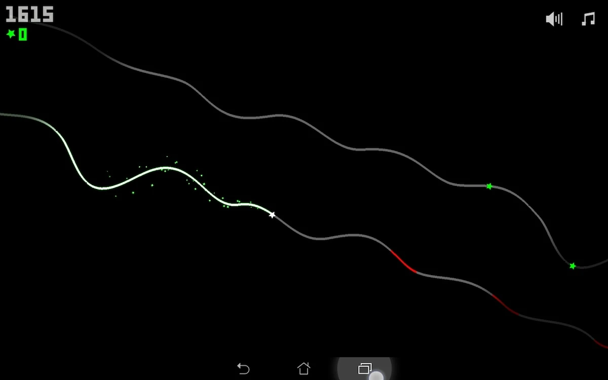
Once in game, there is no actual tutorial. The game just leaves the player i the first level without a clear goal. Since the interactions are quite straightforward, the player can quickly learn by trial and error, specially since the game restarts extremely fast after a game over. The game also uses well known codes to ease learning of the game’s mechanics.
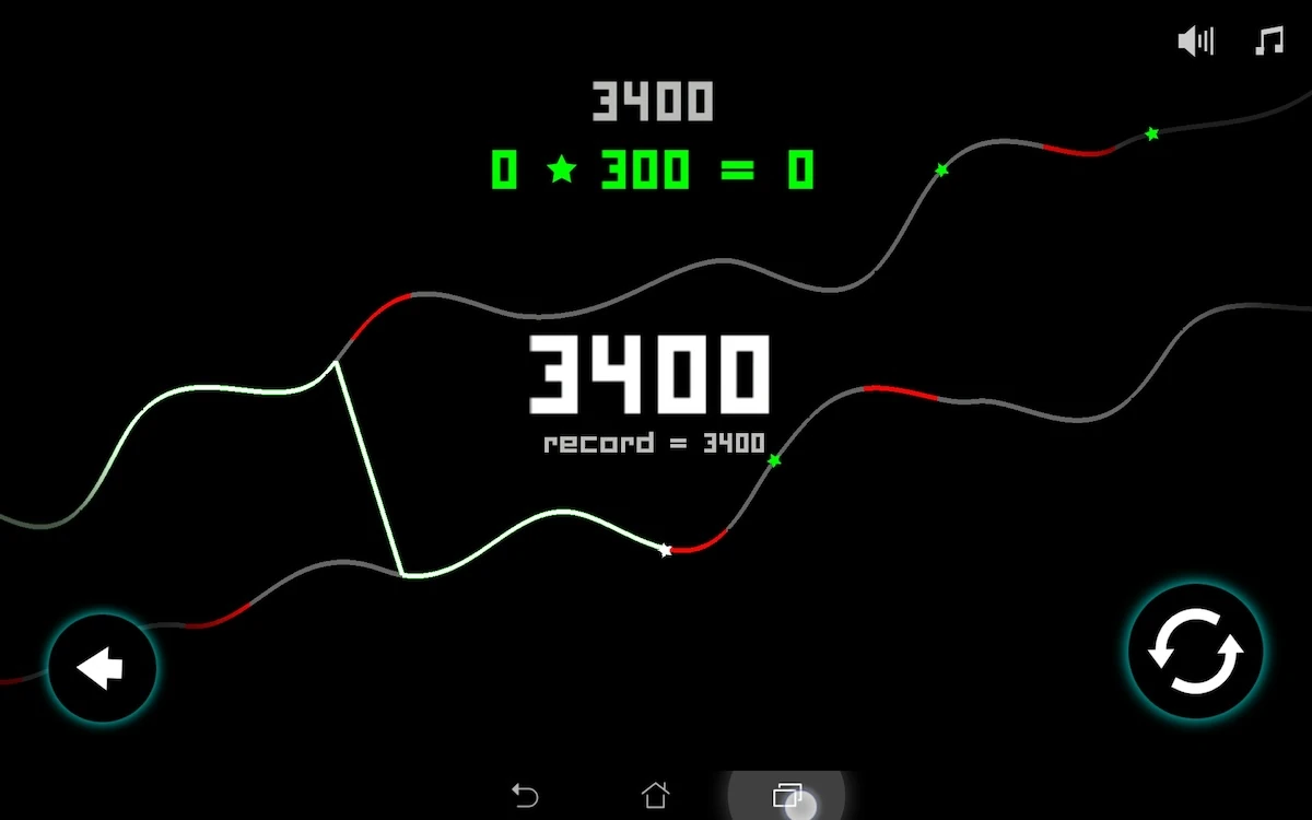
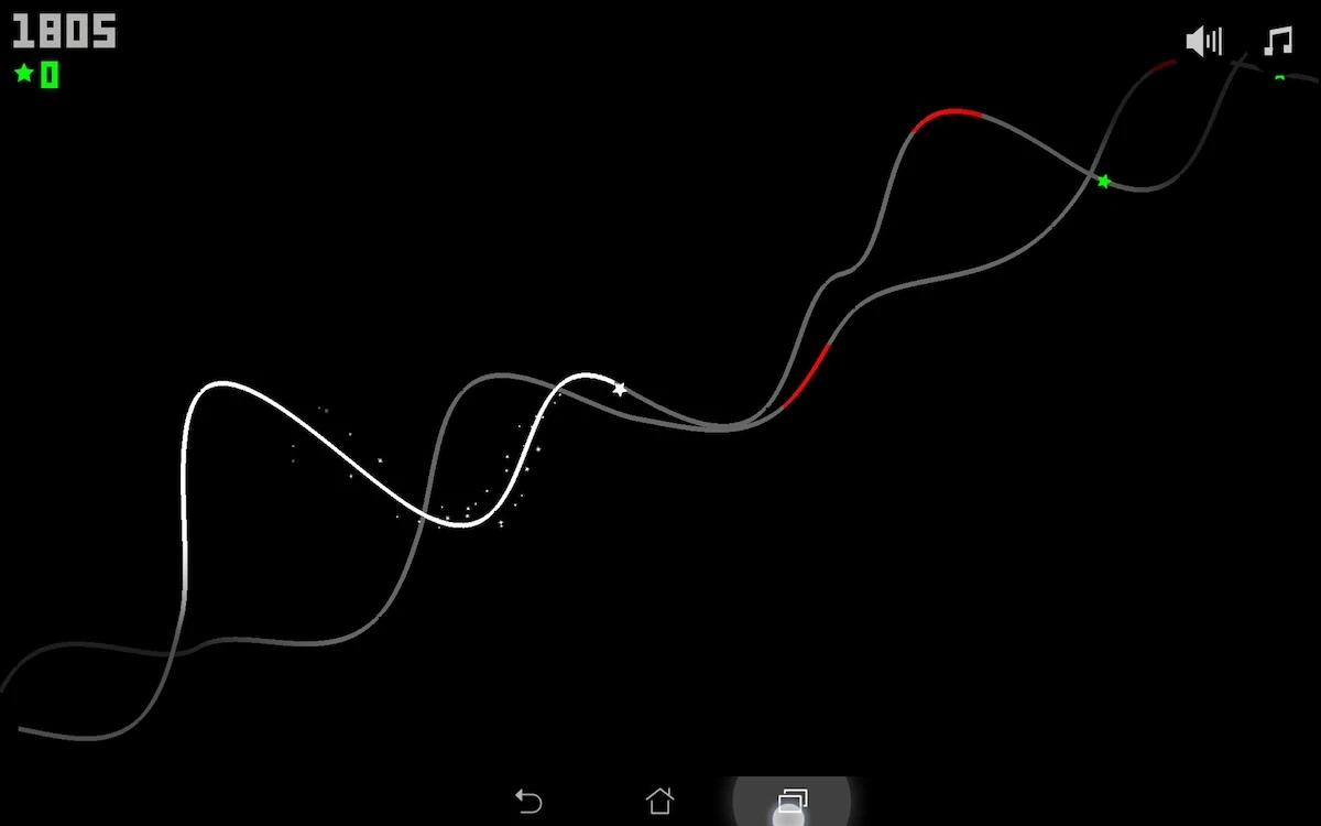
Red is used for bad things, green for good things. The player soon figures out he has to avoid red stuff and collect green stuff.
After a game over, the game displays the screenshot of when the player failed, which also helps him understand his error even if he didn’t know the game rule before.
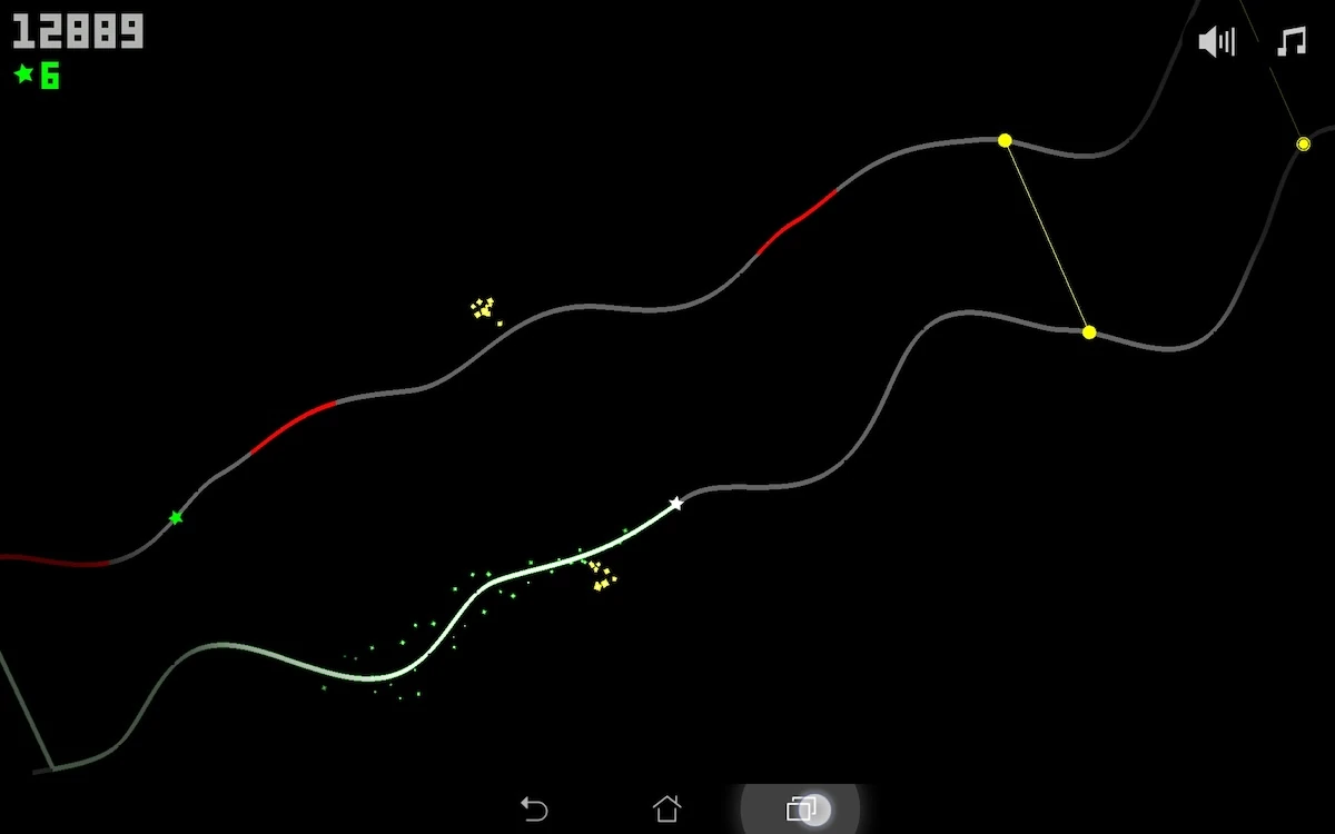
Yellow signs in game are more difficult to understand. Yellow is used for bars that link both lines. The player can understand them both as obstacles, maybe less dangerous than the red ones, or bonuses if he crosses from one wave to the other exactly at that moment.
While feedback for collecting items and failing to avoid obstacles are extremely clear, the one for crossing a yellow section isn’t. Does the player have to dash through a door, does he need to make a special move or action, or does it just mark a checkpoint or progress point? The feedback when moving from one side to another at the same time or just crossing through seems to be the same. For this feature, it is less clear for the player both what to do, and if he succeeded or failed.

When progressing throughout the game, and trying different game modes, the player can adapt his choices to his level of expertise of the game. The difficulty level is very progressive, both in terms of speed, visual complexity of the waves and obstacles positions.
Lastly, the game is very friendly with device native features, and provides a consistent experience and behaviour of the device’s buttons.
Articles on similar topics
The Mass Effect series
Game Usability reviews, Game user experience analysis,
A game usability review of Triple town
Game Usability reviews, Mobile game user experience,
A game usability review of Amazing Brick
Game Usability reviews, Mobile usability, Mobile game user experience, Game user experience analysis, Initial experience, Out of box experience,
A game usability review of Auralux
Game Usability reviews, Mobile usability, Game user experience analysis, Initial experience, Out of box experience,
A game usability review of Ollie Pop Retro Skateboarding
Game Usability reviews, Game user experience analysis, Mobile usability, Mobile game user experience, Initial experience, Out of box experience,
A game usability review of Time of Exploration
Game Usability reviews, Game user experience analysis, Mobile usability, Mobile game user experience, Initial experience, Out of box experience,