A game usability review of Fast Fingers
Fast Fingers is a game where the player has to cross a maze with his fingers without touching the edges of the required trajectory while avoiding moving / dangerous obstacles on the way.
Tested on Android / Asus Transformer Tab
Although the game asks for connecting to social networks before the player even started a session, and the first menu has many icons, which can be confusing, the first play session can be reached really fast. This is very important for mobile games in particular, because players tend to quit the game really soon if the start-up takes too long. The first few seconds are crucial to captivate the target audience.
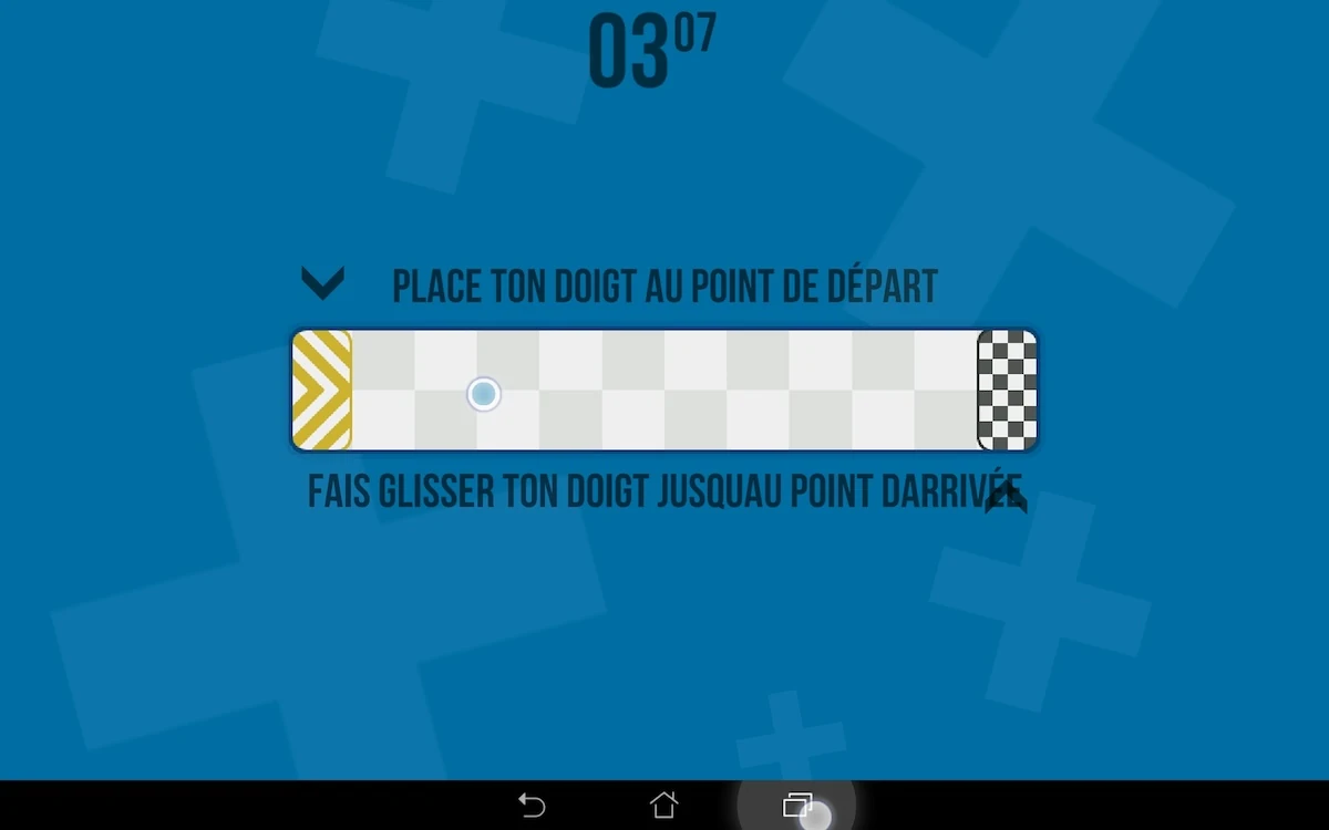
The game starts with a tutorial, but its content is partly displayed below the play area, which means it’s likely to be hidden by the player’s hand at the time it appears. Messages appear in the first few levels to help and guide the player while he discovers the game.
Because of their position, they’re likely not to be read by the players. The main issue with this is that they appear only once, which means if the player realises there was text afterwards and goes back to read it out of curiosity or to be sure he got the game rules right, he won’t be able to.
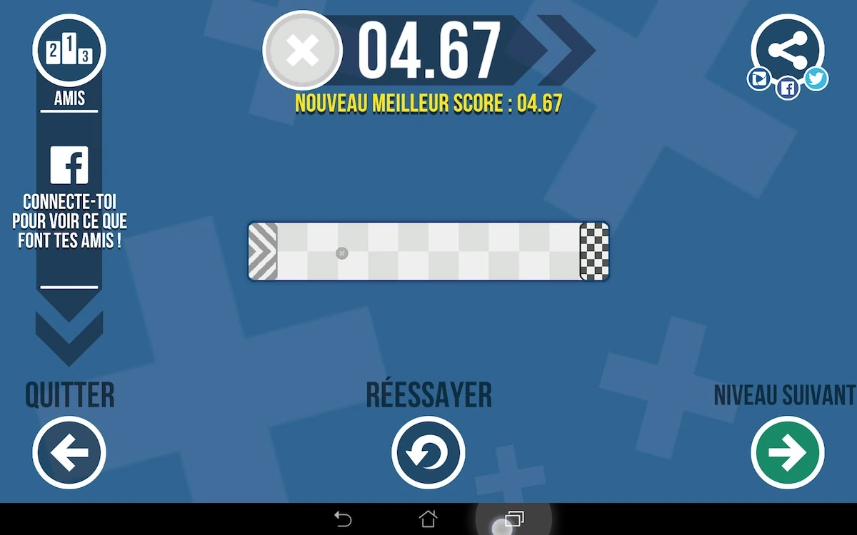
After the player completed a level, he will be presented with a replay of his actions. He will be able to view where he could improve his play, if he wants to maximize his performance. The replay can also easily be skipped and moving on to the next level is very fast for those who want to rush through one time before perfecting their highscores.
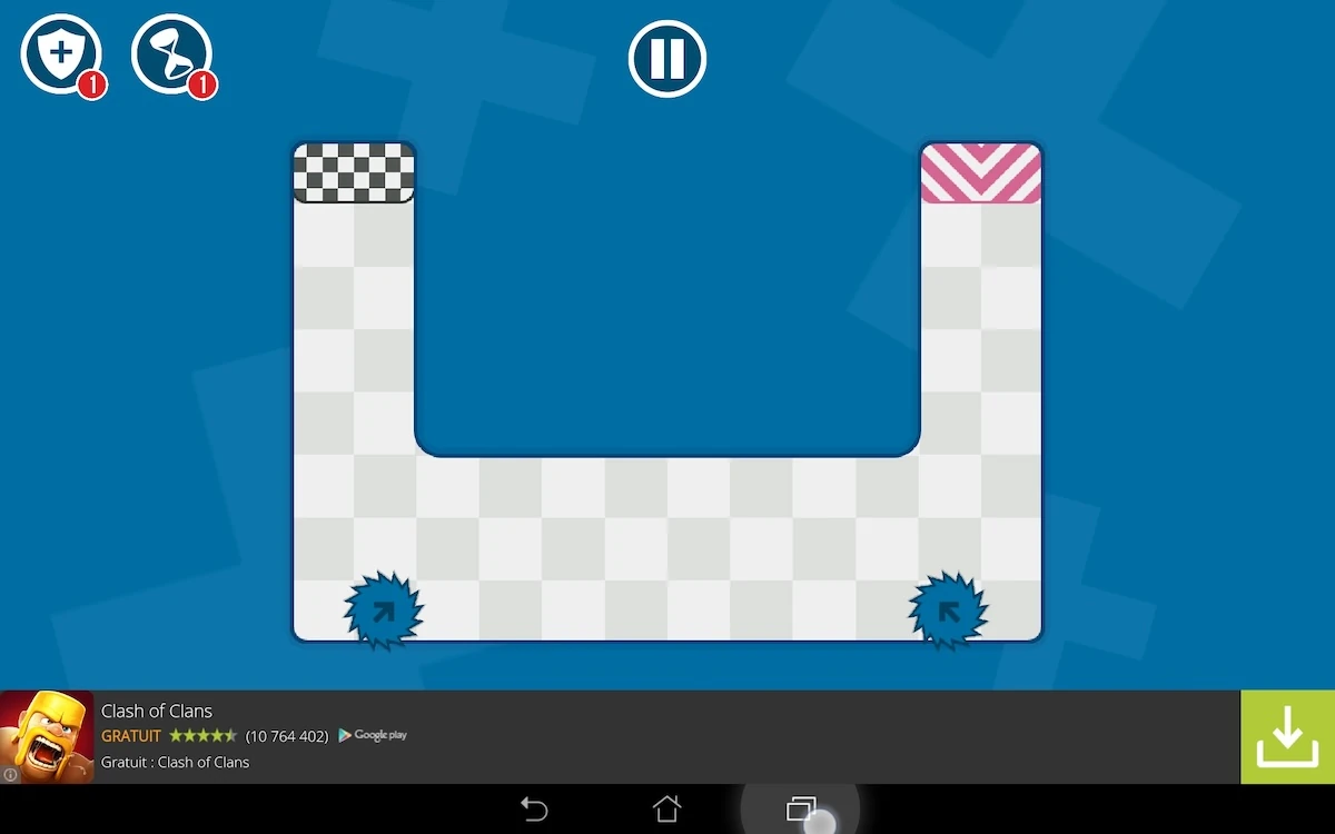
Before playing, obstacles that will move provide visual cues, like arrows or other symbols. These help the player anticipate the level’s behaviour before they tried it, and helps them plan their play-through even on their first try. This helps the player feel in control of the game, by letting them plan ahead and make real choices, rather then learn the hard way through trial and error.
During the game, the finger’s interactions leaves a trail, which gives a positive feedback to the player that he is interacting with the screen, and about what movement he has just made. this also allows him to realise if he is not exactly making the movement he expected, and to correct it if needed. Generally the in-game feedbacks of Fast fingers are clear and explicit: when the player passes, or when he collides an obstacle, the player knows if he failed, when and why thanks to both visual and auditive cues – if their sound is on.
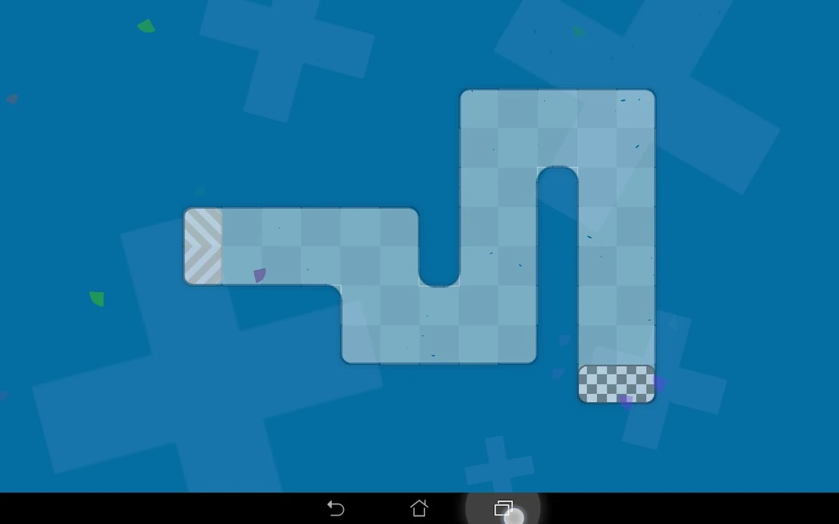
Depending upon the level’s orientation, to the left or to the right, the game will be easier for left and right hand usage, which might be cool for lefties. The hand moves necessarily towards one side of the screen or the other. When the motion goes towards the right, this means while playing with the right hand that the upcoming obstacles may be hidden by the player’s right hand. *
On the contrary, when using the left hand, the player would hide what’s behind him, leaving a clear view. When the level moves the other way around, it feels a little less natural to go against the writing direction, but the right hand is easier to use and does not obstruct the view. If the game would maximize its usability, it could propose all levels mirrored to advantage one or the other directing hand. Mixing both directions is a good compromise however.
To avoid this kind of issue, the easiest way for the player would be to play bottom to top of the screen so his visibility isn’t impaired whichever hand he prefers to use to complete the level.
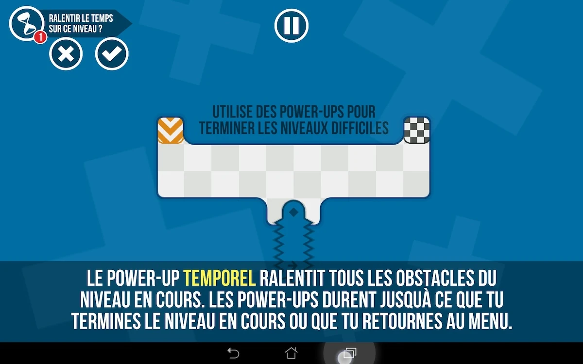
The game offers to use power-ups in the game to make complex levels more easy to achieve, for example, by slowing down time. When the player taps one of the power-ups, the game will show him a description of what the power-up’s effects will be and ask him to confirm his choice, or to cancel it. This ensures the player has control over his choices and doesn’t waste power ups by accident on easy levels – specially if he invested or kept them aside for later in the first place.
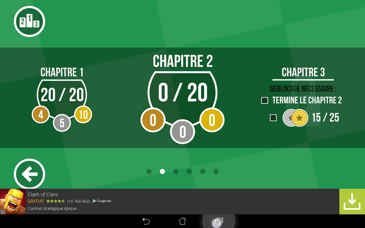
From level 20, things can get ugly: adds displayed at the bottom of the screen seem to hide part of the level design, even if it’s a minimal overlap. This may bother the player, who might wonder if the easy route isn’t hidden behind the add. It also can lead to involuntary inputs on the add. it would be better if a space is reserved for adds to keep the player area well away from it, so the user doesn’t worry about it.
The back button of the device is naturally used to pause the game. Pressing it twice however resumes the game, while the player expects it to close the game – which would be the standard behaviour of the button on most other apps he is used to. This is a bit confusing.
The buttons on the pause menu itself are quite confusing: a X button actually brings the user back to the main menu. This symbol is usually associated with closing the current dialogue, so it can get confusing, specially since its location is closer to the typical resume or access the menu area… Using a hamburger icon here would make more sense and avoid both confusion and errors.
Articles on similar topics
The Mass Effect series
Game Usability reviews, Game user experience analysis,
A game usability review of Triple town
Game Usability reviews, Mobile game user experience,
A game usability review of Amazing Brick
Game Usability reviews, Mobile usability, Mobile game user experience, Game user experience analysis, Initial experience, Out of box experience,
A game usability review of Auralux
Game Usability reviews, Mobile usability, Game user experience analysis, Initial experience, Out of box experience,
A game usability review of Ollie Pop Retro Skateboarding
Game Usability reviews, Game user experience analysis, Mobile usability, Mobile game user experience, Initial experience, Out of box experience,
A game usability review of Time of Exploration
Game Usability reviews, Game user experience analysis, Mobile usability, Mobile game user experience, Initial experience, Out of box experience,