A game usability review of Rythm Racer
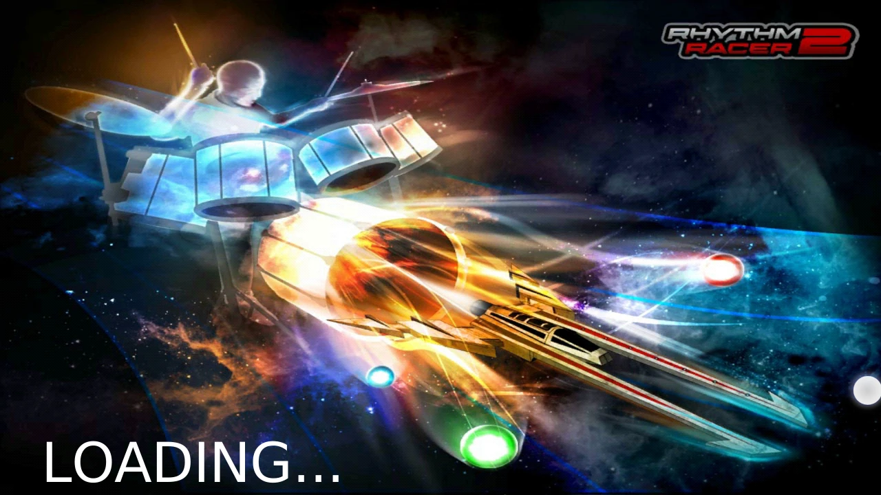
Rhythm Racer is a musical game in which the player has to race with a spaceship on some musical background. The player has to “catch” notes, by moving left and right on the track. Each note creates a sound forming the song track, missing them mutes the sound, as in a Guitar Hero / Rock Band game. When the player catches many notes in a continuous sequence, he gets bonus points to encourage perfect sequences.
Tested on Android / Samsung galaxy S3
The game starts up really fast and allow to player to access the gameplay quickly.

The menus to get into the game are a bit confusing though. First of all, the game displays adds on top of the screen. This would be okay if it didn’t hide the title of the page, which is also the instruction for the player to know where he is and what he’s doing. In this case “select level” can not be read properly. It’s not blocking, but it looks unprofessional.

The levels are presented in a carousel, with small dots to say how many options are available below. The player can use gestures from his phone (like the swipe motion, to select a different level.
The player can also tap each side of the carousel to move the selected item one way or another. Tapping the centre of the displayed option validates the choice. This uses the mobile device’s specific interfaces really well and adjusts both to the novice and more advanced users.
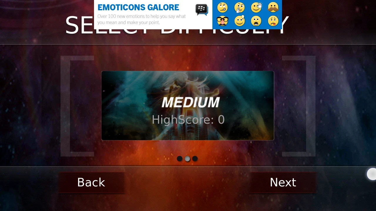
The buttons and interface arrangement is a bit confusing however. The sides of the carousel don’t indicate that the area can be tapped. Below the carousel is a button called “next” which validates the choice above. They player is more likely to expect the button to change the selection to the next entry. Naming the button “confirm” would be more explicit, and would avoid potential errors.
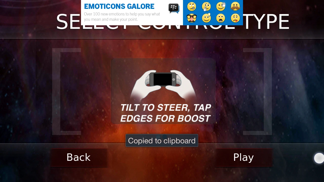
Once in-game, a brief and explicit tutorial explains the concept and the player can decide to start playing when he feels ready. The loading is quite fast too.
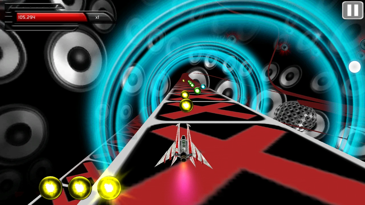
The game offers clear feedback on the player’s success or failures, both through the sound, but also thanks to obvious visual effects: collected notes are listed at the bottom of the screen, and each time a sequence is complete, the spheres visually move towards the score in the corner to show the bonus acquisition.
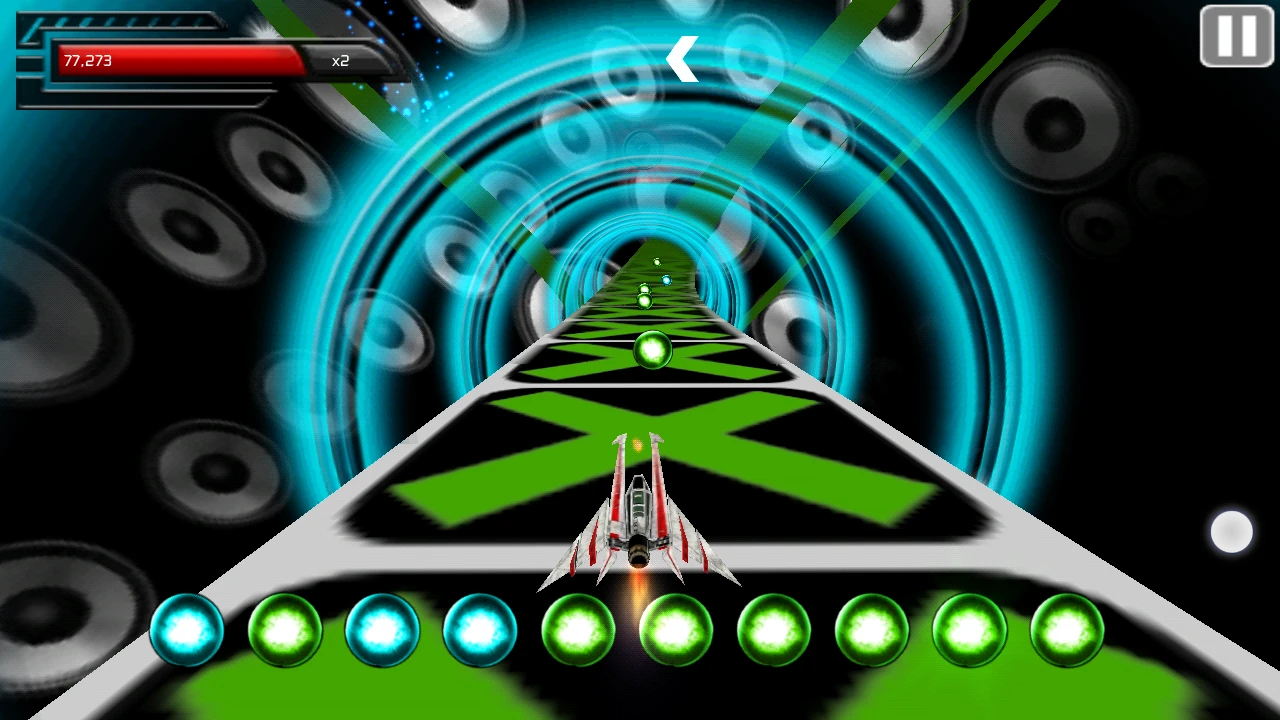
When a note is missed, the sequence is reset.
The game has colourful backgrounds and a dynamic disco feel. Because of this, sometimes, the targets are hard to see. Spheres are different colours depending upon their position on the track.
The track itself changes between different colours, and the background’s “horizon” also uses all the shiny colours of the spheres.
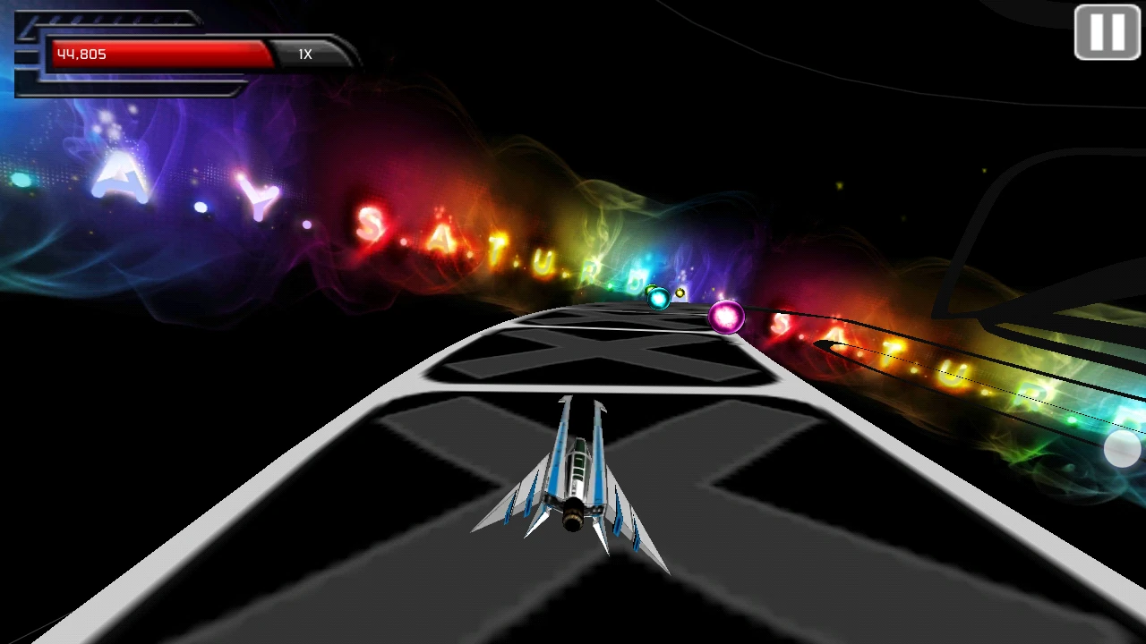
As a result, when the track has a downwards curve for example, sometimes the targets are not visible enough compared to the background colours.
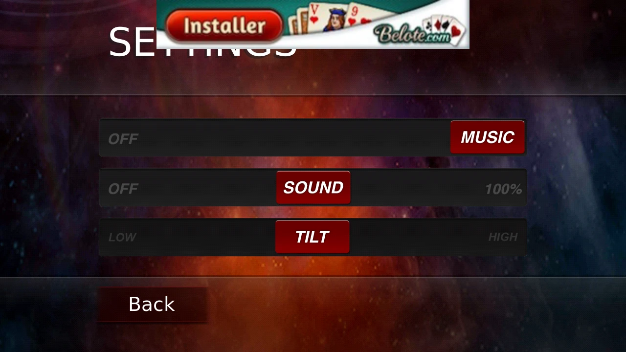
The interactions to move the vessel left and right are based on the mobile’s motion sensor. This means tilting the device left or right will move the vessel. To my taste, the sensitivity was a bit too strong, and I was pleased to see the game allows to adjust this in the settings.
Giving flexible controls contributes to make the game both more usable and accessible.
Articles on similar topics
The Mass Effect series
Game Usability reviews, Game user experience analysis,
A game usability review of Triple town
Game Usability reviews, Mobile game user experience,
A game usability review of Amazing Brick
Game Usability reviews, Mobile usability, Mobile game user experience, Game user experience analysis, Initial experience, Out of box experience,
A game usability review of Auralux
Game Usability reviews, Mobile usability, Game user experience analysis, Initial experience, Out of box experience,
A game usability review of Ollie Pop Retro Skateboarding
Game Usability reviews, Game user experience analysis, Mobile usability, Mobile game user experience, Initial experience, Out of box experience,
A game usability review of Time of Exploration
Game Usability reviews, Game user experience analysis, Mobile usability, Mobile game user experience, Initial experience, Out of box experience,