A game usability review of Strata

Strata is a game in which the player has to wave ribbons together to create a pattern. His goal is to use ribbons of different colors at the right time and spot, in order to complete a target visual.
Tested on Android / Asus Transformer Tab
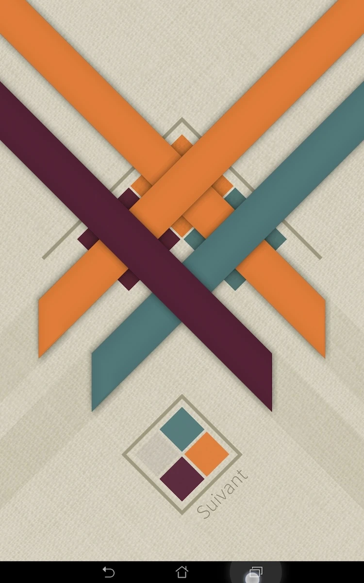
When connecting to the game, the player is first asked to connect to social networks twice. He soon arrives in the game despite this, which is a good thing. The first menu is not directly understandable, but the screen reflects the game’s core mechanics, and uses them to access the actual levels.
The interactions themselves are quite simple, and the player can’t really get it wrong, since there’s only one option. This makes the menu original yet usable. Interactive elements are indicated through motions and animations, which help guide the player seamlessly towards the first level, despite the absence of explicit instructions.

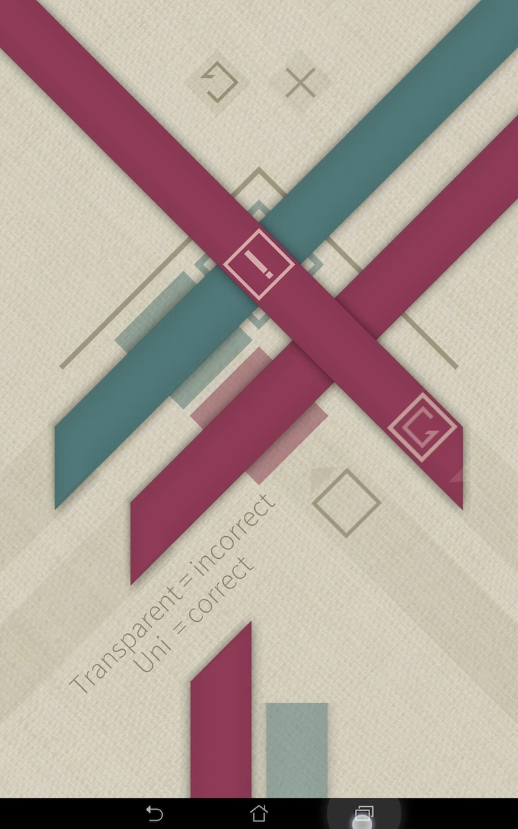
The first level teaches the player the basic gameplay, which he already used: tapping the icons to place ribbons. Each of the first levels teachers the player one thing: adding ribbons, how to read the feedback on valid results vs. wrong colored spots.
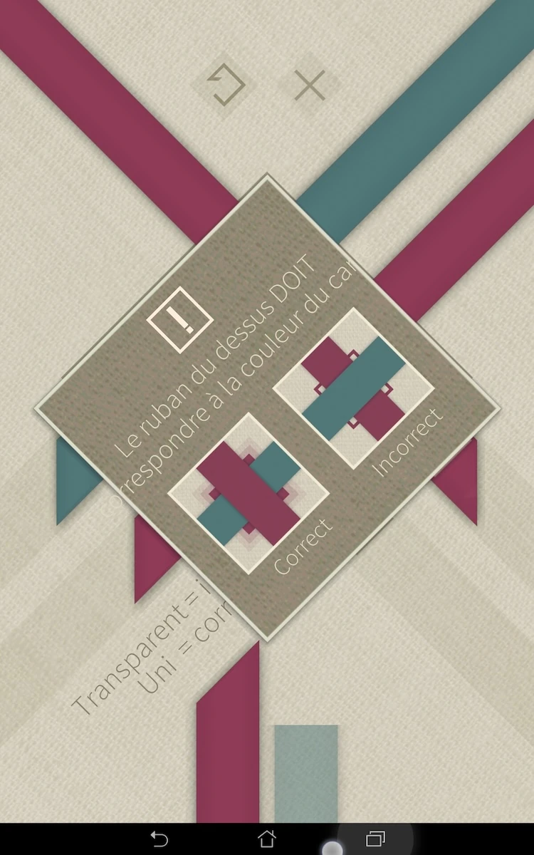
When the player makes an error, he can tap the faulty square, which will trigger a dialogue telling him how to undo his actions, if he didn’t get the tutorial yet, or if he forgot how to do it. The icons themselves to do and undo an action are quite explicit.
The player can only perform 3 actions at any time in the game, which are relevant: place a ribbon, undo the last action and change the ribbons’ color from those available.

On step two, the tutorial is given in two dialogues, which pass automatically after a short time. This may cause the player to miss a piece of information if he was inattentive or if he didn’t read fast enough. It would be better to let the user skip the messages manually when he is done reading – to give him better control over the tutorials progress and adapt his behaviour better.

After the tutorial the game takes the player back to the list of completed levels. This is a bit awkward, since the player doesn’t have anything left to do in this menu. He has to navigate back up one level, and select the next list of levels manually. This forces the player to understand how the menu works, but it forces him to perform an action which is neither interesting nor challenging – since the menus are straightforward and use the same icons the player has learnt to use in the game.

Finally, the game doesn’t allow the player to use his device’s native functionalities to navigate the game, such as the back button. This is a bit annoying, because it will be the first reflex of a player if he wants to leave the app fast because something in real life requires his attention.
Articles on similar topics
The Mass Effect series
Game Usability reviews, Game user experience analysis,
A game usability review of Triple town
Game Usability reviews, Mobile game user experience,
A game usability review of Amazing Brick
Game Usability reviews, Mobile usability, Mobile game user experience, Game user experience analysis, Initial experience, Out of box experience,
A game usability review of Auralux
Game Usability reviews, Mobile usability, Game user experience analysis, Initial experience, Out of box experience,
A game usability review of Ollie Pop Retro Skateboarding
Game Usability reviews, Game user experience analysis, Mobile usability, Mobile game user experience, Initial experience, Out of box experience,
A game usability review of Time of Exploration
Game Usability reviews, Game user experience analysis, Mobile usability, Mobile game user experience, Initial experience, Out of box experience,