A game usability review of Silent Age
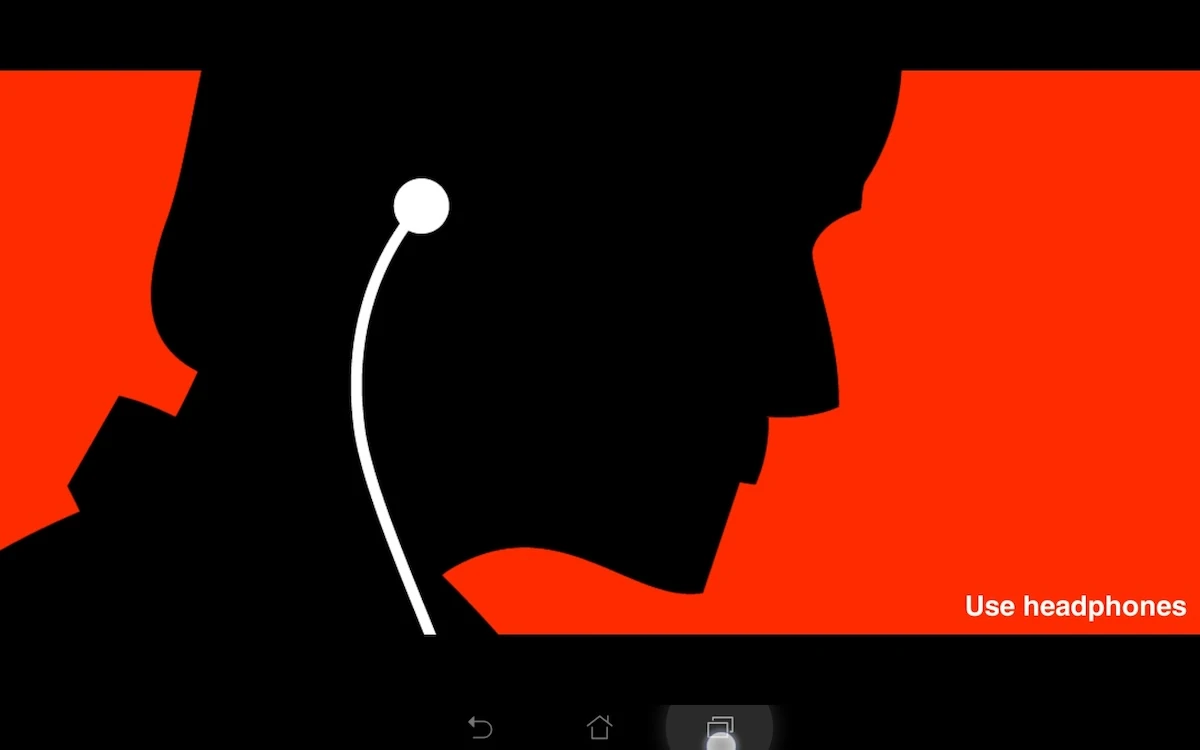
The silent age is a point and click adventure on tablet. In this game, the player has to solve riddles by exploring his environment, talking with people, and using the right items at the right location. He also has the ability to travel through time, which requires him to think outside the box to solve the problems and progress through the game.
Tested on Android / Asus Transformer Tab
The Silent Age starts up really fast, with a nice and immersive intro video. This video sets the mood of the game, introduces the player character and the game world it takes place in.
Texts in the game, be it dialogues, interaction descriptions or menus are clear and readable: nice font size, easy to decipher and presented with a good contrast. The white text on black background might be more tiring on the eye and sensitive to reflections, it integrates well with the global design of the game.
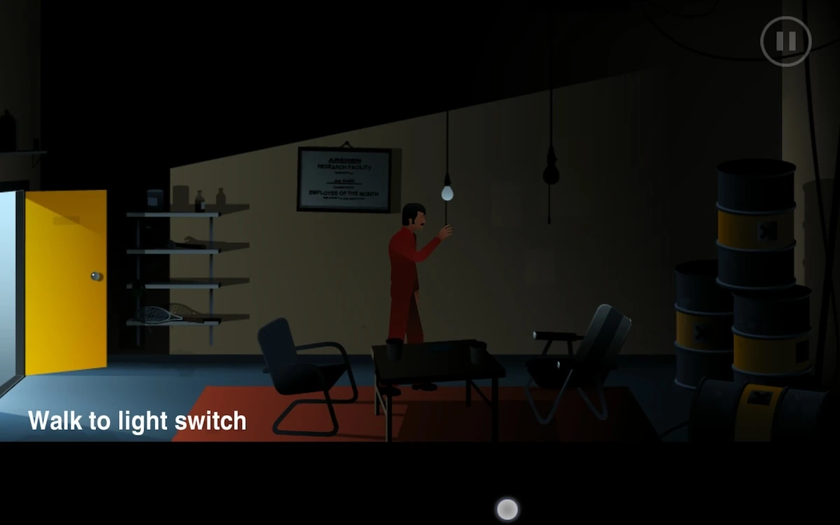
In game, the actions the player will perform are written at the bottom of the screen, near his inventory. Dialogues and descriptions are written on the top of the screen, which helps distinguish content which the player can control and content he needs to read (or not) and can only skip. The interface is structured in a very consistent way.
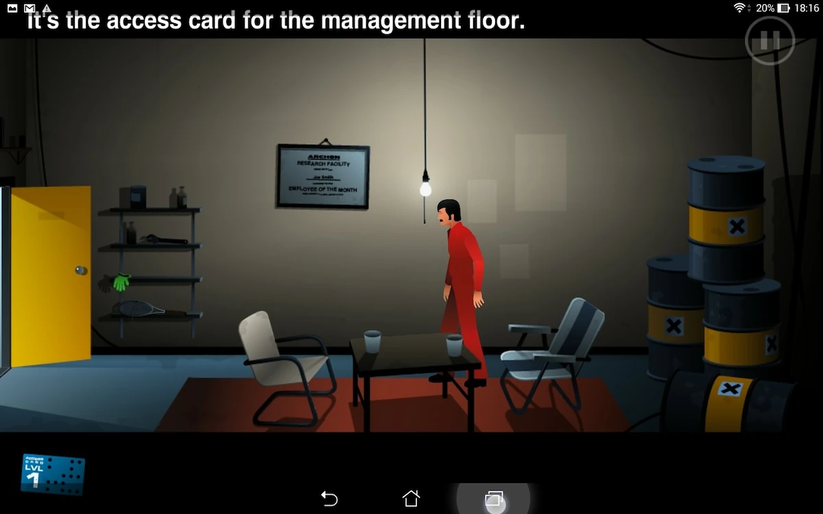
This also means interactions are required in areas that can more easily be reached with his fingers even when holding the tablet, while content that needs visual attention first of all are less likely to be hidden behind his hands.
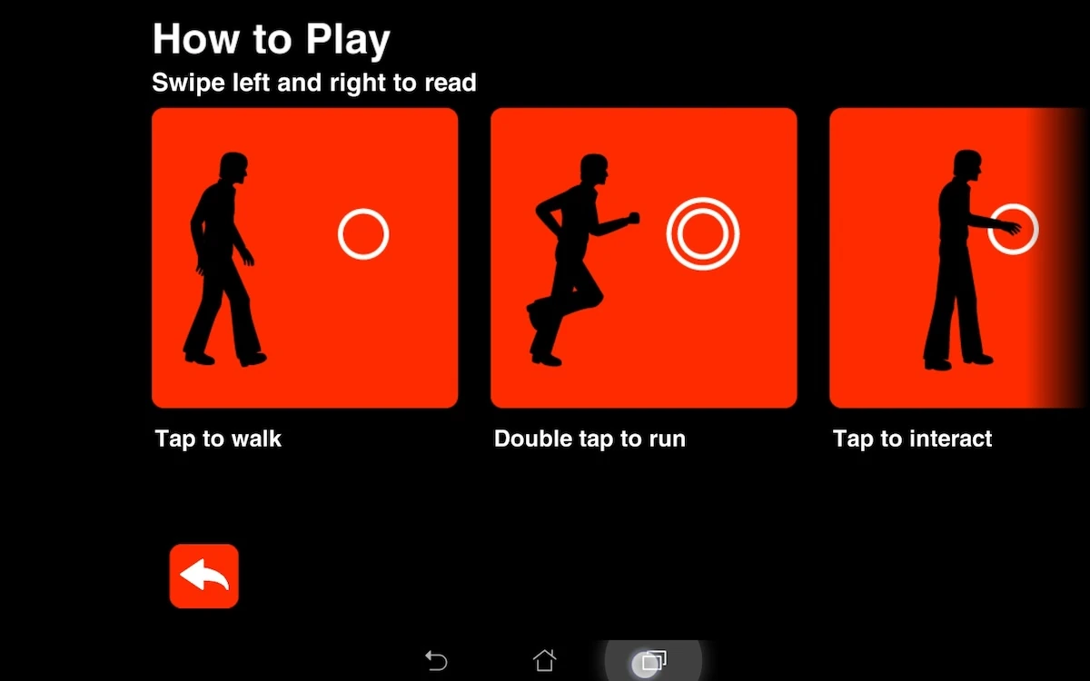
The interactions are well adjusted to touch interface in terms of gestures as well. Like in old school adventure games, the game allows to walk or run to a destination by tapping or double tapping the screen.
Double tapping makes the character run, and can perform an action even if the player has first selected an item from his inventory for example. This used to be a hassle even on some PC adventure games, where the player had to double click the target without an item to be able to run, then use the item – or be doomed to walk there.
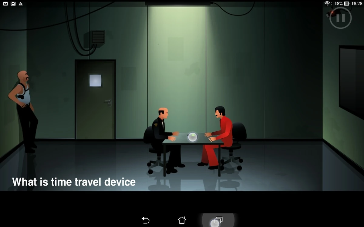
The game also simulates the mouse roll-over from the computer by providing tool tips when the user swipes his finger over the screen : this allows the user to look for hot pixels by moving his finger over the screen, and he can decide to trigger an action directly or not when he releases his touch.
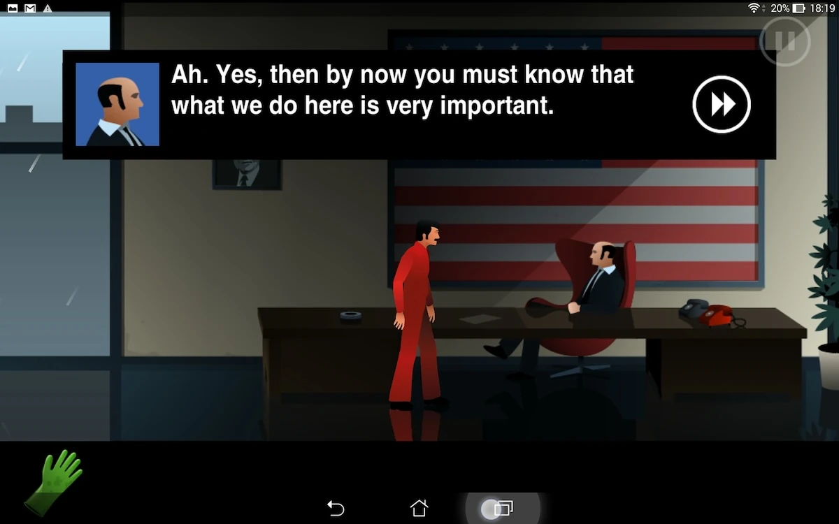
While dialogues are often brief and interesting, the game does not offer a possibility to skip a whole dialogue at once. This could be useful for players who have already played the game, or to avoid having to tap 5 times to go through the same dialogue a second time, if the player tried – as if often the case – to speak with people several times in case they say something different.
In dialogues, the game also doesn’t allow to pause the game: the pause button is behind the dialogue, and is not interactive. This is a shame, specially since the device button works: the back button puts the game in pause and the game resumes properly even during a dialogue. This small inconsistency can be a little frustration for the user, if he is playing on the move in particular.
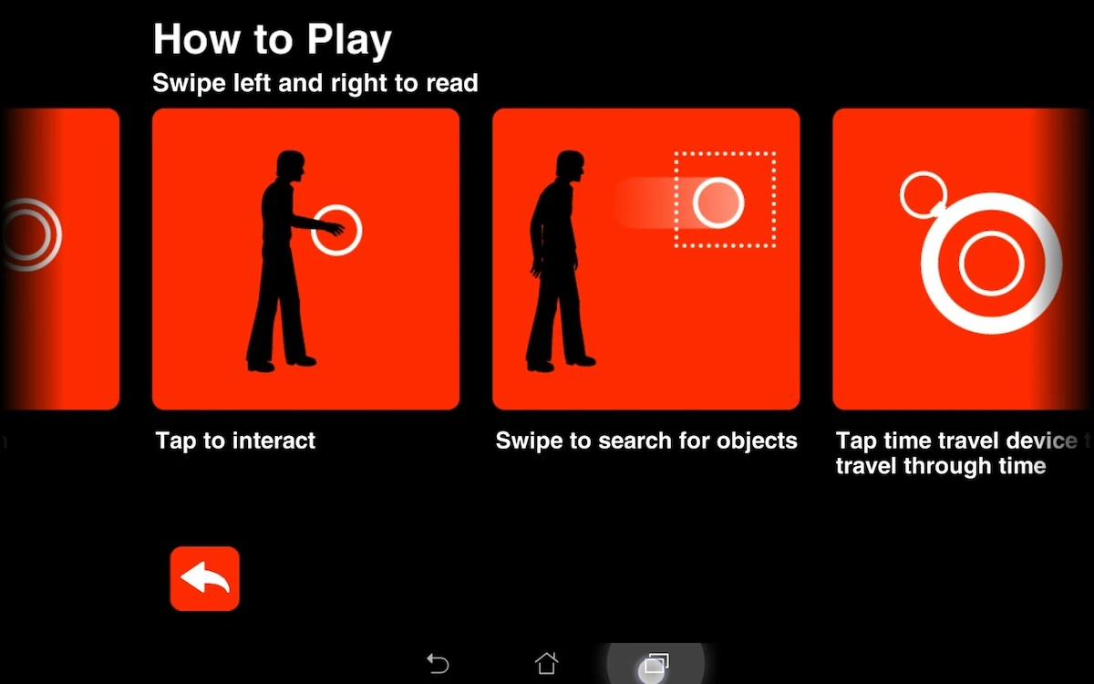
Help is accessible easily through the menu. The help presents all the possible interactions, and game mechanics.
This content is not presented during a tutorial phase before the game is launched. A point and click is quite straight forward, to that might be OK, but the player misses out on advanced functionalities that are very useful, but that other games often don’t have, like the swipe to show hotspots.
Some contextual help in game during the first play, or an optional display of the help when starting up the game could be a nice addition to its usable features.
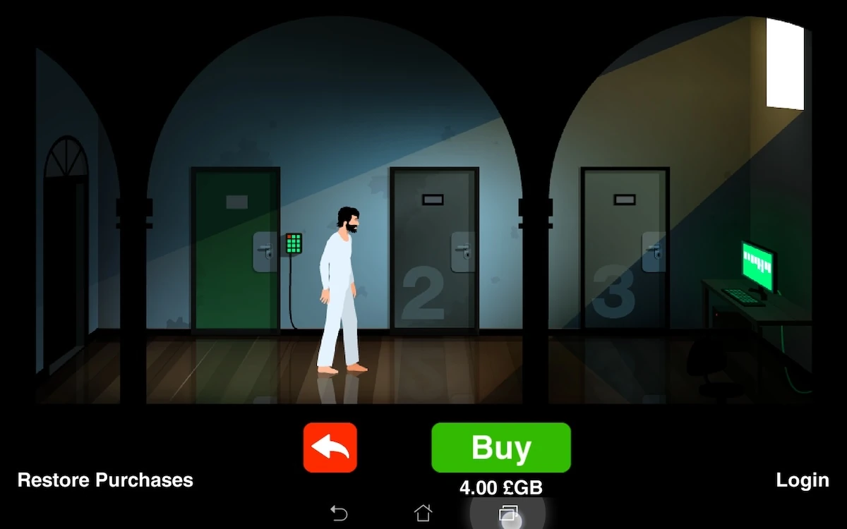
Finally, a small usability issue with the game is seen in the purchase screen, which is presented twice in different ways. The first time, tapping the purchase icon will actually not lead to purchasing new levels, but to the next screen, which basically asks the user the same question a second time.
Articles on similar topics
The Mass Effect series
Game Usability reviews, Game user experience analysis,
A game usability review of Triple town
Game Usability reviews, Mobile game user experience,
A game usability review of Amazing Brick
Game Usability reviews, Mobile usability, Mobile game user experience, Game user experience analysis, Initial experience, Out of box experience,
A game usability review of Auralux
Game Usability reviews, Mobile usability, Game user experience analysis, Initial experience, Out of box experience,
A game usability review of Ollie Pop Retro Skateboarding
Game Usability reviews, Game user experience analysis, Mobile usability, Mobile game user experience, Initial experience, Out of box experience,
A game usability review of Time of Exploration
Game Usability reviews, Game user experience analysis, Mobile usability, Mobile game user experience, Initial experience, Out of box experience,