A game usability review of Lazors

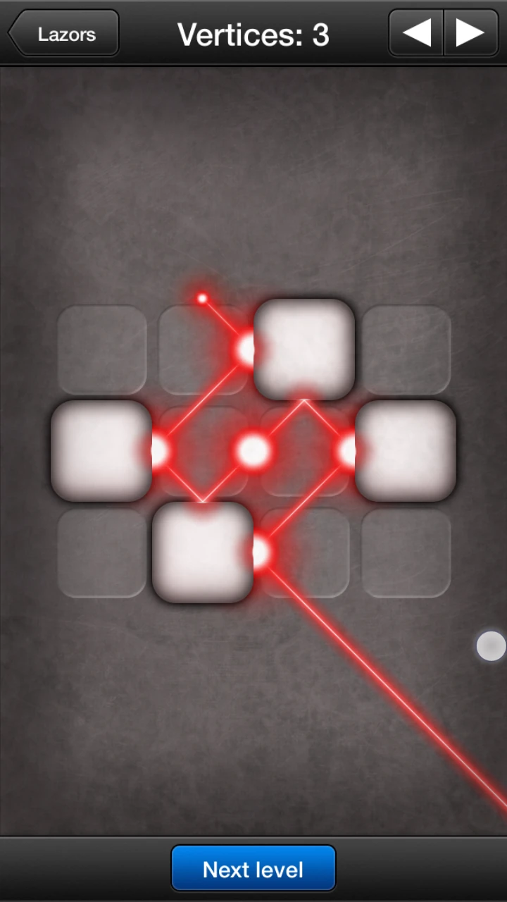
Lazors is a puzzle game in which the player has to move blocs around to specific spots in order to guide a light beam through targets.
Tested on Android / Samsung galaxy S3

The user starts to play immediately after launching the game.
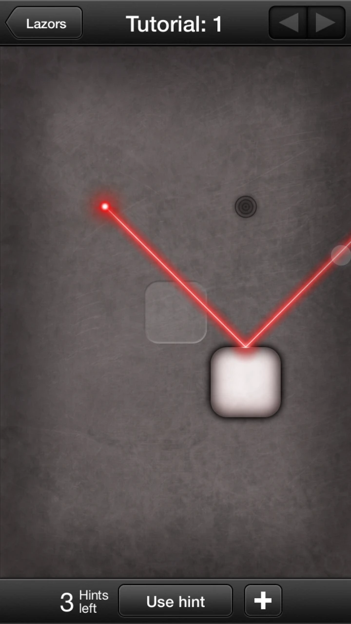
There is no apparent tutorial, but the first levels are actually designed as one, allowing only very basic interactions at first, and taking the user through simple situations to discover all the different types of blocks he can move around, some patterns which he will re-use later. The player can easily complete these levels and will move on seamlessly to the actual game without realising he has played through a tutorial.
Since there are no instructions at all, it may be a little difficult for users who are not used to their mobile devices and interactions yet.

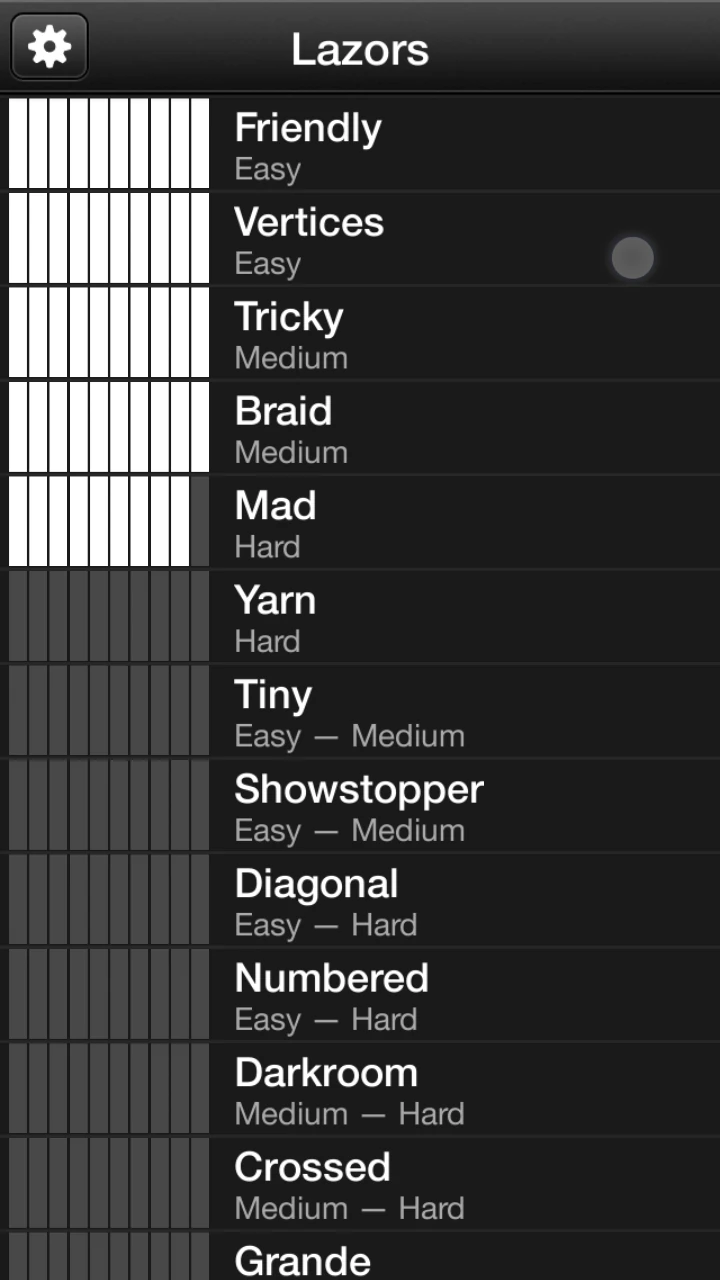
The game offers no option to easily access a previously completed level directly from the list view. The player has to navigate one by one the levels as by displaying them. This can be a bit annoying if he wants to discuss levels or make friends try a specific one out. This is however not a big issue since the game doesn’t seem to encourage replaying levels. It makes sense from that perspective.
The game allows to use hints, which is nice on harder levels to help the player be un-stuck. The hints are limited by the progress in the game, and offer a good value to encourage users to invest in the game.
The way hints are used is a little confusing at times. Once a hint was used, the hint displays the correct block in yellow. If the player leaves the game, and resumes later, the block is not displayed any more. The game did save that the hint has already been spent, and proposes to “show hint” as opposed to “use hint”, but the distinction is too narrow for the user to get it clearly. He might wonder if he will spend another hint on something he already “bought” and not dare using it again. The fact that the number of hints decreases or not is also a bit confusing to the user at first, and may impact his gaming experience a bit negatively.
Blendoku offers a solution that is less confusing on this matter: the hint that is given is locked in place from the moment it was used, which avoids confusion and frustration from the user, who might think he lost one of his few hints for nothing.
Articles on similar topics
The Mass Effect series
Game Usability reviews, Game user experience analysis,
A game usability review of Triple town
Game Usability reviews, Mobile game user experience,
A game usability review of Amazing Brick
Game Usability reviews, Mobile usability, Mobile game user experience, Game user experience analysis, Initial experience, Out of box experience,
A game usability review of Auralux
Game Usability reviews, Mobile usability, Game user experience analysis, Initial experience, Out of box experience,
A game usability review of Ollie Pop Retro Skateboarding
Game Usability reviews, Game user experience analysis, Mobile usability, Mobile game user experience, Initial experience, Out of box experience,
A game usability review of Time of Exploration
Game Usability reviews, Game user experience analysis, Mobile usability, Mobile game user experience, Initial experience, Out of box experience,