A game usability review of Catch the Dot
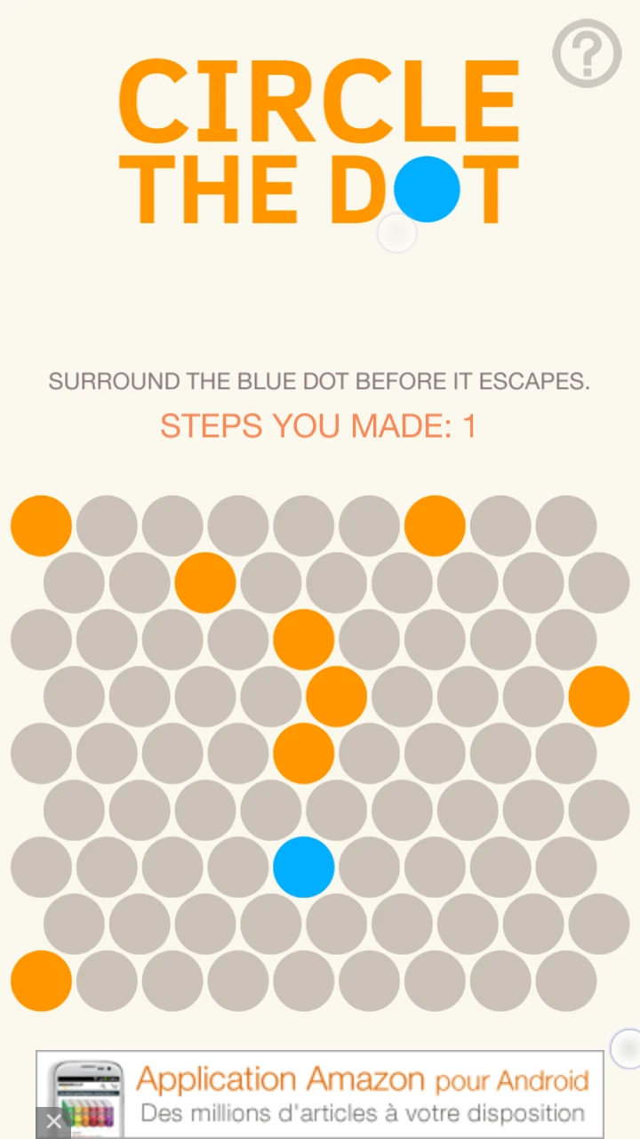
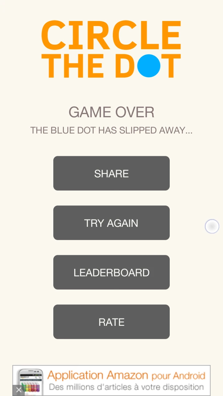
Catch the Dot is a small game in which the player needs to circle a blue dot by placing yellow dots on a grid. Each time, the blue dot will move one step. The game is lost if the blue dot reaches the grids’ edge. The game is won when the dot is completely circled.
Tested on Android / Samsung Galaxy S3

On loading the game, the user can start playing really fast. This is very good for a mobile first experience of the game.
The goal of the game is very clear, but how to achieve it is less explicit. The screen states “Steps you made”, the player may thing he needs to move something around. In fact, he needs to add dots to the game board. The blue dot is the one moving, but he’s not controlling it at all. This makes the game start quite confusing.
The game also seems a bit unfair since some configurations seem impossible to win from the start. This is a bit frustrating for the user, who knows he’s playing in vain since he can’t win.

On the good side, the social media is really well integrated: the player is encouraged to look at leader-boards, and only then, the game asks for an access to an online account. This is both user friendly and proposes the option to users who are a little more engaged and interested in the social features. There are more chances that if he clicks, he might actually connect with one of his accounts.

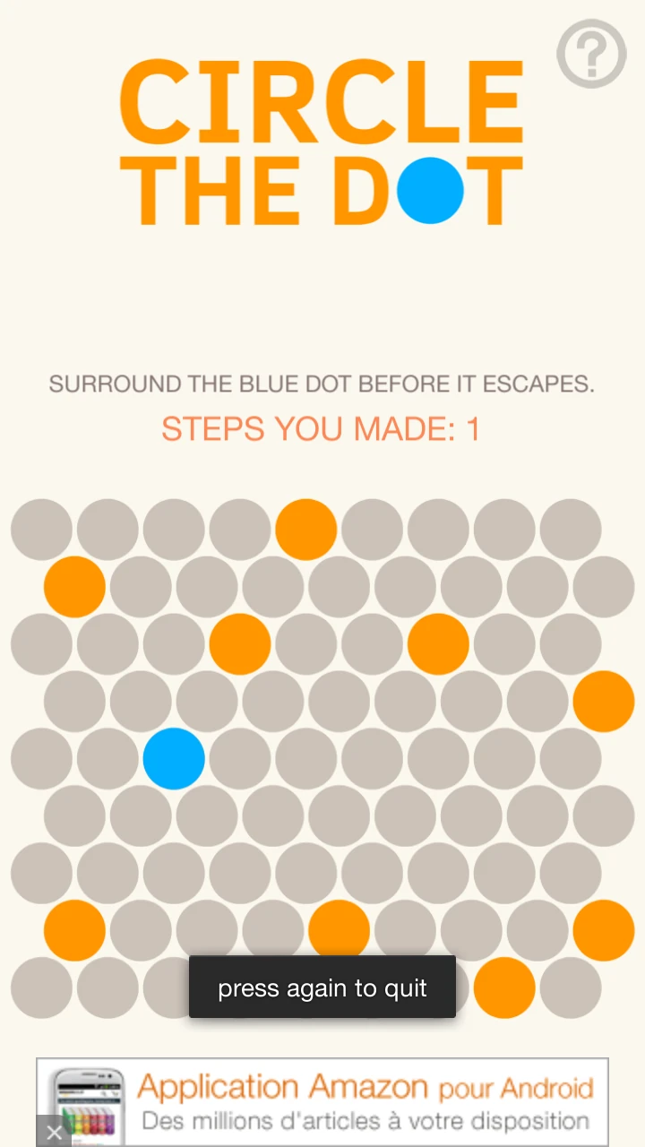
Since a game’s progression can not be saved, it is also very good that the game proposes a safety to prevent errors before closing the game. When the player presses a “back” button on his device, a small text prompts him to press again to quit. This will is not very intrusive, and will prevent any frustration from losing a winning game by accident.
Articles on similar topics
The Mass Effect series
Game Usability reviews, Game user experience analysis,
A game usability review of Triple town
Game Usability reviews, Mobile game user experience,
A game usability review of Amazing Brick
Game Usability reviews, Mobile usability, Mobile game user experience, Game user experience analysis, Initial experience, Out of box experience,
A game usability review of Auralux
Game Usability reviews, Mobile usability, Game user experience analysis, Initial experience, Out of box experience,
A game usability review of Ollie Pop Retro Skateboarding
Game Usability reviews, Game user experience analysis, Mobile usability, Mobile game user experience, Initial experience, Out of box experience,
A game usability review of Time of Exploration
Game Usability reviews, Game user experience analysis, Mobile usability, Mobile game user experience, Initial experience, Out of box experience,