A game usability review of Duet
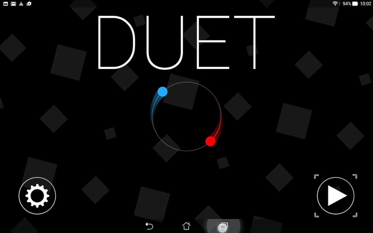
Duet is a game in which the player controls two dots, which can rotate on opposite positions on a same circle. The player has to make them rotate one way or the other in order to avoid obstacles, while progressing through a level.
Tested on Android / Asus Transformer Tab
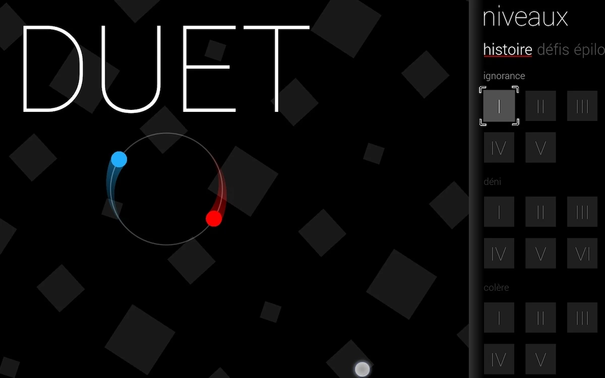
The game starts up quickly and displays a very clear and clean landing screen. The menus to select levels are off-canvas, which creates a familiar behavior for the game’s menus compared to other apps the player might be used to. It is easily understandable thanks to explicit icons and the simple choices that are given to the player.
The only aspect of the menus which might be a little confusing are switching between game modes. While the player can tap on the next mode, the first one will be hidden completely. It actually cycles and can be reached at the end of the list, but this is not immediately clear for the player, which can lead to confusion – specially for more novice tablet users. Advanced users have the option to go back and forth using a swipe motion, which makes it easier and intuitive for them to navigate the interface.
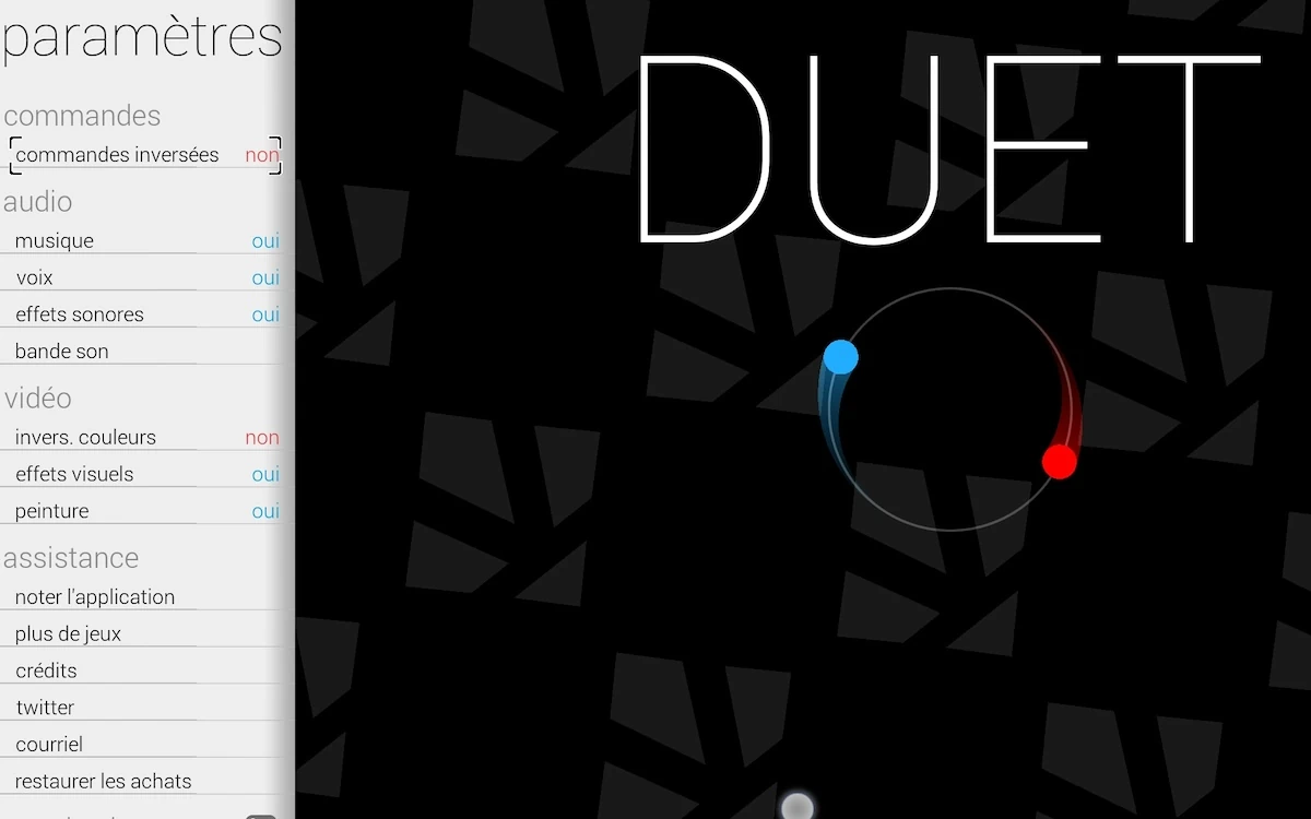
In the options, the game does not clearly state which of the buttons will lead to an in-game change, or display, and which will take the player outside, to a web page in their favourite browser.
This can be surprising and a bit frustrating, since the player will then need to go back to the game manually, after for example, trying to look at the credits. Unless indicated otherwise, the player would expect this type of content to appear directly in the game, and can be slightly annoying – chances are player’s won’t look there often though.
The game respects the original device’s behaviour, and also offers to play both in portrait and landscape modes. The player might be drawn to use portrait to play more easily, but the zoom level also adjusts, granting no tactical advantage to one view or the other. It does allow players to be more comfortable regardless the environment in which they want to play:
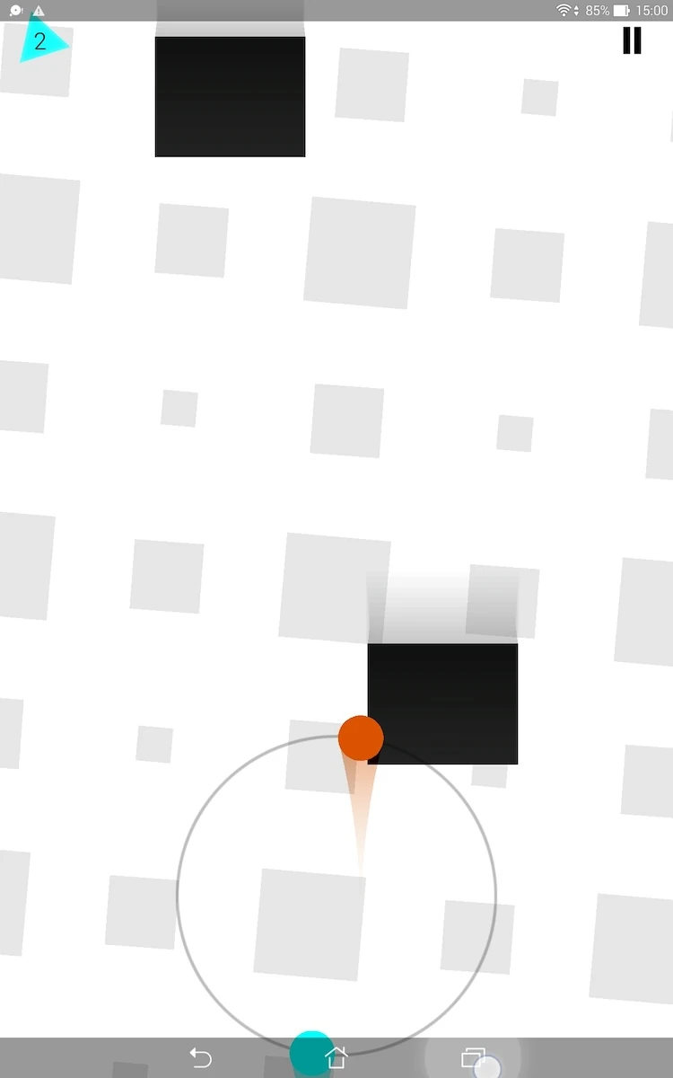
on the move or at home, with the tablet lying on the table or held in their hands.
The game takes in account the player’s context real well, by also providing many options, such as reversing contrasts. This allows player to have less bright visuals when they play inside, or a lighter view that is less sensitive to reflections when playing outside.
The game also provides clear visual cues and feedback on the players actions. The rotation of the dots is made even more explicit thanks to coloured trails for example.
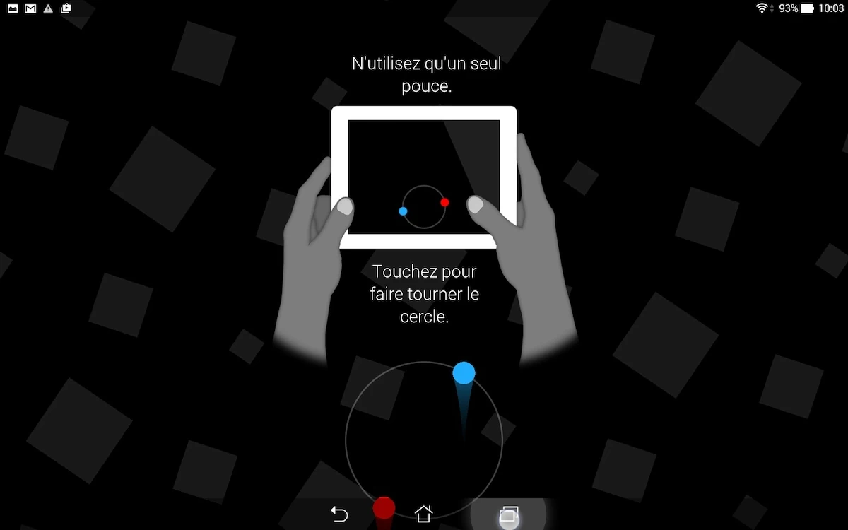
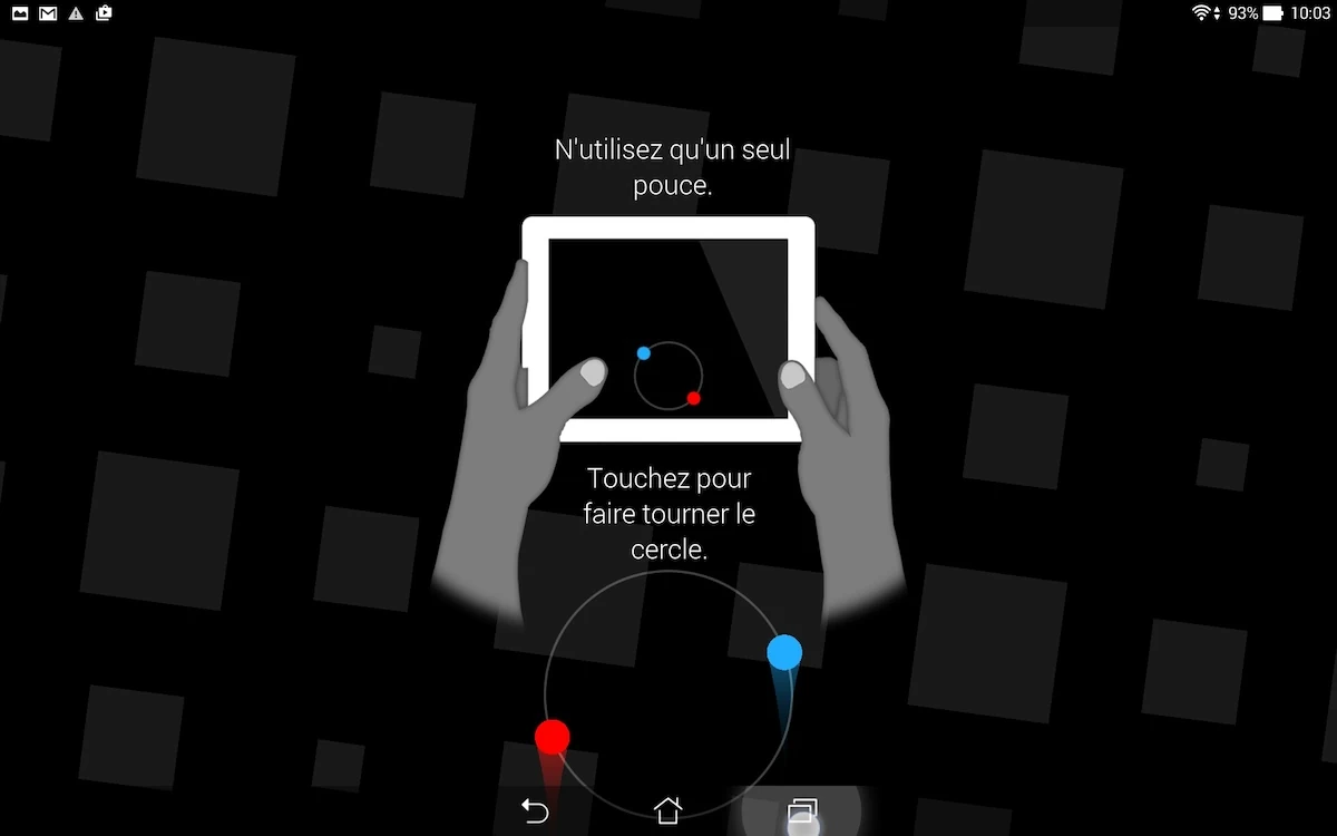
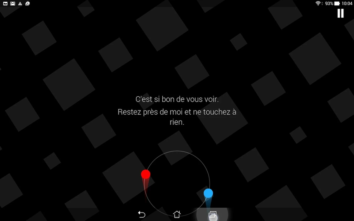
The first levels give some basic information about how to play, explaining the game’s basics. each level teachers the player a new feature or strategy that will help him achieve progress in the game. The tutorials are both non intrusive and provide a sense of progression to the player, who can experience an encouraging start.
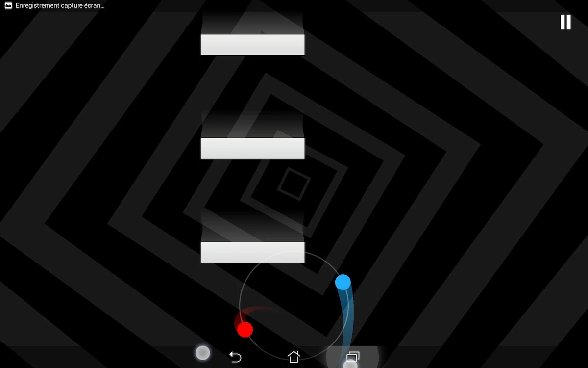
When the player fails to avoid an obstacle, a coloured splatter will help the player understand his error the next time he played, while providing a clear feedback on his errors and why he lost his progress.
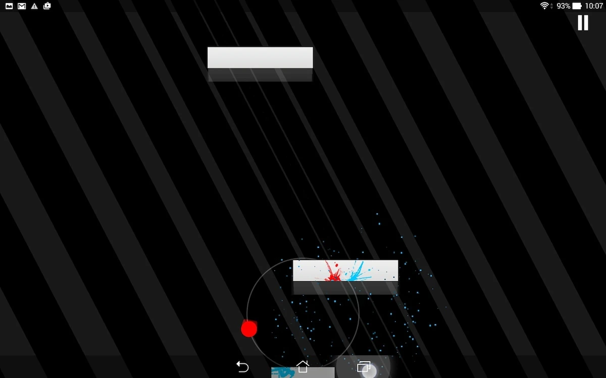
The game level rewinds, making the player clearly understand he can try again without interrupting the game’s flow and quickly reset the level to its starting point.
If the player pauses the game, he will receive a hint on how to be more efficient at playing the game, and encouragements telling him he can actually finish the level. In between levels as well, the game encourages the player to overcome the challenges of the game, always with positive feedback and cheers him on.
The only help the player would need, and that he doesn’t get, is a reminder of which way the dots are going to rotate with which finger. Specially at the begin of the game, the rotation direction is difficult to remember, and some visual indications would be welcome. Without them, the player is likely to fail several times because in an emergency, he will not be able to remember fast enough, and decide which fingers to use to go in the direction he wants. some small arrows on each side of the screen during the first levels would be helpful, without being intrusive.
Articles on similar topics
The Mass Effect series
Game Usability reviews, Game user experience analysis,
A game usability review of Triple town
Game Usability reviews, Mobile game user experience,
A game usability review of Amazing Brick
Game Usability reviews, Mobile usability, Mobile game user experience, Game user experience analysis, Initial experience, Out of box experience,
A game usability review of Auralux
Game Usability reviews, Mobile usability, Game user experience analysis, Initial experience, Out of box experience,
A game usability review of Ollie Pop Retro Skateboarding
Game Usability reviews, Game user experience analysis, Mobile usability, Mobile game user experience, Initial experience, Out of box experience,
A game usability review of Time of Exploration
Game Usability reviews, Game user experience analysis, Mobile usability, Mobile game user experience, Initial experience, Out of box experience,