A game usability review of Clay Jam
Clay Jam is a game in which a bully has ruined clay worlds, and the player has to rebuild them progressively, re-populating the world with clay monster and get rid of the bully. To do this, the player has to roll a ball of clay by tracing groves in the clay ground to influence its trajectory.
He has to make the ball roll on monsters to become bigger, which will allow him to jump faster and push the bully further away. With the clay he collected, the player can create new monsters to increase the worlds size, collect even more monsters, become even bigger, and push the bully even further away.
Tested on Android / Asus Transformer Tab
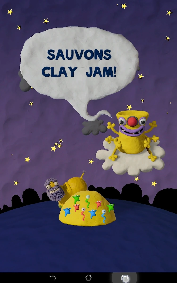
Clay Jam has a nice intro, which puts the player into the story. It does not however allow the user to skip it, should he want to dive directly into the action. Either way, it doesn’t take long before he’s actually playing.
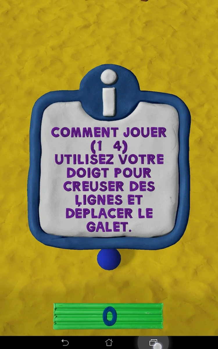
The tutorial starts in the menu, and explains how to start the first game. Then it continues by showing message boxes each time the user needs a new piece of information.
The message box can be closed easily to apply the advice in a real game session.
The menus of the game are colorfull, and interactive elements are identified with animations.
Sometimes, a lot of buttons are present on the same screen, particularly when the menu also contains tutorial elements to guide the user. This makes the whole screen blink, and can be a little distracting for the user, whose attention is drawn to many places at once.
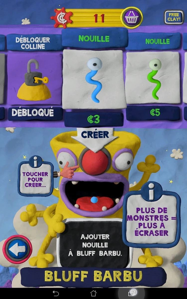
The interfaces also present some inconsistent features. For example, when using clay to add new monsters to a game world, the user can swipe to browse through monsters in the “shop”.
When in the menu, the player can no longer browse levels using a swipe, but needs to tap on buttons. This can be a little frustrating or confusing at first, in either screen: alternatively players might expect arrows and not be sure how to browse through the monsters in the shop.
During a session, the game provides clear feedback when the player successfully caught a monster into his clay ball, or when the player hit something too big to catch.
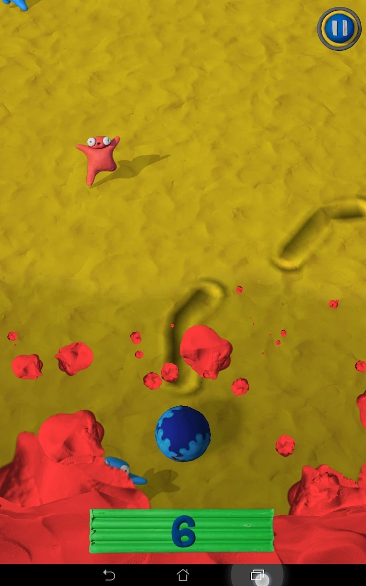
The game also provides many cues helping the player to understand the game, its rules and to anticipate what is going to happen. Creatures too big to roll up are marked with an exclamation mark, to tell the player it will be too big.
When the player moves forward too slowly, splatters of red clay tell him he will soon be caught up with by the red clay wave, which will mean a game over. This leaves him just enough time to move forward fast to avoid the game over, or to decide voluntarily to take a risk and try to catch that extra monster.
Even in terms of goals and records, the game shows the player his best score when starting the game, to give him an idea of what to achieve. When reaching the final rush, the player can see on the way his previous high-score, and can watch it zoom by when he beats it, or stand in front of him when he’s not far. This gives the player a good sense of progression and provides an encouraging start when playing the first couple of times.
Articles on similar topics
The Mass Effect series
Game Usability reviews, Game user experience analysis,
A game usability review of Triple town
Game Usability reviews, Mobile game user experience,
A game usability review of Amazing Brick
Game Usability reviews, Mobile usability, Mobile game user experience, Game user experience analysis, Initial experience, Out of box experience,
A game usability review of Auralux
Game Usability reviews, Mobile usability, Game user experience analysis, Initial experience, Out of box experience,
A game usability review of Ollie Pop Retro Skateboarding
Game Usability reviews, Game user experience analysis, Mobile usability, Mobile game user experience, Initial experience, Out of box experience,
A game usability review of Time of Exploration
Game Usability reviews, Game user experience analysis, Mobile usability, Mobile game user experience, Initial experience, Out of box experience,