A game usability review of The Tower
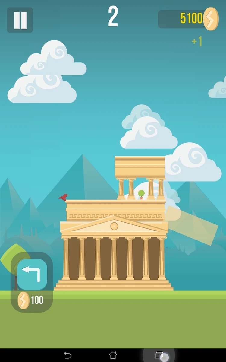
The Tower is a game is which the player has to build a tower by placing building parts right on top of each other. The more accurately the building is placed above the previous piece, the higher the tower can get.
Tested on Android / Asus Transformer Tab

To place a piece of building, the player has to tap the screen at the right moment. The building piece moves automatically left and right above the tower. The player has to tap the screen when the piece is right above the building. Anything sticking out the lower floor will drop off, making the building smaller and smaller until the player fails to hit the building completely.
The game starts up real quick, but asks the player to connect to his social accounts twice. The player doesn’t know at that stage if he is going to like the game and might not see the point.
This feature stands between the player and the game, and doesn’t encourage him to comply, since he has no clue of the added value of these features for him. It is unlikely he will connect at that moment.

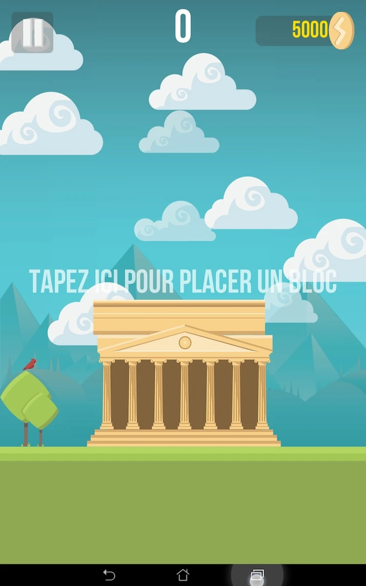
The first screen the player sees afterwards is the tutorial. From there, the player can launch the game immediately. The icons are clear and explicit, and the design is very clean and nicely animated, which makes it more lively.
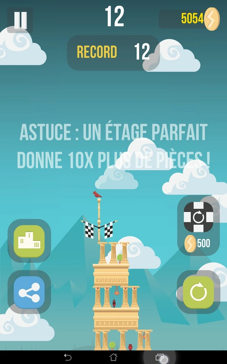
The animations contain clouds, which however can cause readability problems on informations such as the tutorial, hints that are displayed after the player finishes a session of the game. The text is written in which, with no particular feature to make it stand out. when clouds move nearby, it makes it nearly impossible to read the text. Although this happens from time to time and the clouds move away from the text again at some point, it can bother the player when he tries to read instructions or tips.

In between two sessions, the game provides new tips, allowing the player to learn little by little new tricks and strategies that can improve his performance to beat the high-scores.
This screen shows two buttons that look like “new game” or “try again”, one of them with coins. Though the player will probably understand that the coins mean it’s a paying feature, the two buttons are very similar and difficult to separate.
It is likely the player will systematically chose the free option, since he doesn’t know what the paying option adds to his experience, and what its value will be.

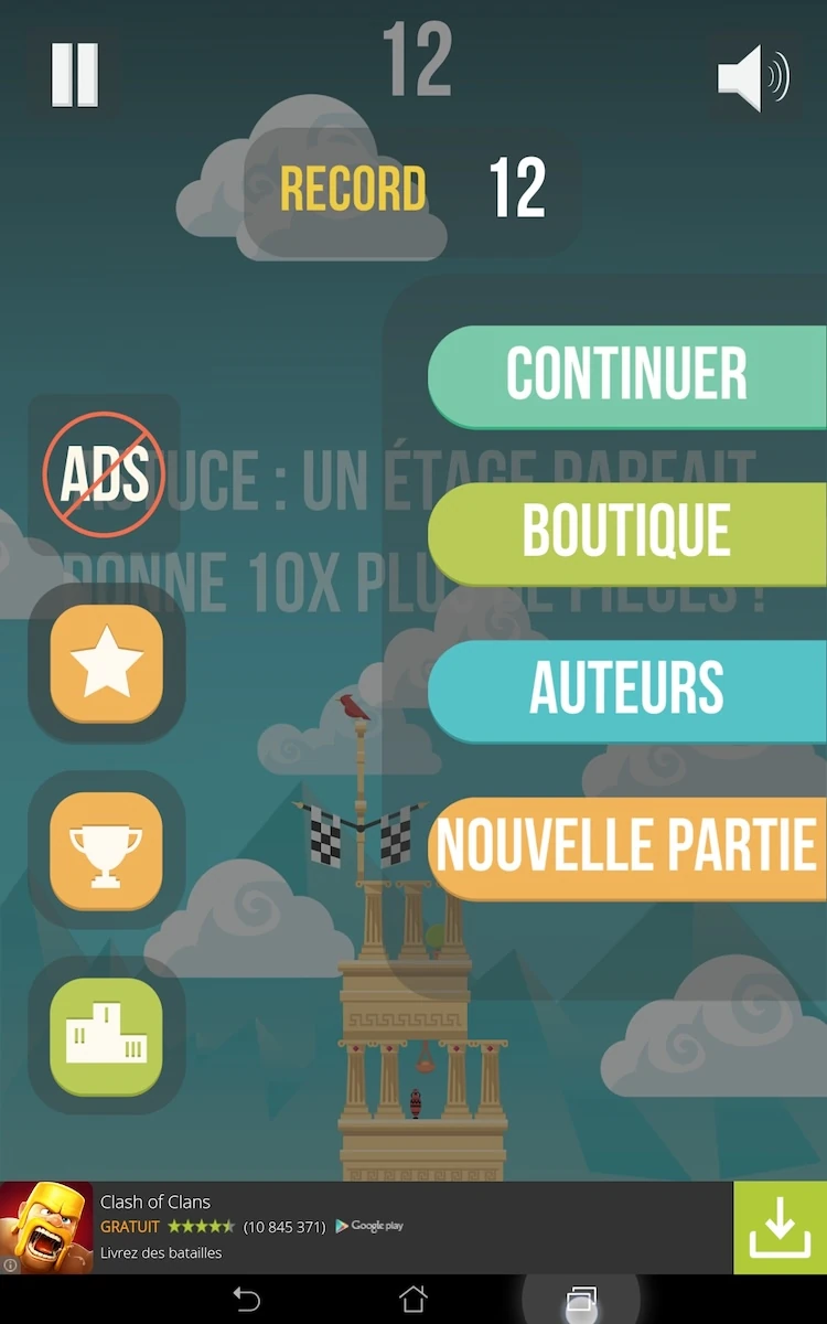
Lastly, when pausing the game, the menu proposes two buttons which can be confusing. The first button, continue, is displayed even when the player has completed a session, which means to the player there is nothing to continue.
The second button reads “new game” which allows the player to reset the game when he’s in the middle of a game, but seems to do the same thing as “retry” when the game is paused. These two buttons seem too similar, and redundant with what the player already can do on the “in between two sessions” menu. It would probably feel less confusing if this was simplified a bit.
Articles on similar topics
The Mass Effect series
Game Usability reviews, Game user experience analysis,
A game usability review of Triple town
Game Usability reviews, Mobile game user experience,
A game usability review of Amazing Brick
Game Usability reviews, Mobile usability, Mobile game user experience, Game user experience analysis, Initial experience, Out of box experience,
A game usability review of Auralux
Game Usability reviews, Mobile usability, Game user experience analysis, Initial experience, Out of box experience,
A game usability review of Ollie Pop Retro Skateboarding
Game Usability reviews, Game user experience analysis, Mobile usability, Mobile game user experience, Initial experience, Out of box experience,
A game usability review of Time of Exploration
Game Usability reviews, Game user experience analysis, Mobile usability, Mobile game user experience, Initial experience, Out of box experience,