A game usability review of Osmos
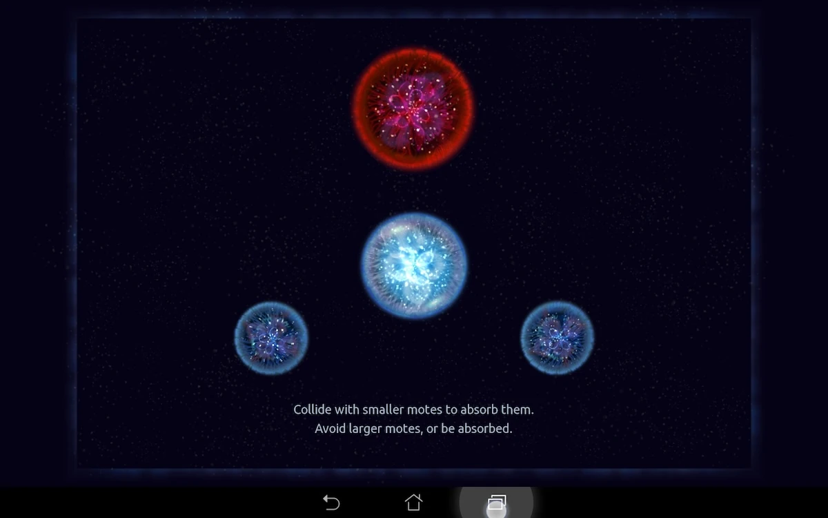
Osmos is a relaxing game in which the player has to grow a sphere of material by absorbing others smaller than him, while avoiding bigger spheres which would absorb him instead.
His only means of accomplishing his goal is moving around, but to do so, he needs to eject material which, in reaction, will make him move in the opposite direction. This also makes him smaller as a consequence. As a result, the player needs to constantly balance his size vs. movement speed and direction.
Tested on Android / Asus Transformer Pad
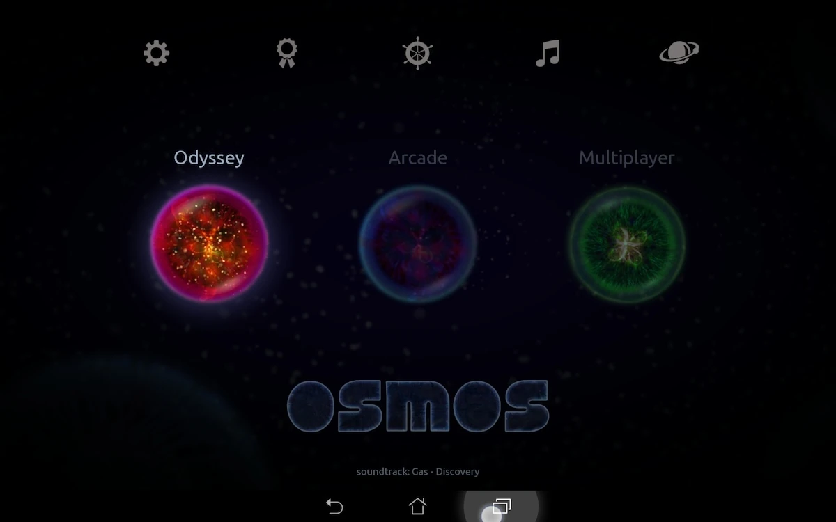
The game starts really smoothly, with a fast loading game and a one tap access to the first level. Aside from this, the menu in the game is very simple, clear and easy to read, thanks to a well contrasted font, that is not too small. From the start, the game is relaxing and pleasing to the eye.
The player arrives immediately in an interactive tutorial to learn the basics while actually playing a real level of the game. The first level teaches the player precise movement – the core gameplay mechanic of the game – by asking to reach a specific position and remaining there for a while.
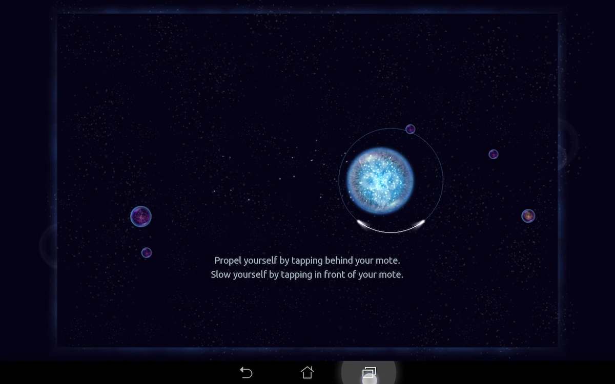
When the player reaches the position, he understands he needs to stay there thanks to a visual feedback that can be understood as a timer: a circle progressively being completed.
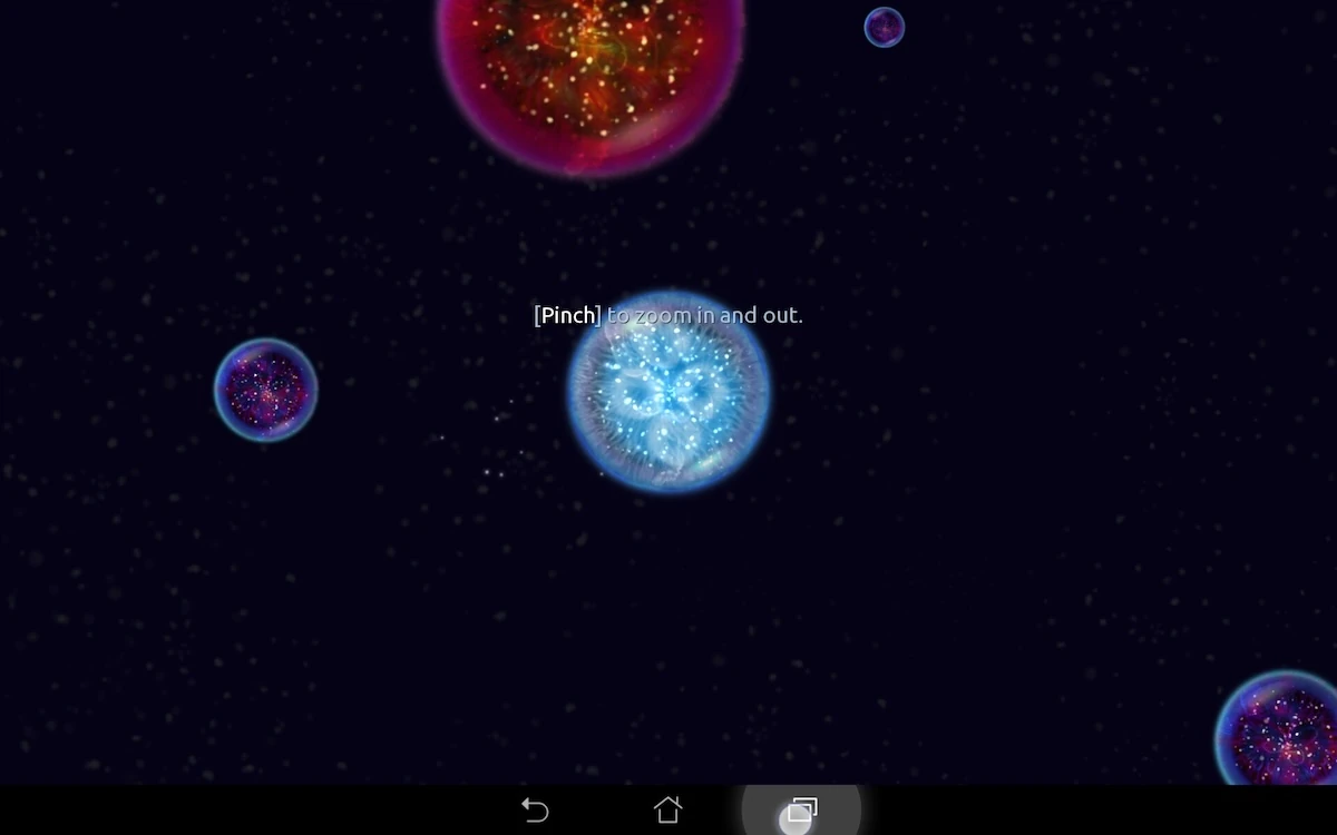
Tutorial indications appear as overlay on the played level, while letting the player free of his actions. The message will be visible as long as the player didn’t perform the explained action. A subtle animation will draw the user’s attention on the hint if the player ignores it for a long period of time.
The games interactions on tablet are really adapted to the device. The player can use taps to move around.
Two finger taps to move on to the next level avoid any errors after the goal has been completed. The game uses familiar motions such as pinch to zoom in and out. The game leaves full control to the player in terms of continuing a free-play after the objectives have been met, or moving on to the next level.
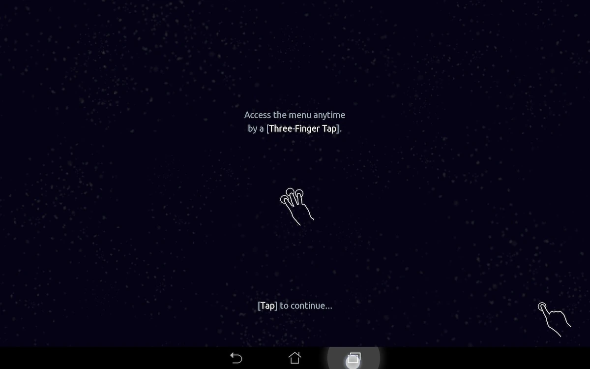
The game also takes advantage of the touch interaction to hide all interface elements: a tap with three fingers will call the menu.
While this is smart to maintain a UI-free and immersive game environment, the absence of any cues forces the player to remember the motion, which is not commonly used on those devices – unlike for example, the escape key on a computer. It is usually better to recall the menu via a button than to force the user to remember it. In this case, the developers preferred to preserve the screen area for the game, rather than clutter it with buttons, which is a meaningful choice.
The game also fixes an issue that pc games could experience with their track-pad: a long tap doesn’t empty your material into a super-fast motion by accident. Instead, each tap is considered as a separate input, and a long tab doesn’t get you killed.
One draw back of the tactile interaction is that, since the player needs to tap behind the bubble to make it move forward, any material ejected to make it move ends up below the player’s fingers
When trying to go very fast, this can sometimes prevent the player from correctly assessing how much material he lost and how much speed he should expect to gain. Although this behaviour is not encouraged by the game, it still happens when trying to catch a very fast opponent, and should still be taken in account.
Articles on similar topics
The Mass Effect series
Game Usability reviews, Game user experience analysis,
A game usability review of Triple town
Game Usability reviews, Mobile game user experience,
A game usability review of Amazing Brick
Game Usability reviews, Mobile usability, Mobile game user experience, Game user experience analysis, Initial experience, Out of box experience,
A game usability review of Auralux
Game Usability reviews, Mobile usability, Game user experience analysis, Initial experience, Out of box experience,
A game usability review of Ollie Pop Retro Skateboarding
Game Usability reviews, Game user experience analysis, Mobile usability, Mobile game user experience, Initial experience, Out of box experience,
A game usability review of Time of Exploration
Game Usability reviews, Game user experience analysis, Mobile usability, Mobile game user experience, Initial experience, Out of box experience,