A game usability review of Mmm Fingers

Mmm fingers is a game in which the player has to put his finger down on the tablet as long as possible, while avoiding obstacles. The game will scroll forward, taking the player through more and more complex patterns of moving spikes that the player needs to avoid, without letting go of the touch. If the player hurts his finger on spikes, it gets eaten by a monster.
Tested on Android / Asus Transformer Tab
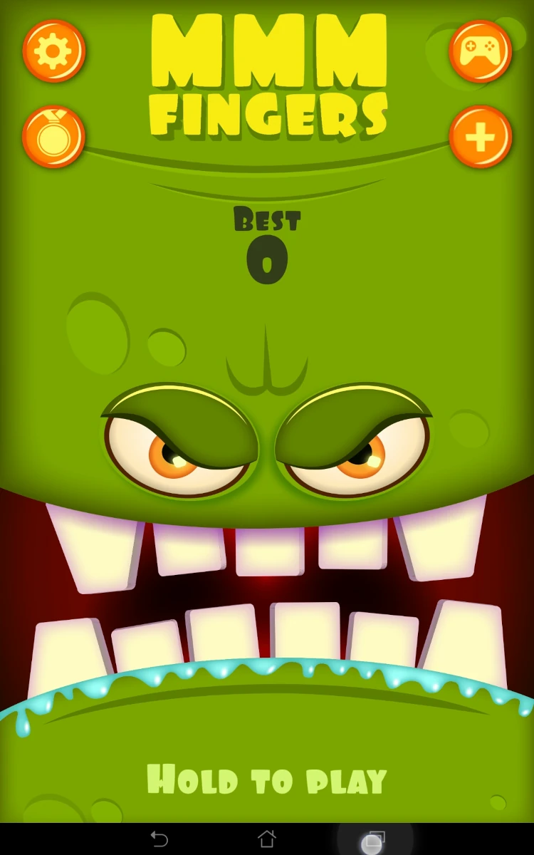
The game starts instantly the first time, and clearly communicates its goal from the first screen. It contains an instruction on how to play, a score hinting that it will be a high-score based game. To star the game from here, the player has to do the action that is the core gameplay: touch and hold the screen with one finger.
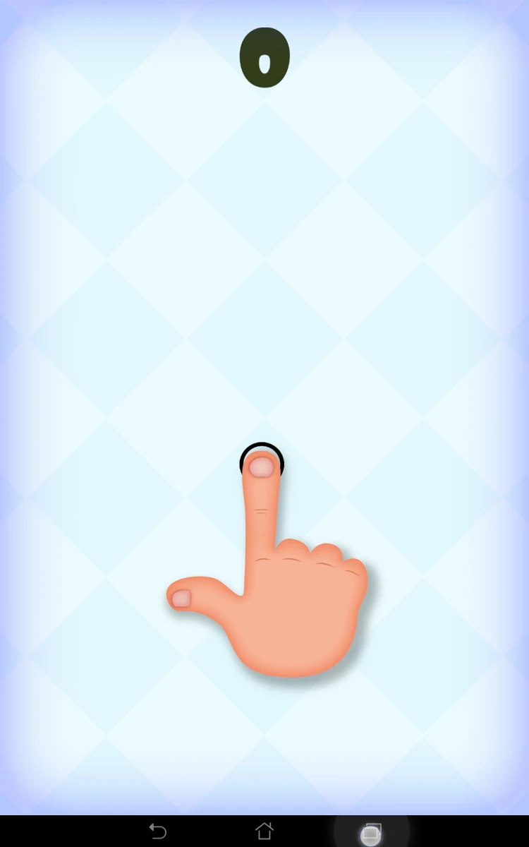
If the player taps the screen instead of holding, the game will still start, but a tutorial will be displayed. Te level will be paused as long as the player doesn’t hold the screen. This means players who need an explanation will get an animated tutorial on game start. Player who immediately get the principle never actually see the tutorial, as long as they don’t make an input error.
This principle is applied at any time in the game. If the player starts a session and does something else, they will be reminded of the controls, should they have forgotten them. It works even if it’s not the first time they play. This also is friendly to user task interaction before a session actually starts. The player can launch the session, briefly attend to something else, and won’t have to restart the session because it automatically failed in the mean time. The game starts really only if the player is ready to focus on the game.


Though nothing tells the player directly that he should avoid obstacles in the game, the pointy, spiky, painful looking obstacles encourage the player to avoid them without an explanation.
Naturally, and specially during the first few sessions, the player will have a natural reaction to remove his finger when actually touching spikes, as if he’d be really hurt – at least he expects it unconsciously.
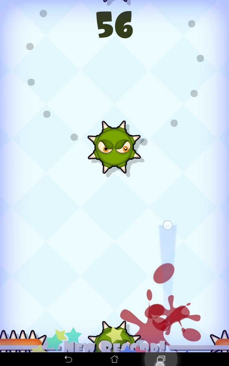
The game then provides immediate feedback on a contact: cam-shake, red colouring, sound and then the monster bites your fingers of course!

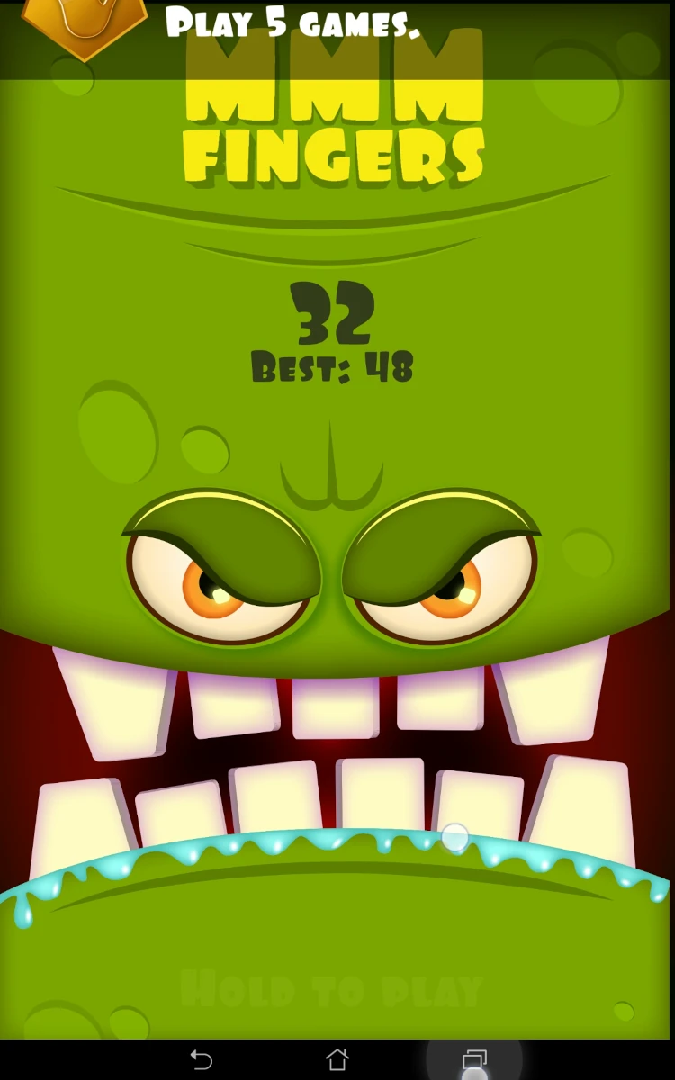
The game also immediately shows the score, if it’s a new high-score. During play, the game also provides information on stages that are passed (every hundreds of points) to give him a sense of progression in the game, despite random obstacles.
The game also shows the latest score and high-scores to the player, as well as some splatters of previous fails, which help him feel if he’s progressing and efficiently encourages him to perform better each time.
Articles on similar topics
The Mass Effect series
Game Usability reviews, Game user experience analysis,
A game usability review of Triple town
Game Usability reviews, Mobile game user experience,
A game usability review of Amazing Brick
Game Usability reviews, Mobile usability, Mobile game user experience, Game user experience analysis, Initial experience, Out of box experience,
A game usability review of Auralux
Game Usability reviews, Mobile usability, Game user experience analysis, Initial experience, Out of box experience,
A game usability review of Ollie Pop Retro Skateboarding
Game Usability reviews, Game user experience analysis, Mobile usability, Mobile game user experience, Initial experience, Out of box experience,
A game usability review of Time of Exploration
Game Usability reviews, Game user experience analysis, Mobile usability, Mobile game user experience, Initial experience, Out of box experience,