A game usability review of Broken Brush

Broken brush is your typical find the differences game with that additional polish that makes it nice. A lot of attention has been given to usability and that shows in terms of user experience.
Tested on Android / Samsung Galaxy S3
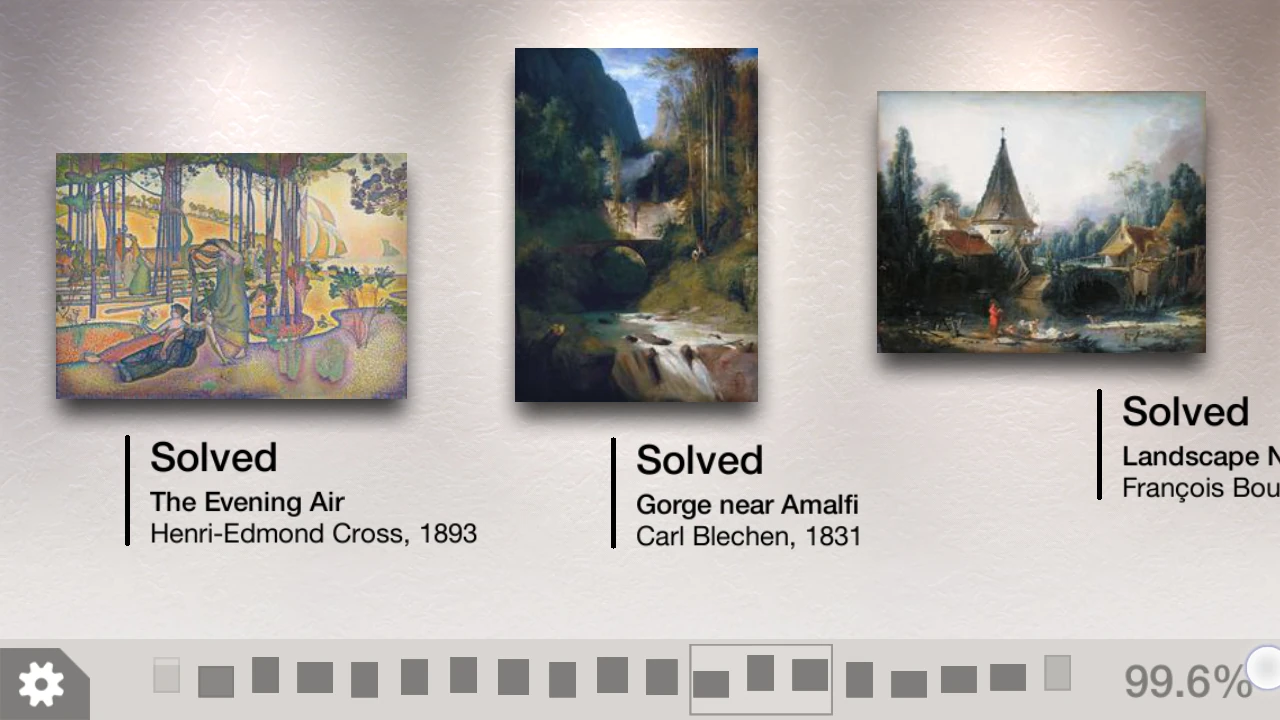
First of all, the interfaces are very adapted to the touch device. In the menus, most interactions are based on scrolling horizontally on the device. The list of levels (paintings) is presented like that, with a slight parallax effect.
A list of miniatures allows the player to navigate very quickly even to paintings that are very far in the list. This effectively allows the user to scroll at two different speeds depending upon what he is trying to do in the list. The list actually displays the progress on paintings, and the required progress needed to unlock new ones.
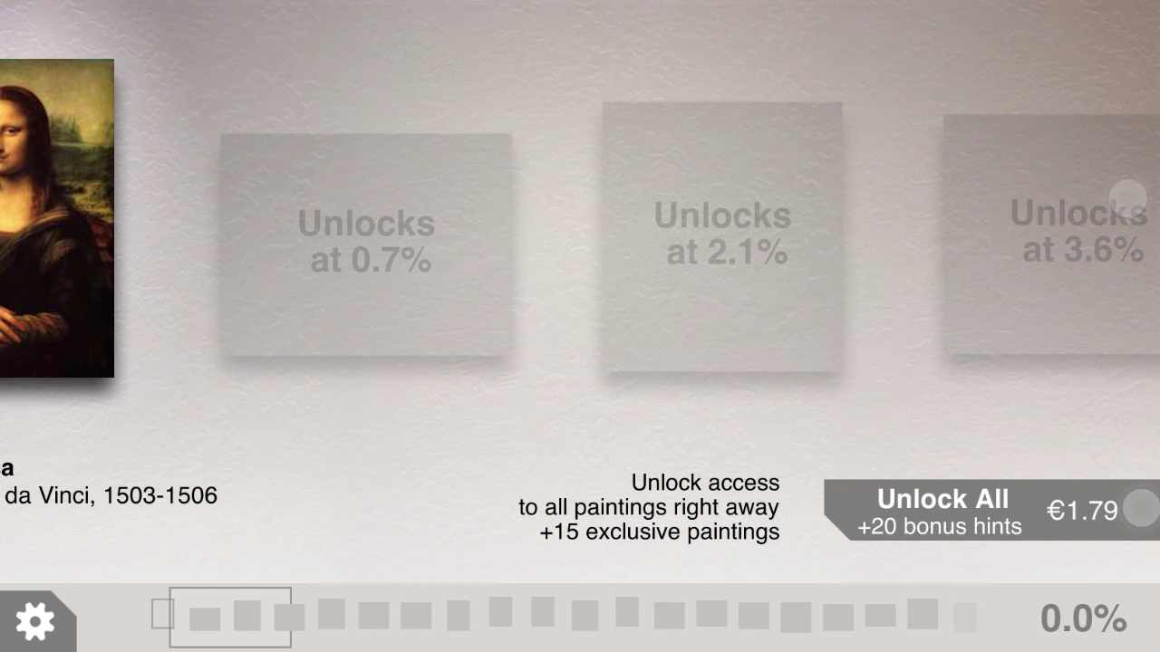
The buying options only appear in the menu once the player has completed the first level, and has started scrolling to the next levels. This allows new users not to be bothered by intrusive shop information, while more engaged users will have a visible access to paying options and why they should take them when it is relevant.
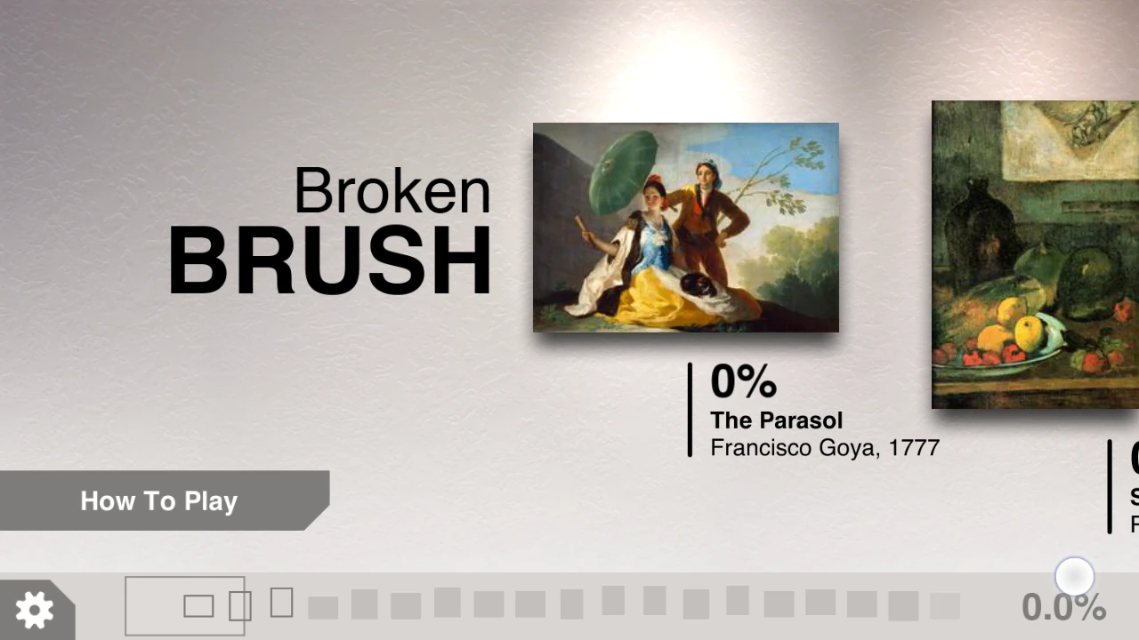
In the list view, the first thing a new user sees is an access to an optional tutorial. Since the game is quite straightforward, this allows the player to start the first level immediately. However, he can access the tutorial at any time.
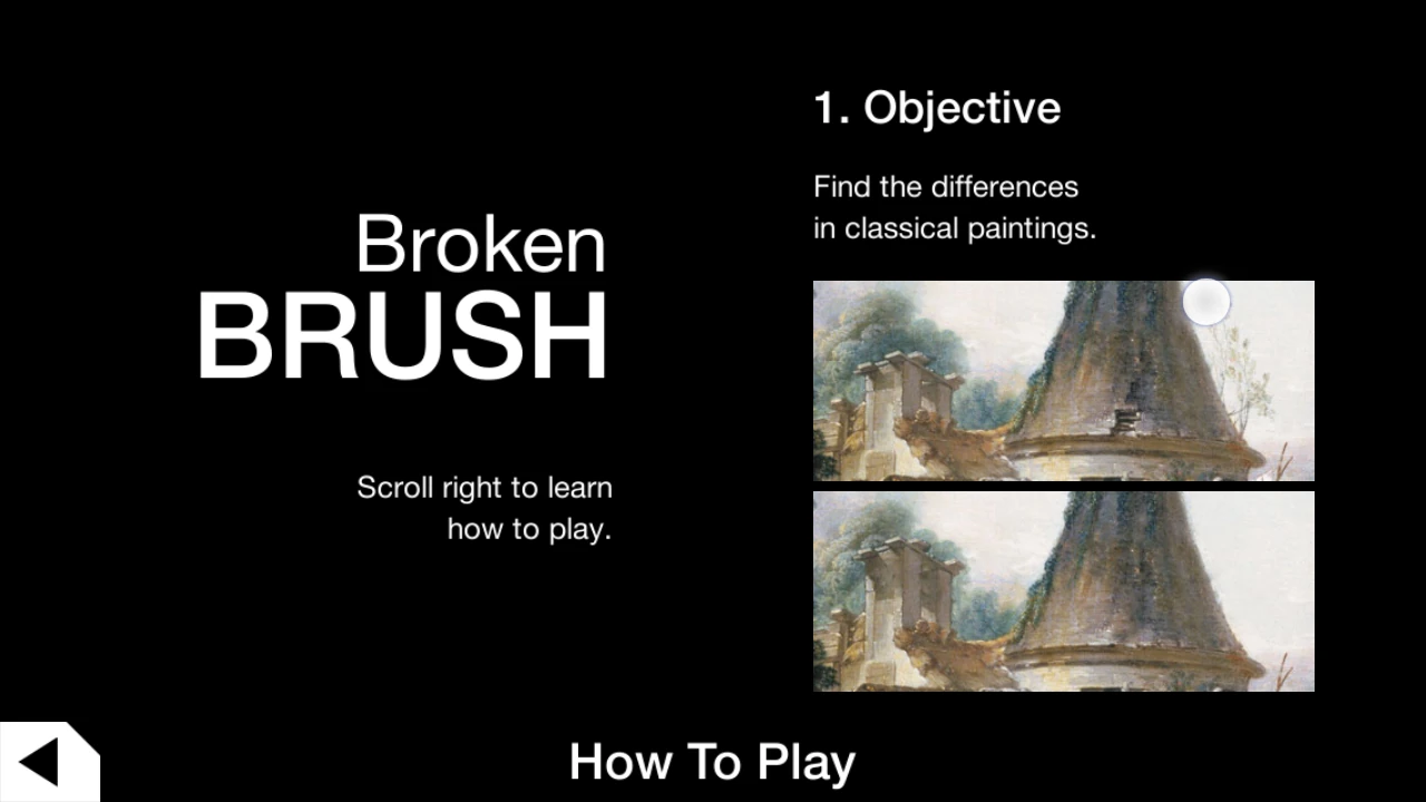
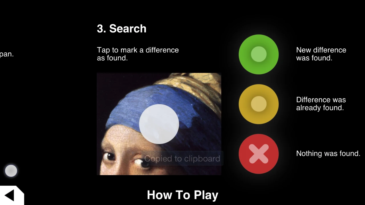
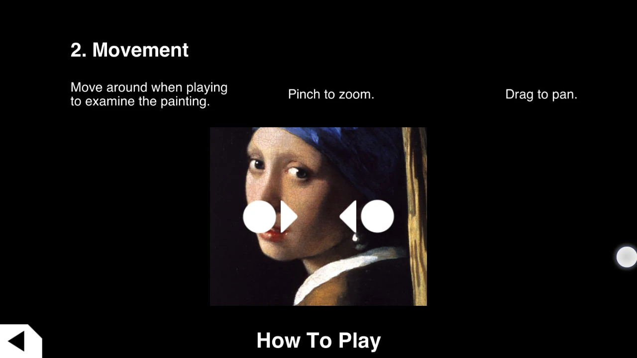
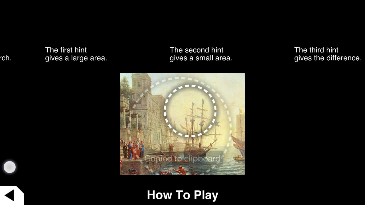
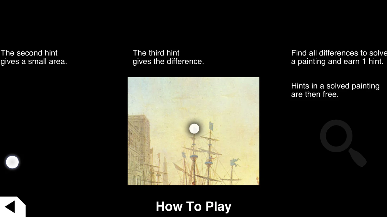
The tutorial itself is also designed adequately for mobile devices. It uses parallax and scrolling to progressively disclose the game’s rules, interactions and options, from the most basic gameplay to the more complex features. This explanation is very smooth and gives full control to the user on the speed at which he will read the tutorial. this way the player also has the option to look only at a certain feature, or to go back to a previous entry if he feels he needs to.
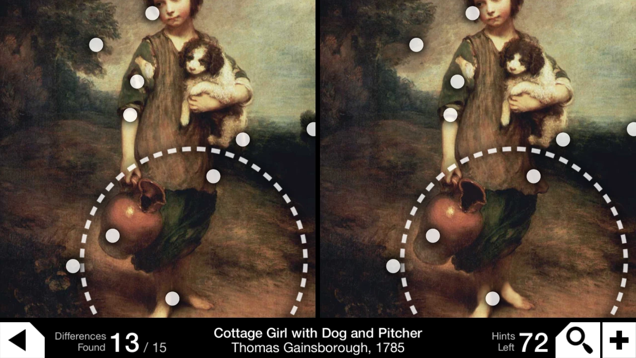
In game, the player has a typical option to zoom and move around on the pictures to find the differences more easily close up. Paying features are hidden behind a small + button or when the player doesn’t have any hints left.
The main usability issue with the game, though harmless, is that sometimes in game, changes between two pictures are very large and count as a single difference. As a result, the player will try to select a second error where there was only one. This is harmless as I said since there is no real consequence to making an error during the game. It is however a little frustrating at times.
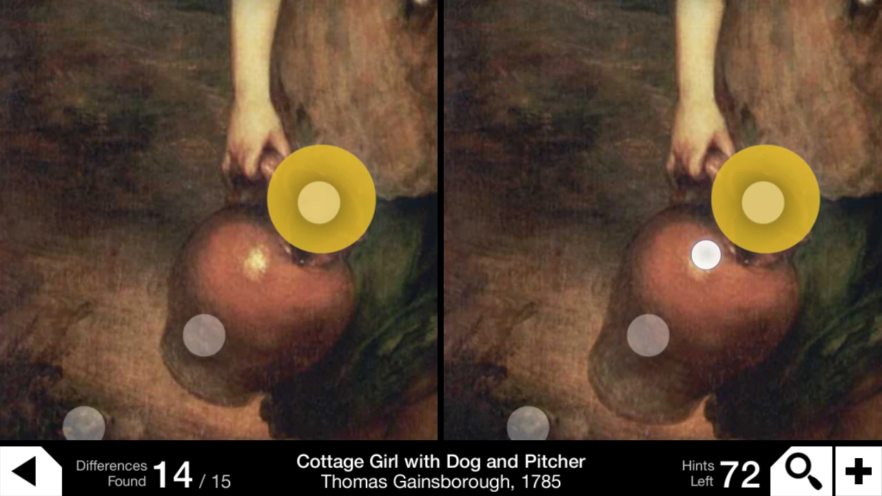
A progressive hints system allows the player to have progressive indications on the area where he missed a difference, before giving the answer. This avoids the frustration of being given the answer directly, since usually with a small hint on the area, the differences are actually easy to spot.
Articles on similar topics
The Mass Effect series
Game Usability reviews, Game user experience analysis,
A game usability review of Triple town
Game Usability reviews, Mobile game user experience,
A game usability review of Amazing Brick
Game Usability reviews, Mobile usability, Mobile game user experience, Game user experience analysis, Initial experience, Out of box experience,
A game usability review of Auralux
Game Usability reviews, Mobile usability, Game user experience analysis, Initial experience, Out of box experience,
A game usability review of Ollie Pop Retro Skateboarding
Game Usability reviews, Game user experience analysis, Mobile usability, Mobile game user experience, Initial experience, Out of box experience, Game interfaces,
A game usability review of Time of Exploration
Game Usability reviews, Game user experience analysis, Mobile usability, Mobile game user experience, Initial experience, Out of box experience, Game interfaces,