A game usability review of Auralux
Auralux is a smart kind of strategy game in which the player controls planets. Planets generate particles which revolve around the planet. They can be used to conquer new empty planets or invade planets controlled by an AI. The goal of the game is to control all the planets and get rid of all AIs.
Tested on Android / Samsung Galaxy S3
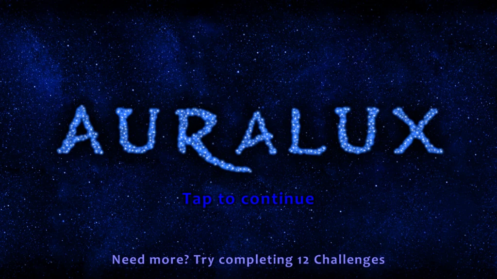
The game starts up really fast and allows quick access to the gameplay. The first level is a tutorial which explains clearly how the game functions.
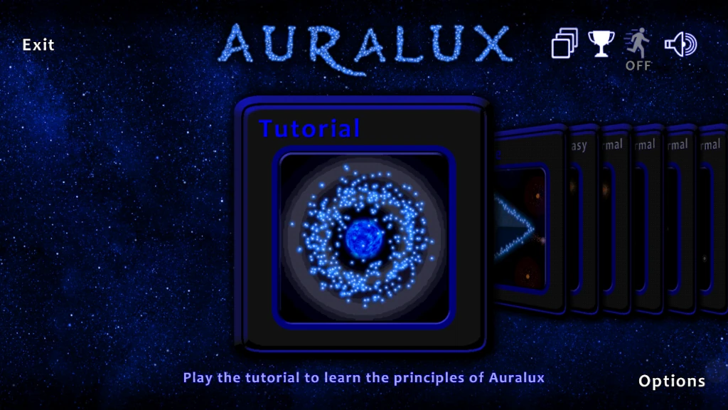
It is short and straightforward. It is very easy to go through the tutorial text messages, and there are few of them. The tutorial is presented in bite sized bits every time the player has progressed a little in the game and reached a certain point. In between, the game lets you play freely on a very simple map.
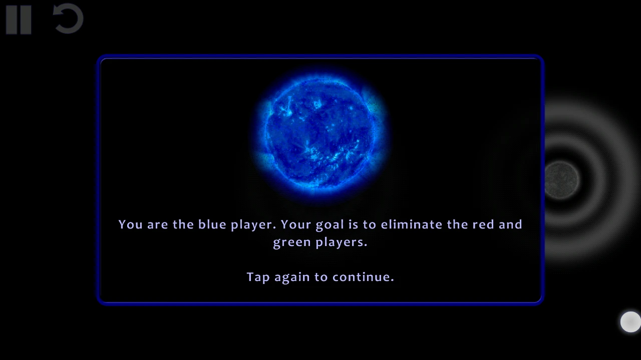
As it is really easy to skip the screens, players can easily skip the tutorial without reading the text first, which can lead them to confusion. Since the interactions are quite simple, it shouldn’t block the player though.
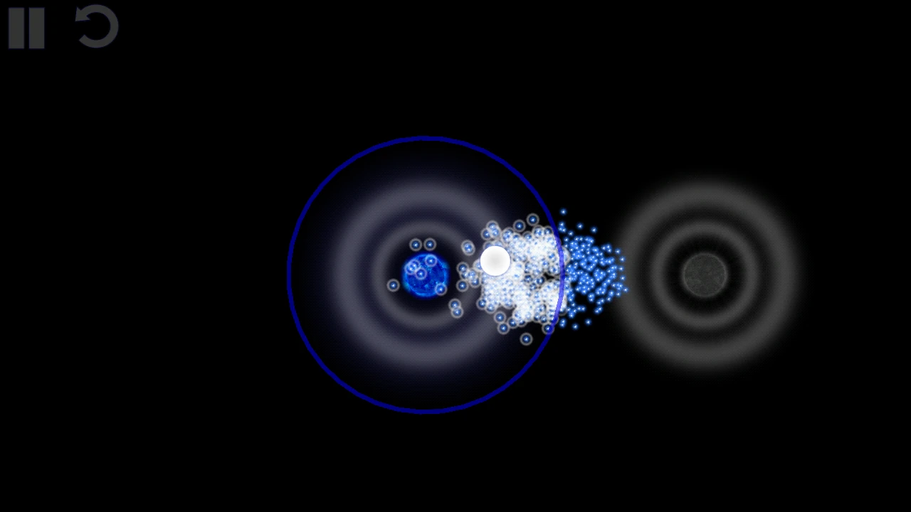
A tap on the screen will move the selected particles to that location. If it is a planet, it will be invaded, if it is an ennemy planet, it will be attacked.
At any time, the game can be paused and resumed easily. The progress is saved automatically when leaving the game or just pausing it. This is particularly adapted to interruptions and makes this game nice to play even in mobility situations like commuting for example.
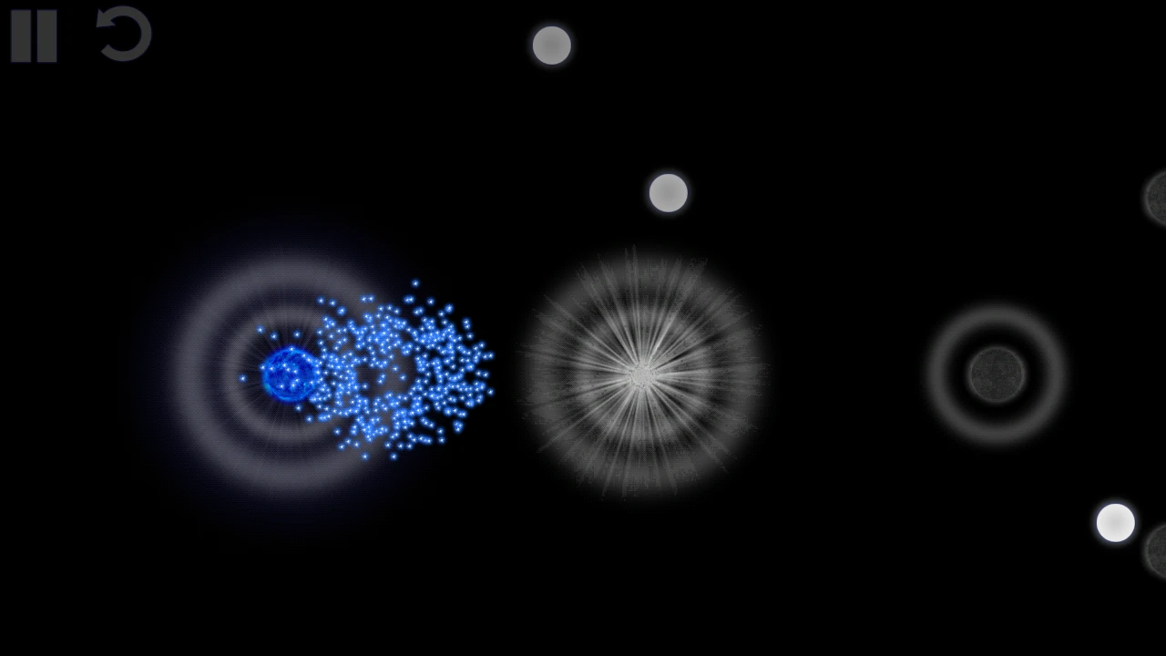
Additionally to visual cues, the game also provides nice audio feedback which acts like generated music. The music informs the player on “fights” between his particles and those of AI players: the more music, the more intense the fight. Audio feedback also indicates the health level of a planet and the progression of its conquest. Although users often disable sound on the move, this is a nice addition to give the game its smooth and polished feel.
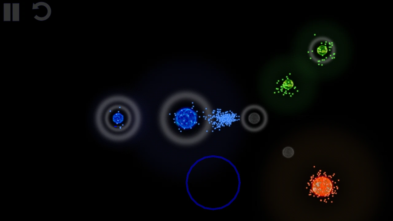
The game being based on different colored populations also has an optional color blind mode, which increases contrast of the particles to make them easier to distinguish even when you can’t see the difference between red and green.
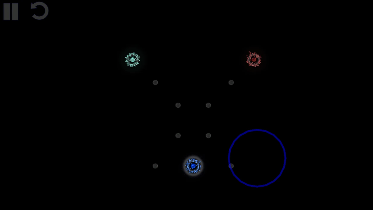
The main usability issue of the game is probably that it does not prevent the phone from going into sleep mode. Often, the player has to wait shortly for his troops to generate over time, while he watches the fights in another area of the screen. It is annoying when the screen goes to sleep mode, and the player needs to unlock it again regularly during play. This could be a critical issue if the game didn’t save and resume quickly and reliably as it does.
Articles on similar topics
The Mass Effect series
Game Usability reviews, Game user experience analysis,
A game usability review of Amazing Brick
Game Usability reviews, Mobile usability, Game user experience analysis, Initial experience, Out of box experience,
A game usability review of Ollie Pop Retro Skateboarding
Game Usability reviews, Game user experience analysis, Mobile usability, Initial experience, Out of box experience,
A game usability review of Time of Exploration
Game Usability reviews, Game user experience analysis, Mobile usability, Initial experience, Out of box experience,
A game usability review of Shu’s Garden
Game Usability reviews, Game user experience analysis, Mobile usability, Initial experience, Out of box experience,
A game usability review of Osmos
Game Usability reviews, Game user experience analysis, Mobile usability, Initial experience, Out of box experience,