Heuristic evaluation of Mini Ninjas and how to describe problems
- Mini Ninja’s Heuristic review
- A common mistake to avoid: describing a problem by it’s solution
- Illustrated with Mini Ninjas
- Things to keep in mind and how this affects everyday work
This article goes through an old heuristic evaluation using Katherine Isbister and Noah Schaffer’s criteria found in the Game Usability book. You’ll find an example of presentation slides, followed by an in-depth review of common mistakes to avoid when writing expert reviews.
Mini Ninjas is an action / adventure game in which the player controls a Ninja who has to save the world from a evil force. The player progresses through open platformer levels, sneak past or fight enemies to progress. The player gathers companions along the way and can switch characters use allies’ special abilities, weapons and properties. The player can also incarnate small animals to hide.
Tested in XBox 360
Mini Ninja’s Heuristic review
A common mistake to avoid: describing a problem by it’s solution
A mistake I have seen many beginners make, and horrors I have myself committed years back is to describe a problem you identify with a solution you imagine.
If you describe a problem as “the map has no legend”, the only possible solution to it is to add a legend to the map. A better way of describing the problem is to focus on the impact on the user. If the problem is “users don’t understand the icons on the map”, the solution might be
- to reduce the quantity of information that’s displayed,
- to simplify the codes, reduce the number of colours or pin designs on the map
- add a legend to explain the pin shapes and colours
- show details when the user hovers or clicks on a pin
This mistake should be avoided because
-
It reflects badly on the author. Stakeholders may see this as a sign the author is incompetent or sloppy. Worse, they might think it is a way to influence design decisions, which can break the trust the team has for the researcher(s).
-
It limits the problem space and makes it harder to come up with the most relevant solution. When the box is smaller than it needs to be, it’s even harder to think outside of it.
-
Describing one problem as the absence of a solution limits the solutions to one option. A good problem description should open perspectives on multiple solutions.
-
If the problem is described generally, you can make multiple hypothesis about why the user didn’t understand, test them, or propose solutions for several possible ways to solve the problem.
Illustrated with Mini Ninjas
I did a first version of the mini-ninja review back in 2012. There were a few examples of that kind of mistake in there. It was just an exercice I did for myself, to improve my skills, so let’s use it to learn together.
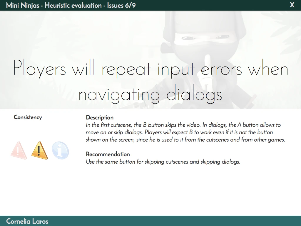
First example : the player can’t press B to move from a dialog step to the next one
- TYPE: Consistency
- RATING: Minor
- DESCRIPTION: In cutscenes, the B button skips the video. In dialogs, the button A is shown to move to the next dialog step or skip it. The user is likely to press B instead repeatedly, without effect, because that’s what they learnt through the cutscene skip interaction.
- SOLUTION: Allow the user to press B to move on to the next dialog. This implies that the only possible solution would be to press B to move to the next dialog. The problem description is not accurate though, and appears clumsy.
The final review reads “Players will repeat input errors when navigating dialogs”. This gives room to decide wether the control should be A or B, and focuses on increasing the consistency between cutscenes and dialogs in general.
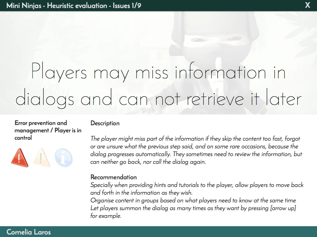
Second example : If a dialog wasn’t read or understood the first time, the player can’t view it again
- TYPE: Error prevention & management
- RATING: Minor
- DESCRIPTION: The player can easily move forward in dialogs and tutorials, but he can never go backwards. If the player feels they didn’t get the first part of the text, they can’t easily go back to it. The same way, if they skip a tutorial too fast, they can’t easily call the message again after going through it once.
- SOLUTION: Specially when providing hints to the player about tutorials, allow the user to summon the information as many times as he wants by pressing [arrow up]
This problem description implies the issue is in the dialog navigation, while different things might cause this problem. Is it too easy to skip the dialog in the first place? Why does the player need to go back and forth? Is information presented in the right step of the dialog? Is information split up too much, or not grouped in teaching units that make sense to the player? Is there too much information at once?
This issue also turns out to be part of a larger problem, but because my original description was so narrow, I had to write up a second issue to cover the whole problem.
Players can miss information from tutorials that move on automatically
- TYPE: Error prevention & management / consistency / player is in control
- RATING: Minor
- DESCRIPTION:Though most dialogs and tutorials require an action of the player to move to the next message, on rare occasions, the dialog moves automatically on to the next step. The player might miss part of the information becus of this, specially since he can’t call the dialog at will.
- SOLUTION: Be consistent with what works and let the user always validate dialogs to move on to the next step. No exceptions.
This is an example of focusing too much on one solution, where a different approach can solve the issue as well. If the player can go back and forth, it can still be annoying if it is too fast to read, but at least no information is lost. By merging both issues in a larger problem, it makes it easier to come up with solutions that will help the whole experience and increase the consistency.
You can see in the slides version that I merged both to become one entire problem in all its beautiful and stimulating complexity: “Players may miss information in dialogs and can not retrieve it later”
Things to keep in mind and how this affects everyday work
Problems often appear in groups, and identifying this helps finding the most effective solutions to solve multiple problems and increase consistency. It will also make other problems less critical.
As I gained experience, I’ve learnt my work is not finding the solutions as much as defining the problems. All my clients come to me with solutions they figured out. They want me to make their solutions work. Wether you work in user research or UX design, the most important aspect of the job is take a step back from solutions and define the problems that needs solving.
When presenting to teams on bigger projects, unlike in this example, I sometimes don’t include any recommendations. The systems the team designs get so complex that it is impossible to know about all the impacts any recommendation may have. I tend more and more discuss possible solutions with the team, but don’t include any suggestions in the presentation itself. The summary at the end would then be a list of issues, rather than a list of recommendations.
Articles on similar topics
The Mass Effect series
Game Usability reviews, Game user experience analysis, Console games,
Beyond - two souls
Console game user experience, Console games,
A game usability review of Amazing Brick
Game Usability reviews, Game user experience analysis, Initial experience, Out of box experience,
A game usability review of Auralux
Game Usability reviews, Game user experience analysis, Initial experience, Out of box experience,
A game usability review of Ollie Pop Retro Skateboarding
Game Usability reviews, Game user experience analysis, Initial experience, Out of box experience,
A game usability review of Time of Exploration
Game Usability reviews, Game user experience analysis, Initial experience, Out of box experience,