Game review - Catherine’s Tutorials and Controls Usability Review
- Tutorials & Controls in Catherine’s nightmares
- Controls clearly explained
- It takes some time to players to get the point
- Good game usability : non destructive actions and the undo function
- Teaching the player the game rules…
- …and even how to play the game
- Explicit tutorials free attention from the message to focus it on its meaning
- Giving away advanced strategies too early diverts user from some features
- Too many tutorials, even when they are good, can break your player experience

Tutorials & Controls in Catherine’s nightmares
In this article, we are going to have a closer look at Catherine’s controls and tutorials. Let’s have a look at how players accomodate awkward controls by moving from using the stick to using the less input-error-prone directional arrows. Next, we will see how even the good tutorial of Catherine can fire back when too much explanations discourage users from using game features.
Controls clearly explained
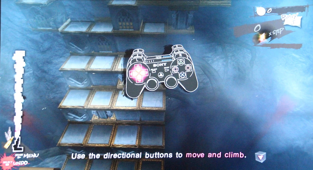
Controls are a little awkward for most players who I saw first try. While the tutorial shows arrows, the directional stick is used mostly at first, until the players get frustrated by slips : that kind of errors where the player wants to do the right action, but fails to perform the right input. Movement controls on the stick aren’t always getting players the results they’re expecting.
For example, moving the stick in a bit of an oblique will randomly trigger not the interaction the player expected. Using the stick also tends to make the player character move too early, and it gets hard to turn towards a box to move it.
It takes some time to players to get the point
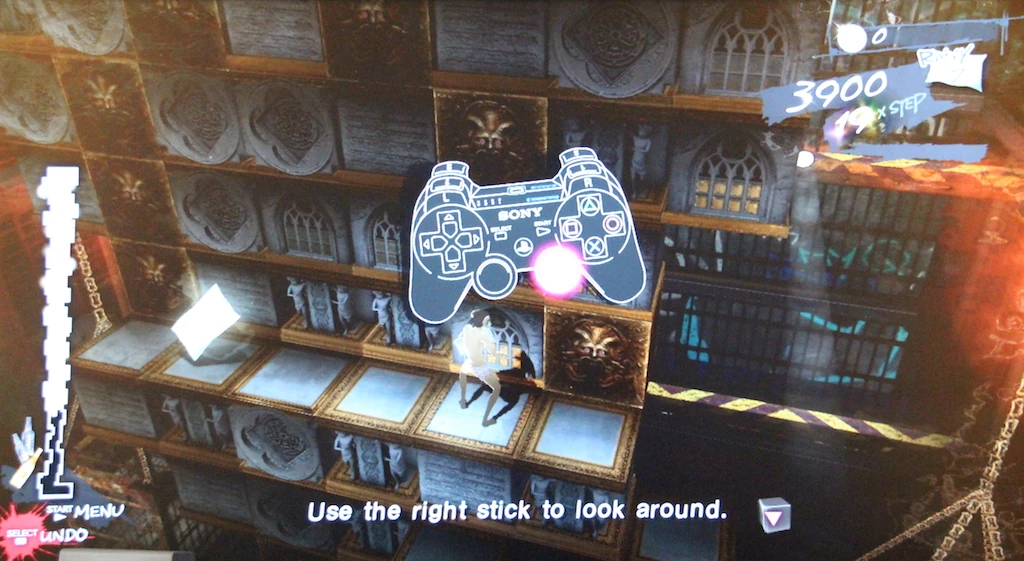
Players do finally realise that it will be easier playing with the arrow buttons a little later, and that greatly enhances their experience and control over their character.
Despite this, controls still cause some trouble even later in the game. For example, if the player is hanging from a block, at the back of the structure, using the same input repeatedly sometimes makes the player go back and forth instead of left left left, specially when moving around angles of cubes. Since it is hard to see your character back there, it doesn’t always make sense to the players and feels like a waste of valuable time.
Good game usability : non destructive actions and the undo function
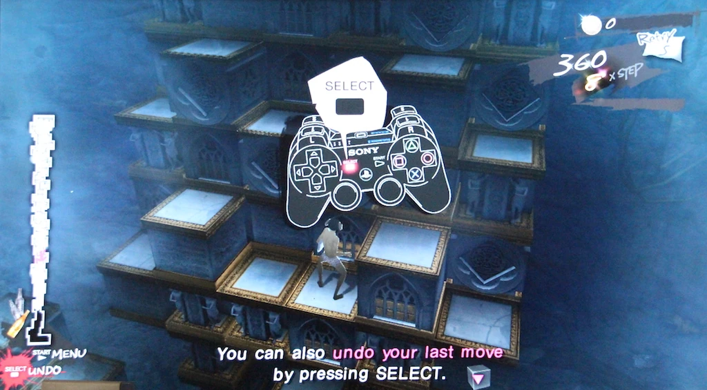
But the tutorial isn’t over yet. Very early in the game, the player is taught how to undo some of his last actions.
This feature is actually nice, because it allows the player to experiment and learn how to progress in levels without being punished for trying out things. If a strategy doesn’t work out, or the player has accidentally put himself in an impossible situation, he has a chance to fix his error and play on. Of course, it does have drawbacks sometimes, for example rewinding your game until a boss attack is repeated at the wrong timing.
Teaching the player the game rules…
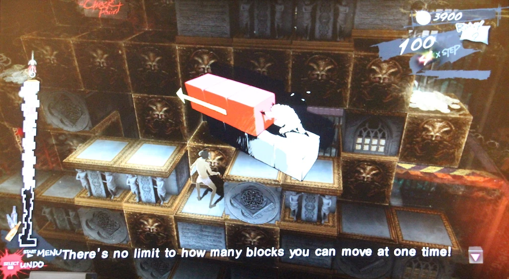
The game doesn’t only teach players about controls, but also about strategies. During play, it gives the player some hints on actions he can perform, clarifying the game’s rules. For example, it explains you can push several blocks in a row, not just one by one. It also teaches the player how to drop from an edge to move around on the side of blocks as well as on top.
…and even how to play the game
The game goes even further : it allows the player to share strategies with other characters in the nightmare. Between levels, players can view hints on how to move around more efficiently in the block world, how to create a staircase in a specific situation, or move around an obstacle.
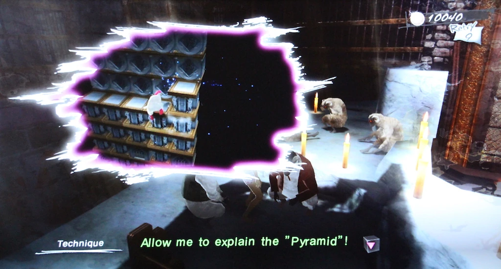
Sometimes the player listens to other sheep talking, sometimes he is the one sharing the hint, like players would in real life. The result is the same : the player’s attention is drawn to a movement pattern he needs to learn to be efficient in climbing and needs to master in order to complete the game.
Explicit tutorials free attention from the message to focus it on its meaning
All those tutorials are examples of good teaching : making the player aware of progressively more complicated information, but giving him time to process the previous one. The tutorials are very visual and don’t require abstract thinking or efforts to understand the message. The player’s challenge is focused on figuring out which pattern to use and successfully carrying it out. As a result, discovering strategies is left in the background, that’s not where the fun lies in this system.
Sometimes though, the information given can be counter productive. For example, the tutorial explaining how the merchant works highlights the fact you can only carry one item, and the previous one will be lost. This kind of hint is good to help the player make good decisions.
Giving away advanced strategies too early diverts user from some features
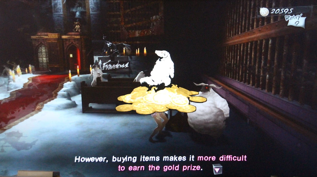
It also explains that buying items at the store will prevent the player from scoring the highest ranks on the levels. As a result, I have never seen the shop used by any player I have observed playing through it. This is one tip that may reduce replay value, but more importantly, it kind of removes the motivation to use the store for players. Unless maybe they are really stuck on a level, but I haven’t seen this happen.
Credits are pretty much infinite if you’re not too bad, so I don’t see players giving up on their checkpoints to buy an item that will harm their scoring, and that they might use during the first part of the level – which they already completed.
Too many tutorials, even when they are good, can break your player experience
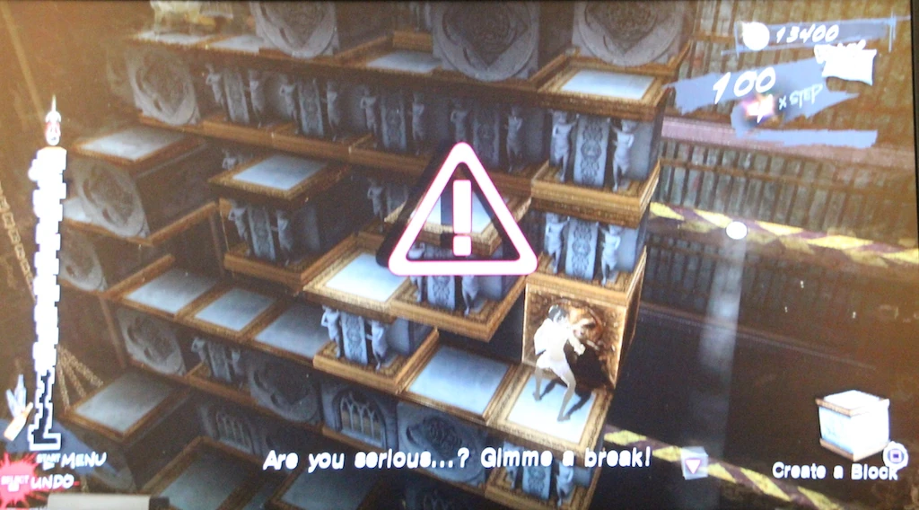
The biggest issue with Catherine’s tutorials, is they are so much scattered and chunked that they clutter the first many levels, until stage 3 ou of 8.
As the player character says “Are you serious… ? Gimme a break !”
The tutorials often appear just before reaching an item, or a checkpoint, or in the middle of a climbing sequence. It is intrusive and breaks the flow the player is starting to feel. This is true even for second playthroughs, for players who already know the games mechanics and just want more challenge. The dialogs can be skipped quickly, but it still interrupts their flow experience, and breaks the game’s intense rhythm.
Articles on similar topics
The Mass Effect series
Game Usability reviews, Game user experience analysis, Console games,
Beyond - two souls
Console game user experience, Console games,
A game usability review of Amazing Brick
Game Usability reviews, Game user experience analysis, Initial experience, Out of box experience,
A game usability review of Auralux
Game Usability reviews, Game user experience analysis, Initial experience, Out of box experience,
A game usability review of Ollie Pop Retro Skateboarding
Game Usability reviews, Game user experience analysis, Initial experience, Out of box experience,
A game usability review of Time of Exploration
Game Usability reviews, Game user experience analysis, Initial experience, Out of box experience,