Catherine’s game Interface usability review - how mismatching mental models can affect the player experience
- Catherine’s storytelling menus
- Mismatched mental models lead to confusion
- Using the player’s vocabulary helps them be confident about their actions and decisions
Catherine is a mature game about adultery and pushing boxes. Don’t run away, it’s the good kind of pushing boxes. Just let me take you through the first steps of the game.
Tested on PS3
Catherine’s storytelling menus

Catherine has very strong storytelling features, from the menu and introduction to top quality animation sequences that hint at mindf*ck anime like FLCL.
Few options, but the most important are there
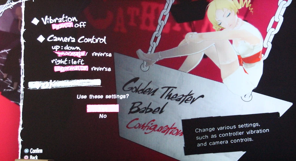
Some little things are a bit odd. First, hardcore gamers are surprised by how few options they find when they start up the game and set for customizing their controls.

They were be happy to see that the most important one for them, revert camera axis, is there, but little else.
Then it is time to start the game at last. The difficulty selection focuses on the benefits users want to gain from the game, rather than their skill level. This makes the game welcoming even to more casual players, who might otherwise feel put off by being presented with a “super newb sucker mode”.
Default to “No” can avoid errors, …or create unnecessary confusion
 Strange thing though, even for hardcore players, when they select normal (or even easy), a confirmation dialog appears, asking them if they are sure of their choice before starting. The default is also set to no, like the game really doesn’t want the player to select this option.
This makes the player feel like he’s really about to make a mistake, and the game wants to make sure he is aware that the game is particularly difficult. It makes sense in games like Batman in which increased difficulty removes important cues that a first time player can not learn by guessing. For Catherine, it is a little unsettling, and unjustified: normal mode is pretty much good for normal mode players who like a challenge, while easy is really easy and allows to focus entirely on the story.

The player then wastes a couple of minutes checking out the easy mode, and finally selects normal as it appears a similar message is always displayed. He is then greeted with a cool and welcoming feedback message telling him his adventure is about to begin.
Saving in an empty slot can be dangerous for your health

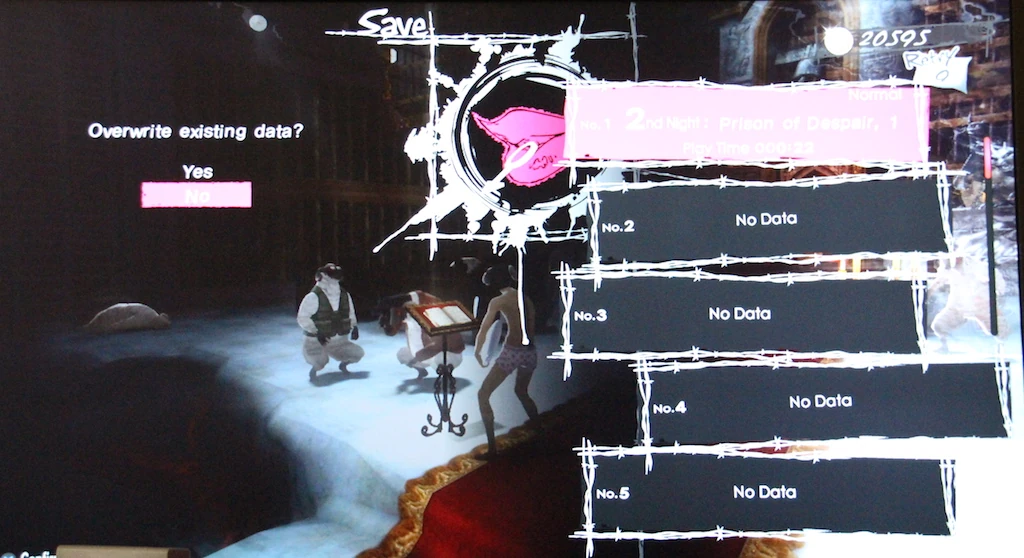
This behavior is consistent too : the default to “no” also appears when saving games. It makes little sense that the game asks for a confirmation when trying to save on an empty slot. Even less so that by default the dialog is set to “don’t save my game in an empty slot”.
This can lead to mistakes: players are used to validate twice to save the game, without reading dialogs. As a result, they can fail to save their progress. Usually, they realise this when they first try to save. Even if I did not see bad consequences as a result, it does require the player to perform an extra input that doesn’t add anything good to the game. This happens because the game was not designed in accordance with the standards players are used to.
Mismatched mental models lead to confusion
When the designer’s logic is far from the layer’s logic, this can lead to confusing if not frustrating moments. Another example is the level progression.
Stairs are just there to indicate the progression between the levels

WRONG! One thing took a while for players to understand : players expected the marks to be levels, and the stairs to be links between the levels. When counting, they didn’t manage to anticipate the remaining number of levels until the boss, and the wake up scene. The design is counter intuitive to them, and confused them in early stages of the game.
Yet, it somehow makes sense. although it makes sense somehow to climb stairs (the levels), and reach platforms (the resting spaces in between levels).
Previous experiences help users interpret new things
To the average gamer, years of experience scream at him that each level is marked by a spot, and line sin between just show the order of the progression. As a result, it is difficult for the player to get out of this “einstellung” (a barbaric, sorry, german word for mindset). Their previous knowledge lead them to make a judgement mistake about the situation they currently face.
And that’s why it is better to follow norms and customs when designing interfaces. Poeple knowledge of previous experiences to understand new things they are discovering. They will require less effort to understand your design, if you design according to the way they expect things to.
So how to innovate ? Innovation certainly requires to break habits? Yes, but innovations are easier to adapt to for users when the gap between novelty and familiarity is as small as possible.
Using the player’s vocabulary helps them be confident about their actions and decisions

Talking of skipping, cutscenes can also be skipped. To do this, press a button, then select “Skip chapter” in the menu. Players can skip content, but can they skip gameplay by accident?
Skip chapter is going to skip the short video sequence, and not, as the players were afraid, skip whole levels. Possibly a translation issue, but skip cutscene would have been more explicit and less confusing.
Articles on similar topics
The Mass Effect series
Game Usability reviews, Game user experience analysis, Console games,
Beyond - two souls
Console game user experience, Console games,
A game usability review of Amazing Brick
Game Usability reviews, Game user experience analysis, Initial experience, Out of box experience,
A game usability review of Auralux
Game Usability reviews, Game user experience analysis, Initial experience, Out of box experience,
A game usability review of Ollie Pop Retro Skateboarding
Game Usability reviews, Game user experience analysis, Initial experience, Out of box experience,
A game usability review of Time of Exploration
Game Usability reviews, Game user experience analysis, Initial experience, Out of box experience,