Axure - optimal widget use to iterate painlessly
Using widgets and styles
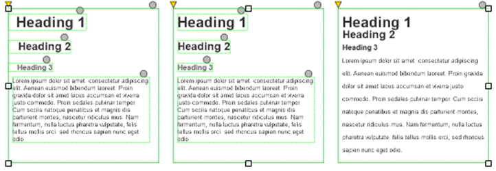
I often seen designers creating complex shapes from a pack of overlaping widgets. This has a couple of negative impacts, both for the designer her/himself, and for the other poeple that will need to edit or use the prototype afterwards. Here are some of these bad practices and how to fix these time consuming working habbits to be more efficient.
Bad practices: using two widgets rather than one
Beginner users will add interactions on all the individual elements, which quickly becomes a hell to update when the wireframes need to be edited at the next iteration. This approach is also prone to errors, where two elements dont link to the same behavior.
Adding hotspots on top of widgets because of using too many of them
Instead of adding interactions on all widgets, intermediate users of Axure will add another widget on top, usually a hotspot (or image map), which allows to see all the elements below, while making an entire zone cliqueable. The drawback of this approach is that simple style related interactions won’t work this way. Besides, it makes it tedious for artists to grab the texts from the wireframes: it’s not possible to select them anymore one the prototype is generated.
Yes I hear you, sometimes it is needed and makes sense, but believe me, most of the time I’ve seen this, it could have been avoided.
Using dynamic panels to simulate button states
When this is applied to a button, intermediate designers also implement roll over and selected states of their buttons by adding a dynamic panel on top of this, which contains the various states of the button. This is very bad. First, it is a waste of time to manually implement interactions that can be configured as simple style options in the widget properties. Secondly, it makes it even harder to maintain and edit the prototype, since not only it has many widgets, but each edit of the button on the text has to be done several times.
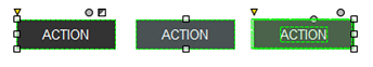
This works for buttons, links and any simple rollover or state related behaviour.
Grouping groups of widgets
The presence of many widgets to compose a single page element has another draw back: it encourages designers to group these widgets, to make the easier to select. This is not so much an issue for the designer. But if by any chance (s)he’s ill one day, and a colleague has to edit the prototype, it will be a nightmare for them to select, and deselect single widgets. This is because the groups aren’t known before hand, and it sometimes requires selecting and deselecting a couple of times the item before realising it was part of a group. The effect is exponential whenever groups are composed of subgroups.
Better practices to implement
Use widgets to their full potential
Whenever possible, if you need to design a complex shape, for example, a button with text on top, that has a roll-over and selected state, please use a single rectangle, and write directly inside it.
Now look at the right hand side, in the middle of the options bar. The first tab allows you to define borders and margings for your button, background color and edges, but also line spacing. You can make your button look exactly as you wish, without using several widgets.
Don’t create interactions that exist natively within the software
The second tab allows you to set roll-over and selected styles, aswell as a couple of more options (disabled, for example). Edit the styles you want for each state you need. You don’t need to code anything, it will be managed by Axure itself.
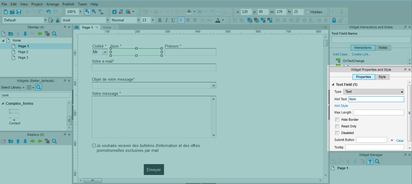
Note that if you are using Axure 7, it also allows you to select a hint text, which you can also style as you wish. This hint will simulate inline labels perfectly, again, without requiring anymore effort on your part. Furthermore, you will spend a lot less effort to edit your wireframes when iterating on yuor concept. And graphic designers will love you for making content copy-pasteable when they need to turn your wireframes into .psd.
Reduce grouping and inceptions of groups
If you have fewer widgets and they are styled properly, you will feel less need to group everything together, since your wireframe will be clean, and widgets will be easier to select and edit. This will make it much more comfortable for others to work with your wireframes too.
Don’t just make efficient interfaces, be efficient !
With this advice, you should be a lot more effective whencreating and editing your wireframes in Axure. More tips will come later to optimise the use of masters, repeaters and dynamic panels. In the meantime, please share your own tips, we’re always happy to hear from you!
Articles on similar topics
Axure basics - create a browsable interface
Axure training, Training in wireframing interactive prototypes, Interactive wireframing,
Axure basics - creating within-page interactions with anchors and visiblity
Axure training, Training in wireframing interactive prototypes, Interactive wireframing,
Axure basics - creating within-page interactions with dynamic panels
Axure training, Training in wireframing interactive prototypes, Interactive wireframing,
Axure - Creating menus with dynamic panels
Axure training, Training in wireframing interactive prototypes, Interactive wireframing,
Axure - How to create Masters and use them efficiently in Axure
Axure training, Intermediate Axure tutorial, Training in wireframing interactive prototypes, Interactive wireframing,
Advanced Axure - Creating repeaters
Axure training, Training in wireframing interactive prototypes, Interactive wireframing,