Axure basics - creating within-page interactions with anchors and visiblity
- Within-page anchors
- Show and hide elements
- Control the visibility of complex elements
- Edit the content of a dynamic panel
We have seen in previous posts the basic layout and functionalities of Axure, as wel as how to add links between pages of a storyboard, to create a browsable storyboard. In this post, we are going to learn how to implement simple interactions within a page, by adding anchors and controlling the visibility of some elements of the page.
Within-page anchors
In order to be able to scroll to an area of the page, you will need to name the widgets you want to scroll to first. Select the item you want to scroll to and type a name at the top of the right column in the field called “shape name”. In my example, I have named two widgets, one at the top, called “top”, and one at the bottom called “bottom”.
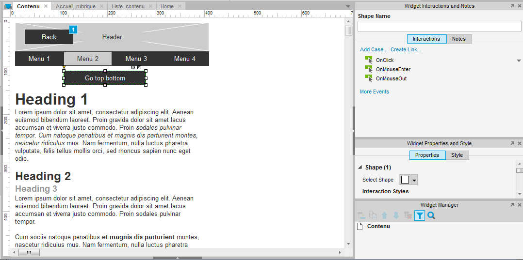
Now, select the button you want to use to reach the anchor.
On the right side, double click the “onClick” action. You should see the following option dialog, but empty.On the right side, inside the first group of interactions, select “Scroll to Widget (Anchor link). The midle and right columns should appear with the options. On the right side, select the target you have named. In my case, that is “bottom”.
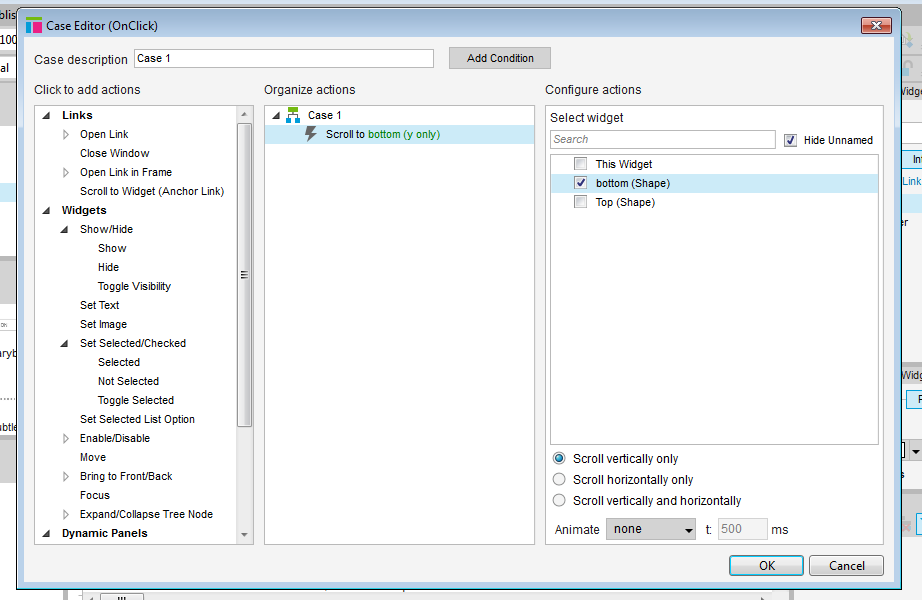
The right side can display all widgets, on only the ones you have named. A checkbox allows you to adjust the view to your needs. If you display all widgets, you you see the folowing screen. If you have few elements in your page, or have not named your widget, you might want to use the full list. Naming the widgets will make finding them a lot easier, either by displaying only the widgets that have a name, or like for adding a link, by typing the name of the widget to filter the list.
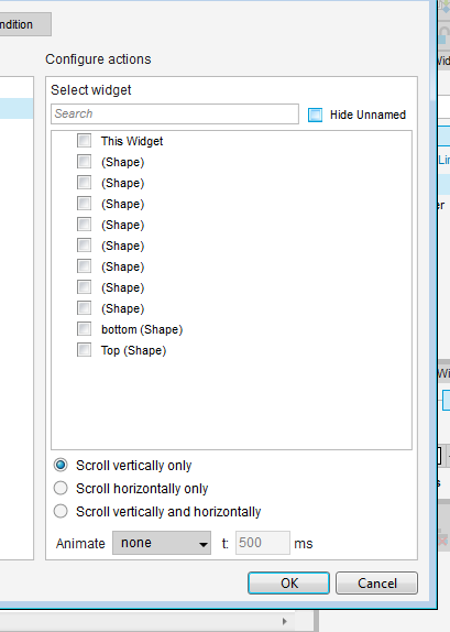
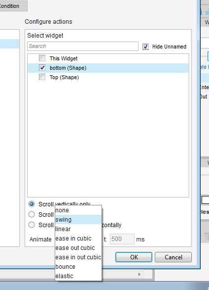
Once you have selected a target widget, you can add options, such as what animation to use to move to the target. An animation will contribute to make the behavior more transparent to users and ease their understanding of the mechanic.
Show and hide elements
When designing pages or forms, it is often needed to be able to display new elements of the content progressively, or to hide some. Showing and hiding elements is quite easy to implement.
To present this feature, we are going to create a drop down menu. This menu is made out of one element : a rectangle, with text on it. Create and place the menu where you would like it to appear. Don’t forget to give it a name.
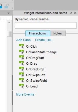
Now select the widget that should trigger the interaction. Since my prototype is meant for tablet, I will show or hide the menu “onClick”.
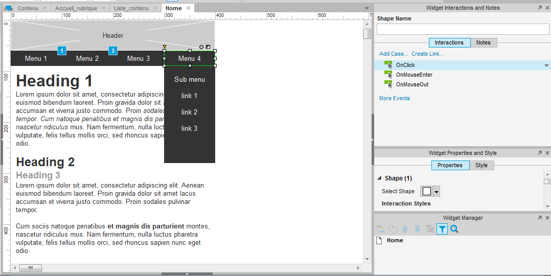
When you have double clicked onClick, you should see a familiar menu. This time, look in the widget actions group in the left colunm, and click on the “Show/Hide” option – which should be the first one. On the right side, select your menu. I called mine “submenu”.
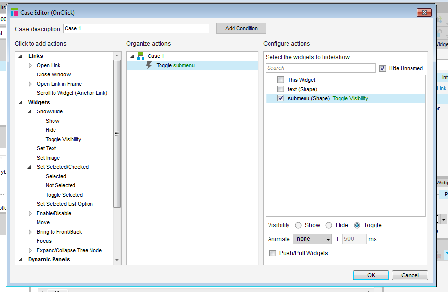
On the bottom of the right column, you can chose which action to perform : show, hide or toggle.Use show and hide if you want the action to be a one time interaction.
We will use toggle, which means each click will change the visibility of the menu : if it is visible, it will become invisible. On the contrary, if it is invisible, clicking will make it visible. Here too, you can chose an animation, to smooth the appearance of the menu, make it seem like it unfolds from the top, bottom or from one side to another.
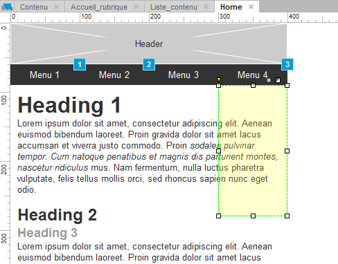
To complete our storyboard, we will want the menu to be hidden by default, so that it appears when the user first clicks on our “menu4” button. To do this, right click on the widget, and click on the “set hidden” entry of the menu.
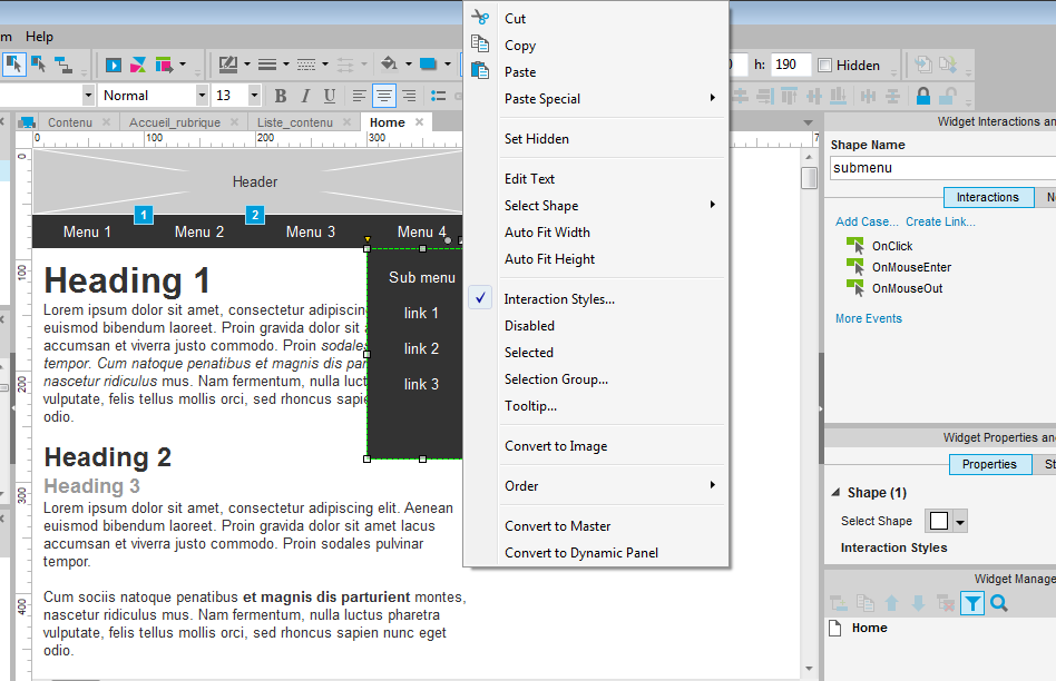
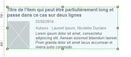
You will know an item is invisible by default because it will appear as a translucent orange area, as in the following screenshot :
Control the visibility of complex elements
It will often happen that your menu is composed of several items, or that you want to show and hide a group of form fields for examples. You could control the visibility of each item composing the group of widgets separately. Axure does provide a way to control this more easily though.
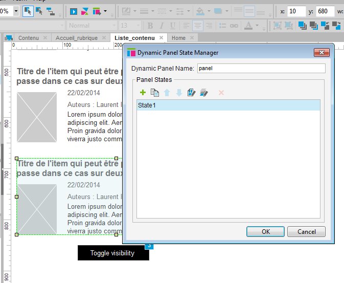
Select all of the widgets you want to make invisible together, and right click on them. In the menu, select “Convert to dynamic panel”.
Now, all the widgets are part of one element called a dynamic panel. It can easily be recognized by its blue tainted area. Notice also on the right hand column, that the dynamic panel can be named and can trigger interactions.
When selecting several separate widgets, this was not possible.
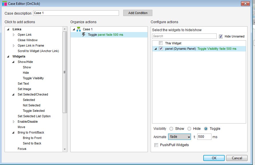
Now you can toggle the visibility of all the elements contained inside the dynamic panel at once, using the same procedure as before.
Edit the content of a dynamic panel
Once you have created a dynamic panel, it will not be possible to edit the widget it contains directly. To edit its content, you will need to open the panel by double clicking on it, and selecting a state, again, by double clicking on it.
You can then edit the content of the panel, as if it were a separate page.
Dynamic panels are a very powerful tool in Axure, which we will learn to use in our next tutorial, to create sliders, rich menus and custom accordeon content.
Articles on similar topics
Axure basics - create a browsable interface
Axure training, Beginner Axure tutorial, Training in wireframing interactive prototypes, Interactive wireframing,
Axure basics - creating within-page interactions with dynamic panels
Axure training, Beginner Axure tutorial, Training in wireframing interactive prototypes, Interactive wireframing,
Axure - optimal widget use to iterate painlessly
Axure training, Training in wireframing interactive prototypes, Interactive wireframing,
Axure - Creating menus with dynamic panels
Axure training, Beginner Axure tutorial, Training in wireframing interactive prototypes, Interactive wireframing,
Axure - How to create Masters and use them efficiently in Axure
Axure training, Training in wireframing interactive prototypes, Interactive wireframing,
Advanced Axure - Creating repeaters
Axure training, Training in wireframing interactive prototypes, Interactive wireframing,