Advanced Axure - Creating repeaters
- What are repeaters ? What are they used for?
- How to create repeaters in Axure
- When to and when not to use repeaters
What are repeaters ? What are they used for?
Repeaters are a powerful tool that appeared with Axure 7. A repeater allows the user to use real data from a table in a wireframe to dynamically build a list view. To create one, you use a special widget called a repeater. While editing the repeater, you give it the shape you want each entry of a list to display content without bothering with its labels.
Then you have to edit the table, fill it with content, and match each content column to one of the widgets from the display. Repeaters also offer advanced formatting options and functions to simulate sorting and pagination for example.
Repeaters are very useful to have a realistic view of what the content will look like despite it being a mockup, without the need to update all the widgets every time the layout changes – which would be the case if you added all the content directly as widgets inside dynamic panels.
How to create repeaters in Axure
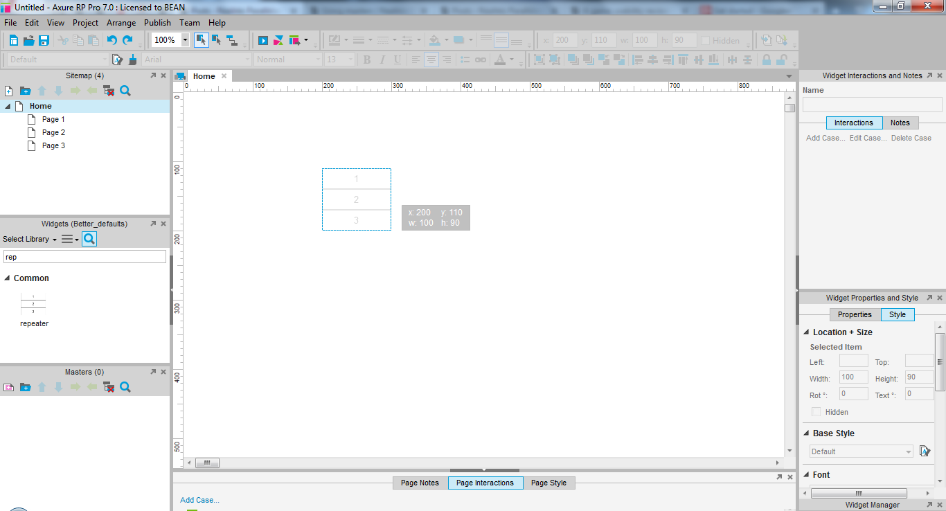
Add a repeater by drag and dropping it into the work area
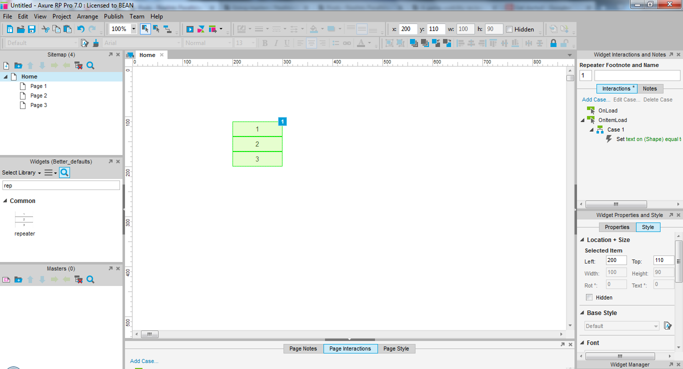
A repeater will look green, as opposed to blue for dynamic panels and red for masters
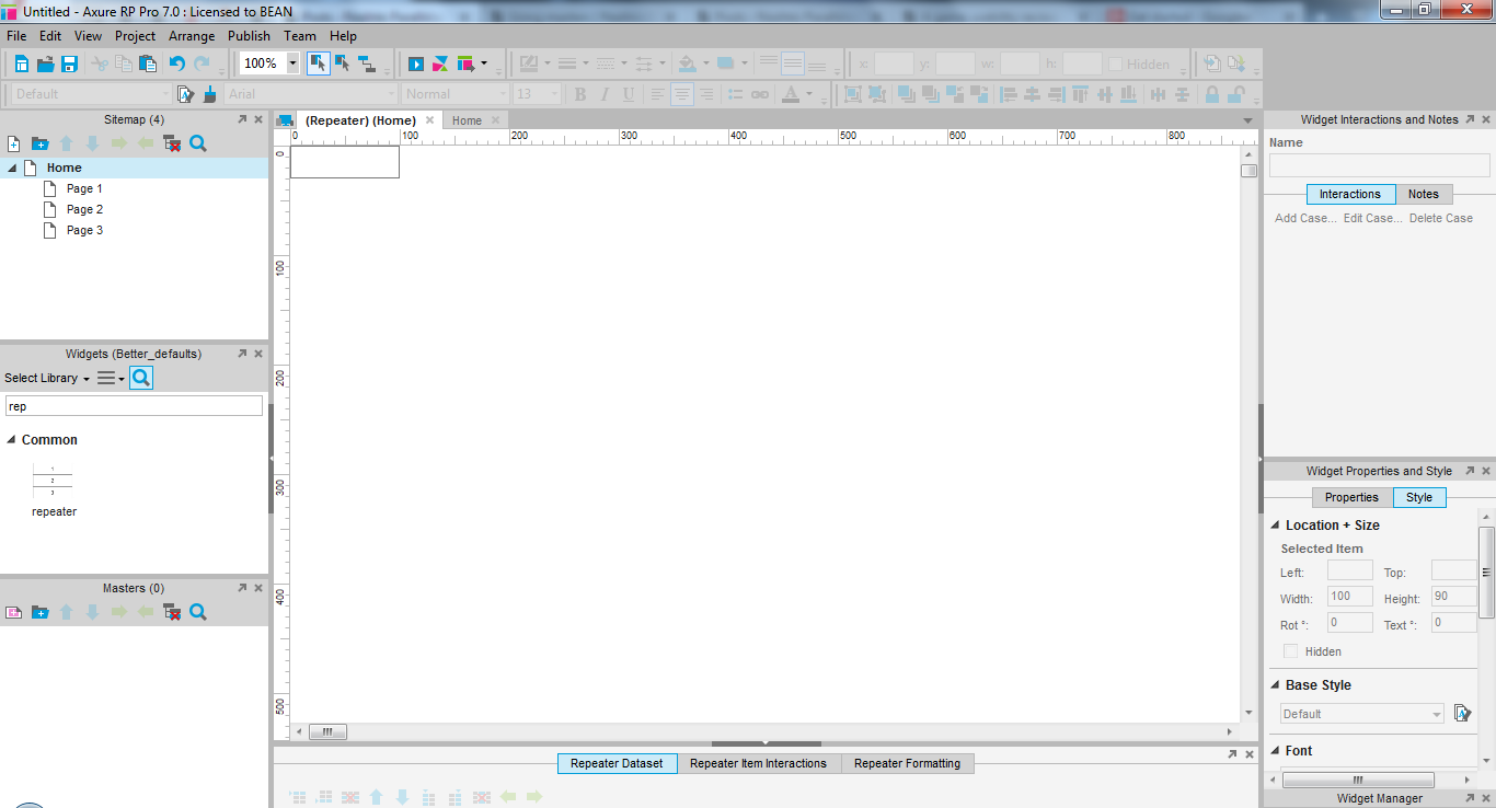
Double click the repeater to edit it. It will open in a new tab, just like a dynamic panel or a master.
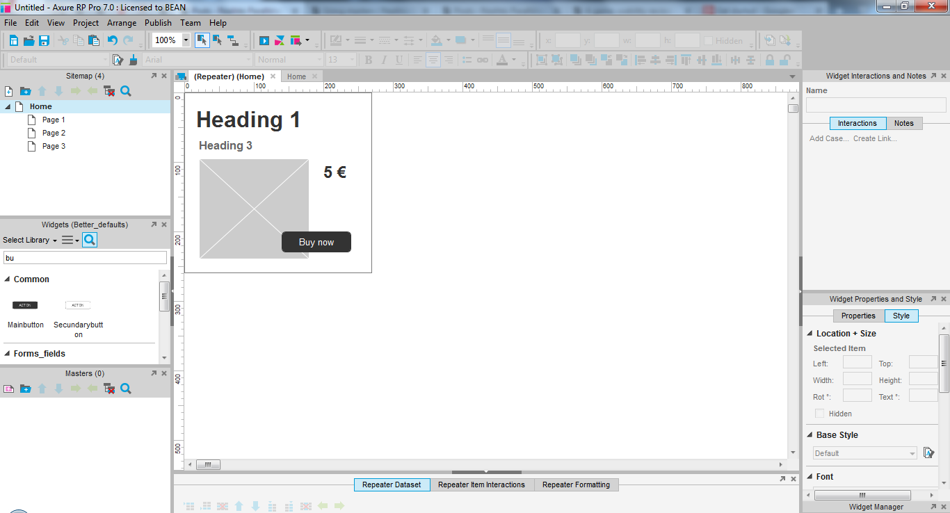
Add the widgets you like to the repeater. Don’t bother editing the text, unless it will be the same on all entries of your list. I will just name my button.
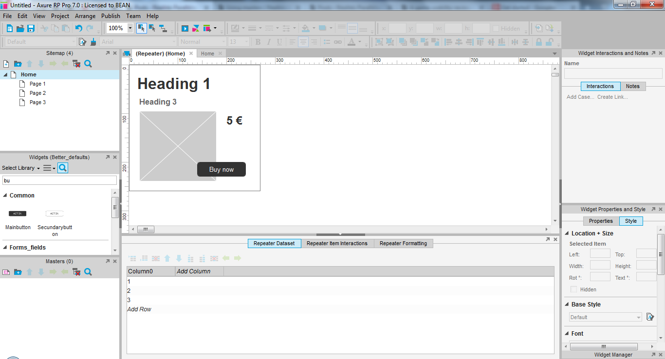
Adding content to a repeater
Below the work area, expand the menu for page interactions, which is now repeater interactions. The first tab allows to to feed content to your repeater.
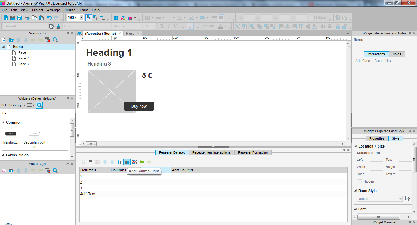
First add as many columns as you have fields you wish to fill in your list entry.

Name each column properly to know what kind of information you will find inside.
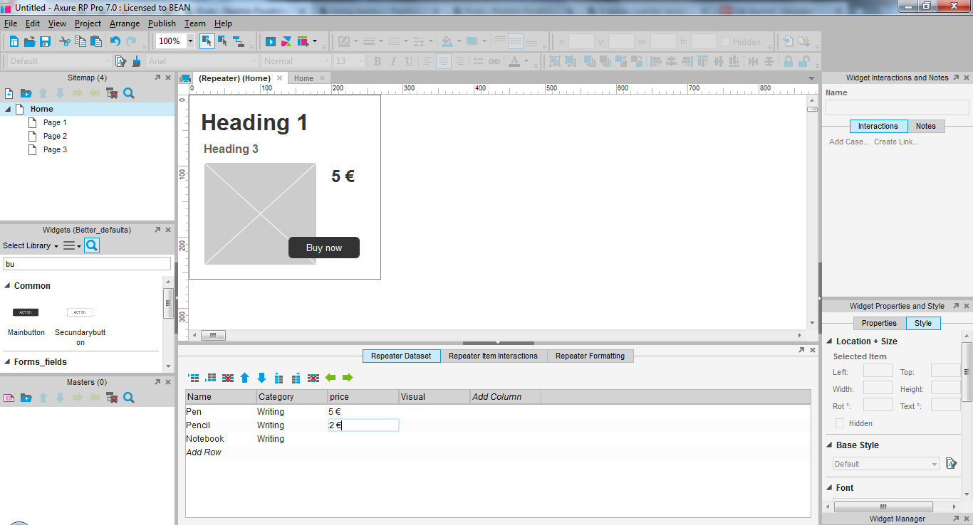
Then, you can enter the first few data entries to try it out. each line will match one list entry.
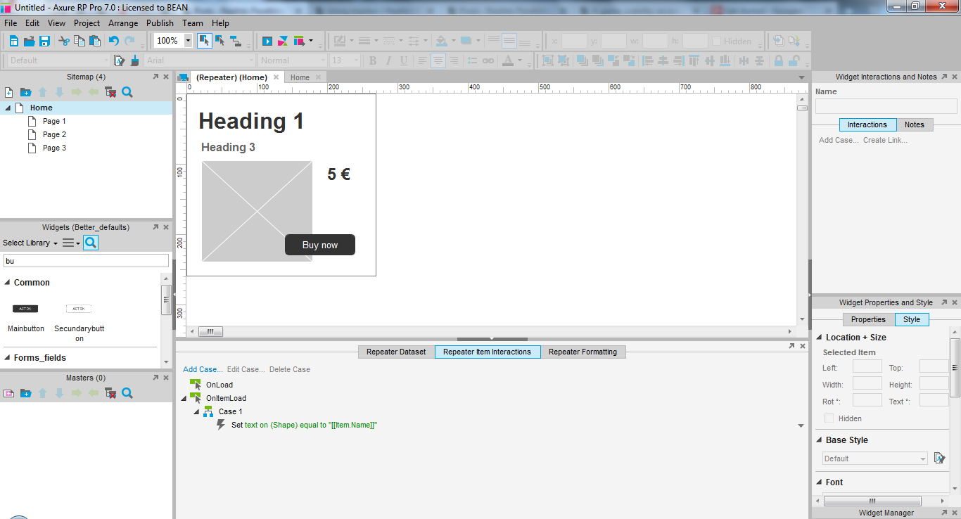
Making content from the repeater appear in the correct widget.
On the second tab, you can define the repeater behavior. By default, there will be one entry only which you can use as a model to create your own.
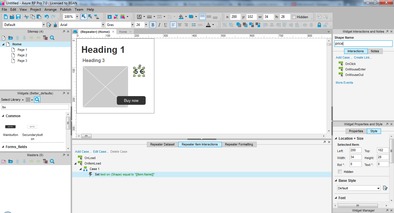
Since the interactions will require to add an action on each widget that should dynamically display content from your data, name all the relevant widgets in your wireframe first to make it easier to find them. Match these names exactly to the columns you created earlier.
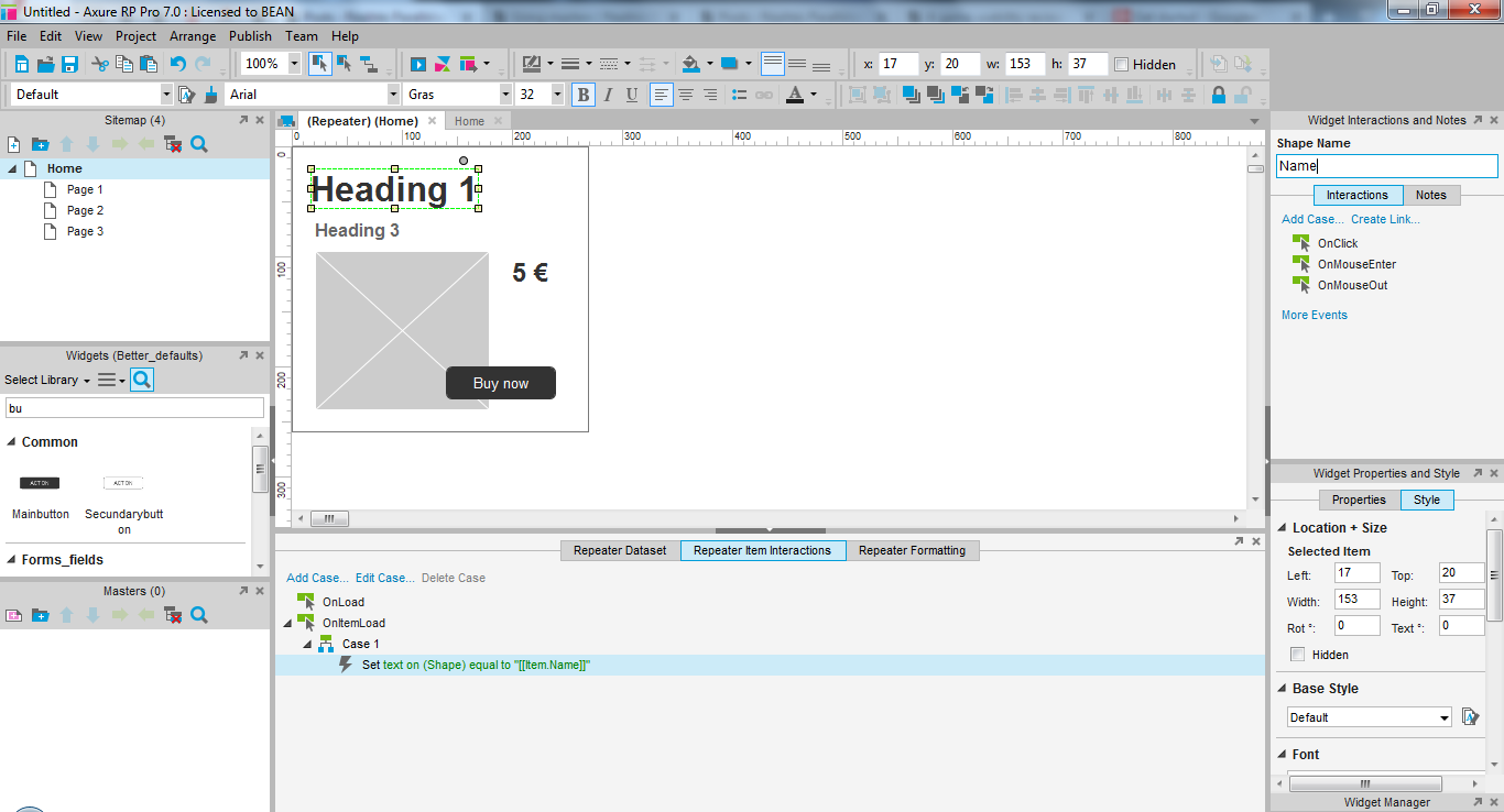
Double click the existing interaction to edit it.
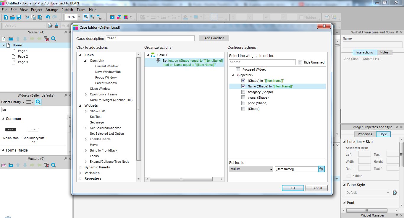
For now, ignore the first column. There is one existing interaction in the central one, select it if needed. We are going to edit it to customize the repeater.
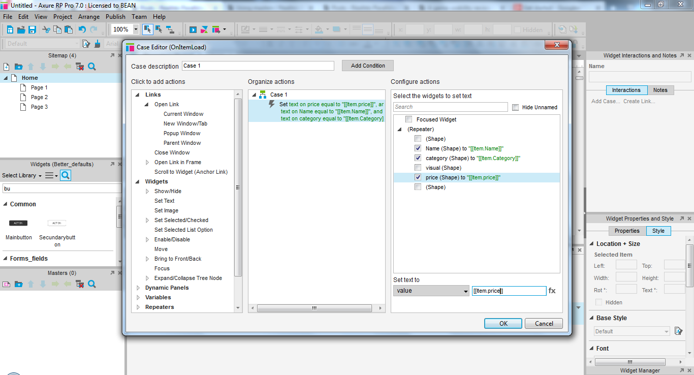
The list of widgets on the right should display your named widgets. Select a widget with a name. In the text field below, look at the text [[item.first column]]. Replace the content after the dot with your matching column’s name. For example, my will be: [[item.Name]]. The content is case sensitive. Repeat for each widget named after a column.
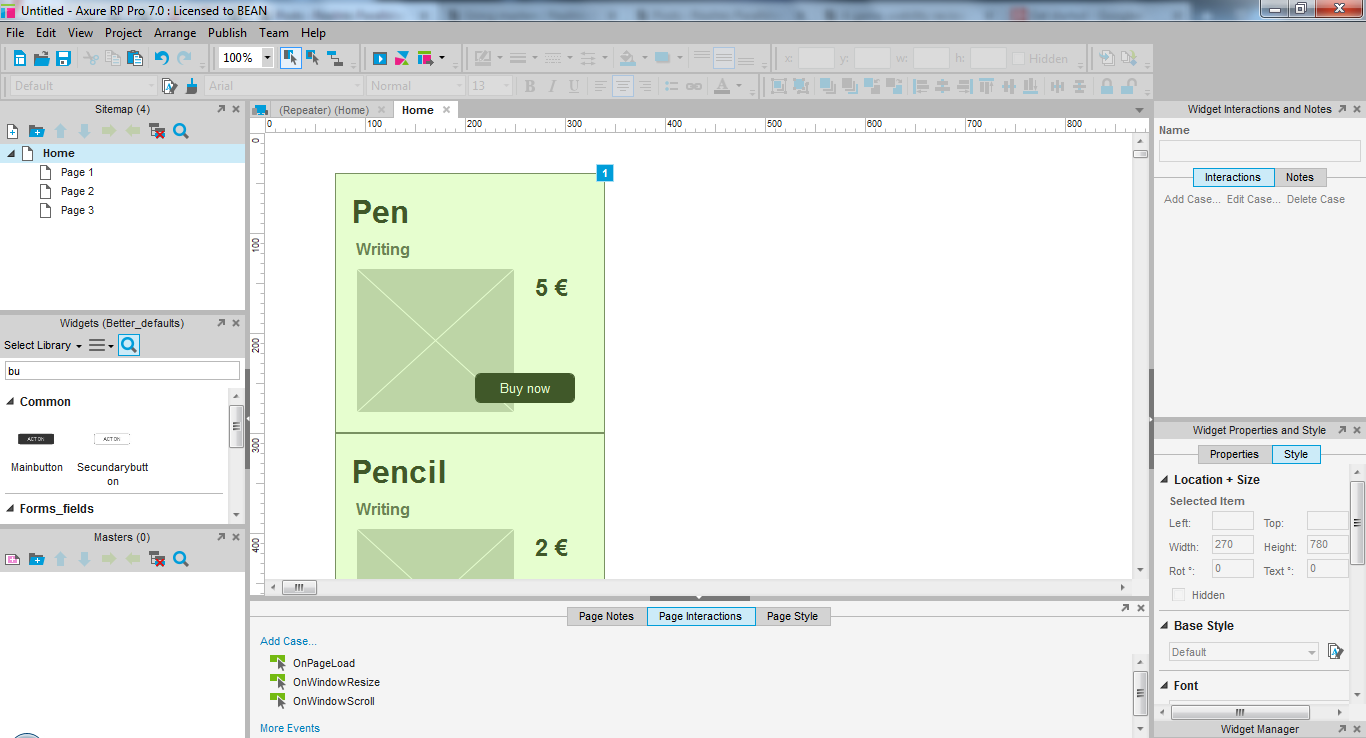
Now open the page where you added the repeater. By default, it will display as a list. You can check if the data is displayed properly like this. If not, something is wrong with your [[item.columnName]] settings.
Changing the layout of the repeater content
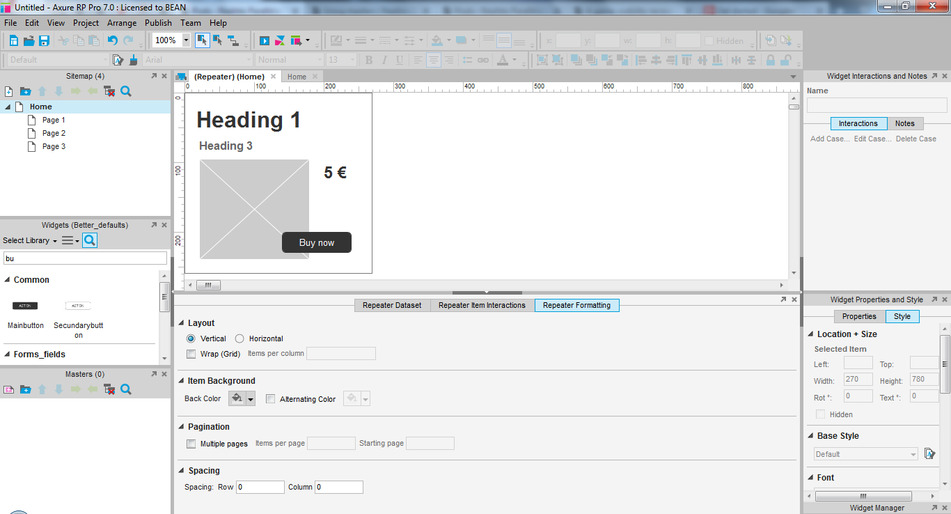
Back to the repeater (by double clicking it). Below, open the third tab. It allows you to format your list just how you want.

First, you can decide if the list should be populated in lines or in rows, and how many items should be displayed in each. Experiment with it to find what suits your content the most.
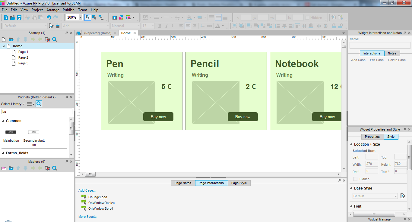
For now, I just decided to display 3 items per row, which appears like this, instead of 3 items in column before.
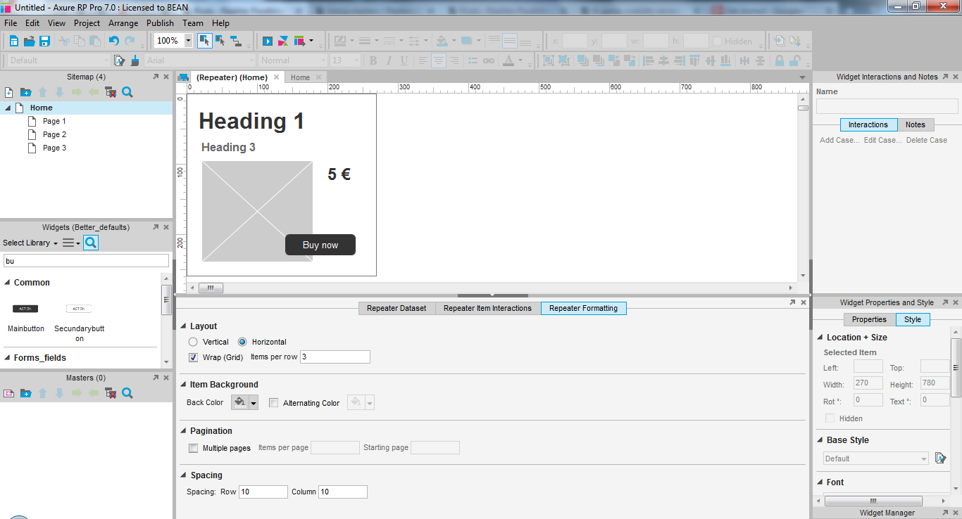
Back to the repeater. Below the row and column options, you can chose a background color for your list, and decide if the content should be displayed all at once or on several pages. For example, use 9 items per page.
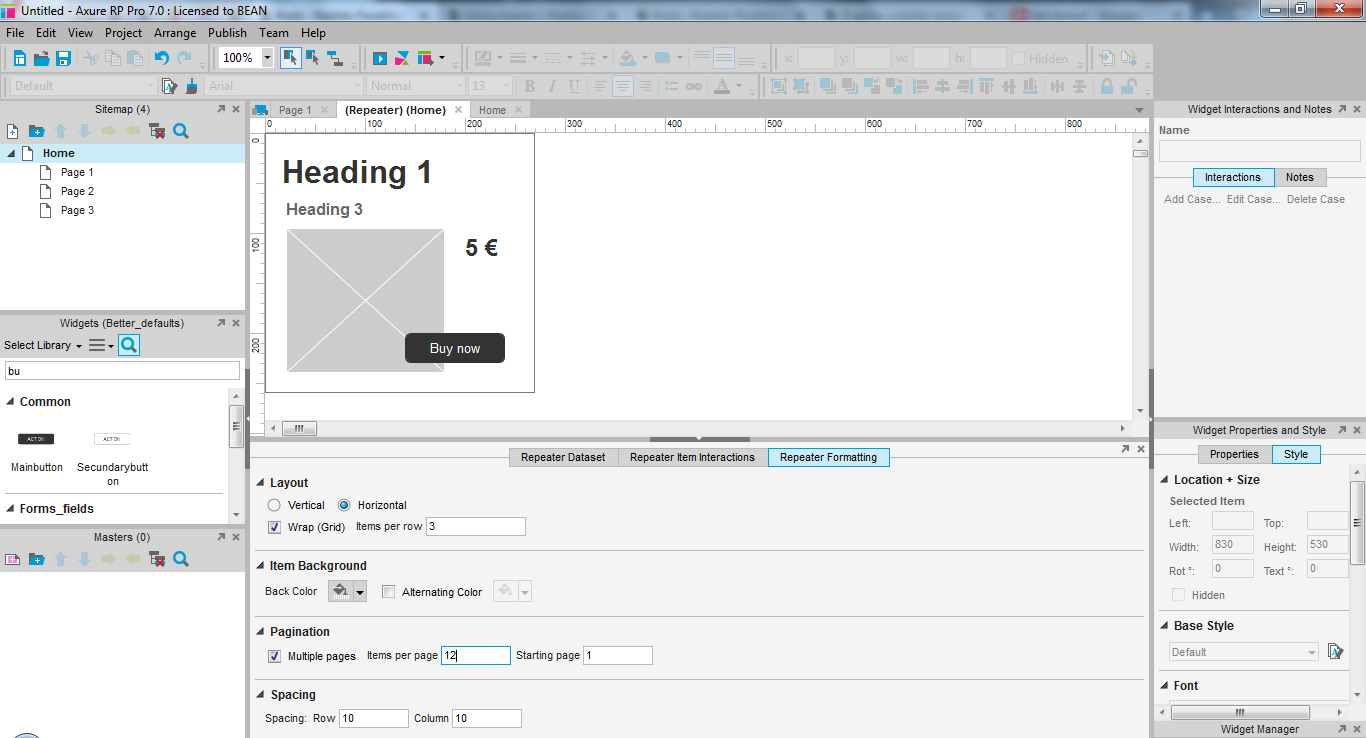
You can also define spacing between lit items, so they are not all touching each other.
Adding pagination to a repeater
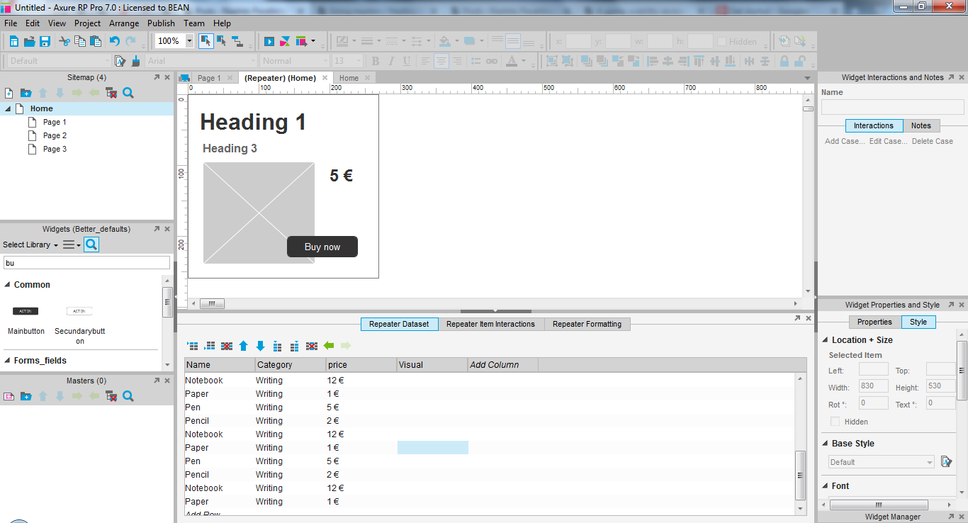
When you are satisfied with the result, you can add the actual content of your list. Either fill all the needed fields with real data, copy paste the existing lines, or copy paste a table directly from excel, open office or google spreadsheets. Pretty much any of those should work. Text files with tabulations should also be fine.
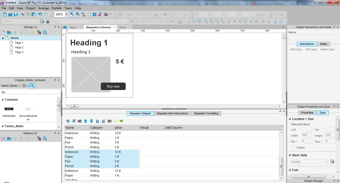
In my case, I just copy pasted the same information several times so it looks varied but is not all real content either.
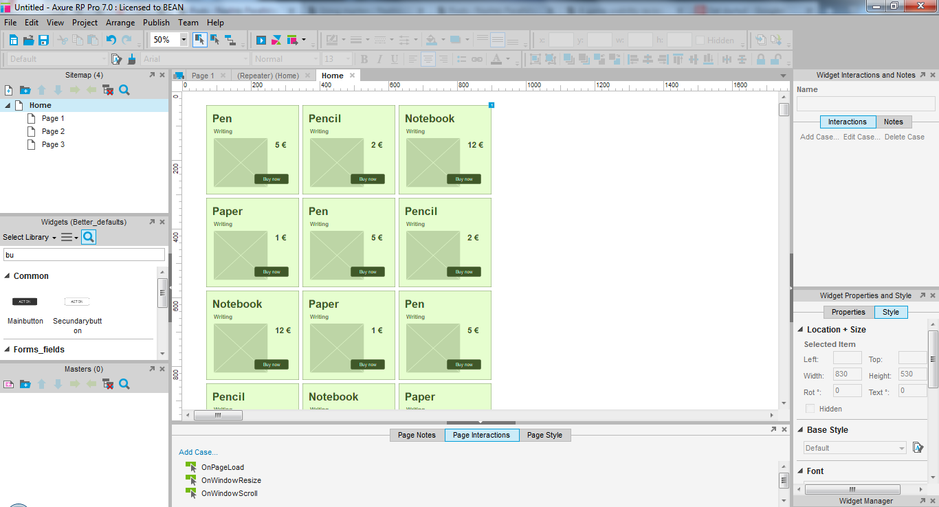
Back to the list on my page. the repeater now displays all the info, and only 9 entries out of my 24. However, I can’t switch to the next page of my list.
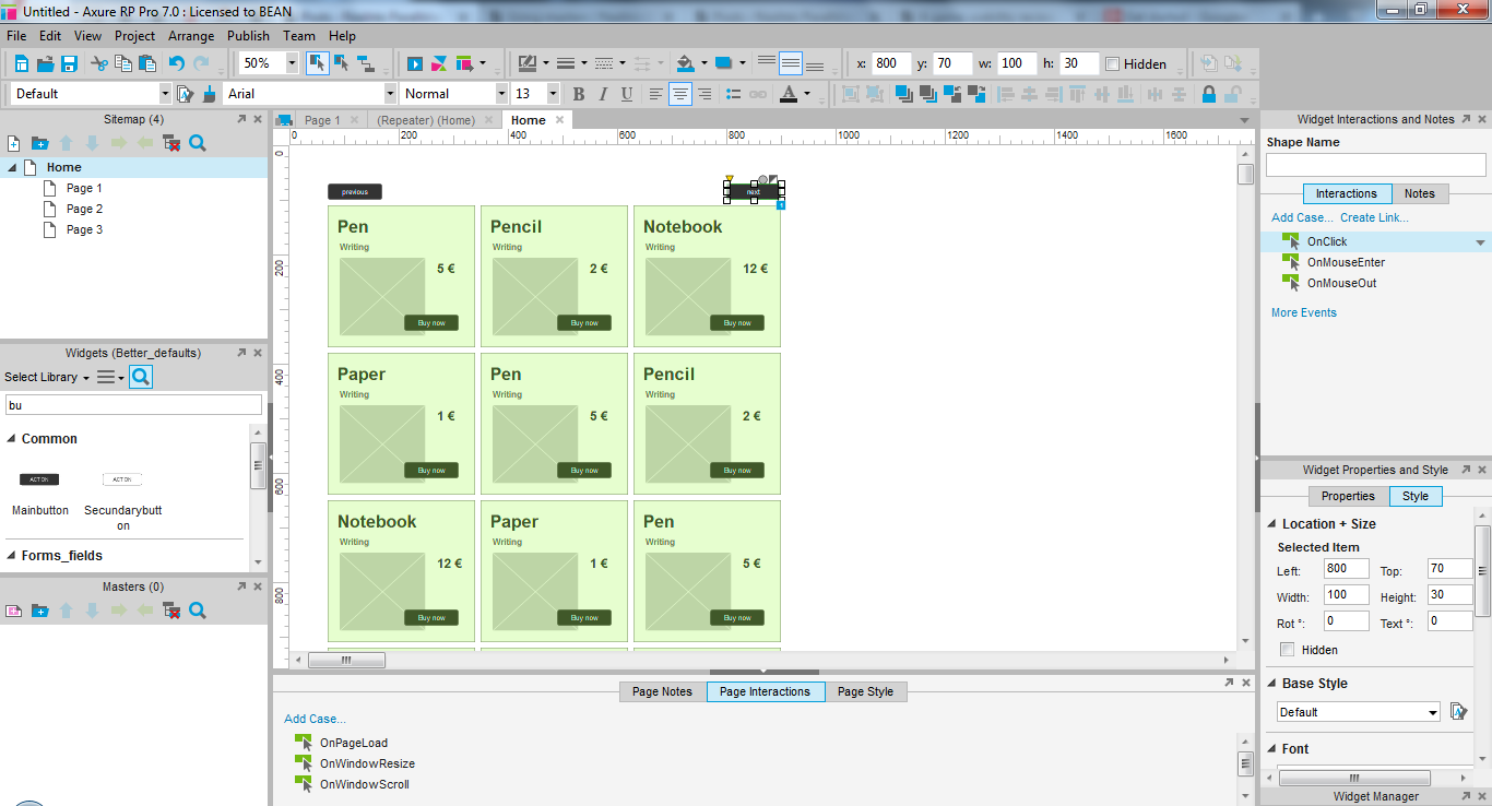
To do this, you need to add a button, and manually create the interaction. Select your button, and add an action on click, as if you wanted to manipulate a dynamic panel.
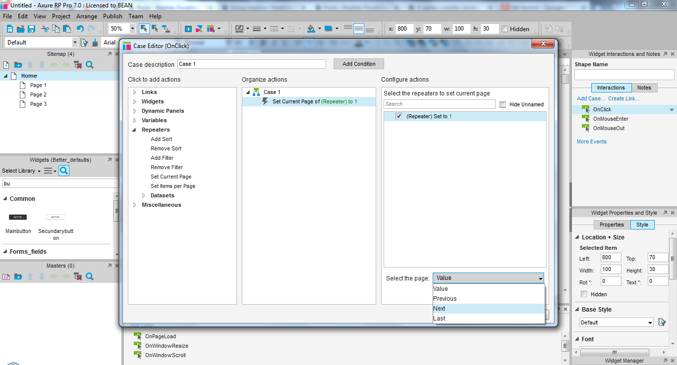
Instead, search for the repeater interactions in the first column, and select “set current page”. Select your repeater in the most right column, then below, select “next page” for example. When you generate your prototype, you will be able to browse the list. You do have to add each interaction manually, so if you want to access the previous page, you’ll have to add another interaction, and so on.
When to and when not to use repeaters
While repeaters are very powerful, the should not be used in all prototypes. If the lists are simple and there are no huge differences in content types, it might not make sense to add real content.
They can be useful to help a client have a better impression of the final result, if they have trouble imagining it and validating your wireframe with lorem, for example. It can also reassure clients to see their content will fit in the fields that are provided.
When adding real content, it also helps you reduce the work load. Since you need to gather the content anyway, you can ask other people to create, review and edit the lists content easily in a table, and import it periodically should it change often. This is a real advantage to work efficiently on the prototype and spend designer’s time on optimising the wireframe’s usability and layout, rather than updating its content – which can be both important, tedious and taking time away from other tasks with a higher added value.
Do not use repeaters on lists where the format of the content changes frequently, or different types of content are intertwined. While repeaters are powerful, they become a huge time waster when a prototype contains many of the to maintain, and even more when they contain several versions of the same one, to simulate breaks in lists, or match different data sources or various pages. If your wireframe contains 5 repeaters with each 3 items in the list, it is likely you would be more efficient updating all the list entries manually, than updating all the repeaters every time.
Articles on similar topics
Axure basics - create a browsable interface
Axure training, Training in wireframing interactive prototypes, Interactive wireframing,
Axure basics - creating within-page interactions with anchors and visiblity
Axure training, Training in wireframing interactive prototypes, Interactive wireframing,
Axure basics - creating within-page interactions with dynamic panels
Axure training, Training in wireframing interactive prototypes, Interactive wireframing,
Axure - optimal widget use to iterate painlessly
Axure training, Training in wireframing interactive prototypes, Interactive wireframing,
Axure - Creating menus with dynamic panels
Axure training, Training in wireframing interactive prototypes, Interactive wireframing,
Axure - How to create Masters and use them efficiently in Axure
Axure training, Training in wireframing interactive prototypes, Interactive wireframing,