Beyond - two souls
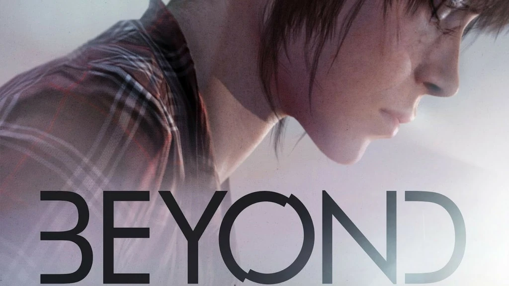
Quantic Dream proposes games that challenge the definition and nature of gameplay itself. In doing so, it also faces specific usability issues and proposes solutions to others. Many articles about the game discuss how the game fits in game design theory concepts like how Beyond Two Souls addresses game and play. This one focuses on its strength and weaknesses in terms of usability and user experience, in particular in comparison to the previous titles of the studio. Let’s have a look at some of the good ideas to learn from, and some of the issues that remain.
Four great ideas to learn from
Show Game settings during the mandatory install
Gamers always check their settings before starting a game. For regular gamers, this allows them to quickly check the graphics and audio settings, change the same things they always do, but also check out the controls, in case it’s a familiar layout, and possibly change them to what they are used to if it’s a genre they play often, and the layout isn’t exactly their favorite.
On the PS3, one thing that’s frustrating to players is the installation of the game on startup. The player wants to play, and when putting in the disk, he first has to wait for half an hour for the game to install.
While the Beyond still installs without the player’s consent and creates the classic ps3 negative flow, which is, put a disk in, wait for an hour, Beyond reduces the negative aspect of the waiting time by letting the user configure their settings while it’s installing. The player will not notice he has to wait for the install to finish at first, and the wait will be less long once he figures out that he can’t play straight away.
New generation QTE focus users on the action rather than on the controller
In Heavy Rain and Fahrenheit, the player sometimes would get the feeling that the game is playing them. The QTE prompts engaged the players to try all actions that were proposed. Sometimes, the player would guess what the outcome would be, but some times it would do something completely unexpected, or worse, something different or opposite to what the user wanted to do.
In Beyond, the QTE don’t appear as such. First of all interactions with the environment are presented more discretely, which allows users to chose whether they want to try the interaction or not. He isn’t compelled to compulsively try everything out.
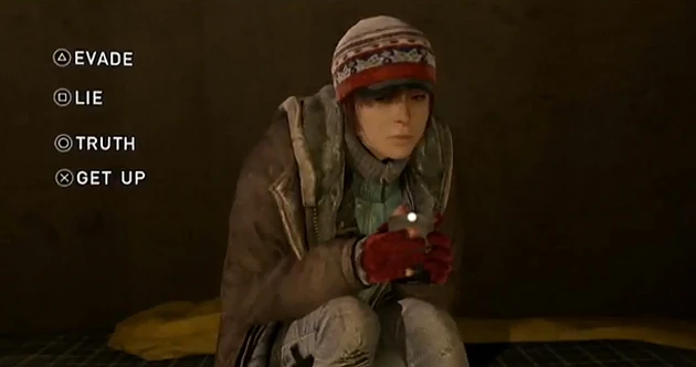
During action phases on the other hand, the user has to read the animations to guess what his character is trying to do. This focuses the player’s attention from press “X” to “climb”, or from “move the stick down” to “dodge an attack”. In the end, the player does the same thing, but removing the controls from the screen as much as possible allows the user to focus on the action.
Level presentation and loading screen
When changing chapters, the levels are presented on a timeline. Although the chapters are not played in a chronological order, this helps the player understand how the different sequences are related. He knows when he will play as a kid or as a kick ass agent.
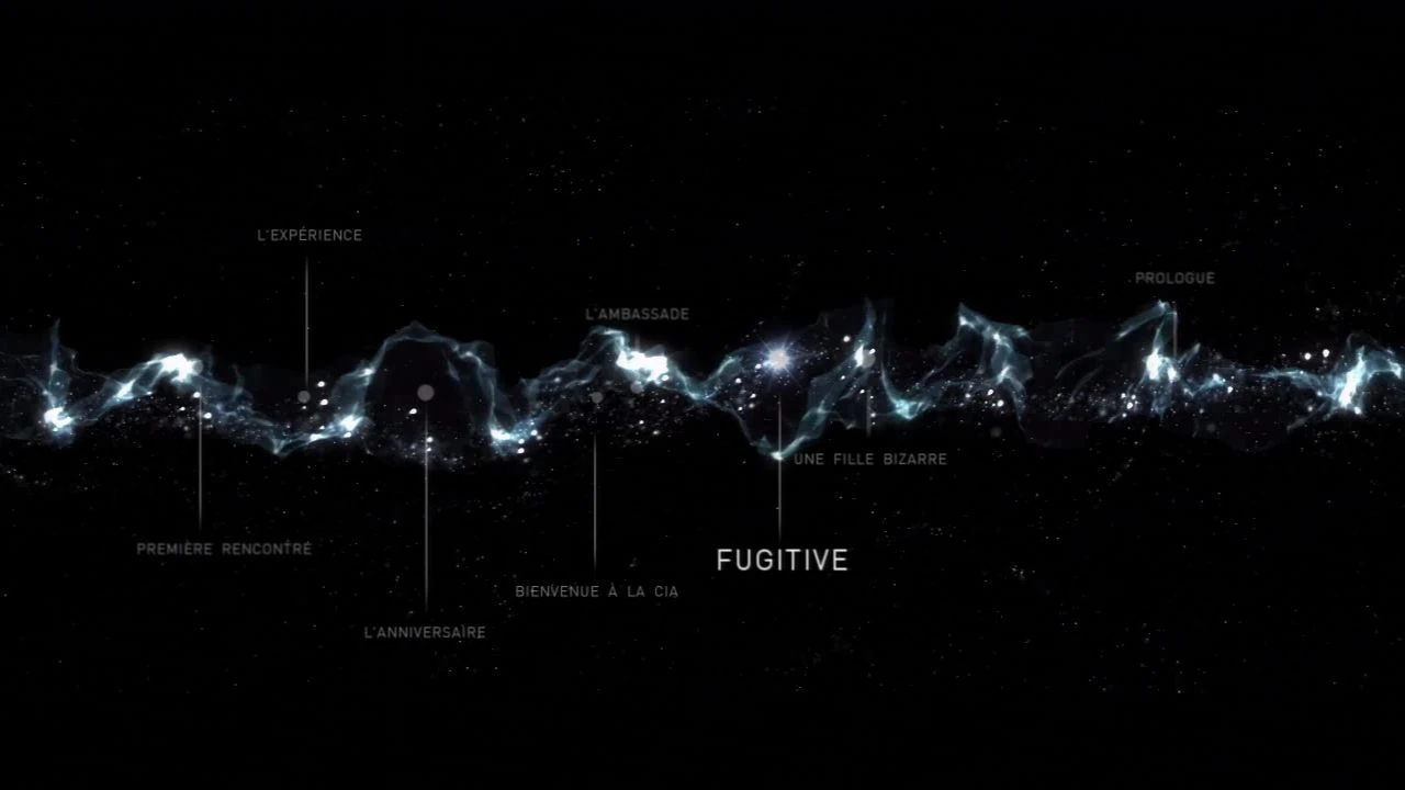
Showing this while loading the sequences helps the player understand the storyline and at the same time, prepares him psychologically for more calm scenes or more action oriented content – although it may not follow a strict rule.
Scenaristic camera in action scenes
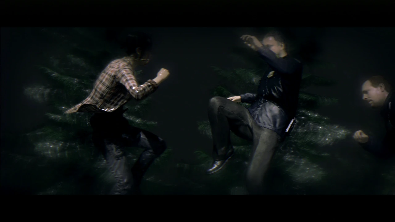
Put the focus on where Aiden has to defend. The fun in playing Aiden isn’t to look around to find the target you need to attack. It’s all about feeling all-mighty, defeating strong enemies with a very simple input and quite little effort. While the fun in playing Aiden is to have a free camera, its auto focus during action scenes makes the experience fluid and allows the user to focus on the action, instead of searching enemies.
Some remaining usability issues
White I was often pleasantly surprised by how usable the game has become compared to previous titles from Quantic Dream, a few small glitches remain in terms of usability.
Confusing Camera movements during action scenes
At times during action scenes, there are pauses in the confrontation, both for dramatic effect and for the player to catch his breath and possibly evaluate the situation. Sometimes, the camera changes from one angle to another, showing the scene with a completely different perspective.
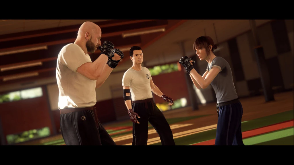
Players I observed were still focused on the action during the break, and the camera movement sometimes results in input errors, since the user was getting ready to punch left, and suddenly the enemy is on the right when it’s finally time to attack.
You wouldn’t suddenly move the camera around a combat scene in Soul Calibur for example. The level of challenge isn’t comparable, but the core of the gameplay is very similar in the end : giving the right input in reaction to what you see of the character’s animations. In both these cases, direction of the movement is critical : do you defend high or low? attacking with a left or right motion will have very different effects…
In order to preserve the dramatic effect of camera movements during fights while avoiding these small repeated frustrations, a possible solution would be to make the camera movement before the break, giving the player time to notice and react to the change. The player can then anticipate his next move and not feel/be tricked at the last moment.
Dodge or block ?
One input which is the hardest to read, is to figure out when being attacked whether to dodge or block. During the tutorial, I’ve seen players repeat the scene over, making the same mistake repeatedly, at the second phase of the fight, when the player needs to duck. While this is finally learnt the hard way, by trial and error, the players still seem to have issues with this later in the game during most combat scenes.

Aiden help me! “I have no idea what I’m doing”
When controlling Aiden, some scenes can get really confusing. The game provides clear information about what actions Aiden can and can’t do. In these particular situations, the players falls back in a strategy that they felt often compelled to do in heavy rain : try all actions in fear of missing something important, which can seem counter effective in Beyond.
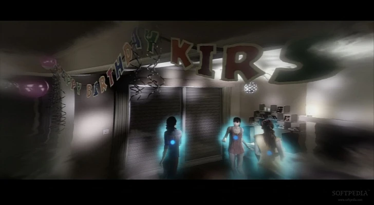
For instance, he can possess enemy characters and use them. He can then use the character against his fellow attackers, or make him commit suicide. Often, the action to commit suicide isn’t clearly identified, and the player is likely to kill many officers without using them to do much damage to the other attackers.
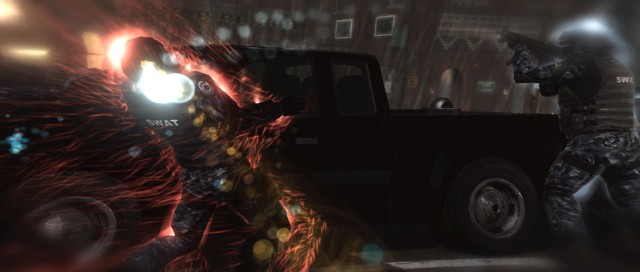
As an example, in a scene where many policemen are after Jodie, this is particularly frustrating when the player takes control of a sniper, and the first suggested action, which might be expected to be ‘lean forward to aim”, actually makes him jump off the roof top.
The issue here is that the player doesn’t know if and when he did something wrong and is likely to temporarily feel out of control.
Conclusion
Despite a couple of remaining usability issues, Beyond: Two souls proved to be an extremely polished version of the principles behind David Cage’s concepts : interactive movies that are able to engage both gamers and non gamers with accessible controls, an immersive story and stunning graphics.
One might argue that it takes the challenge out of the game, that the player’s impact on the story appears trivial. Considering the exploratory nature of the concept, Beyond turns out to be a very mature game system, that embraces and highlight the designers vision.
Articles on similar topics
The Mass Effect series
Console games, Player behaviours,
Catherine’s game Interface usability review - how mismatching mental models can affect the player experience
Console games, Console game user experience, Console games,
Problem solving in Catherine and how the interface design decisions influence player performance affect the player experience
Console games, Console game user experience, Console games,
Game review - Catherine’s Tutorials and Controls Usability Review
Console games, Console game user experience, Console games,
Usability for core games and Bloodborne’s first time experience
Console game user experience, Console games,
Heuristic evaluation of Mini Ninjas and how to describe problems
Console game user experience, Console games,