Prototyping mobile games with Protopie
- Simple and exhaustive mobile interactions
- Fast preview and sharing
- Reasonable learning curve
- Cool short demos, not for usability testing
- Comments
I’ve been looking into alternatives to Axure. Don’t get me wrong, Axure is still my favorite prototyping tool, but I need to keep my skills sharp. I’ve started with Protopie : an app to create highly interactive mobile prototypes using gestures and hardware input.
Simple and exhaustive mobile interactions
Protopie lets you add interactions to mobile designs. It is easy to pick up and you can make awesome effects very fast with an interface that is very similar to video editing. It is great for defining sequences of micro-interactions precisely, thanks to its timeline animation approach. It also allows to create very simple transitions very quickly.
I spent about 2 days on paper to iterate on a concept, then a day in Sketch to create the screens. It took me about half a day to create this interactive prototype in Protopie :
View the resulting prototype in action on youtube
Fast preview and sharing
One of the strength of protopie is its ability to use the mobile hardware to trigger interactions such as tap pressure, compas, built-in gyroscope input… It also lets you create interactions for any motions and number of fingers.
Combined with the protopie app, you can preview most interactions on any device, although some hardware interactions only work with a predefined selection of common apple or android devices. Since it supports few but common devices, it didn’t work with mine.
Reasonable learning curve
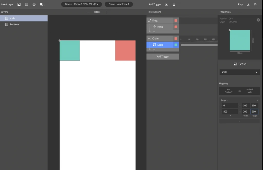
Unfortunately I don’t have access to the demo anymore to share screenshots of my prototype in the interface. I’ll add them later if I decide to buy the app, but I at least want to share an image of the interface. It looks a lot like sketch, with layers on the left, properties on the right. The central area contains the screens. You can only see one screen at a time, which makes navigating screens slightly less efficient.

The first column right of the screen is the timeline, which lets you add interactions and control animation speed and delays.
It takes a bit of time reading the documentation, but once that’s done, it’s fairly easy to use the software. It’s not as simple as doing everything visually, you need to use menus and know all the names to use the app, but it’s way more accessible than Axure. All options and properties in particular are much easier to configure for result with similar complexity.
Cool short demos, not for usability testing
Protopie is great to demo an interaction once. It is not optimized to create fully interactive prototype : you can’t duplicate assets with their interaction easily, which makes creating a fully operational usability testing prototype tedious.
Something as trivial as re-using a toggle animation on a switch requires to copy-paste all elements and interactions one by one and manually update the assets the apply to every time. You can at best duplicate a whole screen to preserve interactions for menus or options, and change the content afterwards.
It’s not going to replace Axure, but I can see how I could use it to test quick animation sequences in no time.
Comments
Hi, I am Fredo from ProtoPie! Thanks for writing an article on ProtoPie. I understand your pain point and I have shared it with the rest of the team. By the way, did you log in on ProtoPie Studio? When you do, you can extend the 7-day trial period with another 30 days. If you already did, shoot me an email :) Cheers, Fredo
Hi Fredo,
Thanks for the feedback! I didn’t know I could extend the trial : will definitely contact you when I do so.
Cornelia
Articles on similar topics
Prototyping mobile games with Flinto
Game development tutorial, Prototyping tools for mobile game user interfaces,