Prototyping mobile games with Flinto
- Flinto is really easy to learn, and efficient to use
- Import from Sketch
- Transition based prototyping
- Saving time with the behavior designer
- Good but not great yet
I’ve been looking into alternatives to Axure. Don’t get me wrong, Axure is still my favorite prototyping tool, but I need to keep my skills sharp. I’ve started with protopie, but my first article will deal with Flinto : a very easy to learn tool that lets you quickly create tactile prototypes.
Flinto lets you add interactions to existing screen designs, on ny screensize, but with a focus on tactile interactions. It is great for designing custom transitions quickly. It is easy to pick up, and allows to explore and experiment ith transitions. Once a transition is good, it can also easily be re-used.
I spent about an hour watching tutorials, a half day designing interfaces for a small text adventure game in Sketch. In just 3h using flinto for the first time, here’s the result :
Flinto is really easy to learn, and efficient to use
Editing in Flinto is based on visual previews. It’s easy to customize starting and end positions of the animation. There’s many options to customize the transition such as animation curves. The app does the hard work of calculating all the steps in between the start and end position.
There’s no global timeline or code involved. Fine control of animations states other than the begin or end position is limited. This is the price for making their creation so easy. This makes bug fixing harder, because there’s few visual cues on where to search for the bug, even when you have a correct intuition about the cause of the bug (typically, incompatible interactions on nearvy widgets).
Import from Sketch
Flinto offers an option to import content from Sketch. Unfortunately no matter how I configured the import, the result was never usable. I understand that there’s work involved to have a clean import. I used lots of symbols to avoid inconsistencies in my prototype, and maybe it’s due to the version I use.

No matter what, I find it way more efficient to just export assets and compose artboards from them, even if it means updating them manually..
Transition based prototyping
Flinto didn’t offer any within screen animations, but only transitions between separate screens until recently. It’s still possible to fake within-screen interactions, by using invisible layers or exporting all states as complete screen.
Flinto advocates it reduces prototyping bugs. It simply offloads the complexity onto the design software, by increasing duplicate content. This increases the risk of inconsistencies in duplicate content while iterating on the design.
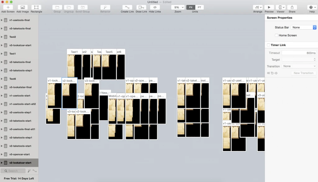
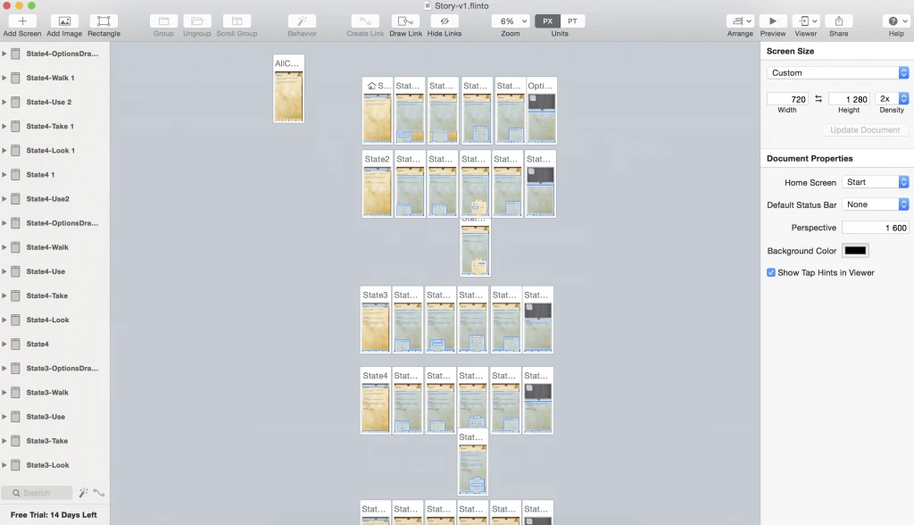
This is what my prototype looked like when using this constrain.

Each line is a state of the prototype, and each line is required to animate the menus. Honestly, it’s tedious despite the fact copy-pasting of content preserves interactions. If this was it, I’d have dropped Flinto.
Once the first line was in place, it was really easy to duplicate them and adapt the screens to each state.
Saving time with the behavior designer
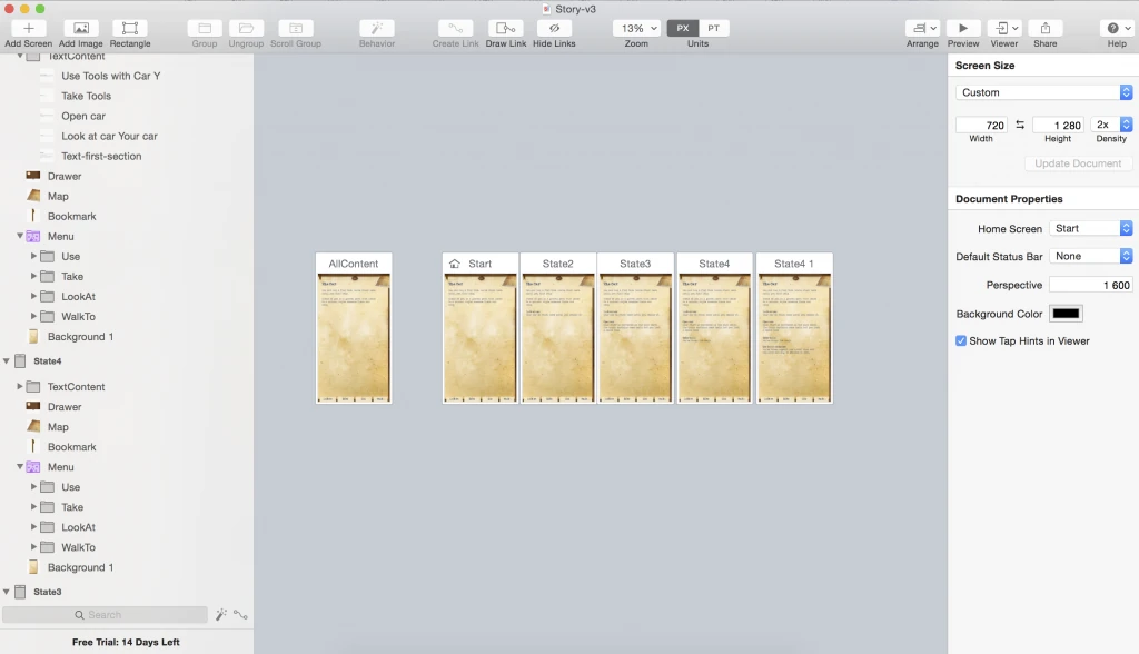
Lucky, the behavior designer fixes this by allowing to add interactions on groups, by giving them different states and creating transitions in between them. It’s basically like and Axure dynamic panel, except the interactions are self-contained.
This is my prototype using 2 group behaviors, for the menu and for the drawer on top. Displaying new content is managed on the page level. It took me about 2h to re-do everything a second time with this feature, but I wasted quite a bit of it hunting for bugs.

From this version, completely editing all interactions took me 1h30, despite re-using the already placed background images. I don’t think my prototyping speed will increase much with experience using this tool.
This video illustrates the second version. As you can see, it’s the same user flow, but the menu and interactions are completely different.
Good but not great yet
I’ve more experimenting to do, but I already see some limitations. I feel Flinto limits my creativity by not allowing me to prototype basic interactions such as drag and drop.
There’s a simplified version of Flinto available as a web-based subscription. The mac version comes with a companion app that lets you stream the prototype to a selection of iphones. This limitation to apple devices also limits the use of flinto for me, and how to easily share prototypes remains a mystery for me.
I’ll use it on a few more projects as long as I’m testing the trial version, but it’s probably not going to replace Axure in my toolset. While Flinto is slightly easier to use, Protopie offers more options in terms of interactions (manage number of fingers, use device hardware on select phones…).
Being able to re-use interactions still places Flinto far ahead of Protopie as long as you don’t need advanced gestures.
Articles on similar topics
Prototyping mobile games with Protopie
Game development tutorial, Prototyping tools for mobile game user interfaces,