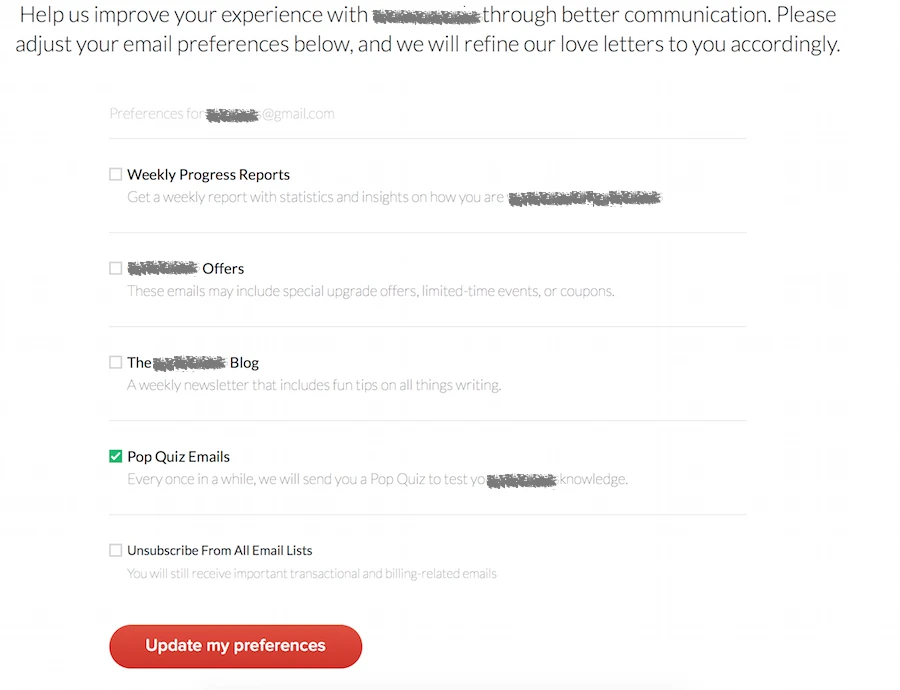
Unsubscribing from mailings, a case study
- Some things I like a lot about this page
- Poor user experience for a page that claims to care
- If you give options, make sure you comply
- How to do better ?
I’ve started using a spellchecking plugin recently, exploring better ways of showing fixes. As soon as I created an account, I started receiving newsletters – which I can’t remember signing up for, but it’s expected. As I always do, I clicked the unsubscribe button immediately, and the unsubscribe page is very interesting to me.

Some things I like a lot about this page
The introduction text is warm and friendly. As someone who just got spammed, it softens my mood.
The list of subscriptions is clean, explicit about which content will be sent.
I also like treating the unsubscription as adjusting preferences, which has a positive connotation and changes the mindset of the user
Poor user experience for a page that claims to care
Some things could be improved a lot too, for a page that claims to care about the user experience…
The initial view had three boxes checked. As a good user, I read only those that were checked and ignored the others completely. (Remember, users don’t read!)
Then I got confused.
The top of the list says: preferences for my email account, and the last button reads Update my preferences. But what do the checkboxes mean ?
Do I check what I want to unsubscribe from?
This option would be more user friendly, and give up aggressive marketing techniques. Not very likely… but, see no evil. Maybe they are super nice ! The way it is done is confusing though.
The user can’t be sure of what they are registered for exactly if they change the preferences. If you’re going to be this user friendly, then ou should also make the choice explicit to at least benefit from the positive image.
Do I uncheck what I want to unsubscribe from?
This option encourages to reconsider unsubscribing and gives a chance to keep the user involved with a mailing. It makes more sense to be more agressive when people are about to cut a touch point off.
So I went with option two, leaving quizzes checked. I don’t care about pricing updates, but challenge my english skill ? Can be fun.
From a marketing point of view this is a success. Getting the user to think twice about the choice increases the chance to keep them in your net.
However, it would be better if the user reconsidered unsubscribing without wondered how to do it. It’s possible to have one without the other. Now I know they care about my attention, but not about my time.
If you give options, make sure you comply
Worst of all, if you’re going to try and keep users within reach, make sure you do what you promise !
Just the next day, I received an update about product features. I was kind of curious and looked extra carefully, thinking they might have hidden a quiz among the useless news. No quiz.
Now I feel like they really wasted my time. If they meant to be nice, they fail hard, because I just unsubscribed from the only thing I wanted to get and don’t know how to subscribe to it again.
If it’s their marketing strategy, well, I prefer to think it’s an implementation problem, a mix up in the database or something… In which case, my only option is to unsubscribe from everything.
How to do better ?
I really like the layout and the user preference approach. A few small changes could change the experience greatly. For example, editing the small line above the list could be enough to clarify the design.
“xxx@gmail.com currently receives”
“Active subscriptions for xxx@gmail.com”
“Currently sent to xxx@gmail.com”

If part of the boxes are checked, it would be easier to understand that those are the active subscriptions. If none are, it would indicate that users need to check whatever they wish to unsusbscribe from. The marketing strategy of each option remains untouched.
The user still needs to think twice about unsubscribing, without wondering how to do it this time. By being more user friendly, you’re building a better qualified database. The communication efforts focus on users that are more engaged.
And who wouldn’t want to increase their conversion rate while optimizing their campaign spending?
Articles on similar topics
Axure 8 - just when you think of moving on, the new features make you stay
Website usability, User Experience,
Creating customer journey maps
Website usability, User Experience,