Shadowrun level editor - efficient wall placement and using height
In previous Shadowrun Hong Kong tutorials, we’ve seen how to add assets to a map and place a floor on a plane. Today we’re going to add some walls to the scene.
Adding walls to your map
Different types of walls
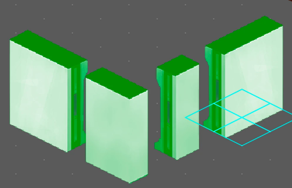
First let’s have a look at the different available wall pieces. Left and right on this image are regular walls. The small piece on the left side is called a connector, it helps fill gaps more easily without having big chunks of walls overlaping. The piece forming the andle at the front is usually called a wall end. Unlike the other wall pieces, it is not cut through but instead has a nice wall finish also on the ende. It is used to make corners in front of the player look better.
Rotating wall pieces
The left and right side regular walls are actually the same piece. You rotate props to adjust their position using the shift key and directional arrows.
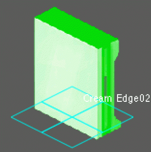
The animation here shows you the wall’s positionning. When you rotate a piece, the wall stays at the same position, showed by the blueish grid below. It shows where on the floor level the wall is exactly.
Use the R key to rotate the selected asset or shift + arrow to turn it directly to a specific direction.
Using connectors
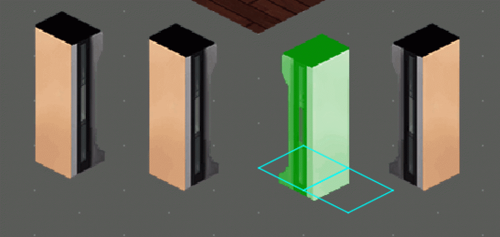
A connector piece will have different locations on the floor based upon its orientation, to help you nudge it in the way that best fits between two other wall pieces that don’t match up exactly.
Assembling wall pieces
As you can see, it fits nearly perfectly but not completely yet. The left wall and connector aren’t properly aligned. To fix this, play with the connector orientation using shift + arrows or rotate the pieces using R key.
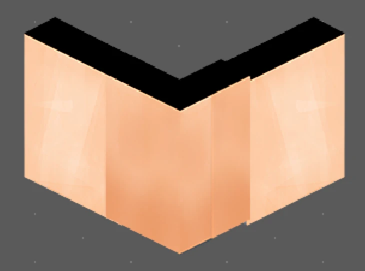
If that’s not enough, you can move props around with more precision using the alt key + arrows.
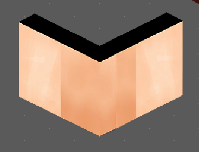
Precision work to create seamless walls
Here you can see I have added walls to our previous scene. To fix the corner, you can use either connectors, wall ends or nudge wall bits into place until it looks perfect.
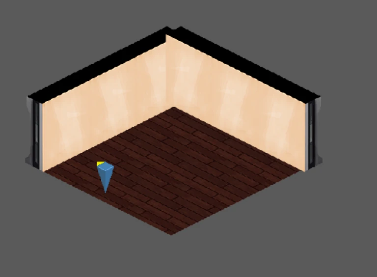
It’s better to fix the alignments straight away so you don’t have a lot of work moving and adjuting your whole level just to fix ne corner.
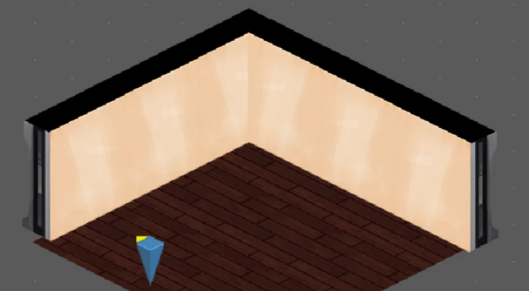
Adding height to your level
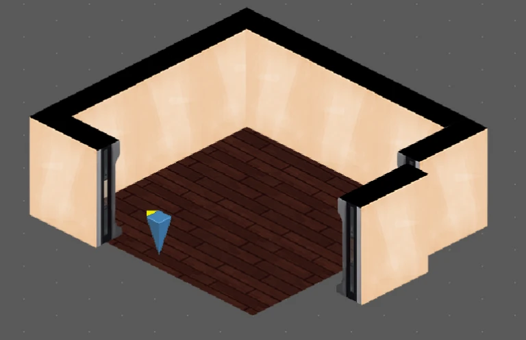
How to correctly place props on top of each other
Now let’s say I have this room, but I want the walls to be higher to give it a “grand” feeling. To do so, you only have one way, and that’s using function + arrow up / down on a mac or page up / down on other computers.
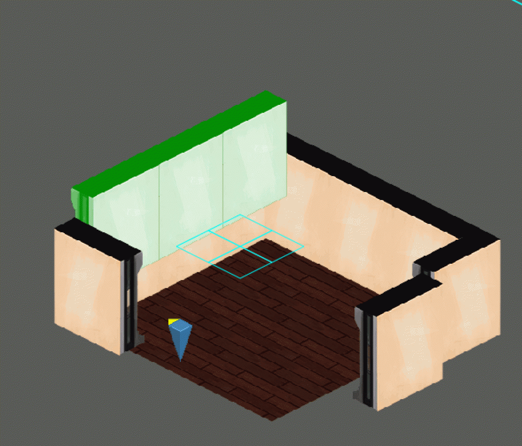
When you do this, you will see the wall move upwards, but the grid showing where the wall is placed on the floor should not move. It should look like this animation.
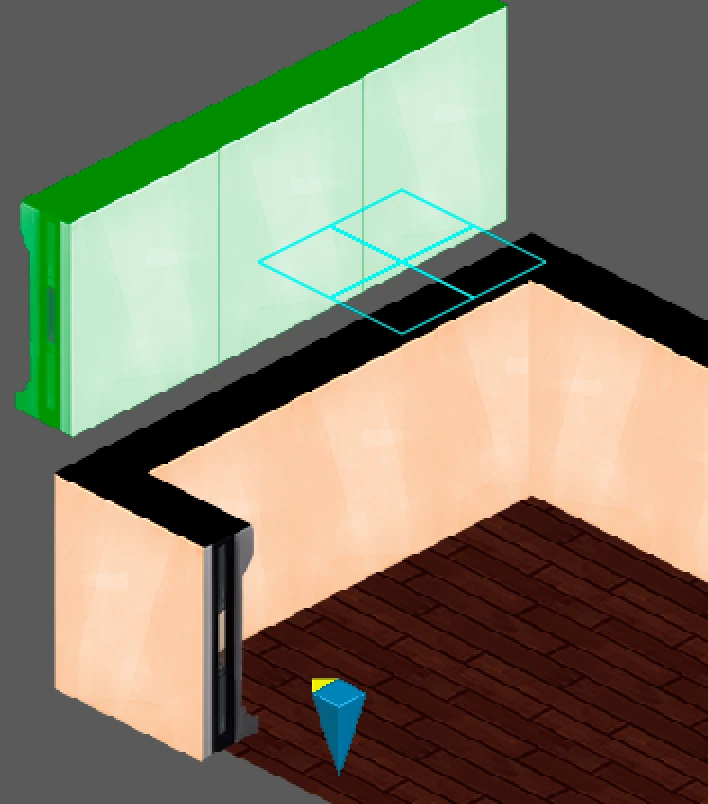
How not to place props on top of each other
If the small blue grid is moving around and does not remain on the floor, it means you are creating an optical illusion of height by placing a wall behind the other, further in the back. That will not look the same in game and does not work to create height.
The wall will remain behind the first one, so you can never really get rid of the black edge on top of the wall properly. Lighting will also be weird since the wall in the back will be darker, further in the back.
Putting glasses on a table
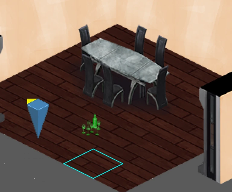
Depending upon the chosen asset, the prop can appear on the floor or already in the air. If you look at this picture, you can see the bottles and glasses are way above the blueish losange, so you know they’re floating in the air.
If you place these glasses on the table, the blue losange should be at the bottom of the table.
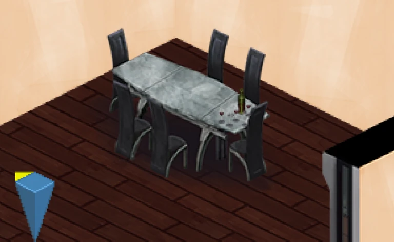
Depending upon where you place the glasses, they may appear in front or behind of the table.
It takes some fiddling to get things to display properly, again, editing the height and position of the asset.
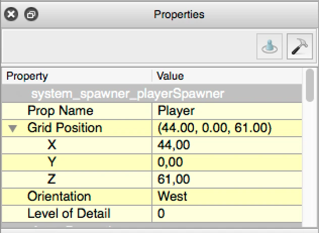
Editing values manually
To be very precise if your positionning, you can directly edit the coordinates of the prop in the properties. X defines the lateral position, Z the depth, and Y the height.
If you want your asset to be above the ground, increase Y.
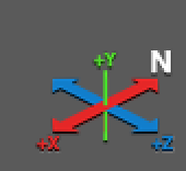
If on the contrary you want to place something below the ground level, give Y a negative value.
Articles on similar topics
Shadowrun level editor - creating a new project
Game development tutorial, Shadowrun Dragonfall level editing, Shadowrun Hong Kong Level editor tutorials,
Shadowrun level editor - editing the path to the content packs
Game development tutorial, Shadowrun Dragonfall level editing, Shadowrun Hong Kong Level editor tutorials,
Shadowrun level editor - troubleshooting (mac)
Game development tutorial, Shadowrun Dragonfall level editing, Shadowrun Hong Kong Level editor tutorials,
Shadowrun level editor - creating a map
Game development tutorial, Shadowrun Dragonfall level editing, Shadowrun Hong Kong Level editor tutorials,
Shadowrun level editor - picking up an item
Game development tutorial, Shadowrun Dragonfall level editing, Shadowrun Hong Kong Level editor tutorials,
Shadowrun level editor basic interactions - inspecting clues
Game development tutorial, Shadowrun Dragonfall level editing, Shadowrun Hong Kong Level editor tutorials,