The epic adventure of buying a qwerTEE
Some site revamps or evolutions bring fresh and new air, others seem to focus on showing what they tried to fix, while breaking whatever worked. I get the feeling this is what happened to qwertee, my personal favorite compulsive buyer shop.
Redesigned recently, Qwertee adopted a fat design look, while their previous modern flat was pretty pleasant. Ok, that’s just me. From the outside, my guess would be to say the original concern was that the Last Chance Tee wasn’t sold as often as could be. So that was fixed, let’s walk through how.
When buying a qwertee, a lot of poeple come from their favorite folowing source. For me, that’s newsletter. I used to land on the home page, with a huge buy button that I couldn’t resist in front of me. But that was before…
Now, I get to this great page :
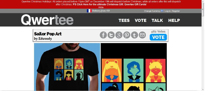
Awesome. I can see in one glimpse the whole design, and …vote ? I thought voting was for upcoming Community Tee proposals to be printed. I clicked on my newsletter, because I wanted to compulsively buy a Tee, and there’s no obvious buy button. Ok, so, next step, I go back to the home page, because clicking on the image doesn’t let me buy the Tee either.
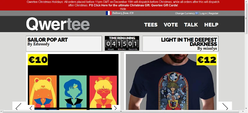
Both Tees on one page : great, because before, I needed to click once and didn’t get to see the previous Tee. Then again, I knew what it was, since I check it out every day. So, the price is clear. I’m a returning customer, so I don’t really care, but for others it can be useful. Still no buy button though. I just need to scroll a little, that’s ok.
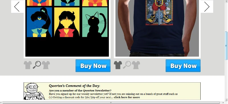
And there we are, two beautiful buttons, so maybe I can get my Tee now, because I really really want to buy it. After clicking on buy, I fall back on a page which I don’t recognize from before. Although I don’t know ifI’m getting used to it yet, or if I remember, I don’t think it actually changed much, except for the graphics.
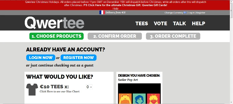
I really want this Tee, so it’s ok if I selected one on the home page, and made a choice to buy today’s Tee, and I need to say I want one again, instead of just selecting my size. It’s quite fast anyway, so it should be okay.
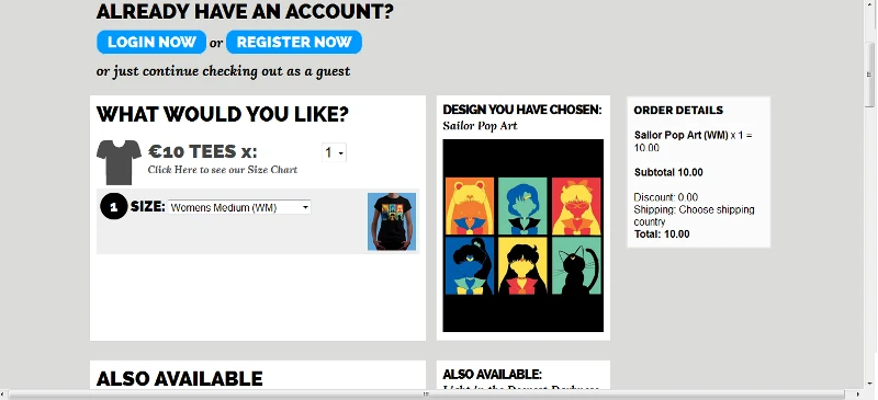
Scroll scroll, I see the second tee. It takes up some space, but I don’t care. No irony this time, I arrive at the address field and the tragedy begins. The fields are empty.
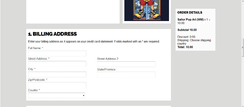
I have an account, but I don’t see where I can connect. I know i can connect on top of the page from the link in the upper right corner, but in the end, I’m annoyed by the new site, which makes me do efforts to spend money compulsively. It just doesn’t work together. At this stage, I abandon my first 3 carts ever on the site, figuring the Tee isn’t that great, and it’s not worth going through the trouble.
Last week however, there was this amazing Terry Pratchett Tee. And this time I went through. Partly because it’s rare to see this theme, and partly because I want to see the rest of the funnel at some point.
So here it is, fifth time I go to the new site, fifth time I feel surprised that I can’t buy a Tee, and anoyed at myself that once more, I didn’t see the huge blue connect button before I get to chose my Tee. I think for sites like these in particular, it is mandatory not to make the user think.
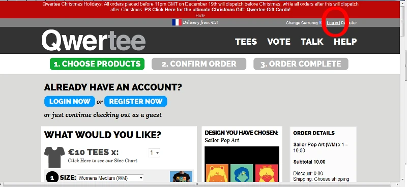
So, here we are, despite the two huge blue buttons, and the same error again, I finally connect to my account using the tiny link in the top right corner.
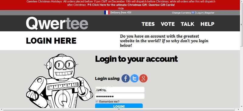
I am almost annoyed that the connect button too is almost below the bottom of the screen, while I’m the first to tell clients scrolling doesn’t matter anymore, and you should guide and invite users to do so instead of cramming everything above the fold. And finally connected… the annoyance continues : I land on a profile page. Where the F is my funnel.
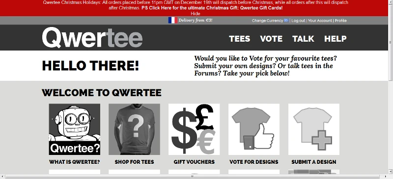
There’s where the fourth time was, for those who wondered. The fourth time I came to the site, I was so annoyed I abandoned my cart right here, after connecting. I find far fetched to hide the whole site navigation in order to avoid any distraction and interference from an e-commerce cart or funnel, once the user is one step inside. It does work however, to increase conversion rates (as show on which test won). Here, we experiment the contrary, the site seems to try to keep us out of the funnel, and it takes tremendous energy to buy anything at all.
Whatever, I really want the Cosmic Turtle Tee, so I go back to the home page.

Scroll down …again

Click buy …. again

Add one Tee which I already chose earlier….again
And select my size…. again (although, the first connexion asked me which size shirts I wore in my profile….)

This time, my address form is pre-filled. I just have to complete my credt card data, which I know by heart now, from buying so many Tees at half past midnight, when they’re just out and fresh, and I don’t want to stand up from bed to get my credit card .
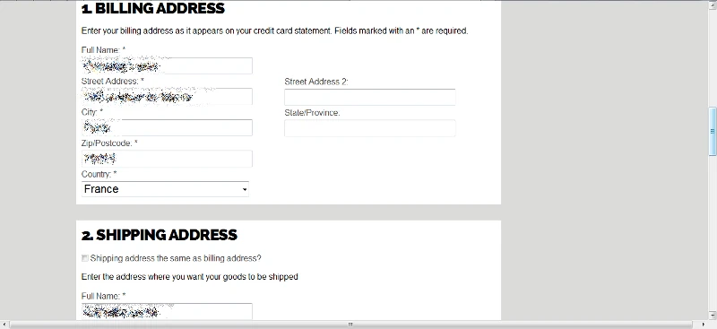
One thing I don’t get, though I don’t care about the space it takes, is why by default the shipping adress is not checked as being the same, yet, it is pre-filled with the same information. in the previous site, that also meant you had to chose the country again twice. Now it’s just a useless block of information that takes up my visual area. Also, I don’t get why in the shirt choice, fields appear conditionnally, and not here.
Since I have no clue about the sites’ analytics or frequent uses, I’ll assume that it answers the most common case. (Sending a shirt to one’s neighbourgh, I mean :p)
One thing did work though, when buying the shirt, I added also the Last Chance Shirt, which I had never done before, although the day before, I figured it wasn’t worth going through the trouble of using the new frustrating site.
As far as my memory is right, when I tried to do this on the previous site, I think it wasn’t possible to buy Today and Last chance Tees in one order, and I found it so ridiculous that I figured I’d never buy a last chance Tee. So, as a conclusion, the redesign did its job. I wonder though if there wouldn’t have been a possibility to make smaller changes, instead of a full redesign.
I’m sure the QwerTEAM had a good reason to make these decisions, that can not be known from the outside. Maybe technical constrains played a big deal and would explain the whole thing. As an outsider though, I hope this one use-case might help making the compulsive buying effortless again some day, and I definitely hope they know what they’re doing, and are doing user research to make the right decisions, because I really need the next Tee.